Analyze Your Findings
Learning Objectives
After completing this module, you’ll be able to:
- Collate your results.
- Use a spreadsheet to organize your results.
- Analyze your results to identify trends, commonalities, and differences.
Finding the Gold Needles in Your Data Haystack
In the previous unit you learned how to observe and interview your users. In this unit, you’ll learn how to collate the data you’ve recorded in written form and look through it to identify any trends, commonalities, and differences across the users you interviewed.
Collate Your Results
Let’s think about how your results might be collated after you’ve recorded and perhaps transcribed them.
If you used a separate note taker during your interviews, it’s important to go through their notes and make sure you understand what’s been written. This is a good step to take even if you were both interviewer and note taker. You’ll likely need to return to your session recordings to verify some parts of the notes.
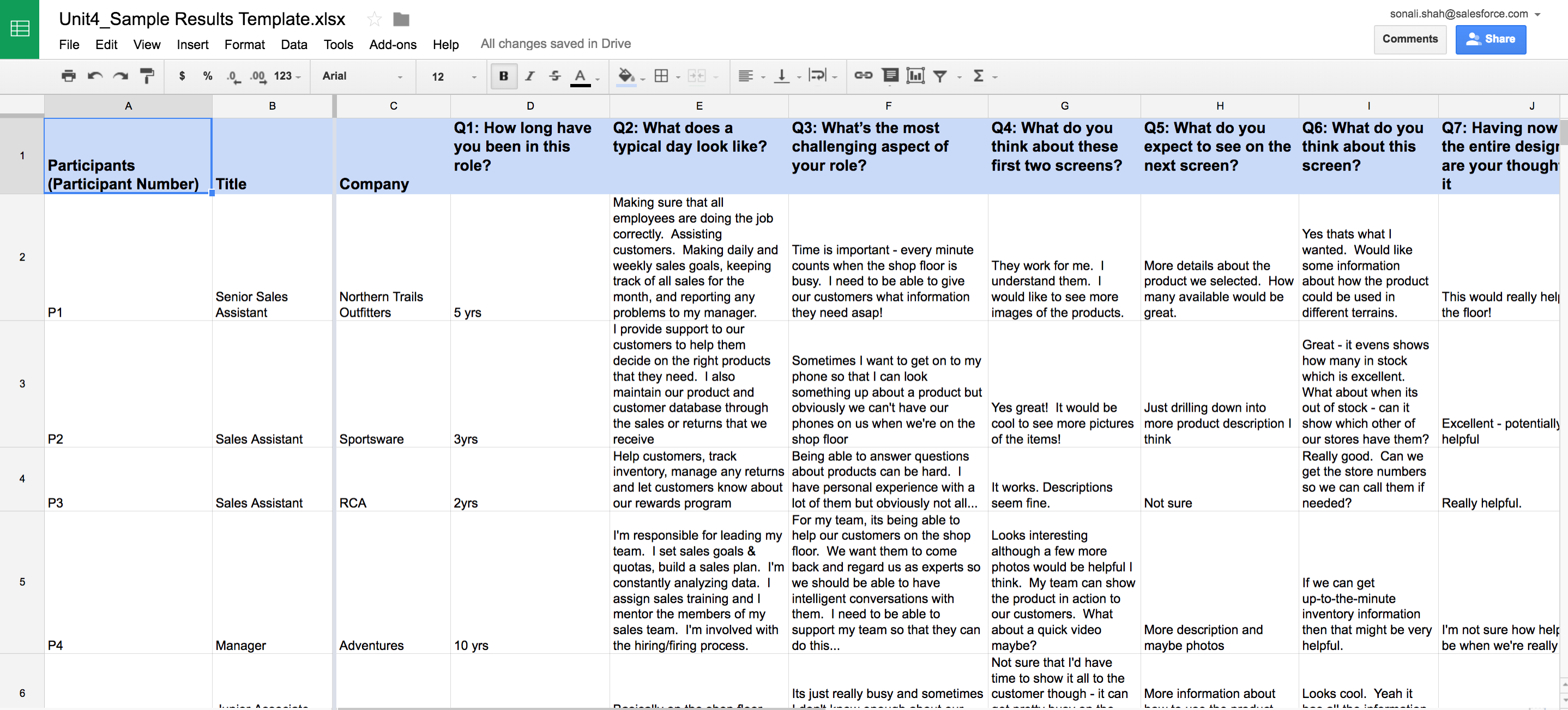
Having checked through the findings for each of your users, you can now pull them together into a spreadsheet. Yes, a spreadsheet. Spreadsheets let you scan across your users’ responses to each of the questions, especially if you’ve organized it well.

Working with Your Data Spreadsheet
As you scan through your spreadsheet, look for both overall consensus and differences in responses from user to user. Spreadsheets help you easily scan your results. And they help you share your data with other team members who might have also been taking notes during your interviews. As a guide for best practices, we’ve included a snapshot of a spreadsheet so you can see what your data might look like (check out the resources section of this module for a template version of sample data).

Create Order from Data Chaos
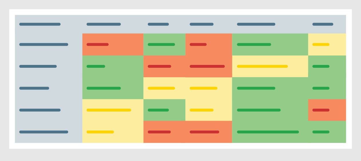
Now that you’ve consolidated all of your notes into your handy-dandy spreadsheet, you can begin to create order from the sea of data before you. Yes, it may look daunting, but you know that each bit of information comes from a user who gifted you their time to help identify a solution to your problem. So it’s up to you to use that data well. You can start by noting responses that might come across as positive, negative, or unsure in their sentiment.
Color coding these responses according to the sentiment can help when you scan across the tab, for example green for positive, red for negative, and yellow for unsure.

Carla uses this approach to see if there are any trends, commonalities, or interesting differences. She uses distinguishing colors to represent the positive and negative trends and interesting patterns. She knows to look for the following elements in her data:
- Commonalities and trends—words, sentiments, phrases, or ideas that seem to appear often across user’ responses.
- Interesting differences—sentiments that stand out in a given response or that appear to be in contrast to a phrase or sentiment in another response.
She also found some similarities across the results and color coded them like a pro:
- Orange = Time/Busy
- Purple = Information availability
- Blue = Product needs more description and photos/images
- Bolded Text = suggestions from participants, additional fields needed, see more images, and so on
Her color-coded spreadsheet of findings is in the resources section for you to use too!
Mapping Solutions to Your Research
But wait, there’s one last step. We still need to map the trends, commonalities, and differences to potential solutions. Yes, actual recommendations to change things. Now you might be thinking that you’re not a developer and you don’t know what’s feasible, so how can you recommend a solution? It’s a risky venture to put your research out there, but to put it out in the wild without having clear next steps as to how all your hard work can be used would be a half-finished job (and we know you’re a closer).
Don’t worry we’ve got your back!
Your Magic Solution Finder
Take each of the trends you’ve discovered and map them to the commonalities and differences you’ve identified. Chances are there are clear groupings of feedback from your users that point to a pretty clear solution. You can even take the time, yes that again, to sync up with your team members and see if they might have a great solution to some of the trends you’ve seen.
Once you’ve mapped your trends, commonalities, and differences to solutions—then you have all of the elements you need to build your story. We’ll get to that in our final unit.
Carla has uncovered some clear trends in her analysis and is eager to map them to solutions. She identified a host of trends that provide a frame for the recommendations and clearly associated solutions:
| Trend | Commonality/Difference | Recommendations |
|---|---|---|
1. There are three roles:
|
n/a | n/a |
| 2. Junior sales assistants don’t have much time because the shop floor is always busy. | Cited 3 times |
|
| 3. Junior sales assistants need to have quick access to all relevant product information. | Cited 5 times | |
| 4. Junior sales assistants want the product details to be easily digestible in the new product. | Cited 4 times | |
| 5. Junior sales assistants are looking forward to trying out the new product. | Cited 6 times |
|
| 6. Senior sales assistants are cautious about the product possibly being a distraction on the shop floor. | Cited 3 times |
Now, finally, Carla is done with the analysis of her data. But she’s not done with her work. We need to take all of this information and make a story—one that’s compelling enough to provoke her audience to act on her recommendations.
Resources
- Download the UX Research Basics Pack:
- Raw results template to enter in participant details and results
- Results template with sample data
- Results template showing how to color-coded sample data