Get to Know Data Maps
Learning Objectives
After completing this unit, you’ll be able to:
- Describe how maps can add to or detract from data analysis.
- Identify different types of data maps and their uses.
The Importance of Mapping Data
Now let’s take a look at how to analyze and visualize map data. To help others see and understand map data, map creators can apply various styles. Stylistic choices can include color, shapes, sizes of shapes, and more.
Data that is tied to geography—whether that's climate data, data about the migration patterns of birds, or data about distribution of food deserts—is useful when seen in context on a map. The information about the geography and location of the data is a valuable part of the analysis.
Types of Data Maps
There are many different types of data maps. Picking the right map type depends on the message you want to convey and the type of information you have. Two main types are centroid maps and filled maps.
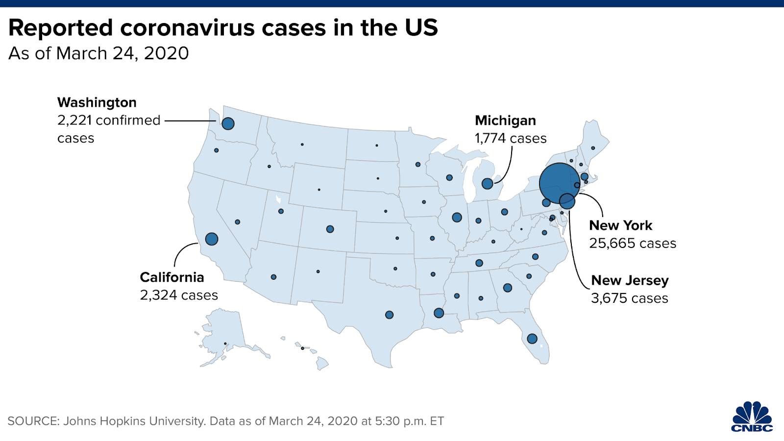
Centroid or Dot Maps
Centroid maps are useful when there’s an abundance of information that must be considered but you don’t need to delve into every detail. A dot represents the middle, or “centroid,” of a specific area. The spot is like finding the average location for a cluster of data points. So rather than crowding a map with many small dots, this map type uses one point to represent a larger group. It simplifies the information while still showing a broad picture and retaining the trend.
Centroid maps are also useful when the shape of the geometry isn’t relevant or when it needs to be consistent, such as plotting similar dots for various cities, rather than their irregular boundary lines.
Centroid maps are often used to depict infectious diseases. The map helps to indicate the general area where cases occur. Then, you can see where the disease is active and how it’s moving. They help to track current cases and predict future hot spots. By tracking how a disease is spreading—without violating patient privacy by mapping exact locations—health experts keep the community safe.
Filled or Choropleth Maps
Unlike centroid maps, which place the data in a dot, filled maps cover the entire geographic region to represent the underlying data. This is useful when the data is relevant to the whole area, or when the size or boundaries of the region are important to the analysis.
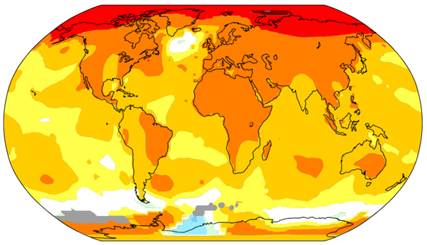
Choropleth maps are colorful storytellers that represent data as color gradients on filled maps. The different colors or intensities are tied to the underlying data. This visualization technique allows you to quickly absorb key information while seeing the whole picture.
Choropleth maps are a great way to display and compare temperatures from various places. The visual gradients of color allow for at-a-glance comprehension of data.
Use Map Types with Care
When you map data, it’s important to remember, “Map the data, not the land.” This is a warning against using filled maps of regions when the data isn’t tied to the land area, but rather some element inside the area.
In a very simplified example, imagine you want to know how much of the planet is covered with taiga versus savanna biomes. A filled map of Russia and Nigeria decently presents the biome data comparison for those countries. Russia is about 19 times bigger than Nigeria, and there’s a lot more taiga in Russia than there is savanna in Nigeria.
However, if you want to know how many people are Russian citizens versus Nigerian citizens, a filled map would distort the fact that Nigeria has a greater population (approximately 230 million) than Russia (approximately 143 million).
Check out this Tableau Public viz that explores this topic in detail, in the context of American electoral maps. The viz includes suggestions of how issues can be overcome with other maps and data visualizations.
Geometry in Maps
Geometry is more than just finding the area of a regular hexagon like you did in school. In the context of maps, geometry is a specific characteristic of map data, often stored in shapefiles. Cartographers use points, lines, and polygons (geometries) to lay out a map.
Imagine you’re looking at house listings on a website. A point is used to represent the location of an individual home listing. Lines are used to show major roads. Polygons outline the lots for specific properties. Another example is park maps. A restroom’s location is a point, hiking paths are lines, and a lake is represented as a polygon. The type of geometry used conveys different types of spatial information.
While working with map software, shapefiles act as a repository of geographic information. Shapefiles are digital containers often separated by topic. There are shapefiles for specific geometries and their subjects. Using the previous example of a park, there might be a point shapefile for structures and waypoints, a line shapefile for trails, and a polygon shapefile for bodies of water.
Spatial Operations and Joins
Spatial operations are methods of comparing data based on its geographical information. A regular join might join rows of data where the birthdate and last name match. But what if you want to join rows of data where a lake is partially inside a nature preserve? Or figure out if a trail crosses over another trail? You need a join that's aware of the properties of spatial geometries.
For the trails crossing, you would use an INTERSECT join. This spatial join type matches when geometries overlap or intersect (think of an intersection of roads). There are other types of spatial joins, such as CONTAINS (one geometry must be at least partially contained inside the other, such as if a postal code falls within a county) and WITHIN (which looks to see if geometries are within a specific proximity to each other). The information is joined to create a unified result.
Spatial operations are used for tasks such as measuring and calculating exact areas within a given range. Let’s say that you’re still looking at house listings. You’re only considering houses that are near a park. Using a WITHIN join, you can find out which houses are close to a park. Spatial operations can help you see which house listings fit your criteria.
Conclusion
Map-maticians, this map basics expedition has come to an end. You’ve explored map types, inspected components of maps, investigated mapping software, and finally observed how to map data. At many points in the journey, you learned new skills and expanded on those skills.
Remember to always consider the following when you view a map: What is the map trying to say, who made the map, and what do you want to learn from the map? When you continue to ask questions of maps, the discoveries and connections you make will take you further on your map literacy journey.