Learning Objectives
After completing this unit, you’ll be able to:
- Build a Basic Point Map in Tableau
- Add Visual Detail to a Point Map
A point map plots geographic data to visualize the location of data on a map. The points can be encoded with size and color to aid visual analysis. For example, if a point is bigger, you know that the location has more of what you're measuring. If it’s smaller, it has less.
When to Build a Point Map
A point map is one of the simplest and easiest maps to make, and it's a great map to make while learning about mapping in Tableau. A point map is a good choice when you want to visualize data associated with specific locations instead of whole areas. For example, in this unit, you explore how many EV chargers are in each postal code in Washington State, rather than how many chargers are in Washington State as a whole.
You can use a point map to see patterns associated with the specific locations. For example, you might see a higher proportion of EV chargers in postal codes around the Seattle metropolitan area, and a lower proportion to the east of the state. Let’s build the map and see if these assumptions are correct.
How to Build a Point Map
Follow along with this tutorial to build a point map and answer the quiz questions at the end of the unit.
Connect Your Tableau Public Account
If you haven’t already, or if your Tableau session has expired, log in to your Tableau Public account in the Playground window to the right. If you don’t already have a Tableau Public account, sign up for one now, and be sure to activate your account before starting this interactive unit. You can find more detailed instructions in The Tableau Data Model badge.

- In the window to the right, you should see the Tableau Build and Analyze Maps workbook in Tableau Public for Trailhead.
- In the Data pane, expand the Alternate Fuel Stations table and double-click the field ZIP.
A map view is automatically created because the Zip field is a geographic field.
In this map, you see a point for each postal code that is in the data set. Now you can see where across the state EV chargers exist. As expected, there does seem to be more points around the Seattle area than in other areas of the state. What isn’t shown is the quantity of EV chargers, and which types of EV chargers are in each postal code. Is there only one EV charger per zip code? Or are there more? Let’s add visual detail to find out.
Add Visual Detail to a Point Map
You would like to know the quantity of the EV chargers per zip code. Your spatial question is, “Which zip codes have the most EV chargers in Washington State?” There are three fields that contain EV charger measures in the data set:
- EV Level1 Chargers
- EV Level 2 Chargers
- EV DC Fast Chargers
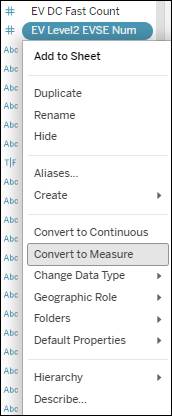
If any of these fields in your data set aren't showing as a Measure (in green), right-click the field and select Convert to Measure.
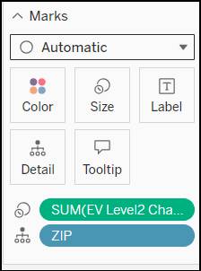
- Drag EV Level2 Chargers from the Data pane and drop it on Size on the Marks card.
The points on the map are now encoded with size, and the points are different sizes, with bigger points representing a higher count of EV chargers per postal code.
- Make the size differences more prominent by clicking Size and dragging the Mark Size bar to the right. Verify the Mark size is set to 50%.
The points are now encoded with size, and there’s a legend to the right of the viz showing the size distribution for the Measure Values.
- Make the Marks more distinct by also encoding the marks with color by dragging EV Level2 Chargers from the Data pane and dropping it on Color.
By default, Tableau applies a blue diverging color palette. The darker the color, the higher the quantity of EV chargers per zip code.
- On the Marks card, select Color. Select Edit Colors…
- Expand the Palette dropdown and select Orange-Blue-White Diverging.
- Check the boxes next to Stepped color and Use full color range on the Edit Colors dialog box.
The Marks on your Point Map are now encoded with both color and size. Your changes are automatically saved, and you can close the Edit Colors dialog box.
Analyze a Point Map
At the beginning of this unit, you wanted to find out the answer to a spatial data question: How many Level 2 EV chargers are in each postal code in Washington State? Are there any patterns that you can see with the quantity of Level 2 EV chargers in a specific area? You created a point map and encoded the measures, which show the quantity of EV chargers per postal code, to visualize this data.
What do you see? You see that there’s a large cluster of Level 2 EV chargers based around the Seattle metropolitan area. East of the mountains, the biggest cluster of chargers is around Spokane, and there are also a respectable number of chargers to the north and south of Seattle, WA, heading toward Vancouver, BC, and Portland, OR.
What else do you see in this data? Keep the map that you created in Tableau Public handy while you answer the questions in the quiz.
This point map has done a great job for representing specific locations of the EV chargers, but the marks overlap, and it’s hard to tell the size of the area where the EV chargers are–are there a lot of EV chargers for the space? Or is there only one charger to serve a large area? To find out, you build a filled map in the next unit.