Become a Data Explorer
Learning Objectives
The Exploration Goal: Who Are My Top Sellers?
You’ve got questions about your business, and the answers are in your data. So you need to become an explorer—a data explorer, that is—using CRM Analytics. As you work toward your badge for this module, you’ll start with a concrete goal that guides all your explorations. The basic concepts that you’ll learn will not only help you through this module but can be applied at your actual company. So, no time to waste—let’s go through the first use case!
Here’s your goal for this unit: The new quarter is starting and you want to run a bonus contest for the best seller in the company to drive sales in one of your product families. You don’t know which family to choose, but the answer is in your business data. You need to understand how your sales are spread among your products in order to choose the focus for your contest. CRM Analytics data exploration allows you to go from one answer to another naturally, and even answer new questions as they arise.
STOP! If you haven't completed the CRM Analytics Basics module, please go there first. You'll need to sign up for a special Developer Edition org before you can do this module.
Get Started with Queries

Under the Datasets section, you should see a dataset called DTC Opportunity. Click to open it.
Now you’re in a tab called “New Lens.” You’ll see the initial state of your data exploration with a count of rows in your dataset. Hover your mouse over the bar to view a box with the exact number. If you wish to rename the Count of Rows label, click Show Fields Panel from the drop-down menu next to DTC Opportunity. Then, click  . In the dialog box, enter the new label name and click Done to save your changes.
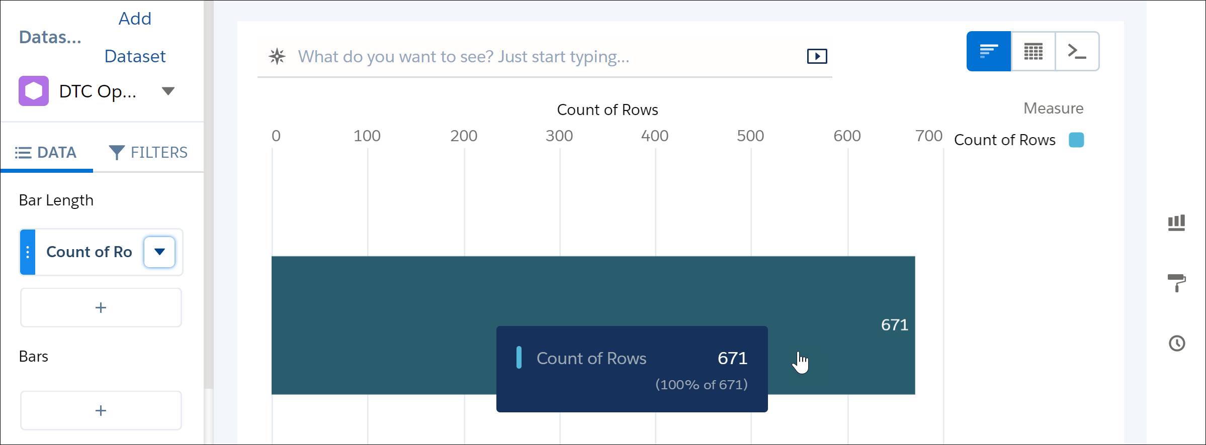
Throughout the exploration, you’ll ask questions about the data. Asking a question is what we call “running a query.” You’ll be changing the query one step at a time to get closer to your exploration goal, and you’ll see this simple bar transform into a sophisticated chart.
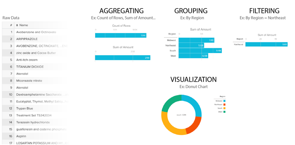
- Aggregating—Summarize the data by some measure. For example, the measure could be a count of the rows of data, as in the initial exploration state. Another common measure is a sum of the amounts.
- Grouping—Group the data by a certain dimension (more on dimensions in a bit). For example, group by product name or account.
- Filtering—Filter the data to narrow your results. For example, show only opportunities within the fiscal year.
Is the current query grouping by anything? Is it filtering by anything? Is it aggregating?
It’s not grouping or filtering, but it’s aggregating the count of rows, which is the default. Note that groups and filters are optional, whereas aggregation is required. Regardless of the query you use, there must be at least one measure to have a visualization.
Group Your Data
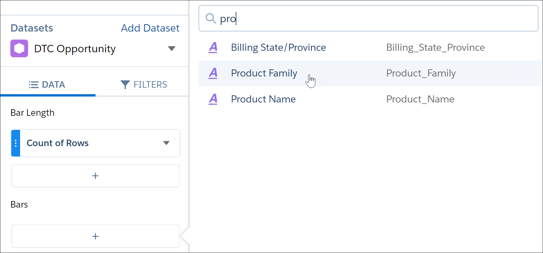
Time to add a grouping by product family. Clicking the plus sign (+) under Bars opens a drop-down menu where you select the dimension to group by.
Don’t know what a dimension is? A dimension is a qualitative value, like region, product name, or model number. So it’s something you can group by.
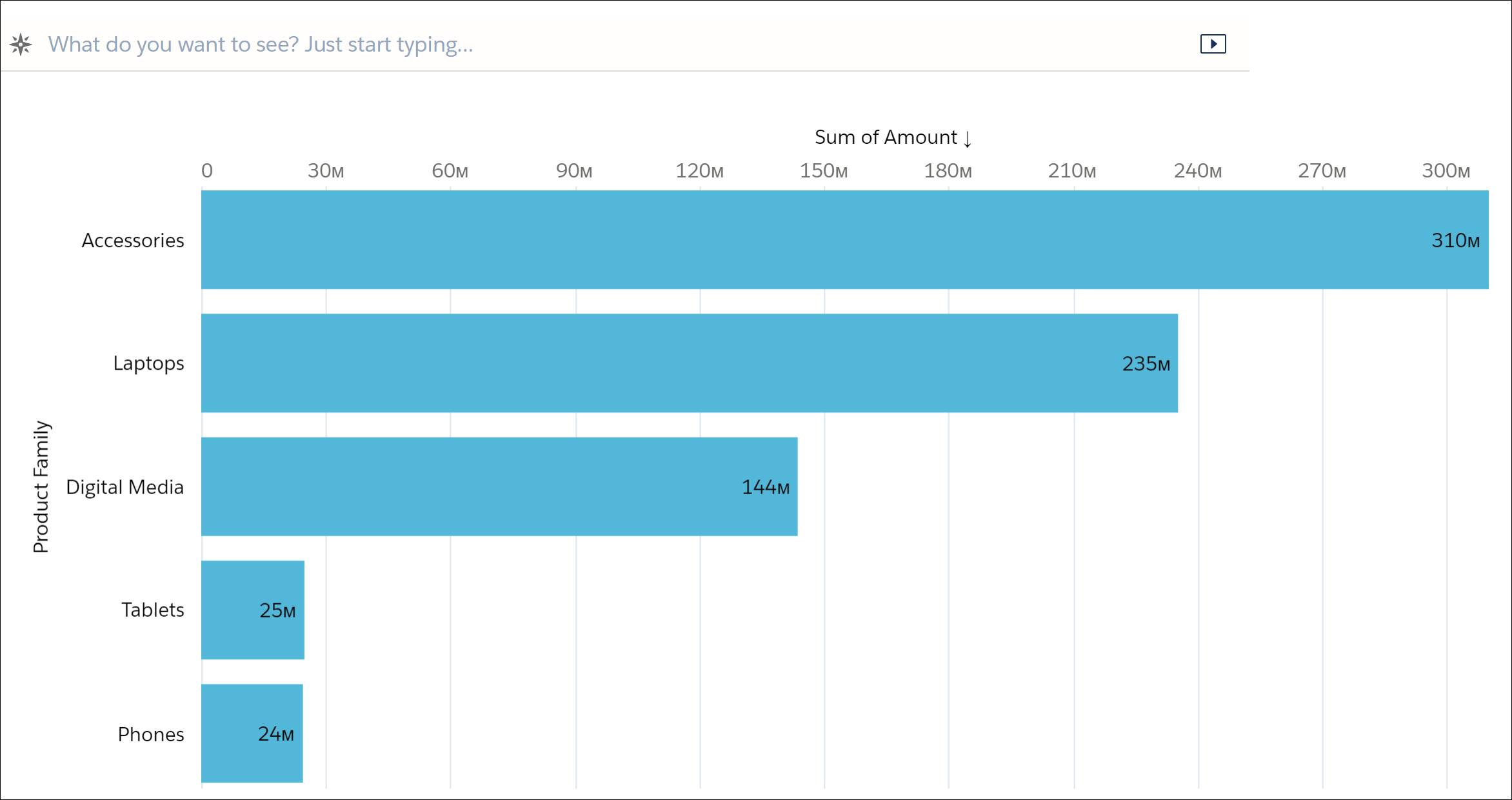
Here, you want to group by Product Family. You can access the dimension faster by typing the name, then selecting it from the list.
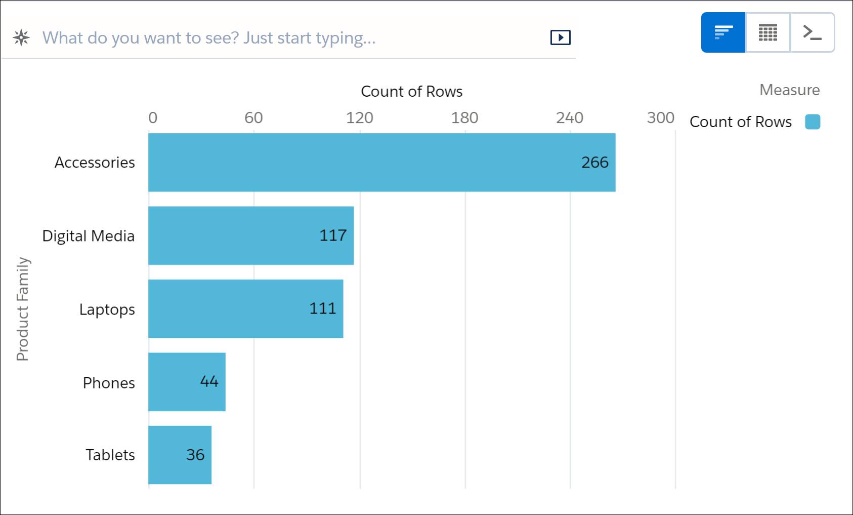
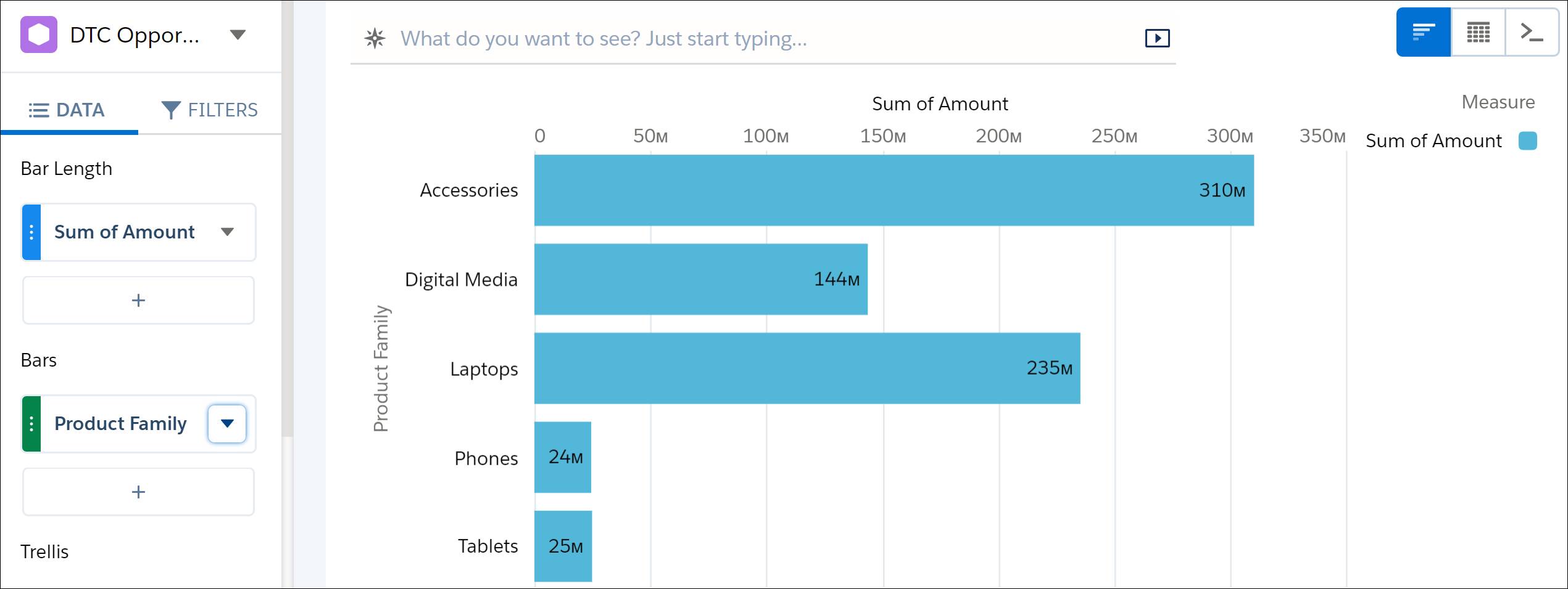
You can see that the aggregation, Count of Rows, is now calculated for every group. But you want to see the revenue brought in by each product family, so you need to change the aggregation. Aggregations are typically made on measures.
- Under Bar Length, click Count of Rows to change the aggregation. The drop-down menu that opens shows you the calculations you can make using a measure, such as Sum or Average.
- You want to see the total revenue brought in by each product family, so click Sum. The list on the right shows the available measures.
- Select Amount.
The chart has been updated, and you can see that the value on each bar is different now!
Drill into Your Data
Just by clicking the blue Laptops bar, you can drill into laptops sales data. Click once to select the bar, and then right-click to open the drop-down menu. Alternatively, click the Drill-down button (  ). Select Opportunity Owner, and let the magic happen!

With a click, you changed the single bar of global sales into a sales rep leaderboard for laptops. Take a look to see what changed in the query.
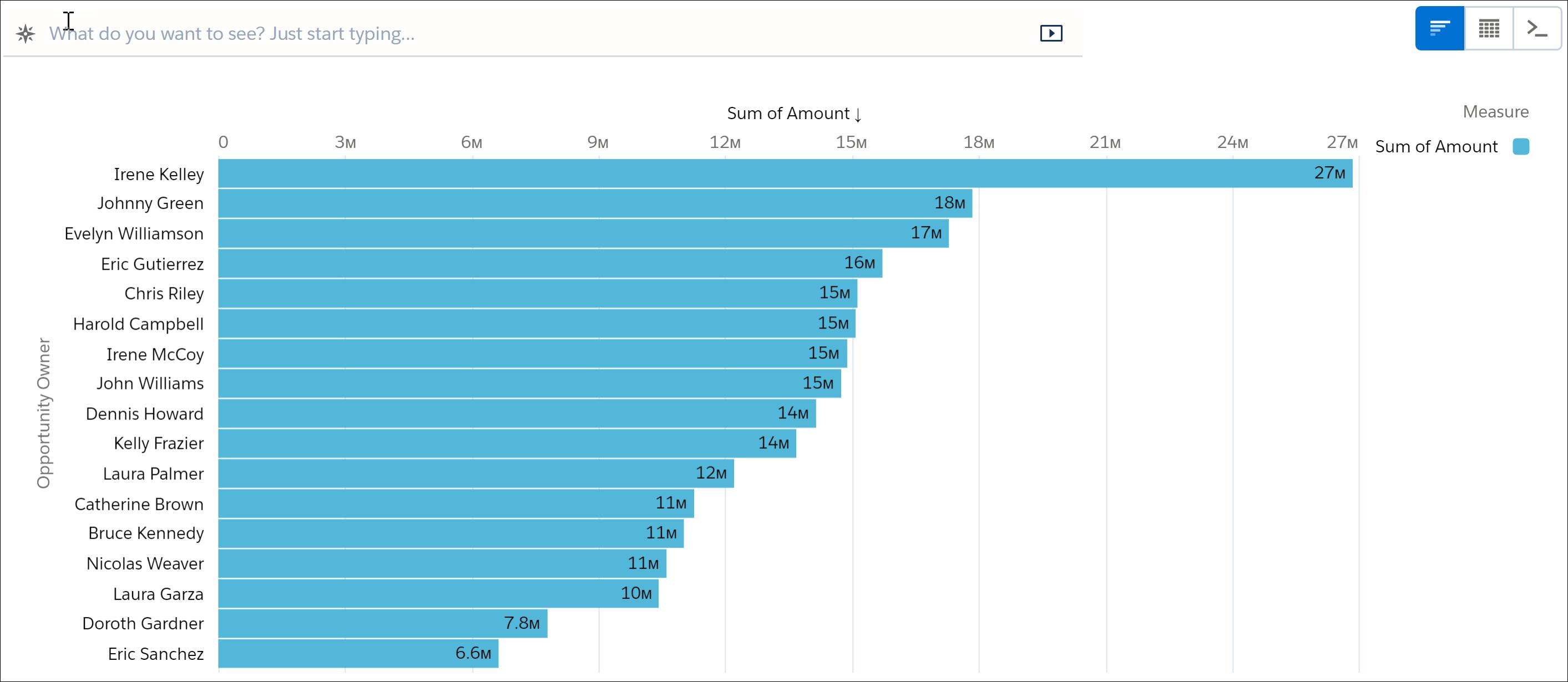
- Under Bars, the grouping has changed from Product Family to Opportunity Owner.
- You’re filtering the product family by laptops only.
You now have an answer to the leaderboard question! But wait! Is it the real answer?
Filter Your Data
- In the Filters tab, click the plus sign (+) under Filters.
- Search for Won, and then click it.
- Select the value true.
- Click Apply.

Did you notice the animation when you added the filter? It’s a great visual way to understand how the results change. Your top sales reps are different when you’re focusing only on the won deals. Some reps went down, others went up, and it’s important to know how they moved when you focus on won opportunities.
Keep Digging: Ask the Next Question
- There are now two dimensions under Bars on the left of the bar chart: Opportunity Owner and Product Name.
- The chart now highlights the second grouping (product name) by color. The right side of the chart includes a legend showing the color-product relationship.
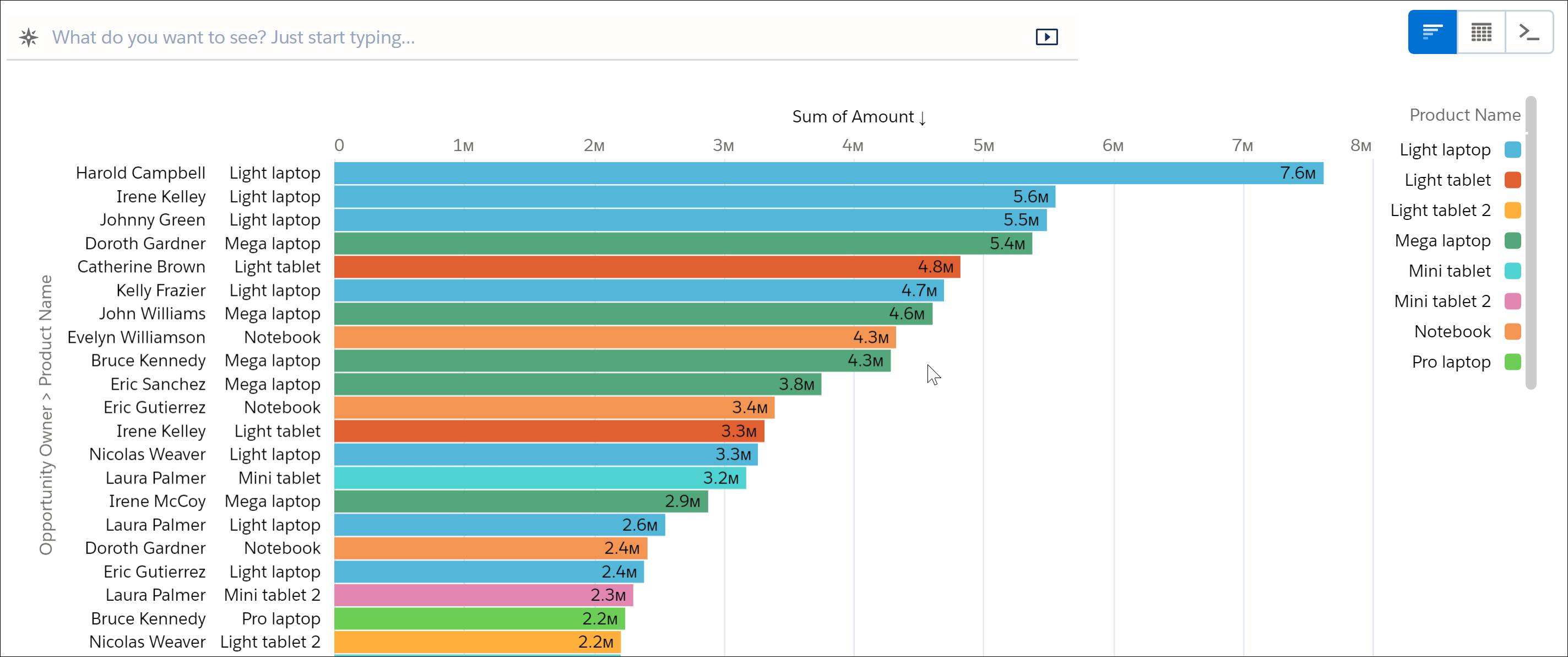
This visualization tells you what products are bringing in the most revenue. As you hoped, light laptops are doing great. Let’s bring this information together with information in the sales rep leaderboard by changing the visualization.
Choose the Right Visualization
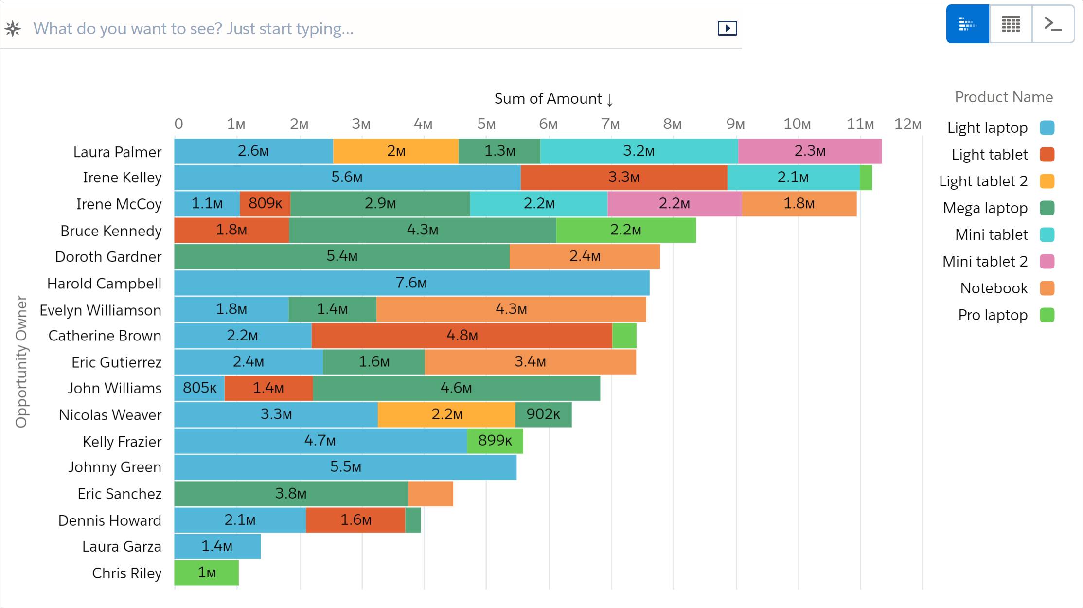
You want to identify the rep who’s best at selling laptops, so you want to see one bar per owner name, but keep the product name grouping. So what if you could “stack” the values for each sales rep?
To see the options for charts, click the chart gallery icon (  ) at the right. Locate Stacked Bar and click it to see what happens. Then click again to close the charts panel.
Each visualization has a different way to handle multiple groupings or measures. Try clicking the charts icon ( ) again, and then select Donut. In this case, it’s creating a donut for each first grouping (Opportunity Owner) and displaying the second grouping on it (Product Name).
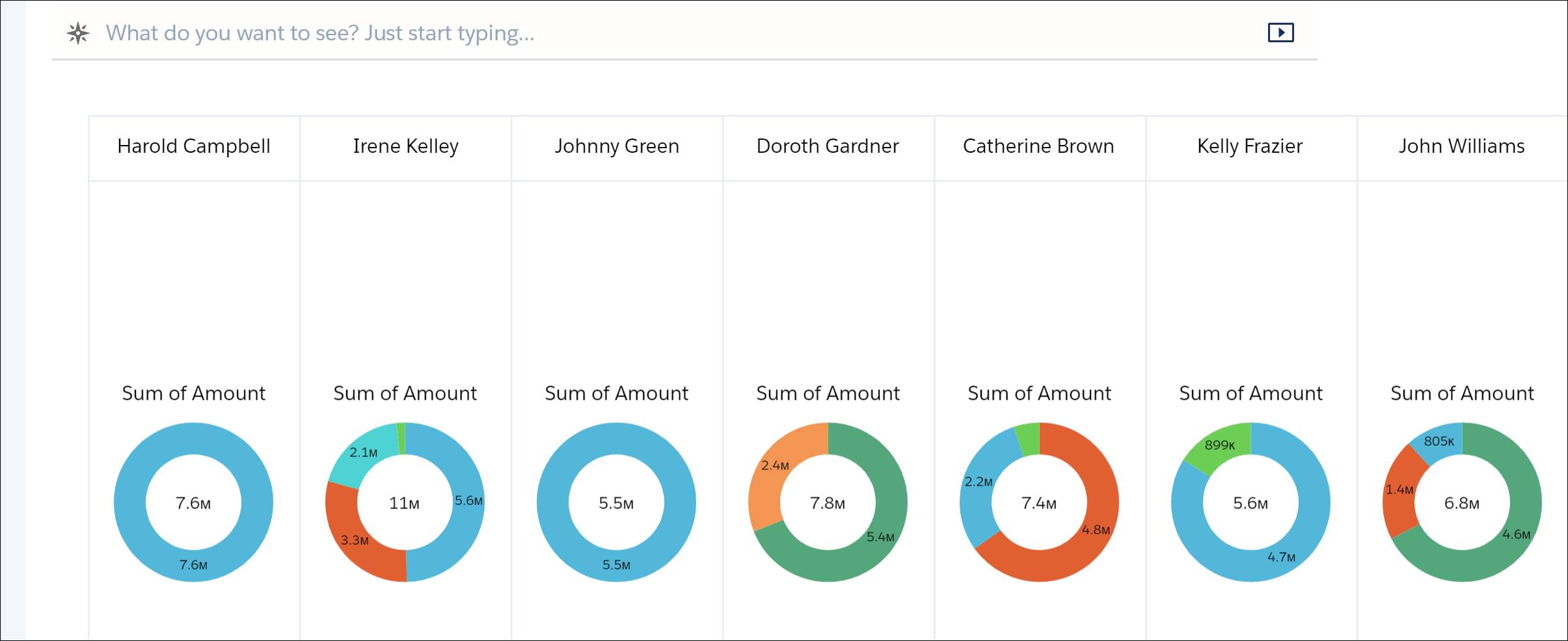
As you did at the beginning, you can hover over any segment to get more information about the values. Multiple grouping charts give you even more valuable information than single groupings, for example you can see the percentage of each second dimension value.
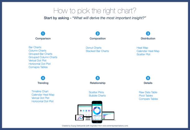
Donut charts are a good way to quickly see the composition of your data. Here’s a summary of the best chart to use based on the insight you’re seeking:
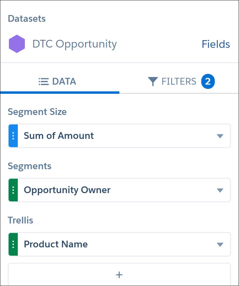
- Under Trellis, delete Opportunity Owner.
- Change Segments to Opportunity Owner.
- Under Trellis, click + to add Product Name.
The visualization now has donuts for each product. On each donut, the second grouping is now by opportunity owner.

Navigate Your Exploration History
 from the More menu to go back where you started. Let’s go back to the stacked bar chart that you wanted.
- Click
 to see the full list of your exploration steps.
 - Click Updated chart to: Stacked Bar.

- Click again to close the History panel.
Notice that the legend makes the chart look crowded. Let’s adjust the layout.
- Click the Properties icon (
 ) to open the Formatting panel.
 - Click the v next to Legend.
- Select Show legend inside chart area.
- Under Position, select bottom-center.
- Click again to close the Formatting panel.
Save Your Work in a Lens
You’re on Your Way, Explorer!
- A dimension is a descriptive value, whereas a measure is a value you can do math on.
- Each visualization is efficient in specific use cases. Choose visualizations based on the major insights you want to derive from them.
- Don't be afraid to go exploring. You can see every step of the journey in the history and navigate between the steps easily.
- You can save an exploration in a lens.
- When you’re exploring data, you’re just mixing and matching four basic actions: aggregating, grouping, filtering, and creating a meaningful visualization.
In the next unit, you’ll spend more time on date-based explorations that include groups, filters, and visualizations. Are you ready to learn more?