See the Big Picture with Charts and Get the Details with Tables
Learning Objectives
Charts and Tables Work Together to Give the Entire Picture
Charts visualize your data so you can quickly get summaries, make comparisons, and identify trends. When you need a close-up view, tables provide you with record-level details. For example, a chart shows the total value of each sales rep’s opportunities, and the table shows details about each opportunity record.
So how do charts and tables work together in Analytics to give you a complete picture of your data? You can select a chart segment and see a filtered list of records in the table. For example, you can select an opportunity type for Irene Kelley in the chart to see only her opportunities of that type in the table.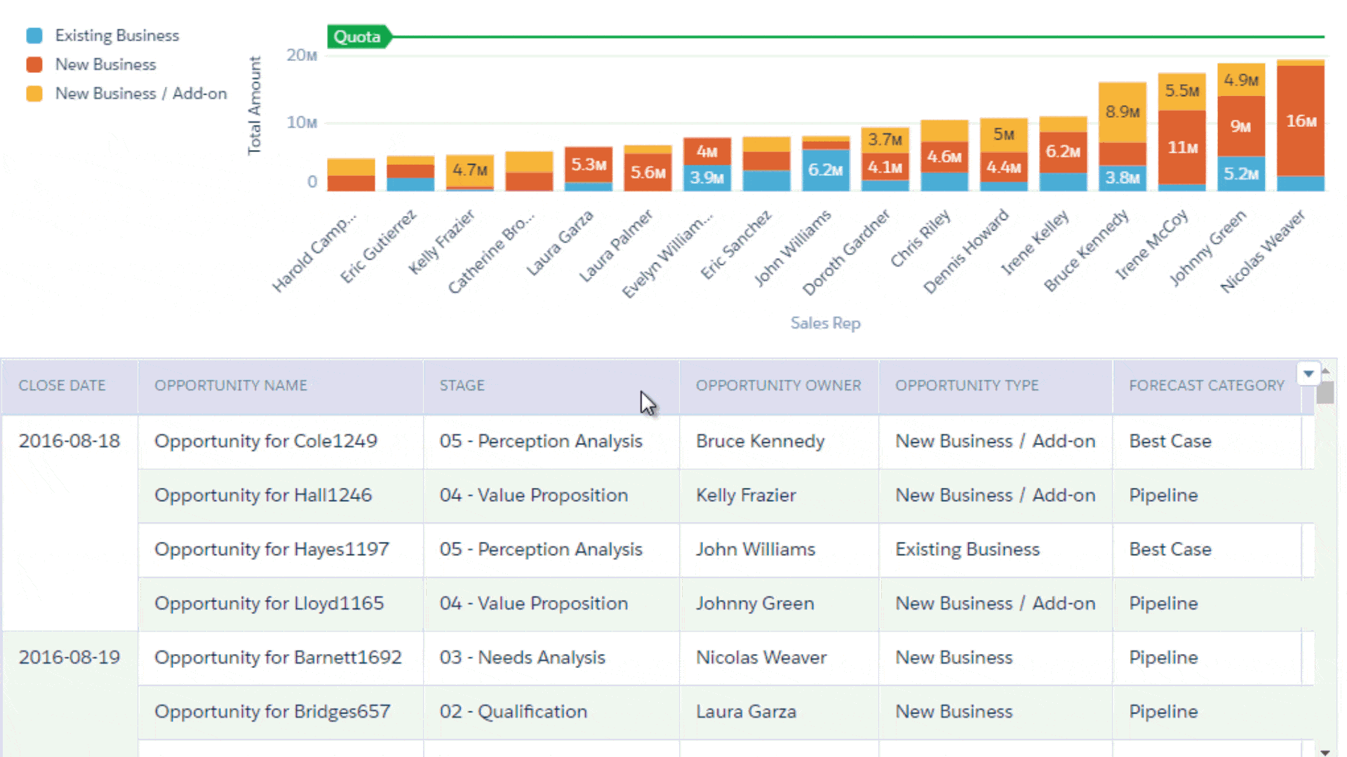
We cover more about widget interactivity in an upcoming unit. For now, let’s get back to Laura’s request to be able to compare reps.
Rank Sales Reps and See Who Hit Quota
Laura wants the dashboard to compare sales reps and identify which reps are currently meeting quota. To show how they stack up against each other, create a chart that ranks reps by their total opportunity amount.
Because lost opportunities don’t affect ranking or quota, exclude them from the chart. (Laura can rely on the “Lost Opportunities” number widget to get that information and see the details about each lost opportunity by adding the table.)
Let’s get started.
- While in edit mode, drag a chart widget (1) to the dashboard canvas, resize and reposition the widget as shown in the following screenshot, and then click Chart (2).

- Set the label to Opp Amount by Owner and Type.
 Before we continue, notice that you weren’t prompted to select the dataset—the DTC Opportunity dataset was selected for you based on your previous query. Although you’ll use the same dataset, if needed, you can click Back to choose a different one.
 - Change the measure from Count of Rows to Sum of Amount in the Bar Length field.
- To group results by sales rep, click + in the Bars field and then select Opportunity Owner.
- Add a second grouping based on Opportunity Type. Groupings affect each chart type differently. For example, a chart can represent a grouping as a segment or color. Also, if you add multiple groupings, the order of groupings makes a difference. When you have time, play around with the order to see the effects on each chart type. In this case, Opportunity Owner is the first grouping and Opportunity Type is the second.

- To exclude lost opportunities, in the Filters tab, click + under Filters, select Stage, and then select all values, except 09 - Closed Lost.
- To apply the filter, click Apply.
- To rank sales reps by total opportunity amount, in the Data tab, click the down arrow next to the Sum of Amount measure, and then select Sort Descending. Note: You can also click the Sum of Amount axis title to change the sort order.
 The query ranks the results, but not by sales rep. The chart ranks based on each combination of sales rep and opportunity type. To rank by rep only, let’s use a different chart type.
- On the right side of the screen, click the Charts button (
 ), select Stacked Column, and then click the Charts button again to close the right pane. Bar and column charts are excellent visualizations for ranking groups of data based on a single measurement, but only when there’s one grouping. Stacked bar and stacked column charts are better when you have multiple groupings.
 - Click the Formatting button
 , scroll down in the widget panel, expand the “Y-Axis (Left)” section, and then set the following properties.
Widget Property Setting Title Set to “Total Amount”. Reference Line To display the quota line, click + Reference Line and enter 22500000 for the value and Quota $22.5M for the label. When you preview the dashboard, the quota line should appear slightly above the last bar in the chart. If not, verify that you entered the reference line value correctly. - Scroll down a bit more, expand the “X-Axis” section, and then enter Sales Rep for the X-axis title.

- Click Done.
- Save the dashboard.
Which Opportunities Are We Talking About?
To switch between the big picture and the details, Laura can go back and forth between Analytics charts and individual Salesforce records. But that’s a little confusing, especially when you can show record details in an Analytics table. With charts and tables in the dashboard, Laura can see both at once.
Let’s add a table to show Laura details about each opportunity.
- Drag a table widget from the toolbar to the canvas, increase the size of the table to 12 cells wide by 8 cells tall, and then click Table.

- Set the label to Opp Record Details.
- Click
 and then select Values Table. Compare Table and Pivot Table are some other table options. But we don’t need a compare table (to create a custom column or group rows) or a pivot table. We just want to use a values table to display the dataset fields in a tabular format.
 - To specify the dataset fields to show as table columns, click the Columns button
 at the bottom of the “Columns” box.
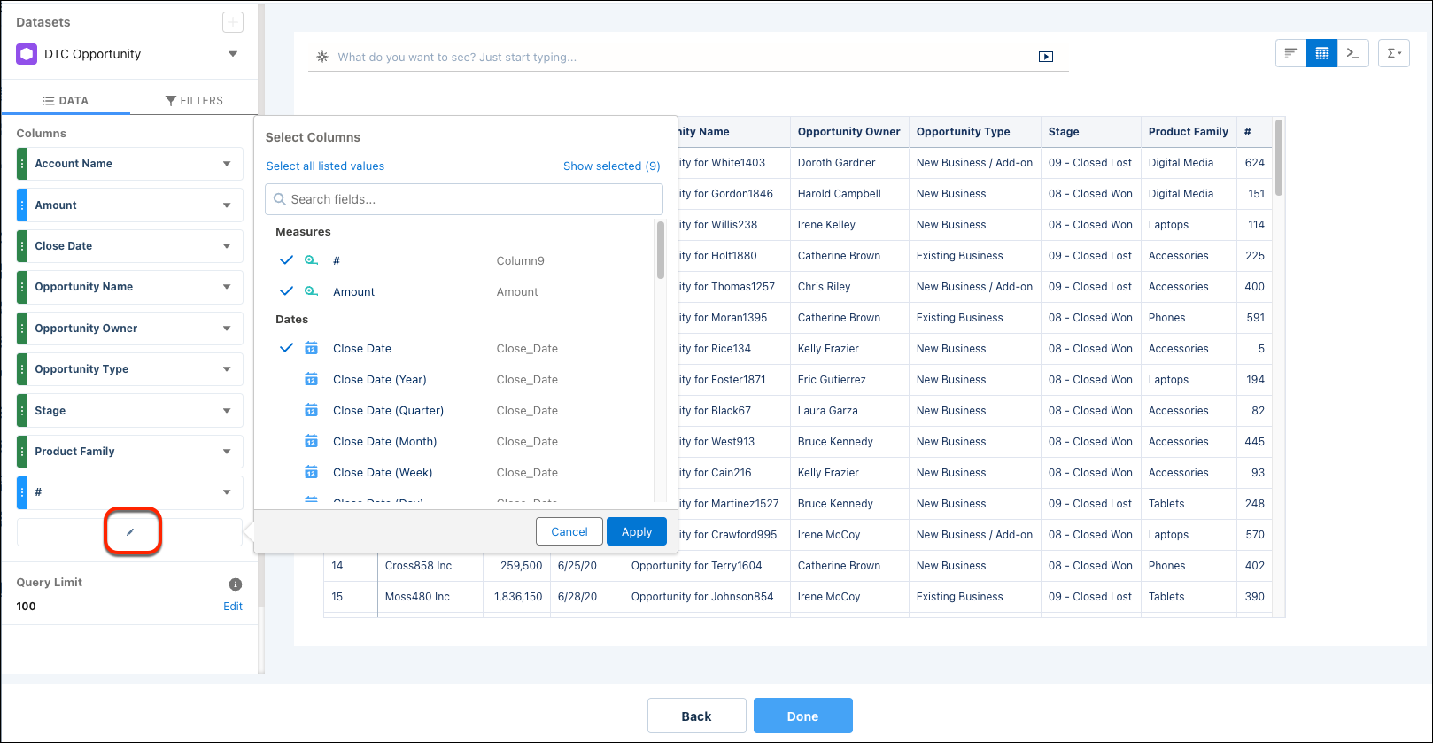
- Select only the following fields. Remove others.
- Account Name
- Amount
- Close Date
- Opportunity Name
- Opportunity Owner
- Opportunity Type
- Product Family
- Stage
- Click Apply to display the selected fields as the table columns. To change the order of the columns in the table, drag and drop a column inside the Columns box. To sort records based on a column, while previewing the dashboard, click the column header in the table.

- To make more room for other columns, let’s get rid of the # column. Click the Formatting button, expand the Other section, and then uncheck the Show Row Index Column option.

- Click Done. The table appears in the dashboard, but there’s empty space on the right. Let’s fix that in the table widget properties to snugly fit all table columns in that space.
- In the Spacing section of the widget properties, select Fit to Widget for Column Width. Now the table spans the entire dashboard.
- Save the dashboard.
Great work! You now have a table widget that shows the details about each opportunity. You also have a chart widget that ranks the sales reps and shows which reps need more opportunities to meet quota.
Now it’s time to add filters so Laura can analyze sales performance from different angles, like by sales rep, stage, product family, and opportunity amount. We cover this in the next unit.