Structure Your App
Learning Objectives
After completing this unit, you’ll be able to:
- Understand the importance of structuring your app’s content.
- Explain the process for structuring your app.
- Determine the structure of The Motivator app and start to fix it.
Criteria for Structuring Your Ideas
You’ve got a great set of feature ideas that express the purpose of My Motivator and can give sales managers what they need. Now, you need to structure them according to several criteria.
-
Priority. What’s most important to the audience and purpose?
-
Logic. What needs to be understood first?
-
Level of granularity. What’s most general, and what’s more specific?
-
Similarity. Similar content should be arranged together. Distinct content should be separated.
With that in mind, you have another look at the list of ideas from the pizza lunch meeting. You’ve already prioritized the list, so you’re partway there. Let’s see it in abbreviated form.
- Leaderboard and activity totals, along with completed and overdue activities.
- Type of activity week by week.
- View activities as they roll up to each level of management, from sales manager through regional manager to sales VP.
- Activities for each rep and each account.
- Separate sections for emails, calls, and so on.
- View activities on a weekly basis.
- Average activity levels benchmark.
- Details for each activity type.
- Inbound and outbound calls.
- Email priority.
- Complete and open events.
- Complete and open tasks.
Seems like a thorough, well-ordered list, so it shouldn’t be too much work to figure out how to organize it in a dashboard.
App Structure Concepts
To help come up with a structure for your ideas, first, let’s take a look at some structuring concepts, using some of the CRM Analytics apps as examples.
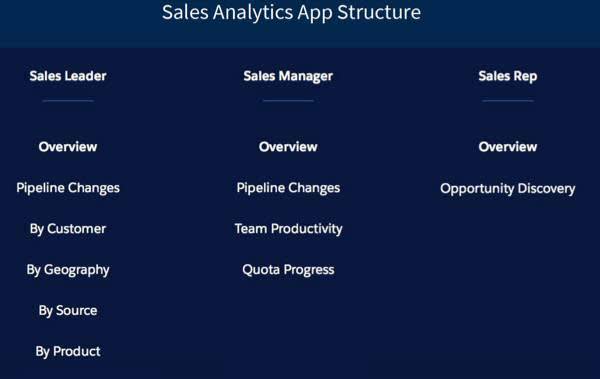
At the highest level, apps are structured around the people who will use them and what they want to learn from the apps. Sales Analytics uses that kind of persona-driven approach and provides broad content to serve several types of users—sales leaders, managers, and reps.
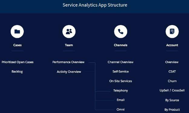
Whether an app serves one or more types of users, it can use a task-driven structure, organized around what those users want to do. Service Analytics provides deep content to address the service manager. Its content is organized according to tasks: reviewing cases, measuring team performance, and analyzing channels and accounts.
With The Motivator, you’ve determined that there’s only one type of user, one persona, to support. Its sales manager audience wants to perform tasks like measuring top performers and reviewing activities in sum (calls, emails, tasks, events) and by account. You can use a simple task-driven structure for its one dashboard, like this.
|
Motivator Structure
| ||
|---|---|---|
|
Measure top performers
|
Review activity summaries
|
Review activities by account
|
Leaderboard showing each rep’s activities |
Each type of activity—emails, calls, tasks, events—week by week |
Account details |
Average activities as a benchmark |
Activities rolled up under management level |
|
|
Details for each activity
|
||
The chart shows a logical organization of the activity metrics according to the priorities you and the team determined. It can be used in the next phase of your work, that is, determining how to lay out the metrics in a dashboard.
From Structure to Layout
When you know what kind of structure to use, you need to start thinking about how to lay out the features. You’ve got a lot of ideas about the features that can meet your audience’s needs. Now, you need a concrete plan to express those ideas in a logical hierarchy. You need to organize the features into a smooth flow from general or most important to those that are specific or of secondary importance.
At this stage, determine if you need one or many dashboards. Some apps require many, such as the default Sales and Service Analytics apps. Others need only one or a few, such as Adoption and Financial Services Analytics. As we’ve seen, an app is defined by its purpose, not some quantity of assets.
As an example, look at the original plan for the hierarchy and flow of Sales Analytics.
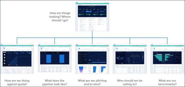
It starts with the most general audience need: to see the big picture of sales performance. Then, it presents detailed views of that big picture according to a logical flow, starting with progress against quota—the sales team’s most important KPI. Clearly, the app needs multiple dashboards to express that flow.
You make your decisions about how many dashboards are needed based on what best helps you tell your app’s story. Whatever you decide, you then need to determine the specifics of dashboard layout, whether it’s one or many dashboards. We look at doing that next.
Design Patterns for Dashboard Layout
Many people before you have had to think about how to express a content structure like the one you just came up with. Because of that, there are a few well-wrought page patterns you can consider to shortcut the process of coming up with a page layout for your dashboard. If your app involves more than one dashboard, each one of them can follow one of these patterns.
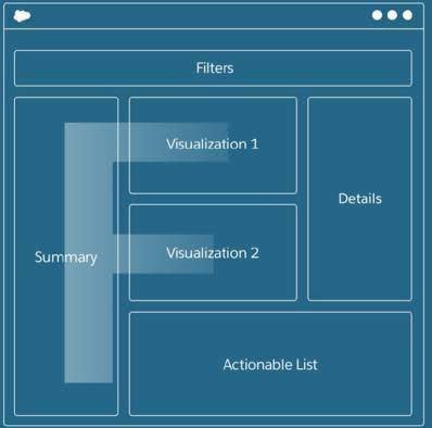
Many dashboards follow what’s called an F pattern because it resembles the letter F. Using this layout, you can place a summary or highest-priority KPI in the left pane (the left side of the F). More granular metric visualizations are positioned to its right (the two horizontal strokes of the letter). More details appear further right and below. Typically, any changes the user makes to the summary, or the more granular visualizations, such as changing a filter selection, also filter the details (labeled Details and Actionable List in the image). In CRM Analytics, we call that faceting; changing a filter selection in one dashboard widget also changes the filter for any faceted widget in the dashboard.
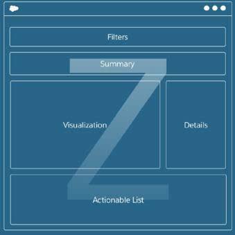
A Z pattern layout involves a top-down scan of the page. The summary information sits centered at the top of the page. Supporting visualizations are positioned below the summary and occupy the full width of the content area. Any faceting on the summary and visualization will filter the more detailed panes (in the image, Visualization, Details, and Actionable List).
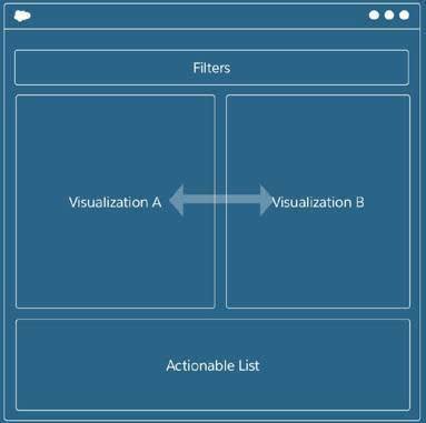
Another typical layout: The side-by-side pattern, is especially useful if you compare two metrics as you can place them next to each other. The user scans left to right and vice versa to compare metrics. Any faceting done separately on either visualization would filter the other visualization in the same way.
What works best for The Motivator’s dashboard? You can rule out the side-by-side pattern since you’re not comparing things. Maybe the Z pattern, but given everything you have to present, it can end up being a pretty long Z and force the user to scroll to get to important information.
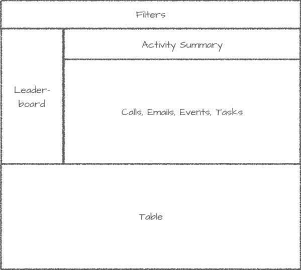
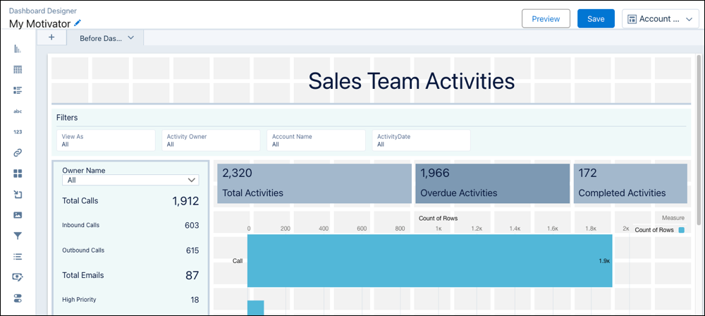
Seems like the F can be the best pattern for you, albeit with some modification. You can put the leaderboard over to the left, and the top part of the F can show activity sums with activity-by-activity breakdowns just below that. Even further below can be the account detail list.
So you decide to give it a try. You’re not much of an artist, but you can draw boxes in the shape of an F and label them with your feature ideas. Here’s what you come up with.
Great, you’ve structured your app. Now, it’s time to keep fixing The Motivator.
My Motivator Makeover, Step 2: Found in Space
When you last touched the dashboard, you fixed an obvious problem related to purpose. Next, fix an equally obvious one in its structure. Again, you’re not going to do everything to get its structure exactly right. You take a few steps in the right direction so you know what to do when it’s time for you to develop apps.
You move the activity summary metrics from the bottom of the dashboard to the top, where it’s clear they belong. When you do that, the top horizontal bar of the F layout is in place.
- Go to the My Motivator dashboard that you worked on in the previous unit.
- If the dashboard isn’t open in the dashboard designer, click the Edit button.
- From the widgets panel on the left, drag a Container (
 ) widget onto the dashboard canvas below the Total Activities metric.
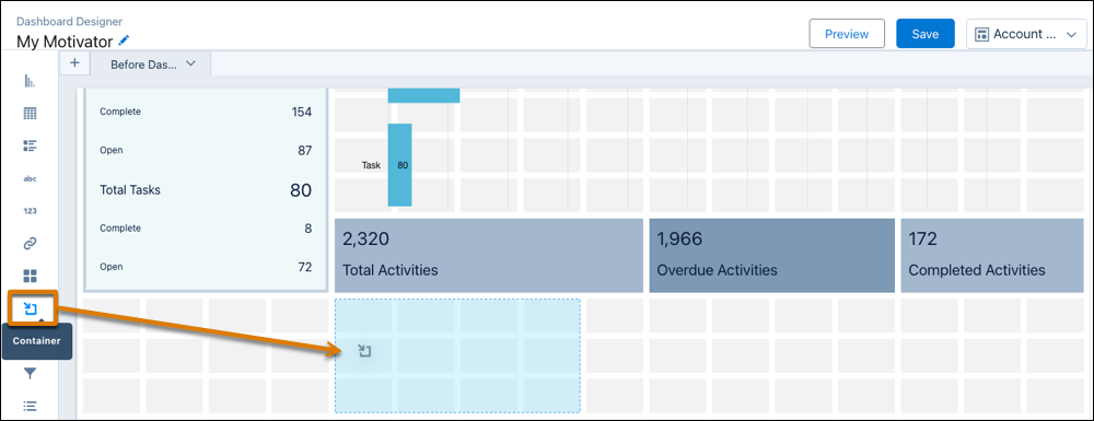
Tip: Containers are great for keeping related widgets together when you move them. Use them liberally.
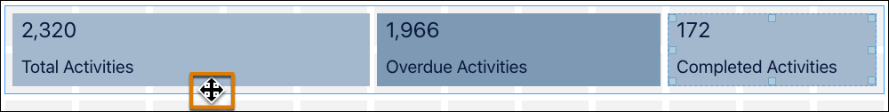
- Use the resize handles (
 ) on the container to resize the container to the same width and height as the three metrics.
Tip: If you ever lose sight of the container, click or hover over where you think it is and it reveals itself.
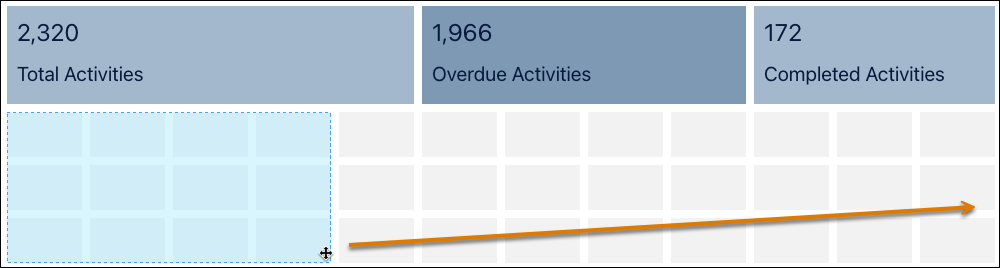
- Drag the Total Activities metric down into the container below it.
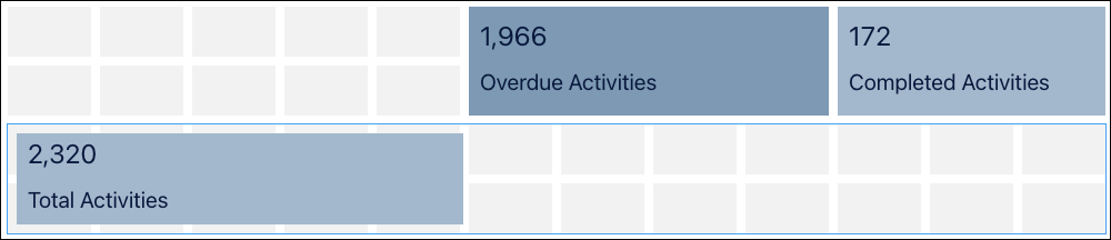
- Repeat step 5 for the Overdue Activities and Completed Activities metrics. Now that all the metrics are in the container, move the container to move the widgets around at the same time.
- Hover over the edge of the container until your cursor changes to cross arrows, then click and hold.
- Click Shift and drag the container up to just below the filters.
Tip: When you move a widget, click Shift to automatically move other widgets out of the way. We call this reflowing.
- Save your updated dashboard, and then preview it.
Much better, right? And pretty simple, too. But far from perfect: You notice that the summary KPI boxes aren’t the same size or color. You’re jumping ahead to the next part of the design process: surface polish. We’ll focus on that, the last part of the design process, in the next unit.