Make Dashboard Widgets Interactive
Learning Objectives
After completing this unit, you’ll be able to:
- State and contrast the two methods for making widgets interactive.
- Provide at least one example of how you can use faceting in an Analytics dashboard.
Widget Interactivity, the Power of Analytics Dashboards
In the previous unit, you created global filters that let Laura and other users filter the dashboard results by rep, stage, product family, and amount. In this unit, we’ll explore how to use those filters to answer different questions. We’ll also look at ways to customize the default interaction among widgets to create an even better, dynamic experience for the sales team.
Before we jump into that, let’s step back and learn about the different ways to make dashboard widgets interact with each other. Check out this video.
OK. Back to work. Now it’s time to see the real power of Analytics dashboards. Let’s look at how dashboard interactivity can help Laura help her reps.
Two Paths to Interactivity: Faceting and Selectors
As you saw in the video, there are two primary ways to make your dashboard widgets interact: selectors and faceting.
In the previous unit, you built selectors that require the user to manually click a list to update results. Faceting is the "set it and forget it" method. It makes dashboards interactive by allowing selections made on chart, date, list, range, and toggle widgets to automatically filter other widgets in the dashboard. For example, if Laura selects a specific sales region in a list widget, she can immediately see only the accounts from that region in a table widget.
By default, queries from the same dataset are faceted. However, you can use targeted faceting to decide exactly how widgets communicate. To customize this, select a widget in the designer and click the Query tab in the Properties panel.
In the Faceting section, you have four options:
-
All: The widget both broadcasts its selections and updates itself based on filters from others. This is the default.
-
Include: The widget facets with only the specific queries you choose from a list.
-
Exclude: The widget facets with all queries except the ones you specifically choose to ignore.
-
None: The widget operates independently. Selections are local to the widget and won't update others.
While the Faceting dropdown controls how a widget reacts to others, the Broadcast selections as facets checkbox controls if the widget sends filters out. If you want a chart to be clickable but don't want it to change the rest of your dashboard, simply disable broadcasting.
Monitor Sales Performance from Different Angles
Over the next sections, we’ll look at how you can use global filters to answer additional questions not answered by the initial dashboard results.
One of Laura’s initial requests was to know which reps don’t have enough pipeline to make quota. Based on the chart, Dennis Howard is the only one—his opportunities are below the quota line.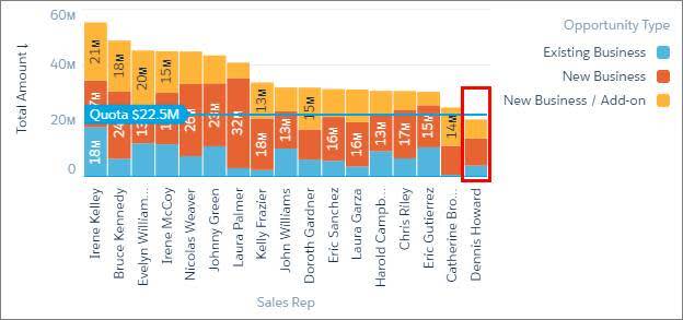
To find out how much he’s short, let’s take advantage of the global filters.
- Click the Preview button.
- To filter the dashboard results on Dennis, select Dennis Howard in the Opportunity Owner global filter and click Apply.
Notice that the number widgets immediately update to show Dennis’s open, won, and lost opportunity amounts. Using the open and won amounts, we see that, even if he wins all of his deals, he can only hit $20.7M ($10.9M + $9.8M). That’s still about $2M below the $22.5M quota. 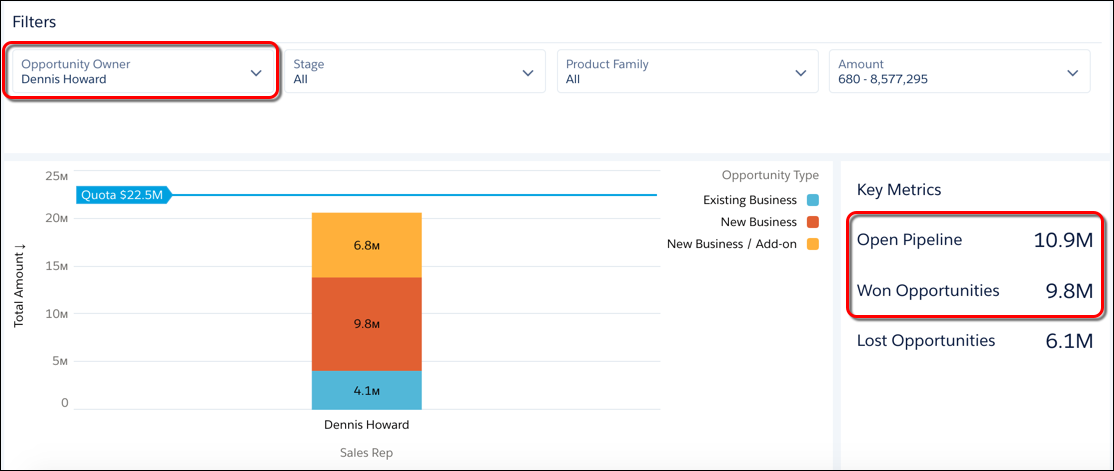

Thinking like a sales manager, the next question is “what can we do to help Dennis?” We can help him:
- Close his existing deals.
- Build his sales pipeline with more deals.
Let’s see how we can use the dashboard do that.
Move Open Deals to Closed
To help Dennis close his deals, Laura starts with the deals that are supposed to close soon. To focus on them, let’s filter the dashboard results further.
- Verify that Dennis Howard is selected in the Opportunity Owner filter.
- To see only open opportunities, select all stages, except 08 - Won and 09 - Lost, in the Stage global filter and click Apply.
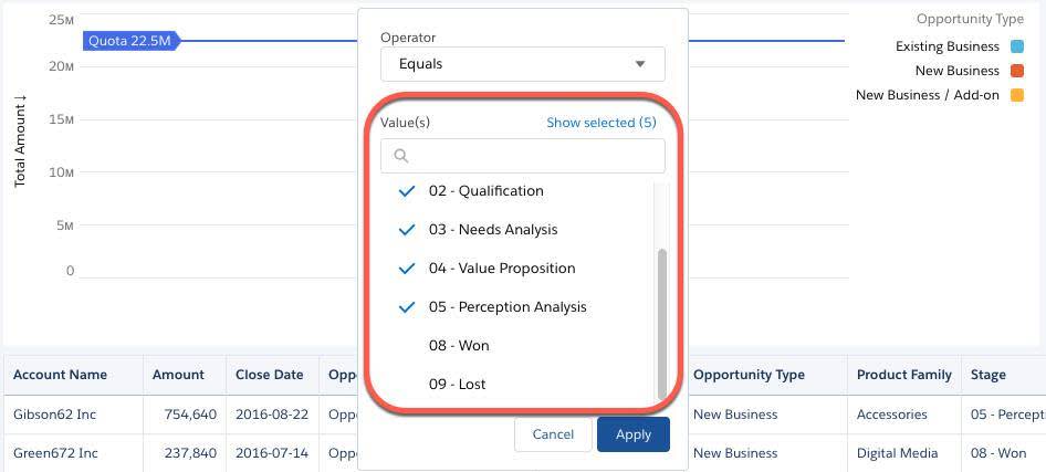 The table and the rest of the dashboard widgets show all open opportunities owned by Dennis. Wonderful!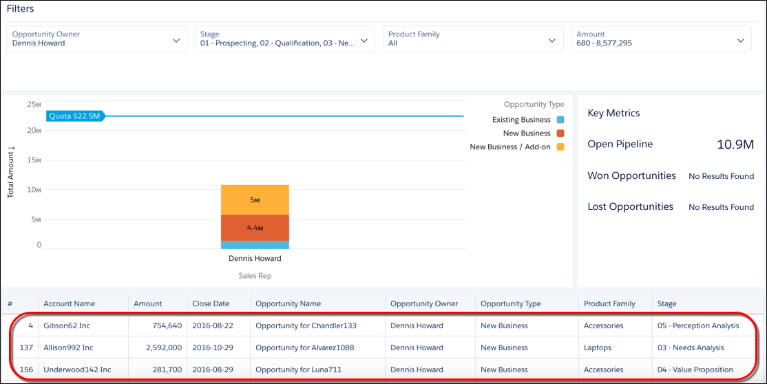
- To sort the table records in descending order based on close date, click the Close Date column header twice.

Great! We can now see which opportunities are supposed to close first. Laura can use this ordered list to know which of Dennis’s open opps to close. Now let’s see how to use the dashboard to fatten Dennis’s pipeline.
Build the Sales Pipeline
Laura has a standard two-prong approach to help reps build their pipeline. First, she helps reps generate leads for new opportunities. Second, she provides cross-sell and upsell strategies to increase the deal size of existing opportunities.
Dennis is in luck! Last month, DTC Electronics launched a new tablet product line. To break into this new market, DTC offers a 25% discount on any accessory with the purchase of a tablet. Dennis can use this marketing campaign to get new deals and cross sell. Let’s see how well Dennis is doing with this new product line.
- To clear any selections made in the dashboard and return to its initial state, click the Return to Initial view icon. Analytics clears the selections in the Opportunity Owner and Stage global filters.
- To see his deals, select Dennis Howard in the Opportunity Owner filter and click Apply.
- Now try to select Tablets in the Product Family filter.
The tablet option is missing. It’s not there because Dennis doesn’t have any opportunities for this product line. Wow. Perhaps Dennis needs some product training and sales strategies for tablets—especially since they have so much potential. Look at the average tablet deal size for other reps. Maybe Eric Gutierrez can give Dennis some tips.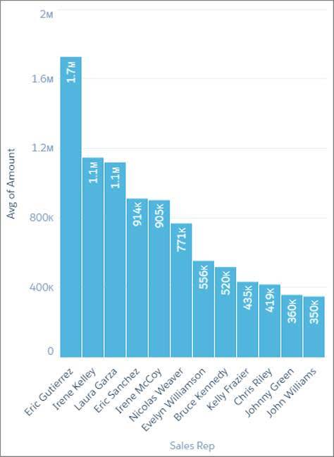
With a few selections, you were able to filter the dashboard results to answer different questions. You didn’t have to build more widgets to get your answers.
Compare Reps Based on More Sales Performance Metrics
Now let’s explore the power of bindings. Bindings let you dynamically modify any part of a query—including the measures, filters, groupings, and sort order—and change the display of a widget based on a selection or the result of another query. Let’s see how Laura can use bindings to help her team succeed.
Laura’s two-prong approach to building the pipeline is great. But to be most effective, she needs to know which reps need more deals and which need bigger deal sizes. Let’s add more performance metrics to our dashboard to help Laura determine the right strategy for each rep.
The current chart compares reps based on the total value of their opportunities. But what if we add a comparison based on the number of opps to see who needs more deals? And then add another that compares average deal size to see who needs to increase the size of their existing opps?
One way to do this is to add two more charts, one for each additional metric: number of opps and average opportunity amount. But those new charts will take up a lot more real estate on our dashboard. What if, instead, Laura can choose the metric to show in the existing chart? Oh yeah. Now we’re talking!
Welcome to bindings. Using bindings, Laura can pick one of the following metrics: number of opportunities, average opportunity amount, or total opportunity amount.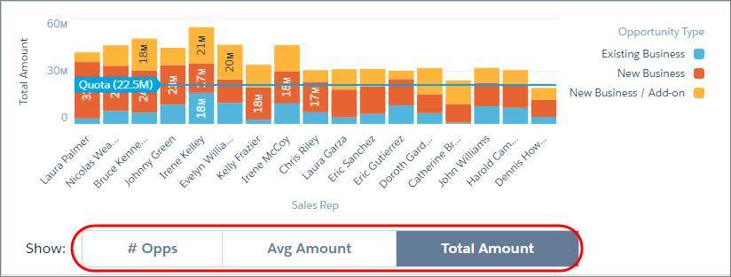
You have to tinker with some JSON to create this binding. But we don’t cover that here. To see a similar example of how to implement it, check out the “Sales Performance with Selectable Measures” dashboard included in your Analytics DE org. To see more binding examples and learn how to build them, deploy the CRM Analytics Learning Adventure app on your org. It contains lots of great examples.
Because Laura typically looks at the total amount to see who’s meeting quota, you can show the Total Amount measure by default when the dashboard first opens. To do that, use the Pick Initial Filters option to set the initial selection for the toggle widget. 
This is just one example of what bindings can do—there’s so much more sophisticated dashboard interactivity that you can implement with it.
You just created a highly impactful dashboard, not just for Laura, but for the entire sales team. Each sales rep can filter the dashboard to see how they are performing. They can track their opportunities, monitor their pipeline, and see at a glance whether they have already met or can meet quota. Most importantly, they can monitor their progress towards qualifying for that trip!
Resources
- Help: Filter the Dashboard Results with Faceting
- Help: Create and Manage Dashboards with Reusable Components
- Help: Set Initial Selections in the Dashboard
- Help: Dynamically Modify the Query, Initial Selection, and Widgets with Bindings