Utilize Custom Widgets
Learning Objectives
After completing this unit, you’ll be able to:
- Explain the basics of creating custom widgets.
- Create an up button using Marketing Cloud Intelligence’s custom widget.
- Create a custom header using Marketing Cloud Intelligence’s custom widget.
What are Custom Widgets?
Marketing Cloud Intelligence’s widget library offers a wide range of widgets so you can create heat maps, status bars, goal gauges, and even scatter plots. But what if you want to create something very specific? For example, a table that collapses according to specific characteristics you determined. This is where custom widgets come into play. Using CSS, JS and HTML, you can create a custom widget from scratch. If you don’t know how to code, don’t worry. You can also create custom widgets that don’t require coding knowledge.
Add a Custom Widget
Let’s say you want to add an up button to your page so that whenever the user clicks, it brings them to the top of the page.
To create a custom widget, first go to the dashboard page and click add widget (1), then under the elements library, click Custom (2).

Next define its classification (1). In this example, you’re creating an up button so select Button (2). Now, you can enter the editor (3).

The editor screen is divided into different sections.

You can see a preview of the widget and how it functions(1). You can apply HTML code (2) JS code (3) or CSS code (4).
In the Snippets Library (5) you can find ready-made code snippets and other external sources to use in your code.
Create an Up Button
Now let’s create the button. In the editor, add the following snippets.
In the HTML section, add the following:
<img src="https://datorama-freshdesk-success-center.s3.amazonaws.com/Other/img_72329.png" onclick="gototop()" width="82" height="86" alt="Up">
In the JS section, add:
function gototop(){
DA.navigation.dashboard.scrollToTop();
}
In the CSS section, add:
img {
cursor: pointer;
}
Once all the snippets have been added, click Apply.
If you return to your page, you can see the up button you just created.
Let’s review each code snippet, so you can understand how to manipulate the code to your needs later on.
HTML
The HTML determines what the button looks like. Let’s break each part.
-
img src="https://datorama-freshdesk-success-center.s3.amazonaws.com/Other/img_72329.png"This is the source of the image, you can insert any publicly available address.
-
onclick="gototop()"This is the action that should take place upon clicking the button. It is actually a function name, which is described in detail in the Javascript, or JS section.
-
width="82" height="86"This signifies the width and height of the image.
-
alt="Up"The alternative text that displays in cases where the image doesn’t appear.
JavaScript
The JavaScript (JS) describes the action that takes place when the button is clicked. In this case, the action is to scroll to the top of the page. However, if you want to change it, no problem whatsoever! This is where the snippet library comes in handy. Simply go to the JavasScript library, and open the Navigation APIs. All you need to do is switch the line of code within the curly brackets { } with whatever action you want to perform, and follow the instructions.
Let’s say you want to navigate to a specific widget on the page. From the Javascript library (1) click Navigation API (2), and select Scroll to Widget (3).
Replace the code snippet inside the curly brackets, and insert the widget ID which can be found in the options menu under widget | Info.

CSS
Last is the CSS, which adds some design elements to your code. For example, you can change the button’s font and color using css. In this example, the button is very simple, so you can leave it as is.
Add a Header Widget
Your page is coming together beautifully! But how great would it be if you could add a header that can help you navigate the page with ease?
Thankfully, you don’t need to create one from scratch. The Marketing Cloud Intelligence team created a template based on custom widgets, and all you need to do is modify it slightly with no coding knowledge required.
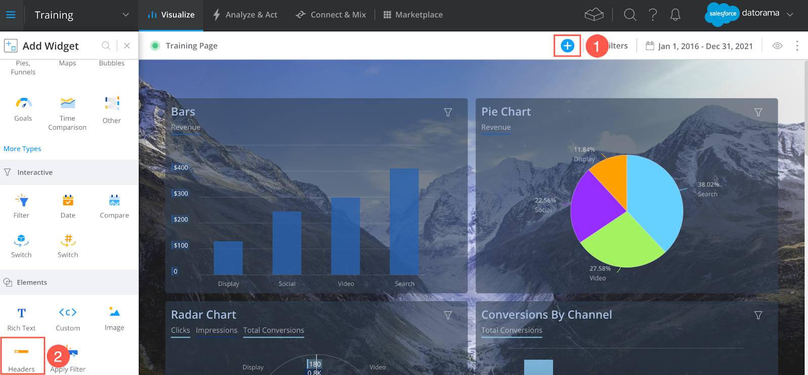
From the dashboard page, click the + sign to add a widget (1), and under the elements library, click Headers (2).
You have multiple design options you can choose from. Select the one that best suits your needs.
Click the editor and begin customizing your header.
Don’t be intimidated by the appearance, you only have to change the JavaScript code (1), and there are specific instructions there to navigate you through the process (2).

Simply follow the instructions and tailor the header to your specific requirements, and you’re done!
Watch this video to learn more about custom widgets.
In this module you learned how to create professional dashboard pages so you can organize and manage your data. You also learned how to tailor your dashboard pages into beautiful, branded reports, how to browse and share your pages with different stakeholders, and how to create custom widgets with no prior coding knowledge.
Congratulations, you now know how to visualize your data in Marketing Cloud Intelligence!
Resources