Learning Objectives
After completing this unit, you’ll be able to:
- Create and analyze a bar chart.
- Format a bar chart to improve readability and facilitate comparison.
- Create and analyze a stacked bar chart.
Connect Your Tableau Public Account
To get started, connect to your Tableau Public account in the Playground window to the right. If you don’t have a Tableau Public account, sign up and activate it before starting this interactive unit. If you need more detailed instructions, check out Data Storytelling with Tableau Public.

Scenario
Now that you’ve learned about bar charts, you're ready to build one while applying best practices.
The Coffee Chain sales department needs a visual representation of sales by product, so Jamal decides to create a bar chart. Follow along with the steps here. Remember, you can use Undo in the toolbar  if you make a mistake.
Questions for Analysis: Compare Product Sales
- Which are Coffee Chain’s top-selling products?
- Which are the lower performers?
Build a bar chart to find out.
Build a Basic Bar Chart
- Drag Coffee Chain Sales to the Rows shelf.
Now you can see the total sales. But you want to compare the sales of products to one another.
- From under Product Hierarchy, drag Product to the Columns shelf.
That was easy. You now have a basic bar chart to compare sales by product.
You can already see that Colombian was the top-selling product. It looks like Amaretto and Regular Espresso are both lower performers, but it's hard to determine which is the lowest. And the lengthier product names are harder to read.
Apply Best Practices and Add More Information
Put the products along the left-hand side so the names are easier to read.
- Swap rows and columns using the toolbar icon.

And then sort the bars to make the comparison of products easier.
- Sort the bars descending using the toolbar or sales axis icon.

Now you can see that Regular Espresso is the lowest-selling product. Your bar chart can now easily answer our first set of analysis questions.
Jamal knows that Coffee Chain segments these products into different product types. What could you do if you wanted to see how these products perform against other products within these product types?
- Drag Product Type to the left of Product on the Rows shelf.
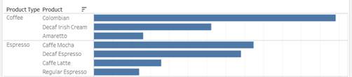
Nice work. You've created a bar chart that compares sales by product divided into panes for each product type.
The top half of your viz should look something like this.
Answer Questions Using Your Bar Chart
If you hover over any of the bars, you see a tooltip with the exact sales numbers for each product. Jamal hears that Coffee Chain is particularly interested in sales of herbal tea.
You can use your bar chart to answer questions about herbal tea, such as:
- Which is the highest-selling herbal tea and how much did it make?
- Which is the lowest-selling herbal tea and how much did it make?
It’s best practice to name your worksheets meaningfully to match your analysis.
- Double-click the tab for Sheet 1 at the bottom of the screen. There are alternative ways to perform many actions in Tableau. You can also right-click | Rename.
- Rename the sheet
Sales by Product, then press Enter to save the change.
Build a Stacked Bar Chart (Optional)
What if you want to explore how product sales in the different Coffee Chain markets are performing against one another? And how do sales for each of the product types contribute to the overall value of sales for each market? This last question is a part-to-whole question that you can answer by building a stacked bar chart. Note that this challenge is an opportunity for you to create a stacked bar chart but won't be checked.
As a start, you can quickly build another bar chart.
- Create a new sheet by selecting the New Sheet icon
 next to the sheet tab
 Sales by Product.
- Build a horizontal bar chart with Coffee Chain Sales on Columns and Market (from under Location) on Rows.
How can you see how each of the product types are performing in each of those markets?
- Drag Product Type to Color on the Marks card.
Apply Best Practices to Your Stacked Bar Chart
To see the exact contribution each product type makes to sales within a market, use mark labels.
- Select Label on the Marks card and then select Show Mark Labels.
- Rename the sheet
Sales by Market and Product Type, then press Enter to save the change.
The top half of your chart should look something like this.

Nice work. You've created a stacked bar chart that compares sales measures by market while also showing how product types contribute to the overall value of sales for each market.
Answer Questions Using Your Stacked Bar Chart
Use your viz to answer these questions:
- Do any product types stand out as outsized contributors to market sales?
- Which market doesn't have any sales for tea products?
Jamal observes that there are no product types with an outsized contribution to market sales and wonders about the data for tea products in the southern market. Maybe Coffee Chain hasn't started selling tea products in all of the markets yet. These insights would be great to share with the Coffee Chain stakeholders to confirm this data set is complete and that everything represented here tells the full picture of what's happening in that market.
Publish Your Viz (Optional)
To save your workbook for more analysis later, publish it to Tableau Public.
- From the area above the toolbar or from the File menu, select Publish As.
- On the Publish Workbook dialog, enter a name for your viz, for example,
Coffee Chain Bar Chart.
- Select Publish.
Note:
Select the first sheet containing your bar chart before checking the challenge.