Get to Know Data Graphs
Learning Objectives
After completing this unit, you’ll be able to:
- Define data graphs and their role in data modeling.
- Explain how to create and manage relationships using data graphs.
- Describe how data graphs retrieve data faster in Data 360.

Explore Data Graphs
A data graph provides a flexible way to model relationships between datasets, such as how customers connect to their orders, order items, cases, products, and services. This makes it easier to interact with and explore connected data quickly and easily. In Data 360, a data graph defines these connections between data model objects (DMOs), helping you understand the complex interrelationships within large datasets.
Data graphs are optimized for fast access to interconnected datasets, streamlining how organizations query and analyze their data. By capturing relationships directly, they enhance decision-making and enable better operational insights.
Build Data Structures with Data Graphs
Data graphs allow you to create models that reflect real-world relationships, such as those between customers, products, and services. These models can encompass various data types, including telemetry and web engagement data, from both internal systems and external data lakes or warehouses. By structuring data this way, you make connections clear. Instead of searching through scattered data, you can quickly trace how information is linked. This makes it easier to find what you need and build reports.
Review Northern Trail Outfitters’ Use Case: Customer Support and Product Recommendations
Northern Trail Outfitters wants to give personalized product recommendations to repeat customers. They do this through a WhatsApp campaign that focuses on selling more products based on past purchases. For example, if a customer buys hiking boots, the system recommends related products like trekking poles or backpacks. Similarly, customers who purchased outdoor gear 5 years ago receive offers for updated models or additional accessories. Instead of creating a segment for this campaign, the WhatsApp system pulls data when the customer sends a message to the WhatsApp bot.
When a customer interacts with the WhatsApp bot, the backend queries Northern Trail Outfitters’s Data 360 for customer details. This data needs to be organized in a structured hierarchical JSON format, which is possible only through a data graph. Sales orders older than one month are excluded from the data graphs due to recency limits because Orders, Order Items, and Cases are modeled as engagement DMOs. If the customer wants to change the setting in recency filtering, they can use the recency filter options.
By using data graphs, Northern Trail Outfitters was able to connect customer history with real-time interactions, enabling the WhatsApp bot to deliver timely, relevant product recommendations that improved the customer experience.
Create and Manage Data Graphs in Data 360
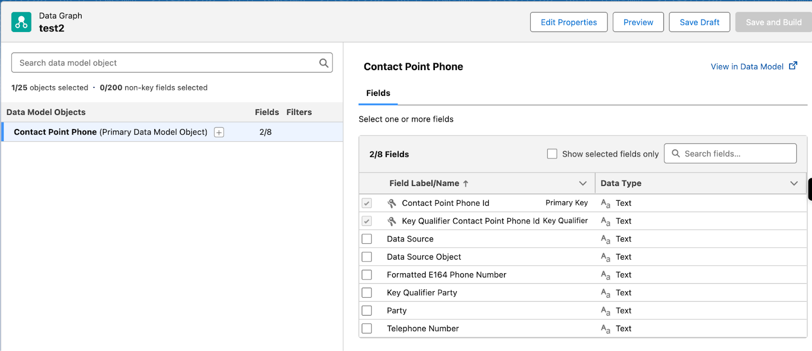
Data graphs in Data 360 allow for the visualization of relationships between DMOs, even at multiple levels. They enable you to trace related fields through a data graph editor page, ensuring the inclusion of the appropriate field data.
These fields are aggregated and transformed into a read-only data graph record that formats the combined data as a single JSON blob. You can query the graph metadata and JSON data directly using the Data 360 Metadata API and Query API. You can also use the data in other apps and operations. This gives you one connected view of your data, making it easier to work with and share across your business.
Identify Types of Data Graph
Data graphs can be categorized into standard and real-time data graphs, each serving unique purposes depending on the urgency and accuracy of the data updates.
Standard Data Graph
A standard data graph processes and updates data with a brief delay, typically ranging from a few minutes to a few hours. This type of graph is ideal when instant data accuracy is not critical, but timely updates are necessary. Use cases for this type of data graph include:
- Batch processing: Aggregating data at regular intervals.
- Data synchronization: Maintaining consistency across systems with minimal lag.
- Reporting: Generating reports where immediate data updates are not required.
Real-Time Data Graph
A real-time data graph updates data instantly, making it ideal for scenarios where immediate accuracy is essential. It supports use cases such as live monitoring, instant notifications, and fraud detection. Real-time graphs are especially valuable in high-impact situations like showing call center agents the current order status, delivering product recommendations during an active shopping session, or alerting users the moment unusual activity occurs. By always providing the freshest information, real-time data graphs help ensure timely decisions and seamless customer experiences.
Sum It Up
Data graphs provide powerful tools for modeling and managing complex data relationships, enhancing both data visualization and real-time decision-making. Understanding their role and functionality enables you to optimize your data operations and derive meaningful insights from interconnected datasets.