Activate SLDS 2 and Preview Dark Mode
Learning Objectives
After completing this unit, you can:
- Explain what the Salesforce Lightning Design System 2 (SLDS 2) dark mode is and how styling hooks support customization.
- List which aspects of dark mode Salesforce admins and developers can customize.
- Activate SLDS 2 in your org.
- Create a custom theme.
- Preview dark mode.
Before You Start
Before exploring dark mode, it’s important to understand a key point: Dark mode is exclusive to SLDS 2 themes. If your Salesforce org currently uses an older SLDS 1 theme, you must transition your org to SLDS 2 before you can activate dark mode.

Before you start this module, make sure you complete the following content. The work you do here builds on the concepts and work you do in that content.
-
Salesforce Lightning Design System 2 for Admins
-
The Salesforce Cosmos Theme: Quick Look
-
Dark Mode in SLDS 2: Quick Look
If you want some bragging rights, also go ahead and complete Salesforce Lightning Design System 2 for Developers. It helps you learn about developer tasks in SLDS 2 and will help you with dark mode, too.
Dark Mode Overview
You’re about to dive into one of most requested Salesforce features: dark mode. Dark mode is a visual display setting that inverts the traditional light color scheme by presenting light-colored text and visual elements on a dark background. It’s designed to enhance your work experience, especially if you spend long hours on your screen. Get ready to personalize your workspace and give your eyes a break!
Dark mode is more than just an aesthetic choice. Dark mode addresses critical accessibility needs for users with visual impairments and those who experience migraines from bright screens. As we mentioned, Salesforce users have shown significant demand for dark mode. Read this IdeaExchange post for more information.
As an admin or developer, you preview and activate the dark mode setting at the org level. Then your users can enable it–turn it on–in their personal org views.
Sign Up for This Free Developer Edition Org
To complete this module, use a special Developer Edition org enabled for dark mode and contains our sample data. Get this free Developer Edition and connect it to Trailhead now so you can complete the challenges in this module. Note that this Developer Edition is designed to work with the challenges in this badge, and might not work for other badges. Always check that you’re using the Trailhead Playground or special Developer Edition org that we recommend.
- Sign up for this free Developer Edition org enabled for dark mode.
- Fill out the form:
- For Email, enter an active email address.
- For Username, enter a username that looks like an email address and is unique, but it doesn't need to be a valid email account (for example, yourname@example.com).
- For Email, enter an active email address.
- After you fill out the form, click Sign me up. A confirmation message appears.
- When you receive the activation email (this might take a few minutes), open it and click Verify Account.
- Complete your registration by setting your password and challenge question. Tip: Save your username, password, and login URL in a secure place—such as a password manager—for easy access later.
- You are logged in to your Developer Edition.
Now connect your new Developer Edition org to Trailhead.
- Make sure you’re logged in to your Trailhead account.
- In the Challenge section at the bottom of this page, click the name of the Developer Edition org that you just set up and then click Connect Org.
- On the login screen, enter the username and password for your Developer Edition org.
- On the Allow Access? screen, click Allow.
- On the Want to connect this org for hands-on challenges? screen, click Yes! Save it. You are redirected back to the challenge page and ready to use your new Developer Edition to earn this badge.
Dark Mode Customization Options
Salesforce native dark mode isn’t just a simple color inversion; it’s a sophisticated implementation built on SLDS 2 styling hook architecture. Many elements of the Salesforce interface automatically adapt when dark mode is enabled. But you can also apply custom touches in some specific areas so that everything looks perfect.
To customize dark mode, you can:
- Select a unique brand color for your org to use in dark mode. Salesforce automatically generates a complementary color palette for your dark mode accents.
- Have your org use the same brand color that it uses in light mode, and edit only your dark mode accent colors. While you can do this, Salesforce strongly advises against overriding the automatically generated accent colors. Doing so can compromise the guaranteed contrast and accessibility. Sticking to the defaults provides the best visual experience and compliance.
Styling Hooks
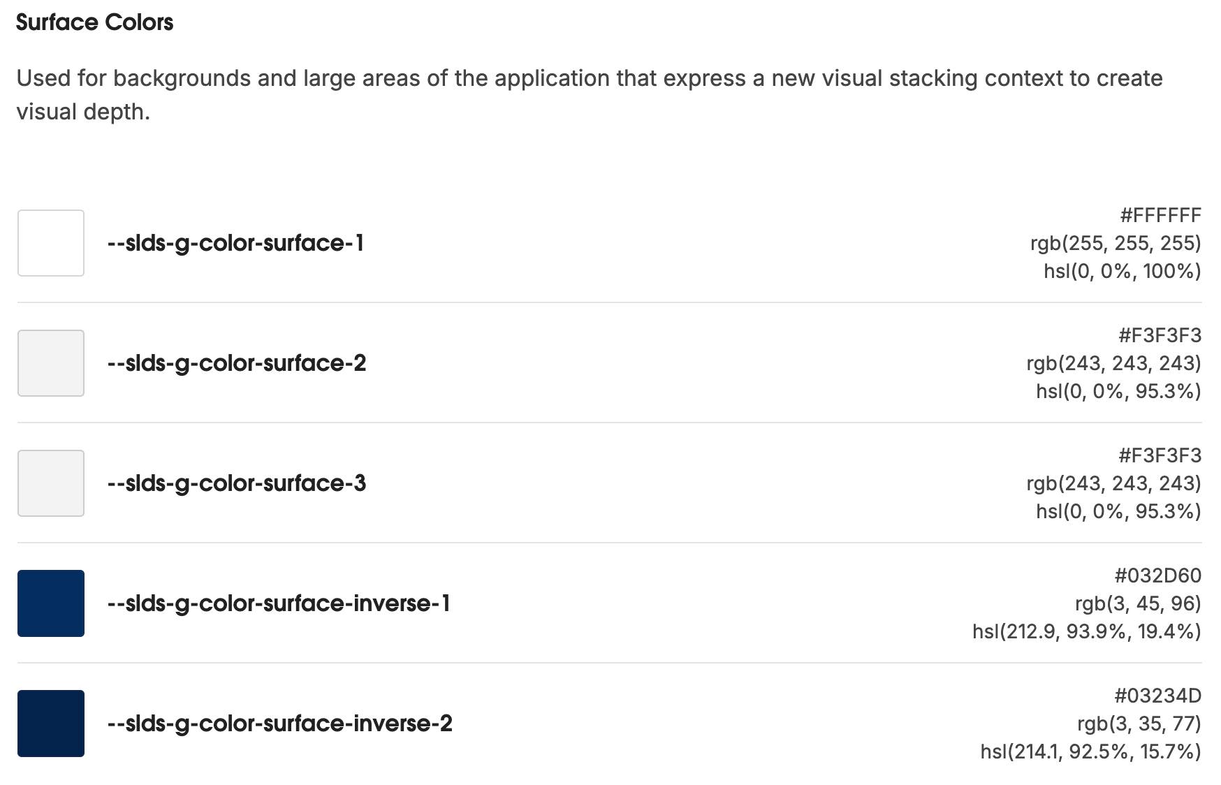
At the heart of dark mode’s adaptability for custom components are SLDS 2 styling hooks. These hooks are like smart variables in your Cascading Style Sheets (CSS) that automatically adjust their values based on the current color mode and your org's branding.
For developers, these hooks make integrating custom components with dark mode incredibly straightforward. Instead of defining fixed color values, you reference a styling hook. There are different categories of styling hooks, such as semantic color or accessible system colors. All styling hooks that are SLDS 2 compatible are global styling hooks and start with --slds-g.
For example, use the --slds-g-color-surface-3 global styling hook instead of hard-coding #F3F3F3 to style your surface light grey.
For more information on styling hooks, check out these SLDS 2 resources.
Use Styling Hooks to Create Custom Components
As you develop custom components, be sure to adopt SLDS 2 best practices including styling hooks from the start to ensure your components are ready for dark mode. The power of styling hooks lies in their ability to make your components mode-aware without writing conditional logic for every single style.
Here's how to conceptualize using styling hooks.
For … |
Instead of … |
Use … |
Example
|
|---|---|---|---|
Backgrounds and surfaces |
Fixed colors |
Global styling hooks. They automatically resolve to the appropriate dark background color. |
|
Interactive elements, text, or accent colors |
Fixed colors |
Global styling hooks. They adapt to light and dark modes, and reflect the specific brand accent colors in your org’s custom theme. |
|
For example, to create a Lightning web component to display a blue button on a white background, you can use SLDS 2 global styling hooks like this.
Styling Hook |
Purpose |
|---|---|
--slds-g-color-brand-base-40 |
Primary brand blue color |
--slds-g-color-neutral-100 |
White text color |
blueButton.css
.custom-blue-button {
    background-color: var(--slds-g-color-brand-base-40, #0070d2); /* Blue background */
    color: var(--slds-g-color-neutral-100, #ffffff);/* White text */
    /* Optional styling for better appearance */
    border: none;
    padding: 0.5rem 1rem;
    font-weight: bold;
    border-radius: 0.25rem;
    cursor: pointer;
}
/* Remove default lightning-button styling (optional, for full control) */
.custom-blue-button .slds-button {
    background-color: inherit;
    color: inherit;
    border: inherit;
    padding: inherit;
    font-weight: inherit;
    border-radius: inherit;
}
By always using global styling hooks, you make sure that your custom components have the right style for both light and dark modes, and any custom themes you set.
Dark Mode Development Flow
Now that you know a bit about dark mode and styling hooks, it’s time to work with these features. Dark mode requires that your org runs on SLDS 2. To ensure that dark mode works with your brand and brand colors, at a high level the development flow we recommend goes like this.
- Activate SLDS 2 in your org (if it isn’t turned on already).
- Create a custom SLDS 2 theme for your brand.
- Save your theme.
- Enable the dark mode option for your users.
- Preview your custom theme in dark mode.
- Use SLDS Linter to identify anything that doesn’t look right in preview, and fix those issues.
- Activate your new theme and dark mode.
Pretty straightforward, right? Time to get started.
Activate SLDS 2 in Your Org
To turn on SLDS 2, you must activate a theme built on SLDS 2, such as the default theme, Salesforce Cosmos. Follow these instructions in the special Developer Edition org that you set up at the beginning of this module.
- In your org, click
 and select Setup.
(Your org has been configured as a unique Developer Edition org type, and you need to complete this step as written. Dark mode is only currently available in Free Suite, Starter Suite, Pro Suite, Professional, Enterprise, and Developer Edition orgs. In Starter Suite orgs, you would click and select Open Advanced Setup.)
- In the Quick Find box, search for and select Themes and Branding.
- From the Salesforce Cosmos theme dropdown list, select Activate.
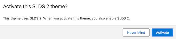
4. Click Activate again to finalize your selection of Salesforce Cosmos.
Create a Custom Theme
The SLDS 2 default theme, Salesforce Cosmos, is pretty great. Bright colors, rounded corners—it’s very easy to use. While you might want everything Cosmos has to offer, you also want your org to look and feel like your brand. You can achieve this by creating a custom theme. Input your brand’s color, and Salesforce sets or generates a color palette using our color system that optimizes for color contrast and accessibility. If necessary, you can manually adjust individual accent category colors in the Advanced Configuration settings.
In your Developer Edition org, follow these steps to create a custom theme and set your brand color.
- From Setup, in the Quick Find box, search for and select Themes and Branding.
- Click New Theme.
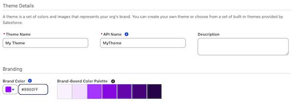
- Name the theme
My Theme.
- In Brand Color, enter this value:
#9900FF. Notice how the Brand-Based Color Palette changes to purple-hued, accessible colors that work well with#9900FF.
- Click Save.
Notice that you aren’t activating your new theme yet. It’s a best practice to enable and preview dark mode first.
Preview Dark Mode
You understand that dark mode is a powerful, helpful visual setting, but you’re more of a try-before-you-buy kind of person. Besides, Salesforce orgs can be complex, and you want to verify that everything looks just right before making it available to all your users. No worries: you can preview the theme that you just created in dark mode.
In your Developer Edition org, follow these simple steps on the Themes and Branding page.
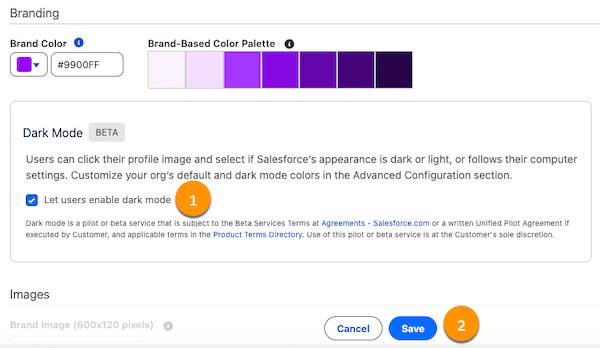
- In your My Theme window in the Dark Mode section, select Let users enable Dark Mode (1).
- Click Save (2).
- Click Preview.
- Click the App Finder
 , and search for and select the Trailhead app. (Keep the Setup tab open—you need it shortly.)
Notice the purple text on the Home tab and the message at the top of the page: You’re previewing a theme!
- Click your avatar to view your profile.
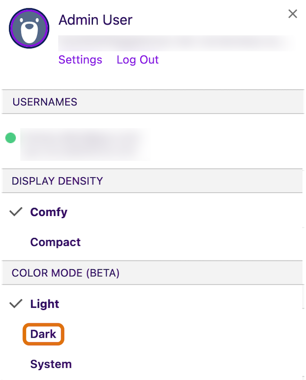
- Select Dark.
- Close your User Profile.
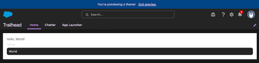
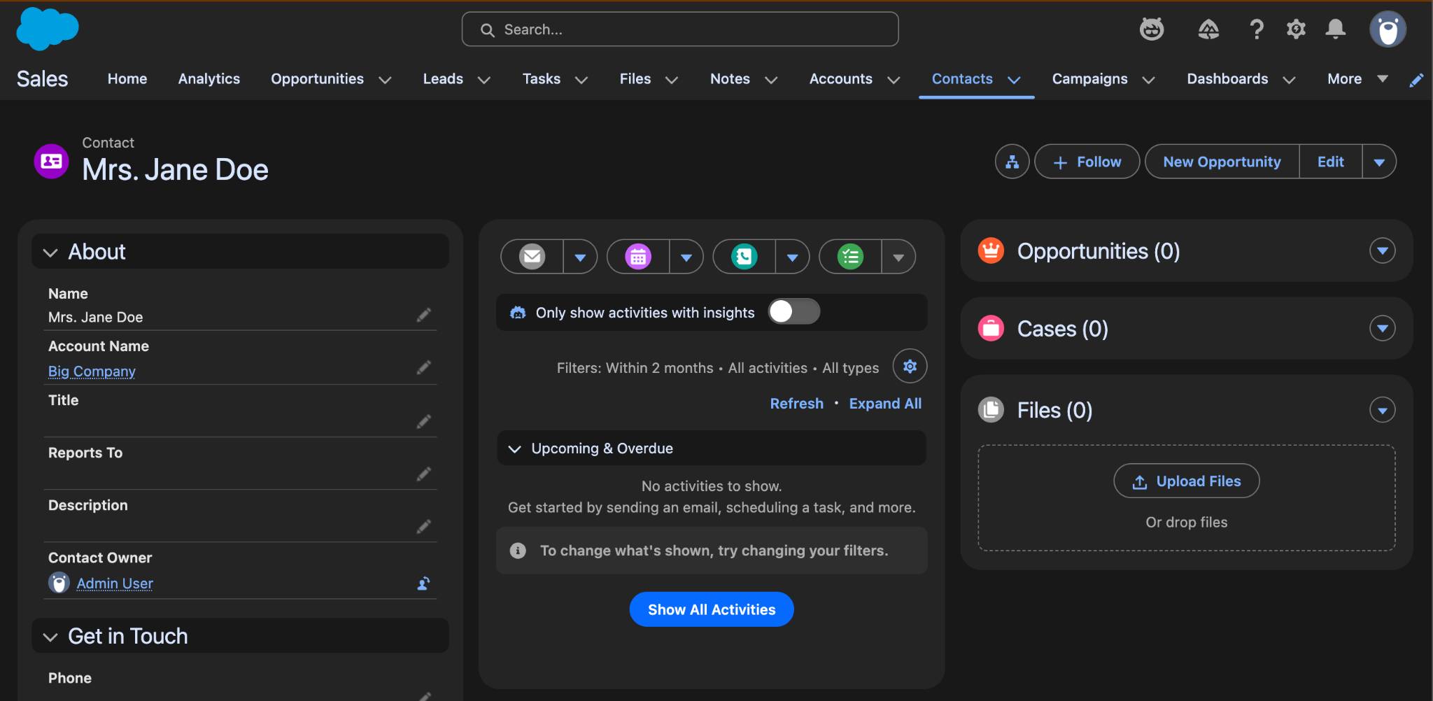
Voila! You see your brand color, #9900FF, in dark mode. But does anything look funny? How about the Hello, World! app displayed in dark text on a light background? If you spotted that, you found a bug in dark mode. The app isn’t responding correctly to dark mode.
No worries! In the next unit, you dive deeper into what specific customization options there are for dark mode, and fix that bug.
For now, make sure you complete all the steps in this unit using your special Developer Edition org (see the signup link at the top of this unit). Then click Check Challenge to Earn 500 Points below.