Add the Chart to Your Dashboard
Build a Cool Dashboard
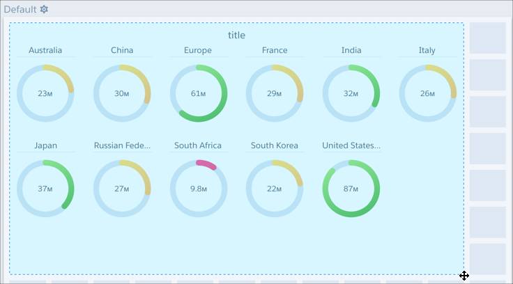
Dashboards give you a chance to add a little more style to visualizations and use a presentation mode when your big moment comes and it’s time to present your data.
- Click
 to clip the lens. In the display label dialog, click Clip to Designer. The clipped lens appears as a query on the right side of the Dashboard Designer canvas.
- Drag your new query onto the canvas.
- Enlarge it so that you can see all your flags—drag a corner handle until you’re happy with the results.
- With the query in the canvas selected, in the Widget tab, click Widget Style. Then, click the arrow next to Background Color and select black.

- In the General panel, select Dark as the Theme.

- Click
 and enter following values:
- Title: worldwide_sales
- App: My Private App
- Click Save.
To view the dashboard, click ![]() .
.
You've Done It!
You’ve got a dashboard you can be proud to show off when it’s time to make your report! When you’re ready to present your dashboard, just open the dashboard from the list of dashboards and click ![]() . You'll see the dashboard in a full-screen presentation mode.
. You'll see the dashboard in a full-screen presentation mode.
![]()
Chart icons can be any images you’d like to use, as long as those images live in Salesforce. To learn how to add Chatter icons to Analytics charts, see Add Icons to Analytics Charts in Salesforce help documentation.