View Variables in Visualizations
Learning Objectives
After completing this unit, you’ll be able to:
- Describe the various uses of quantitative and qualitative variables in a visualization.
- Use variables in a visualization.
In the previous unit you learned that variables can be qualitative or quantitative and are organized as fields or columns in data sets. But how are these variables used when visualizing data?
Quantitative and qualitative variables are used differently in visualizations.
- Quantitative variables are the data elements you can calculate. They can also be aggregated (sum and average are two examples of aggregation). For example, in a visualization that shows sales for a region, sales is a quantitative variable.
- Qualitative variables set the level of detail in the visualization. They can be used to categorize, segment, and reveal the details in your data. For example, in a visualization that shows sales for various regions, region is a qualitative variable.
Visualization Overview
To illustrate the effect of viewing only a quantitative variable (field) or of viewing both a quantitative variable and a qualitative variable (field), let’s look at visualizations showing the sum total of profits for various products of a business.
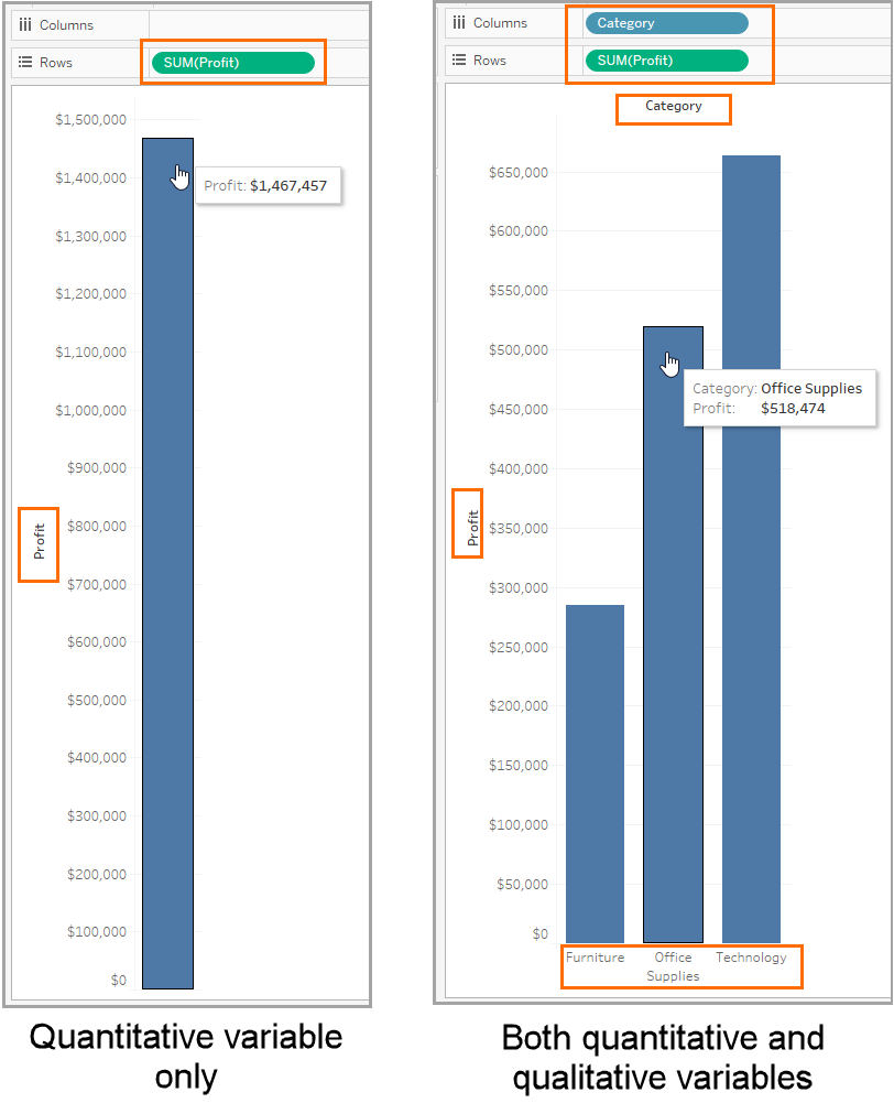
The visualization on the left includes only a quantitative variable, the sum (or total) of profits for a business. You can see that the business has yielded a total of more than $1.4 million in profit. The visualization on the right includes a qualitative variable (Category), so you can see the total profits segmented by the three product categories: furniture, office supplies, and technology.
Example: Using Variables in a Visualization
Now that you’ve seen how visualizations work, let’s look at how quantitative and qualitative variables can reveal deeper data insights in visualizations. We use a data set that contains information about a fictional business franchise. We examine the variables in the data, and then explore some visualizations that use quantitative and qualitative variables.
-
Examine the Variables
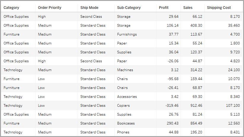
Let’s examine a few of the variables.
Category, Order Priority, Ship Mode, and Sub-Category are qualitative variables. Profit, Sales, and Shipping Cost are quantitative variables.
-
Take a Closer Look at the Qualitative Variables
Take a moment to look at the row-level values in the qualitative variables.
Category and Sub-Category contain value names without any implied rank or order. These are nominal variables.
Order Priority and Ship Mode contain values that imply a logical rank or order. These are ordinal variables. This distinction will be important when we explore visualizations.
-
View the Visualization Before Qualitative Variables Are Added
We begin with a visualization that contains only one quantitative variable and shows average shipping costs.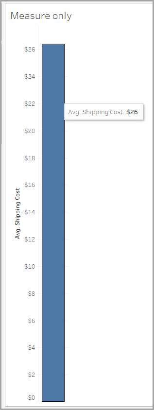
-
View Visualizations with Nominal Variables Added
Qualitative variables add more detail to visualizations.
Let’s begin with the nominal variables. With the Category dimension added, average shipping cost is now segmented by product category. We can see that the Technology product category has the highest average shipping costs.
The visualization on the right drills deeper down with the addition of the nominal variable Sub-Category. Now we can see that, even though Technology had the highest average shipping costs by product category, Tables have highest average shipping costs by product subcategory.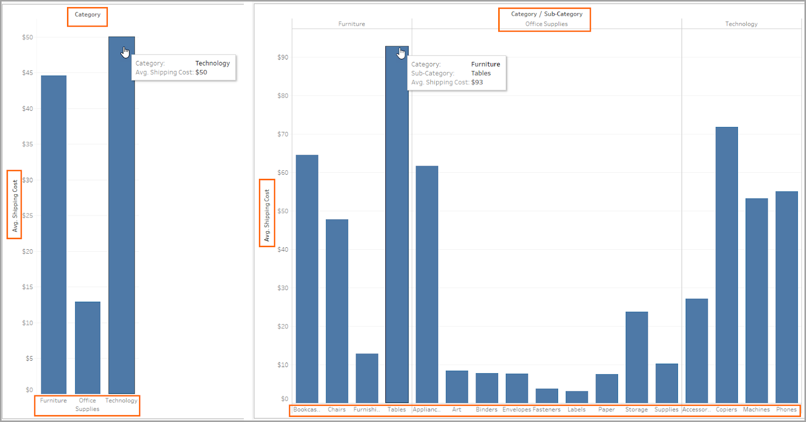
-
View a Visualization with an Ordinal Variable Added
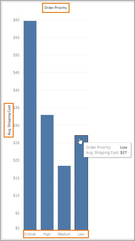
Now let's see what happens when we explore another visualization, one that uses an ordinal variable to analyze average shipping costs by Order Priority.
What do you notice? Surprisingly, low-priority orders have higher average shipping costs than medium-priority orders do.
-
View a Visualization with a Second Ordinal Variable Added
Adding a second ordinal variable enables us to analyze average shipping costs by both Order Priority and Ship Mode.
What do you notice? Surprisingly, for medium-priority orders, orders shipped first class have higher average shipping costs than orders shipped the same day.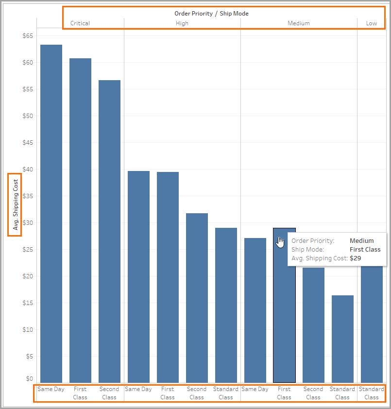
In this module, you examined how variables can be classified as quantitative, qualitative, discrete, and continuous. You also explored some visualizations with a quantitative variable and both nominal and ordinal qualitative variables. You now have an understanding of how to use variables in a visualization.
Resources
- Book: Lane, David M. Introduction to Statistics. Online Statistics Education: An Interactive Multimedia Course of Study, 2020.
- Tableau Help: Dimensions and Measures, Blue and Green