Check Axes
Learning Objectives
After completing this unit, you’ll be able to:
- Describe how axes, scales, and intervals are used in charts.
- Identify appropriate axes for specific chart types.
- Recognize common forms of axes misuse.
What Are Axes?
Axes (singular: axis) create the structure for how data is displayed in a chart. Axes provide scales that assign values and labels for the data points shown in a chart.
Many charts have two axes.
- The horizontal axis, commonly called the x-axis
- The vertical axis, commonly called the y-axis
Understand Qualitative and Quantitative Scales
When it comes to axes in graphs, there are two types of scales.
- Qualitative, which assigns labels for categories such as Food, Housing, and Clothing
- Quantitative, which assigns values for numeric variables such as 0, 5, and 10
To learn more about variables and scales, complete the Variables and Field Types module.
Now that you learned what axes are, take a look at the different graph types used to communicate data visually.
| Graph Types for Communicating Qualitative Variables | |
|---|---|
|
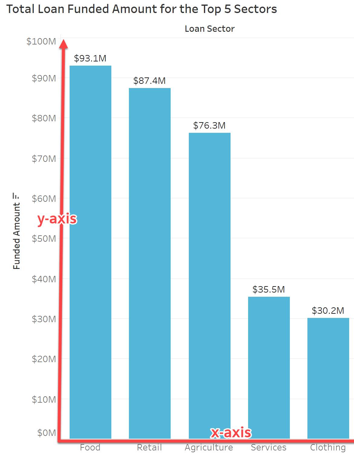
A bar chart uses height (or length) to compare values among categories or subcategories. |
|
|
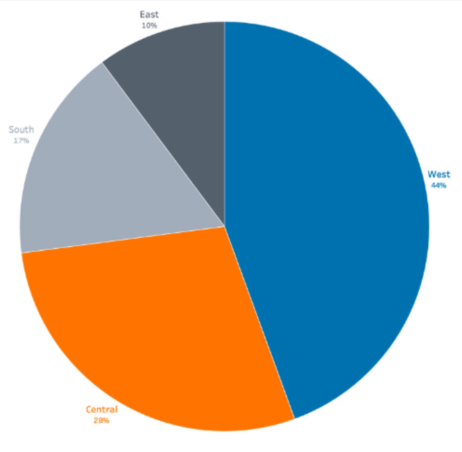
A pie chart depicts data as a percentage of a whole when comparing categories. |
|
| Graph Types for Communicating Quantitative Variables | |
|---|---|
|
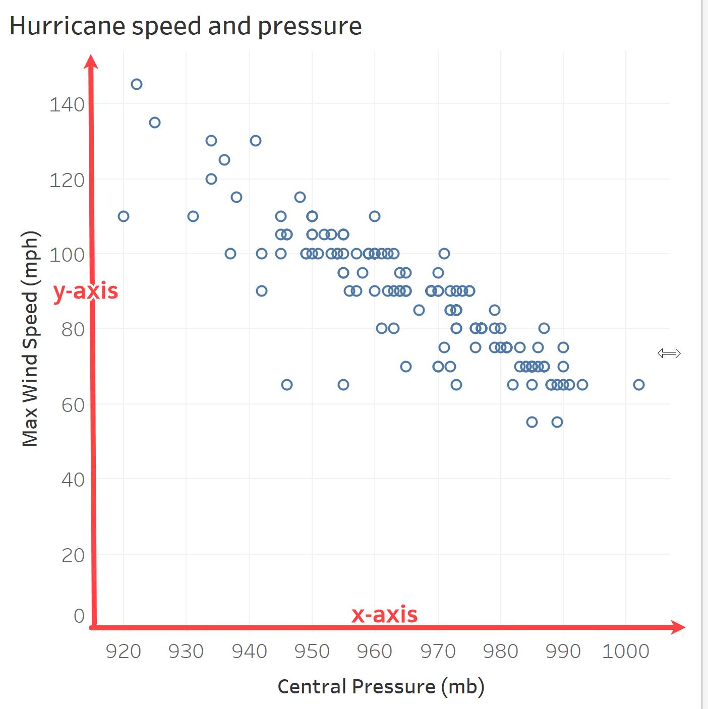
A scatterplot shows the relationship between two quantitative variables. The data is plotted as Cartesian coordinates, marking how far over and how far up each data point is. |
|
|
A line chart connects a series of quantitative values, and is often used to show a time series (where the x-axis is time). Also known as a line graph or line plot. |
|
|
A histogram depicts a distribution of data and the frequency of values in a data set as connected bars. The width of the bars is tied to the values on the x-axis. Statisticians, scientists, and analysts refer to the widths of each bar as bins. |
|
|
A box and whisker plot shows the distribution of data using percentiles. Also known as a box plot. |
|


Get Familiar with Intervals
An interval is the distance between the values (tick marks) on a quantitative axis. There should always be a consistent distance between each of the tick marks, or equal intervals on a quantitative axis. For example, if a chart is showing the commute times for employees, a consistent interval of 10 minutes might be appropriate. Inconsistent intervals (such as 15 minutes, 40 minutes, and 60 minutes) can lead to misinterpretations and incorrect conclusions.
Take a look at an example: an impressive increase in Sue’s tomato harvest.
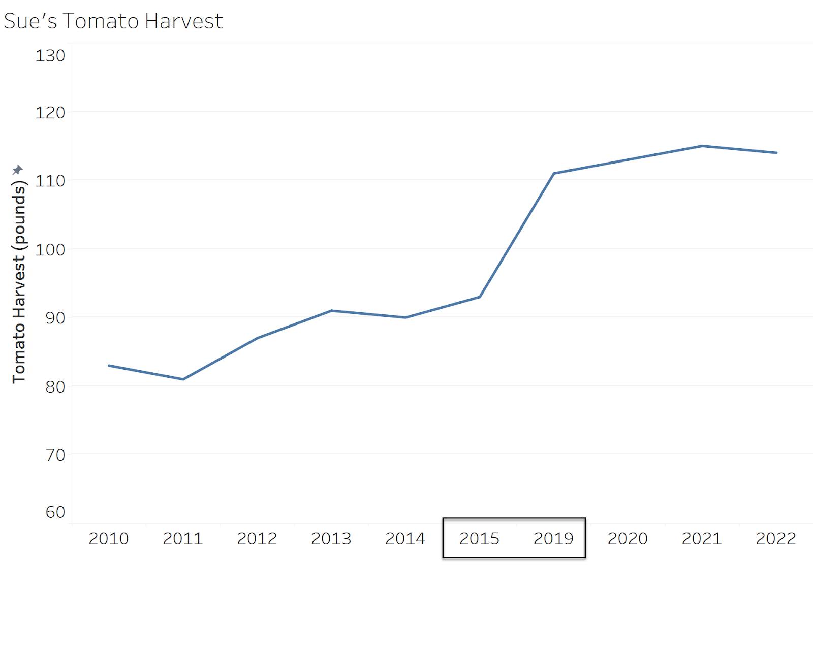
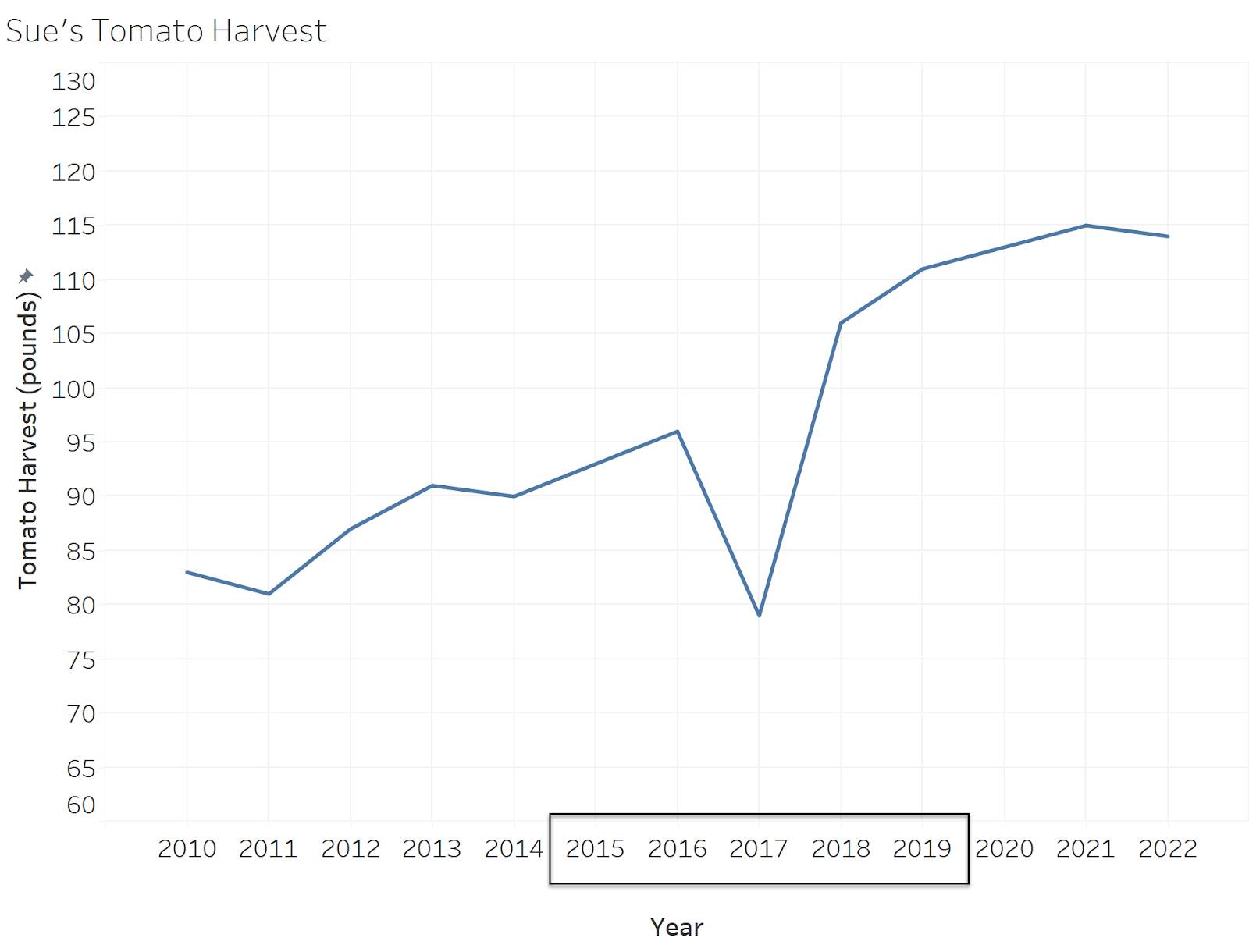
In the previous chart, you can see that Sue harvested several more pounds of tomatoes in 2022 compared to when she started in 2010. However, did you notice that the years 2016 to 2018 are missing from the x-axis? Now, take a look at the chart with those years included on the axis.
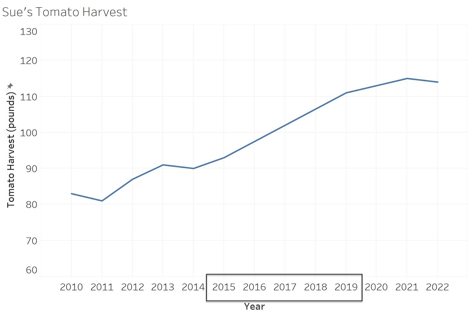
With consistent intervals along the x-axis, it’s easier to see that Sue’s tomato harvest may have gradually increased over time.
In addition to checking more consistent intervals, it’s important to pay attention to missing data points, or nulls. Do you know what happened during 2016 to 2018? Maybe Sue had a difficult year during that period.
Watch for Qualitative Axes in Graphs Meant for Quantitative Data
Be mindful of any attempts to display scatterplots, line graphs, or histograms with qualitative axes. For example, review the following chart about the number of borrowers in particular sectors.
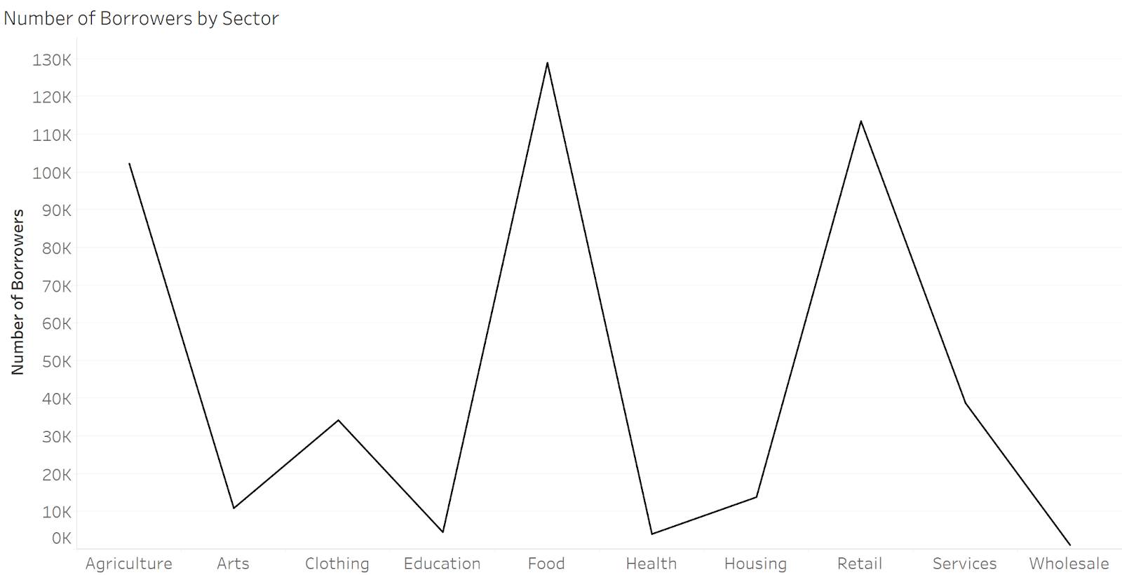
For this data, you need a bar chart! A line chart is used to show sequential values such as dates or times. Line charts should also always use x-axes with even intervals, with the x-axis showing a quantitative variable. In the above example, it doesn’t make sense to put sector categories in sequential order. A bar chart would be a much better choice, as long as the baseline follows some important best practices.
Bar Charts Must Start at Zero
It’s important for all bar charts to start with a zero baseline, meaning that the bottom of the bar is zero. To better illustrate this importance, review the following charts relating to regional sales numbers.
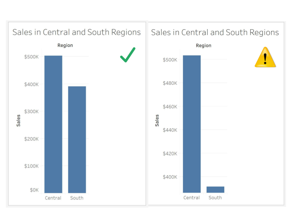
In the chart on the right, you’re led to believe that there’s a significant difference between the two regions on the x-axis. The second chart is deceiving because the y-axis starts at $380K instead of zero. When you interpret bar charts, you’re comparing the length of the bars. Starting the axis at $380K causes our eye to interpret a three-fold difference. In the first chart, the only change is that the y-axis starts at zero.
Now you can quickly see how the difference between the changes was exaggerated in the second chart–not a very dramatic difference at all! That’s why it’s important to remember that when you’re viewing bar charts, always check that the baseline starts at zero.
Line Charts Might Start at Zero
When viewing line charts, however, the “must start at zero” rule doesn’t apply. In fact, sometimes it’s better to not have the y-axis of a line chart start at zero! Take a look at the following two-line charts of global temperature over time (data source: Graphing Global Temperature Trends).
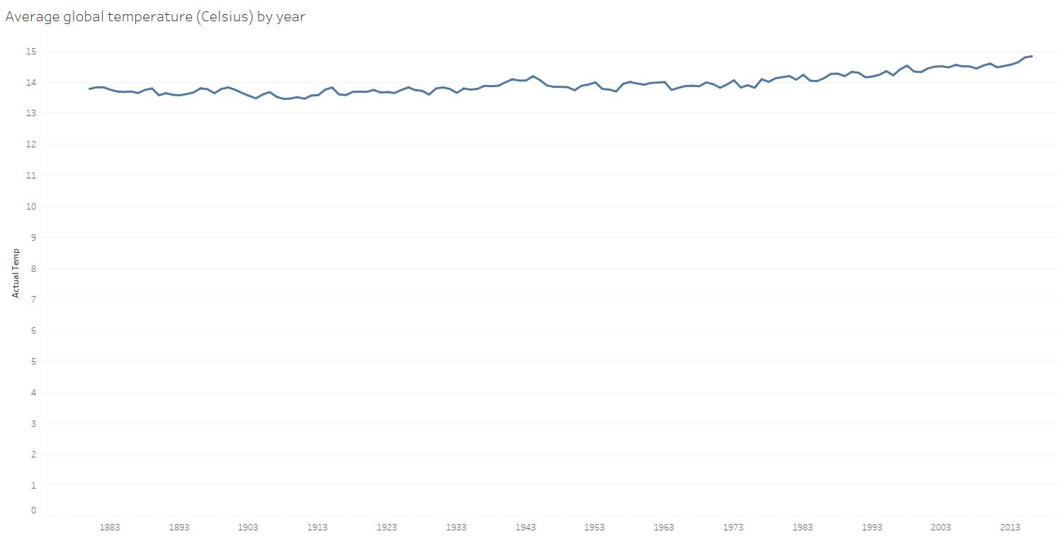
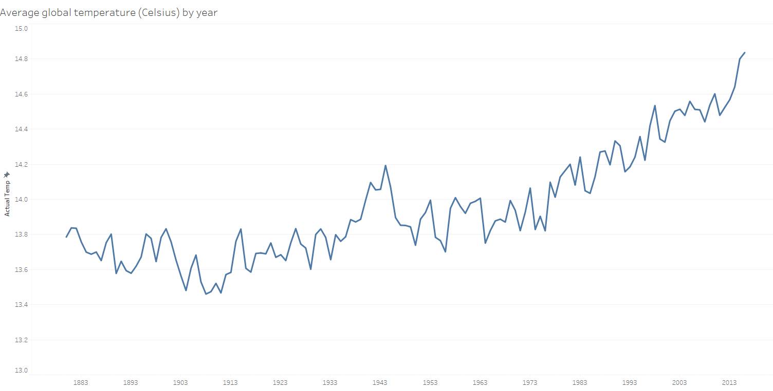
The second chart gives you a better picture of the pattern or insight of what may be happening with global temperature over time and that’s because the y-axis doesn’t start at zero in the second graph. In this chart, you can see more details that weren’t obvious before, such as changes from year to year.
The Great Debate About Multiple Axes
There’s much debate in the data visualization world about the usefulness of dual axes in a single chart. While dual axes are helpful when used properly, they can also be misleading and misused at times.
The Case for Multiple Axes
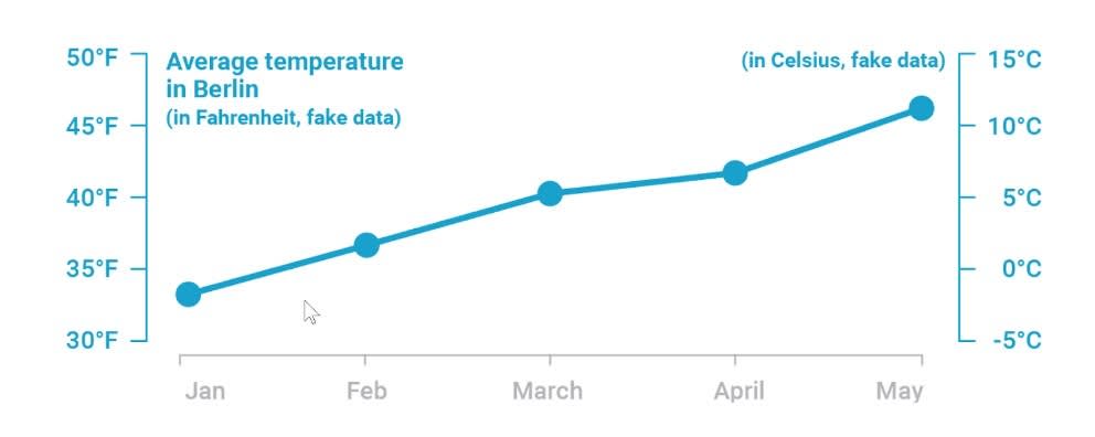
There are legitimate use cases for using multiple axes. For example, it can be effective to show the same set of data points on two different scales using dual y-axes, as is the case when showing the same data with two different units of measure (such as inches and centimeters or kilograms and pounds). In the following chart, temperature is shown in Fahrenheit on one y-axis, and in Celsius on the other.
The Case Against Multiple Axes
Unfortunately, there are several instances where multiple axes are deceptive, both intentionally and unintentionally. In her Datawrapper blog, Lisa Charlotte Muth, a respected writer and educator in the data visualization field, shares this misleading graph showing two different series of data points using two y-axes.
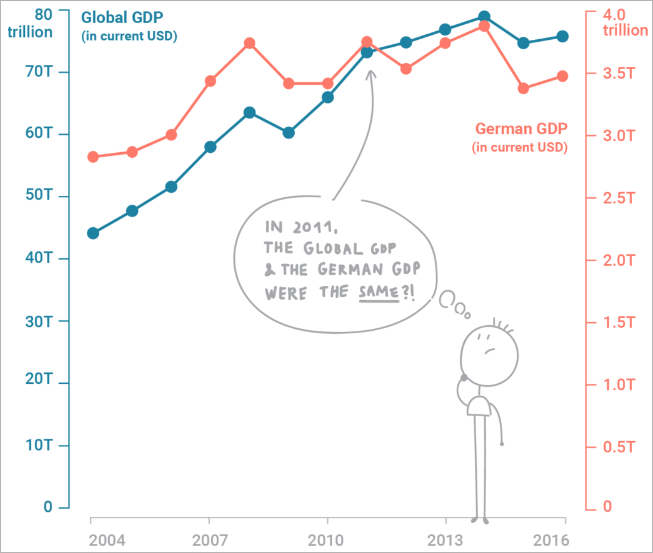
Take a careful look at the scales in this chart. The two y-axis scales are different, and lead you to wrongly believe that Germany and Global GDP were the same in 2011. In reality, there was a significant difference between these numbers of over 66 trillion dollars.
Remember, always check the axes when you view graphs to ensure the data makes sense the way it's presented!
Resources
- Trailhead: Variables and Field Types
- Tableau Site: Truncating the Y-Axis: Threat or Menace?
- Book: Steve Wexler (2021): The Big Picture: How to Use Data Visualization to Make Better Decisions–Faster,. McGraw-Hill Companies
- Book: Alberto Cairo (2020): How Charts Lie: Getting Smarter about Visual Information, W.W. Norton & Company
- Blog Post: Why Not to Use Two Axes, and What to Use Instead