Discover the New UI
Learning Objectives
After completing this unit, you’ll be able to:
- List the five guiding principles that Salesforce used to develop the Salesforce Cosmos theme.
- Describe some key elements of the new design.
- Explain who can access the Salesforce Cosmos theme and when.
- Disable and enable the new UI.
What Is the New UI?
In 2015 we launched the Salesforce Lightning Design System (SLDS 1), to help designers and developers build user interfaces that match the look and feel of the Salesforce Lightning Experience. Lightning UI is what you interact with to use Salesforce applications and data.
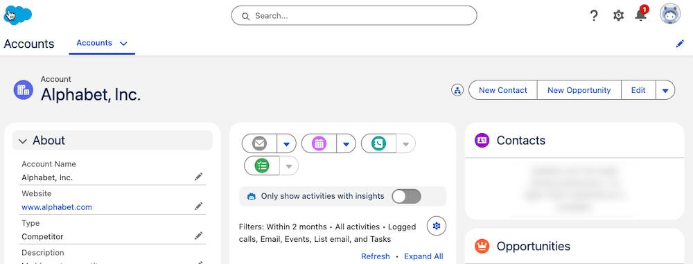
With the Salesforce Cosmos theme, you can experience the visual style enhancements to the Lightning UI framework built on the Salesforce Lightning Design System 2 (SLDS 2). Salesforce Cosmos is the first new theme available in SLDS 2. This refreshed, modern design of Salesforce delivers easy navigation, improved page load speed, and approachability for every job function.

So why did we refresh the UI and launch a new theme? A lot has changed since 2015. Salesforce products have grown beyond CRM to include Agentforce, AI, Data 360, Einstein Trust Layer, and much more. User and customer expectations are growing. And AI has ushered in a new, agentic era. These changes require a refreshed UI to support fast, easy, and compelling experiences.
The Salesforce Cosmos theme helps:
- Align with the expanding Salesforce product portfolio.
- Provide a cohesive user experience across all Salesforce clouds and features.
- Match customer expectations for modern UI.
Now let’s take a look at our guiding principles for the design.
Our Guiding Design Principles
In developing Salesforce Cosmos, the Salesforce User Experience (UX) team focused on these key principles.
-
Seamless. The UI is connected and unified across all experiences.
-
Responsive. It reacts appropriately and responds quickly.
-
Intuitive. It’s easy to learn, use, and navigate.
-
Trusted. It’s reliable and stable as it guides and supports you.
-
Delightful. It’s enjoyable to use.
We keep these principles top of mind as we continuously learn from feedback on our #True to the Core Trailblazer Community channel (login required).
And, as we developed Salesforce Cosmos, we conducted research with external end users to identify and design it. Those customers report two key benefits of the enhancements.
-
Productivity. Study participants found that the new UI exceeds their expectations for a clean, productive experience.
-
Task completion. Participants found that they completed tasks more efficiently and with more confidence using it.
Explore Key Features
Next, let’s check out some key elements of the Salesforce Cosmos theme.
Circular Motifs
Circular shapes and rounded edges convey friendliness and smoothness: They make you feel welcome. Rounded corners in the new UI indicate that an element is interactive. Elements in the interface with square corners aren’t interactive.

Legible Icons
Icons are more legible at varying scales, which creates uniformity across the UI. The icon improvements provide visual clarity so that users can more easily see when a button is active, for example.
Legible Fonts
We also improved legibility through type and font scale. These improvements help bring to the forefront the data and insights that benefit users.
Higher Contrast Colors
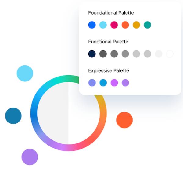
UI colors are grounded in the Salesforce color system, with cleaner, brighter, higher-contrast selections. Our updated, accessible color theory improves contrast in innovative ways.

Inviting Cues
The new design of Salesforce Cosmos welcomes you to navigate through your tasks with buttons and other interactivity that mimic real-world experiences. Cues like drop shadows and gradients on buttons define what actions you should take when.

How Do These Enhancements Help You?
We think the refreshed design will delight our users. But it also offers significant productivity benefits. Salesforce Cosmos and SLDS 2 help you work faster and more efficiently because:
- With streamlined navigation, simplified icons, at-a-glance views, adaptable spacing, and intuitive cues, your work is organized and harmonious.
- Intentional use of color contrast, space, and icons provide clear indicators of success and priority.
- Optimized Cascading Style Sheets (CSS) code improves performance and load times.
- Adherence to Web Content Accessibility Guidelines (WCAG) means the UI is approachable and accessible.
Work with the New UI
We started our rollout of Salesforce Cosmos on June 5, 2024 to new and existing orgs. SLDS 2, the new architecture underpinning Salesforce Cosmos, is available in orgs as of February 21, 2025. For more information on availability, read the Salesforce Cosmos Theme and SLDS 2 Availability topic in Salesforce Help.
If you’re working in a new or existing org that has Salesforce Cosmos enabled, enjoy the experience. To activate the Salesforce Cosmos theme, here’s how to do that.
- In your org, click
 and select Setup.
- For Starter orgs, click Open Advanced Setup. For all other orgs, skip this step.
- In the Quick Find box, search for and select Themes and Branding.
- From the Salesforce Cosmos theme dropdown list, select Activate.
If you don't immediately see Salesforce Cosmos upon activating it, refresh the page.
To turn off Salesforce Cosmos and switch to SLDS 1, activate a theme without an SLDS 2 badge next to the theme name. To create an SLDS 1 theme, from the New Theme dropdown list, select New SLDS 1 Theme, then configure and activate the theme. When you activate an SLDS 1 or an SLDS 2 theme like Salesforce Cosmos, you enable that version of SLDS for your org.
