Sapere quando e come usare tabelle, mappe e altro
Obiettivi di apprendimento
Al completamento di questa unità, sarai in grado di:
- Identificare i casi in cui le tabelle di testo sono il metodo di visualizzazione più adeguato.
- Stabilire quando usare le mappe e quali sono le best practice per la loro visualizzazione.
- Usare con sicurezza diversi tipi di grafici per fare confronti.
- Descrivere le best practice per ottenere visualizzazioni leggibili e accessibili.
Quando i dettagli contano
Anche se i grafici sono uno strumento efficace per aiutarti a comprendere i dati, talvolta è necessario fare confronti con i singoli numeri.
Tabelle
Le tabelle permettono di fare confronti dettagliati e di cercare singoli valori quando occorre.

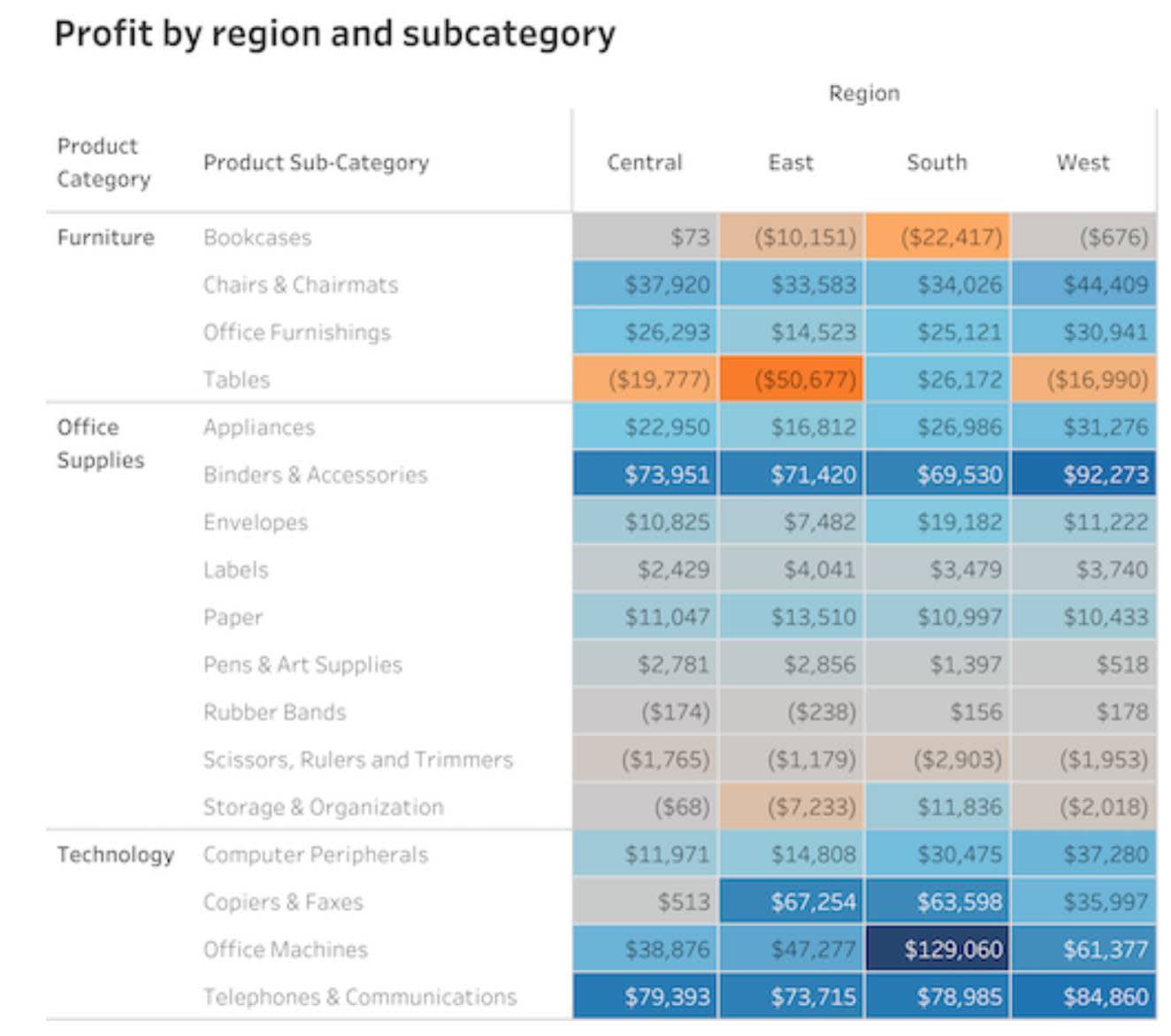
Tabelle in evidenza
Le tabelle in evidenza consentono di aggiungere il colore alle tabelle e ti permettono di cogliere più facilmente le differenze tra i valori.
Fare confronti con le mappe
Nella prima unità hai appreso che la mappa è stata una delle prime forme di visualizzazione conosciute. Tutti noi abbiamo utilizzato una mappa per orientarci nel traffico o per trovare il percorso migliore per raggiungere una destinazione. Quando la posizione è fondamentale per comprendere i dati, puoi utilizzare le mappe per fare diversi confronti mediante il colore e servirti di bolle con dimensioni basate sui valori per mostrare valori quantitativi sulle mappe.
Mappe coropletiche
Le mappe coropletiche, dette anche mappe colorate, sono uno degli strumenti più comunemente utilizzati per confrontare i dati tra più regioni. I confini delle regioni sono determinati dalla posizione geografica e ciascuna regione viene riempita con colori o tonalità che rappresentano valori quantitativi. Nell'esempio seguente, il blu più scuro indica gli utili più elevati, mentre l'arancione più scuro denota le perdite maggiori.


Mappe a simboli
Nelle mappe a simboli, invece che tramite il riempimento delle regioni con un colore o un'intensità, i valori quantitativi vengono mostrati utilizzando forme con valori codificati per la dimensione e/o il colore.
Nell'esempio seguente, la dimensione e il colore di ciascun cerchio rappresentano la magnitudo di ciascun terremoto che si è verificato tra il 1981 e il 2013.

Mappe di densità
Le mappe di densità, detta a volte mappe termiche, si usano per mostrare dati che potrebbero essere raggruppati in cluster in aree specifiche. La densità del colore indica la quantità di punti dati presenti in una data posizione. Diversamente dalla mappa a simboli, la mappa di densità consente al visualizzatore di vedere facilmente i luoghi in cui sono presenti molti punti dati.
Nell'esempio seguente, la mappa di densità mostra i luoghi con i maggiori cluster di punti di ritiro a Manhattan, New York.

Presentare il messaggio
Visualizzazioni accessibili
Ora che sai quali sono i grafici migliori per la visualizzazione dei confronti, tieni presente che l'adozione di buone prassi di progettazione rende i grafici più accessibili e facili da capire.
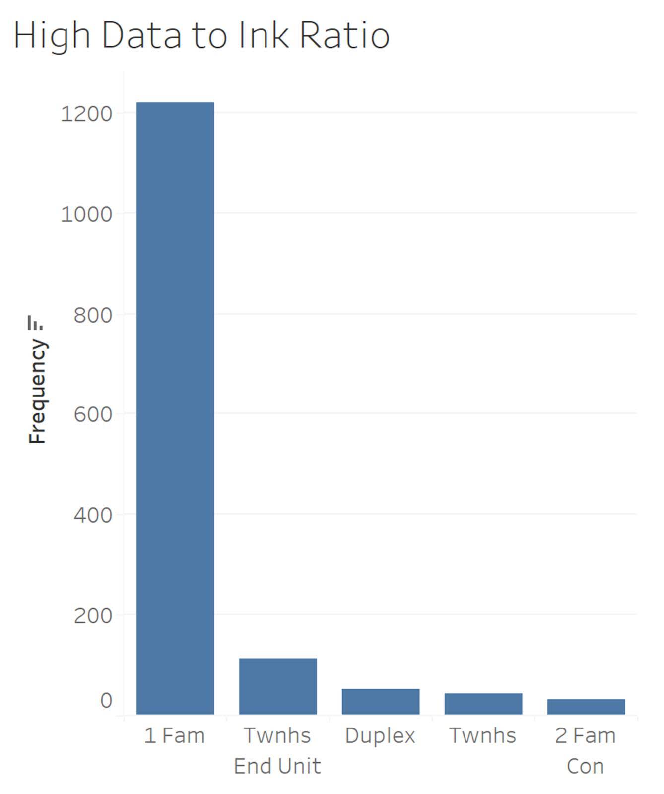
Rapporto dati-inchiostro: l'esperto di visualizzazioni Edward Tufte consiglia di ottimizzare il rapporto “dati-inchiostro” e ridurre al minimo l'“inchiostro non legato ai dati”. Bisognerebbe ridurre al minimo le prassi che, ad esempio, portano a inserire un numero eccessivo di linee griglia.

Adeguatezza delle etichette e dei titoli: il titolo del grafico deve descrivere chiaramente ciò viene mostrato, mentre gli assi e le legende richiedono etichette che indichino le unità di misura (per le variabili quantitative) o i nomi delle categorie (per le variabili qualitative).
Riguardo nei confronti degli utenti daltonici: il daltonismo colpisce circa il 4,5% della popolazione e significa che la persona non è in grado di distinguere alcuni colori, come il rosso e il verde. Quando è possibile, usa tavolozze di colori adatte per le persone daltoniche.
Individuazione e prevenzione dei grafici fuorvianti: gli odierni strumenti software sono potenti e permettono di creare visualizzazioni belle e accattivanti che influenzano il pubblico. Quando crei grafici, fai molta attenzione a riconoscere ed evitare le prassi di progettazione che portano a grafici fuorvianti. In Linee guida per l'individuazione dei grafici fuorvianti è disponibile un elenco di controllo, chiamato SCAM con un acronimo che significa controllare Source (origine), Chart type (tipo di grafico), Axis (asse) e Message (messaggio), da utilizzare quando si leggono i grafici per individuare i grafici fuorvianti.
Interpretare, esplorare e creare visualizzazioni è un lavoro importante, così come fare pratica. Esamina i grafici che vedi ogni giorno. Presentano i dati nel miglior modo possibile? Ci sono domande che restano senza risposta?
Ora hai a disposizione un nuovo insieme di strumenti per aiutare te e la tua community a leggere e creare visualizzazioni di dati.
Risorse
- Post del blog Lovelytics: 6 Design Tips for Better Business Dashboards in Tableau (6 suggerimenti per migliorare la progettazione dei dashboard aziendali in Tableau)
- Sito web Tableau: A Guide to Highlight Tables and Heatmaps (Guida alle tabelle in evidenza e alle mappe termiche)
- Sito web Tableau: Choropleths, Isopleths, and Area Maps (Mappe coropetiche, isopletiche e ad area)
- Trailhead: Linee guida per l'individuazione dei grafici fuorvianti
- Post del blog di Tableau: How to Spot Misleading Charts, A Checklist (Come individuare i grafici fuorvianti: un elenco di controllo)
- Tableau Public: Visualization BBC Style Guide (Guida di stile BBC per la visualizzazione)
- Trailhead: Nozioni fondamentali sulle mappe