Perché abbiamo bisogno dei grafici
Obiettivi di apprendimento
Al completamento di questa unità, sarai in grado di:
- Descrivere l'importanza dell'uso dei grafici.
- Scoprire come i grafici aiutano a porre domande e a rispondere.
- Comprendere l'importanza della qualità dei dati usati nei grafici.
Perché utilizziamo i grafici? Brevi cenni storici
Da molto tempo l'uomo crea grafici per visualizzare i dati. Migliaia di anni fa venivano già create mappe di città e paesi, tra cui la mappa della città di Nippur nel 1400 a.C. circa. Altri manoscritti, come quelli stilati da Tolomeo nel II secolo, utilizzavano le immagini per descrivere i principi dell'astronomia.
Oggi continuiamo a usare i grafici come strumento di rappresentazione dei dati e miglioriamo costantemente la nostra capacità di raccontarne la storia.
Pensa al cruscotto di un'automobile. Mentre guidi puoi vedere a che velocità stai andando, sapere quanta benzina è rimasta e avere la certezza che riceverai un avviso in caso di problemi di qualsiasi tipo. I progettisti dei cruscotti delle automobili stanno molto attenti alla collocazione di numeri, etichette e quadranti, in modo che il cruscotto ti mostri i dati più importanti esattamente quando ne hai bisogno.
Allo stesso modo, le visualizzazioni dei dati ti consentono di fare confronti, osservare le tendenze, monitorare le situazioni e i progressi e trarre conclusioni che ti aiutano a risolvere i problemi e a prendere decisioni migliori.
Tipi di grafici
Secondo la definizione del Cambridge Dictionary, un grafico è “un disegno che mostra le informazioni in modo semplice, spesso utilizzando linee e curve per mostrare le quantità”. I grafici permettono di individuare relazioni o modelli nei dati più rapidamente rispetto a quanto sia possibile con l'esame di punti dati grezzi. Così come esistono molti tipi di dati, esistono anche molti tipi di grafici che consentono di visualizzarli: grafici, tabelle, diagrammi, mappe e così via.


I grafici aiutano a porre e rispondere a domande
Porre domande perfette
Nel modulo Nozioni di base sulla data literacy si sottolinea l'importanza del porre le domande giuste. Le domande si pongono quando si esplorano i dati determinano la direzione delle analisi e le conclusioni che ne derivano. Se vuoi usare i tuoi dati per migliorare le decisioni che prendi, devi porre le domande giuste per ottenere le risposte migliori.
Nel post del blog Find Hidden insights in your data: Ask why and why again (Scoprire le informazioni nascoste nei dati chiedendo mille volte perché), Andy Cotgreave, senior technical evangelist di Tableau presso Salesforce, spiega come interagire con i grafici e porre continuamente nuove domande sui dati può portare a svelare la causa principale di un problema per intraprendere le migliori azioni possibili.
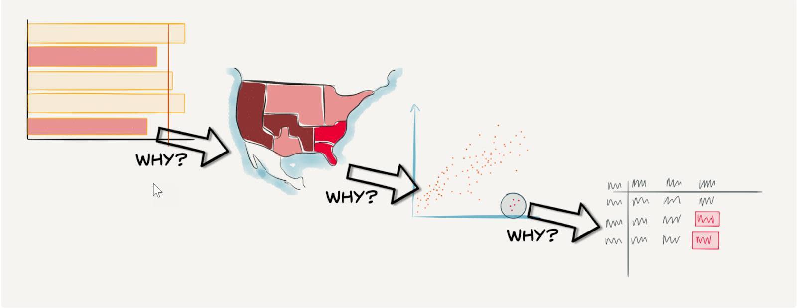
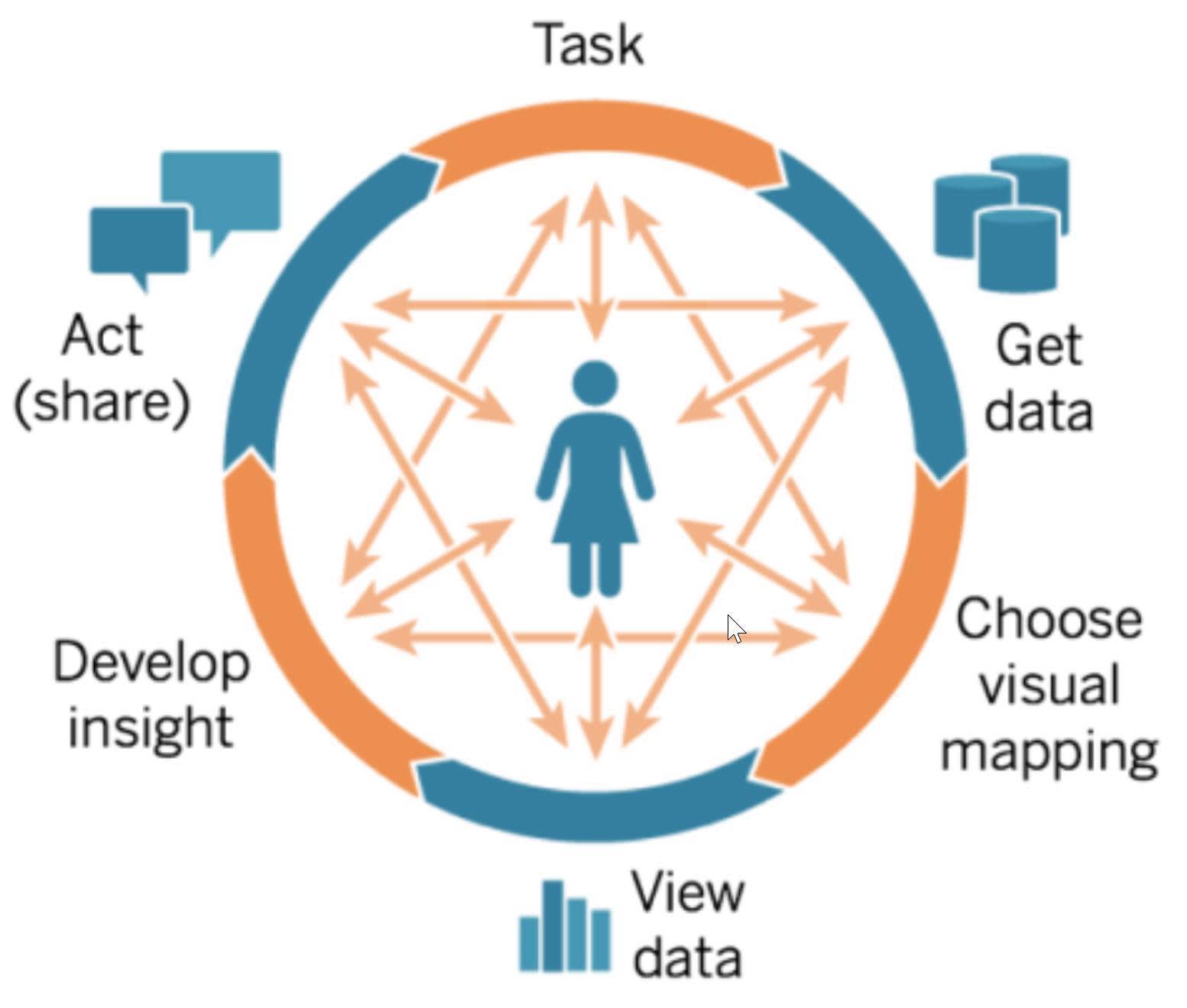
Il ciclo dell'analisi visiva
Il ricorso ai grafici per porre continuamente domande può essere considerato parte del ciclo dell'analisi visiva, elemento fondamentale delle best practice dell'analisi.
Il punto di partenza del ciclo è un'attività o domanda specifica riguardante il business, seguita dall'acquisizione dei dati, dalla loro visualizzazione per estrapolare informazioni dettagliate, dalla condivisione di tali informazioni e dall'esecuzione di azioni su di esse e, infine, dalla formulazione di nuove domande man mano che il ciclo prosegue. In qualsiasi punto del ciclo si può stabilire che la risposta che serve corrisponde a una domanda diversa. La capacità di porre le domande giuste guida il ciclo dell'analisi e porta a informazioni dettagliate migliori.
Perché è importante? Perché le aziende che seguono le best practice associate all'analisi riescono a sfruttare meglio i loro dati e ad amplificarne al massimo l'impatto sulle attività.
Fare confronti per esplorare i dati
Quando usi i grafici per porre e rispondere a domande, fai dei confronti. Ad esempio, potresti porre queste domande: Di quanto sta cambiando l'utile nel tempo? C'è un prodotto più redditizio di un altro? Quale campagna di marketing sta funzionando meglio? Queste domande portano a fare confronti tra i dati.
Qual è il modo migliore di fare questi confronti? Usare i grafici, naturalmente! Ma quali grafici dovresti creare? Come chi progetta i cruscotti delle automobili, anche chi progetta i grafici dedica molta attenzione alla scelta di quali utilizzare per la visualizzazione dei dati. Usare visualizzazioni che mostrano i confronti e rispondono alle domande permette agli utenti di avere informazioni dettagliate più rapidamente e li aiuta a porre domande più giuste man mano che il ciclo dell'analisi prosegue.
Gli esperti di visualizzazione dei dati hanno studiato la percezione visiva del cervello umano e sanno che determinati tipi di grafici possono agevolare la nostra comprensione delle visualizzazioni di dati. Quando usi i grafici per visualizzare i dati in modo efficace, puoi osservare modelli o tendenze e notare outlier o anomalie che non saresti in grado di rilevare se usassi testi o tabelle.
L'arte dei grafici
Mentre gli obiettivi aziendali richiedono efficienza, la visualizzazione dei dati lascia ampio spazio alla creatività. Puoi creare visualizzazioni bellissime che superano lo scopo di “comunicare attraverso i dati”. Le visualizzazioni possono raccontare una storia e attirare un pubblico più ampio per le tue analisi. Nella visualizzazione su Tableau Public di Asha Daniels il numero di singoli leopardi è indicato da punti neri, disposti in modo irregolare a macchia di leopardo nella metà che rappresenta gli anni '70, mentre i punti non raggruppati rappresentano gli anni 2020. La visualizzazione trasmette un messaggio importante attraverso una rappresentazione artistica.

L'efficacia delle visualizzazioni dipende dalla qualità dei dati
Prima di iniziare a esplorare le visualizzazioni dei dati, devi assicurarti che i dati utilizzati siano di alta qualità. Che tu legga o interpreti un grafico predisposto per te da qualcun altro o crei grafici che serviranno ad altri, controlla sempre che i dati siano di buona qualità e che siano quelli giusti per rispondere alla domanda o al confronto a cui stai lavorando.
Risorse
- Blog di Tableau: Find hidden insights in your data: Ask why and why again (Scoprire le informazioni dettagliate nascoste nei dati chiedendo mille volte perché)
- Trailhead: Nozioni di base sulla data literacy
- Trailhead: Variabili e tipi di campi
- Trailhead: Linee guida per l'individuazione dei grafici fuorvianti
- Blog di Tableau: Spot Misleading Charts, A Checklist (Individuare i grafici fuorvianti: un elenco di controllo)
- Visualizzazione Tableau Public: Disappearing Leopards (La scomparsa dei leopardi)
- The Data School Blog: Can you Make Art in Tableau? (È possibile creare arte con Tableau?)
- Sito web Tableau: Cycle of Visual Analysis (Il ciclo dell'analisi visiva)
- White Paper Tableau: Designing Great Visualizations (Progettare visualizzazioni eccellenti)