Learn When and How to Build a Bar-in-Bar Chart and a Bullet Graph
Learning Objectives
After completing this unit, you’ll be able to:
- Describe the purposes of bar-in-bar charts and bullet graphs.
- Explain the steps to build bar-in-bar charts and bullet graphs.
- Identify best practices to use when creating bar-in-bar charts and bullet graphs.
Scenario
Coffee Chain stakeholders want to know how product sales compare against the budget or the targets that they set at the beginning of the year. You can use several chart types to compare multiple measures, such as sales and budget, across categories, including a side-by-side bar chart, a bar-in-bar chart, and a bullet graph. In this unit, you take a look at each of these.
Side-by-Side Bar Chart
A side-by-side bar chart lets you compare multiple measures with bars that are next to each other. The use of side-by-side bar charts can offer additional depth to your analysis and answer multiple questions at the same time.
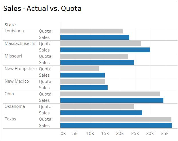
The following bar chart shows both actual sales and quota by state so you can compare sales and quota by state as well as sales and quota to each other. However, in this chart, it's difficult to quickly discern specific information like which states met their sales quotas.

A side-by-side chart can look crowded. Using different colors for the measures can help as shown in this chart with different colors for quota and sales.
Building Side-by-Side Bar Charts in Tableau
In a side-by-side chart, multiple measures are in the same shared space. When that's the case, Tableau uses the Measure Values and Measure Names fields. Measure Names is a dimension that contains a label for each measure. Placing Measure Names on Rows provides a label for every measure in the view.
In this view, the measures are Sales - Actual and Sales - Target. Measure Values is a measure that contains the numerical values for each measure. Placing Measure Values on Columns shows the Value horizontal axis. Specific measures can be shown by adding a filter to Measure Names.

Best Practices
In addition to the best practices for bar charts described in the first lesson, consider these additions for side-by-side charts.
Select each tab to learn about best practices to consider.
Bar-in-Bar Chart
A bar-in-bar chart usually compares two measures against one another or two discrete dimensions. The measures should have a logical relationship to the other, for example, budgeted spending versus actual spending. A bar-in-bar chart is more compact, organized, and more immediately informative compared to a side-by-side chart. A bar-in-bar chart consists of layering one bar on top of another, adjusting the width of the top bar so the bottom bar is visible, allowing comparison without stacking marks or expanding the axis. A bar-in-bar chart provides a quick visual comparison.
The bar-in-bar chart below shows the same information as the first side-by-side chart above. However, in the bar-in-bar chart, the two sales bars (actual sales and sales quotas) have contrasting colors, with actual in orange and quota in blue. Also, the quota bar is nestled within the actual bar. Because neither one is obscured by the other, both can be viewed at the same time, and actionable decisions can be reached sooner.

Bar-in-bar charts can be used with measures that have a relationship which is not necessarily a target or goal. The following bar-in-bar chart shows how exports compare to imports for each year between 2000 and 2010. From 2003 through 2008, imports clearly outpaced exports in Iceland. However, the reverse happened for 2009 and 2010, which indicates a major economic change during that time.

A bar-in-bar chart doesn't have to consist of only two bars. In the following bar-in-bar chart, information about total GDP has been added to the export and import information shown in the previous chart. The addition of GDP shows that GDP decreased considerably in Iceland from 2007 to 2010, the same period during which imports slowed down compared to exports.

Demonstration of Building a Bar-in-Bar Chart in Tableau
Bar-in-bar charts in Tableau use Measure Names and Measure Values in the same way as side-by-side charts while also using color and size to differentiate the measures.
Imagine Jamal’s customers at Superstore want to answer the following question about their company's retail data:
- Which product categories have already met their sales targets?
Watch this short video to see how to build a bar-in-bar chart from a side-by-side chart to find the answer.
Note that bar sizes can be edited by using the Marks card in Tableau Public, not the size legend.
Best Practices
In addition to the best practices for bar charts described in the first lesson, consider these additions for bar-in-bar charts.
Select each tab to learn about best practices to consider.
Bullet Graphs
A bar-in-bar chart is useful for comparing measures directly, but what if the Coffee Chain stakeholders want to see the progress of a measure moving toward (or beyond) its quota, target, or threshold?
A bullet graph is a good way to compare the performance of a primary measure against others, or against a separate goal while showing stages of progress toward a fixed goal.
This bullet graph shows the same information as the first bar-in-bar chart above with actual sales shown as a horizontal orange bar. Quota sales are shown as a smaller vertical blue reference line, perpendicular to the horizontal line. Reference bands, the shaded bands behind the orange bars, measure the different stages of progress toward the quota.

Here's a summary of the differences between a bar-in-bar chart and a bullet graph. In a bar-in-bar chart, the actual and target numbers are nestled together. But in a bullet graph, a vertical line represents the target. There are also reference bands in progressively lighter shades. These bands represent stages of progress toward the target and this visual representation is a key advantage to a bullet graph. When the main bar passes the reference line, the target has been met or the threshold has been reached.
In this chart, a calculation is used that identifies whether or not a bar has met its goal. When you apply this calculation to color, it makes problem areas easy to spot.

Demonstration of Building a Bullet Graph in Tableau
A bar-in-bar chart previously showed Jamal's Superstore customers which product categories had already met their sales targets. Now imagine that they have an additional question:
- What is each product category's stage of progress toward meeting its target?
Watch this short video to see how to build a bullet graph to find the answer.
Best Practices
In addition to the best practices for bar charts described in the first lesson, consider these additions for bullet graphs.
Select each tab to learn about best practices to consider.
Next Steps: Build and Analyze a Bar-in-Bar Chart and a Bullet Graph
In this unit, you learned about several chart types for comparing multiple measures, such as sales and quota, across categories, including a side-by-side bar chart, a bar-in-bar chart, and a bullet graph. You learned that bar-in-bar charts and bullet graphs are more sophisticated options than a side-by-side chart because both are more compact and make it easy for the eye to quickly convey information to the brain. A bar-in-bar chart is useful for comparing measures directly, and a bullet graph is a good way to show stages of progress toward a fixed goal.
In the next two units, you build and analyze a bar-in-bar chart and a bullet graph on Tableau Public while applying best practices.
Resources
- Tableau Online Help: Measure Values and Measure Names
- Tableau Reference Library Article: Understanding and using Bullet Graphs
- Tableau Online Help: Build a Bullet Graph
- Tableau Online Help: Reference Lines, Bands, Distributions, and Boxes
- Tableau Online Help: Get Started with Calculations in Tableau