Fix Inaccessible Language and Visual Indicators
Learning Objectives
After completing this unit, you’ll be able to:
- Explain how plain language improves message readability.
- Update a visual indicator formula to use meaningful alternative text.
Accessible Content
The previous units focus on structural changes and organization to improve accessibility. Now, let’s shift our focus to the content itself. How you present information, both visually and textually, can determine whether a user succeeds or struggles.
Images and visual indicators are powerful tools for communicating data quickly. But without meaningful alternative text (alt text), that information can be confusing or even effectively invisible to users relying on screen readers. Additionally, alt text is important because browsers display the alt text for all users in the event an image can’t be displayed or loaded.
Similarly, the words you choose to convey important messages matter. Overly complex language or jargon creates barriers that can alienate users. By embracing plain language and prioritizing meaningful alt text, you ensure that every user, regardless of ability or background, has equal access to the information they need to do their job.
The Power of Plain Language
Using clear, concise, and simple language is a cornerstone of accessible design. Overly complex words and sentence structures can create significant barriers, particularly for users with cognitive disabilities. However, simple language benefits everyone. Whether a user is reading in their second language, rushing to complete a task, or coming from a different educational background, plain language ensures that your message is understood. A good general guideline is to aim for a reading level equivalent to that of an 8th-grader in the United States. This approach reduces the mental effort needed to understand the vocabulary, allowing all users to focus on the content itself.
There are many tools available, such as the Hemingway Editor, to check the reading level of your text. As an example, let’s look back at the rich text component on the contact record. You applied the proper heading in a previous unit, but did you notice the text below the heading? More importantly, did you understand what it meant?
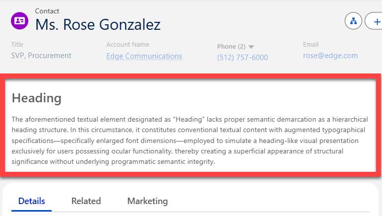
Here’s the text as it currently appears on the contact layout.
“The aforementioned textual element designated as "Heading" lacks proper semantic demarcation as a hierarchical heading structure. In this circumstance, it constitutes conventional textual content with augmented typographical specifications—specifically enlarged font dimensions—employed to simulate a heading-like visual presentation exclusively for users possessing ocular functionality, thereby creating a superficial appearance of structural significance without underlying programmatic semantic integrity.”
If you enter this text in the Hemingway Editor, it tells you that the content is written at a post-graduate level, which means most (if not all) users won’t understand it easily. Now, let’s review a block of text that conveys the same meaning but in simpler language.
“The text labeled “Heading” is just normal text with the font increased, not a real heading in the code. Visually, it looks like a heading, but screen readers won’t recognize it as a heading.”
Isn’t that much easier to understand? Let’s take this back to the Hemingway Editor to confirm. Now our text is rated at a 7th grade reading level–success!
Granted, this isn’t text you’d typically find in a Salesforce org but it helps make our point: Using clear, simple language ensures that your message is accessible to everyone, regardless of their reading level or cognitive ability.
Write Meaningful Alt Text
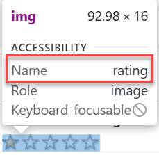
Next, you take a look at the Lead Source Rating formula field on the Contact record (now located on the new Marketing tab). This field provides a visual indicator, ranging from zero to five stars, based on the Lead Source field. For example, a lead from a "Purchased List" displays a 1 star rating, while a "Phone Inquiry" lead displays a 5-star rating. This field can help users quickly assess the quality or potential of the contact at a glance.
However, the current formula presents a significant accessibility barrier. It’s written in a way that displays the same alternative text ("rating") for all six possible images.
IMAGE(
CASE( LeadSource,
"Purchased List", "/img/samples/stars_100.gif",
"Web", "/img/samples/stars_200.gif",
"Partner Referral", "/img/samples/stars_300.gif",
"Word of mouth", "/img/samples/stars_400.gif",
"Phone Inquiry", "/img/samples/stars_500.gif",
"/img/samples/stars_000.gif"),
"rating")
This means that a screen reader user will hear “rating” regardless of the actual star count assigned. While the images all have alt text, the alt text leaves out critical information, preventing some users from accessing the same data as their peers. In other words, the alt text is meaningless. Let’s fix that.
Fix Alt Text
The syntax for an IMAGE formula is relatively simple when used alone: IMAGE(image_url, alternate_text). But the nested CASE() formula used in our example adds complexity to the formula and requires a bit more thought when considering alt text. There are several ways you can fix this; described here is one solution that makes the relationship between each image and its alt text clear.
Hands-on challenge note: In order to pass the challenge for this unit, you must complete the steps outlined in the badge content.
- From Setup, select the Object Manager.
- In the Quick Find search box, enter
Contactand select Contact from the list.
- Select Fields & Relationships.
- Search for and select
Lead Source Rating.
- Select Edit.
- Replace the existing text with the following formula and select Save.
CASE( LeadSource,
"Purchased List", IMAGE("/img/samples/stars_100.gif", "1 Star Rating"),
"Web", IMAGE("/img/samples/stars_200.gif", "2 Star Rating"),
"Partner Referral", IMAGE("/img/samples/stars_300.gif", "3 Star Rating"),
"Word of mouth", IMAGE("/img/samples/stars_400.gif", "4 Star Rating"),
"Phone Inquiry", IMAGE("/img/samples/stars_500.gif", "5 Star Rating"),
IMAGE("/img/samples/stars_000.gif", "0 Star Rating"))
Now, if you view the contact record for Ms. Rose Gonzalez and enter Ctrl+Shift+C on Windows (or Cmd+Shift+C on Mac) to inspect the Lead Source Rating field, you see that the Name in the Accessibility section, which is assigned from the alt text in the formula, is 1 Star Rating.

In the next unit, you apply similar concepts to error messages and hyperlinked text.