Format Your Visualizations
Learning Objectives
After completing this unit, you’ll be able to:
- Explain when to format your visualizations in Tableau Cloud.
- Describe what elements you can apply formatting to in Tableau Cloud.
- Use visual best practices.
Why Format Your Visualizations in Tableau?
Tableau products are designed to help you create visualizations that tell a story or answer a question. Every product comes with formatting defaults in place that adhere to visual best practices so you can rest assured that you're creating visually pleasing visualizations.
But sometimes, you want to tailor formatting to enhance both your analysis and your presentation. Perhaps you'd like to use a color scheme in line with your company's brand, or you’d like to use the font preferred by your decision makers. You know what story you’re telling and what information is the most important for your audience. Tableau makes it easy for you to format your content for almost everything you see when using Tableau—from the overall workbook color scheme to a tooltip that shares a data insight.
Types of Content That Can Be Formatted
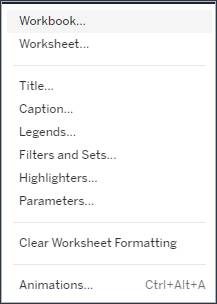
In Tableau, you can set your formatting preferences at the workbook and worksheet level, or you can format individual elements, such as titles, filters, and animations. You can change the font, text style (for example, bold, italics, or underlined), or color of your text. These settings can be accessed through the format pane found in the Tableau Cloud toolbar.

Within a visualization (or viz, for short), you can change the color, shape, and opacity of marks. You can also add borders to your marks. Tableau provides color palettes for both categorical and quantitative fields. Categorical fields (for example, a country) can be assigned color palettes specifically designed for the greatest visual differentiation between categories. Quantitative fields (for example, the sum of sales) can be assigned color-diverging palettes that show a gradual blending from one color to another. You can also select a color palette designed to be more accessible for people with color blindness. These settings can be accessed by clicking the different boxes on the Marks card. Choose Color to edit colors, Size to increase or decrease the size of your marks, and Shape to change the shape of your marks.

Visual Best Practices
Move from Biggest to Smallest
As you format your work, consider using a biggest-to-smallest workflow. Start with elements that you'd like to tailor for the entire workbook, such as fonts, titles, and lines. Then move down to the worksheet level, and, finally, to individual parts of the view. Taking care of the workbook-level changes first saves you time.
Limit Colors
Too many colors can create visual overload and take the attention away from your analysis. Choose a few contrasting colors. Be sure that there's enough color contrast between the background and the text. If you're using a trend line, choose a color that stands out from the other colors in the viz. Color can be used to impart meaning—a bolded, bright orange metric stands out in a sea of black font and grabs your readers' attention. If there are too many colors on the viz, the insights you’re seeking to highlight might not pop the way you want them to.
Use Fonts That Are Accessible and Optimized for Online Readability
Try to stick with one or two fonts, and steer clear of fancy fonts that are hard to read. Like too many colors, too many fonts cause visual overload and distract the reader from the data. The fonts in the Tableau typeface family were designed to be paired with data visualizations and optimized for legibility at any size. Tableau uses them by default. If you choose to use a different font, consider the accessibility and readability of the font. Using a 12-point font is a general best practice as it’s easy for most people to read. The most accessible fonts available in Tableau, outside of the Tableau typefaces, are Calibri, Arial, Verdana, and Times New Roman.
Now that you know what types of content can be formatted in Tableau and some visual best practices to keep in mind, dive into how to apply the formatting at the different levels.