Gestion des événements dans les composants Web Lightning
Objectifs de formation
Une fois cette unité terminée, vous pourrez :
- Créer une application qui comprend plusieurs composants
- Décrire la structure de fichiers d’un composant complexe
- Gérer des événements
Suivi du parcours d’un événement
Vous avez créé un composant et l’avez déployé vers une organisation. Commençons à ajouter un peu d’interactivité grâce à la gestion des événements. Nous suivons le parcours d’un événement à travers plusieurs composants pour une gestion complexe des événements dans une application. Cette application est un sélecteur de produits pour un magasin de vélos. Les utilisateurs cliquent sur un nom de vélo et une image pour voir plus de détails.
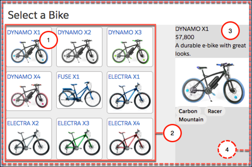
Cette application comporte quatre composants qui fonctionnent ensemble.
-
vignette : affiche un élément individuel.
-
liste : organise les vignettes.
-
détails : affiche les détails de l’élément lorsque l’utilisateur clique sur une vignette (semblable à la bikeCard que vous venez de créer).
-
sélecteur : contient l’ensemble des composants. L’utilisation d’un composant de conteneur n’est pas obligatoire, mais nous en utilisons un ici pour faciliter la gestion des événements.
Pour l’instant, l’application utilise un fichier de données pour charger les données statiques à tester. Dans l’unité suivante, vous apprendrez à extraire des données dynamiques à partir d’une organisation.
Composition des composants
Ajoutons quelques fichiers à notre projet, que nous pouvons ensuite déployer dans une organisation.
- Téléchargez les fichiers pour cette application ici : Application Bike Selector pour Trailhead.
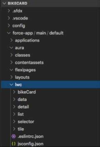
- Décompressez les fichiers dans le dossier force-app/main/default/lwc du projet bikeCard.
Relations entre les composants
Dans cette application, plusieurs composants fonctionnent ensemble : certains composants sont imbriqués dans d’autres. Tout comme les éléments HTML peuvent être imbriqués les uns dans les autres, les composants Web Lightning, qui sont des éléments HTML personnalisés, peuvent être imbriqués dans d’autres composants Web Lightning.
Dans notre système de fichiers, les dossiers des composants ne donnent pas vraiment d’idée de leurs relations.
Voyons comment les composants sont imbriqués au niveau de l’interface utilisateur sur un diagramme.
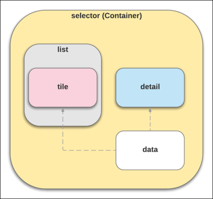
En regardant les fichiers, vous pouvez constater que le composant Sélecteur assure la mise en page et affiche les composants Liste (c-list) et Détails (c-detail).
Mettez à jour detail.html avec ce qui suit :
En regardant dans detail.html, vous pouvez voir le rendu conditionnel (lwc:if={product} et lwc:else). Si vous n’avez rien choisi dans la liste, un message vous demande de le faire. Si vous avez choisi quelque chose, les informations sur le vélo apparaissent.
Le composant Liste affiche plusieurs composants Vignette (c-tile), qui correspondent à chaque vélo dans les données. Cette imbrication est réalisée dans le HTML pour chaque composant parent. Par exemple, le composant Liste utilise le code HTML suivant, qui inclut le composant Vignette sous le nom c-tile.
Prenez note de la manière dont chaque itération de l’élément de vélo génère un nouveau composant Vignette. Le simple fait d’inclure la balise de composant c-tile implique que chaque composant Vignette devient son enfant. Le « conteneur » de définition de classe division est utilisé pour le style, de manière à ce que vous puissiez contrôler la disposition des vignettes. Si vous regardez list.css, vous pouvez constater qu’il enveloppe le contenu.
La relation parent/enfant est importante, non seulement pour la conception de l’application, mais aussi pour la gestion des événements.
Voyons plus en détail la gestion des événements.
Événements vers le haut, propriétés vers le bas
Dans un composant complexe (qui contient plusieurs composants parents et enfants), les composants peuvent communiquer vers le haut et vers le bas.
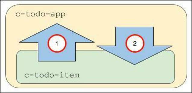
- Le composant enfant c-todo-item envoie un événement au composant parent c-todo-app. L’enfant peut par exemple transmettre un objet événement au parent lorsqu’un utilisateur clique sur un bouton, ce qui permet au parent de gérer l’événement et de modifier la page en cours.
- Le composant parent c-todo-app transmet une propriété ou appelle une méthode dans le composant enfant. Le parent peut par exemple définir une valeur de texte ou appeler une méthode dans un composant enfant.
Intéressons-nous maintenant à la façon dont fonctionne cette communication.
Transmission des informations vers le haut
Les informations peuvent être transmises vers le haut en utilisant des événements et des écouteurs d’événements.
Le composant enfant distribue l’événement et le composant parent l’écoute. La distribution de l’événement inclut la création d’un objet événement que l’enfant peut transmettre au composant parent. Le parent utilise un gestionnaire pour répondre à l’événement.
Par exemple (ne créez pas ces composants), un composant enfant comme celui-ci contient une méthode nextHandler() qui crée un objet d’événement simple à l’aide de CustomEvent() et distribue le type d’événement « next » lorsque l’utilisateur clique sur un bouton Next (Suivant).

Le composant parent écoute l’événement avec le gestionnaire d’événements intégré précédé du préfixe ’on’(onnext).
Il transmet ensuite l’objet événement à un gestionnaire d’événements.
Transmission des informations vers le bas
Les informations peuvent être transmises vers le bas en utilisant des propriétés publiques et des méthodes publiques.
Vous pouvez rendre une propriété de composant publique en la faisant précéder du décorateur @api. Définissez ensuite la propriété publique grâce à un composant externe.
Par exemple (ne créez pas ces composants), si le composant enfant c-todo-item comporte les éléments suivants :
Définissez la valeur du parent à l’aide de ce qui suit :
Notez que la variable itemName est définie à l’aide de l’attribut au format de casse kebab item-name. Les noms de propriété dans JavaScript sont en casse mixte tandis que les noms d’attributs HTML sont en casse kebab (séparés par des tirets) pour répondre aux normes HTML. L’attribut item-name dans le balisage correspond à la propriété JavaScript itemName.
Les propriétés publiques sont d’excellentes solutions pour transmettre des valeurs primitives, des objets simples et des tableaux.
Vous pouvez également utiliser des méthodes d’obtention et de définition pour exécuter une logique lorsque les propriétés sont obtenues ou définies. Et n’oubliez pas de les annoter avec le décorateur @api pour les rendre publiques pour d’autres composants.
Vous pouvez également créer des méthodes publiques pouvant être appelées à partir d’un composant parent. Créez une méthode publique dans le composant enfant en la définissant avec le décorateur @api, puis appelez-la depuis le composant parent.
Par exemple, imaginons que nous disposons d’un composant enfant comme celui-ci (ne créez pas ces composants) :
Lorsque le composant c-video-player est inclus dans un composant parent, nous pouvons invoquer la méthode à partir du composant parent comme ceci :
Nous avons défini une méthode handlePlay() qui déclenche l’événement. Nous allons ensuite utiliser la méthode DOM querySelector() pour rechercher un élément DOM appelé c-video-player et invoquer sa méthode publique.
Gestion des événements en HTML
Notre application de sélection doit donc gérer un type d’événement : l’utilisateur qui clique sur une vignette. Lorsque cette situation se produit, le composant détails doit être restitué avec les informations de la vignette correspondante. Vous pouvez gérer les événements en HTML (ajouter un écouteur d’événements dans le modèle) ou en JavaScript (écrire une fonction d’écouteur d’événements). Nous vous recommandons d’utiliser l’approche HTML, en procédant comme suit.
Chaque composant Vignette écoute le clic de l’utilisateur, car le code HTML du composant Vignette (tile.html) contient un écouteur d’événements onclick.
Lorsqu’un utilisateur clique sur l’une des instances Vignette dans l’interface utilisateur, l’écouteur onclick appelle la fonction de gestionnaire tileClick dans le fichier JavaScript tile.js.
Modèle d’événement pour l’application de sélection
Dans notre application de sélection de produits, nous utilisons un composant complexe (qui contient plusieurs composants parents et enfants). Nous vous recommandons de propager l’événement vers le haut en suivant la hiérarchie des composants, afin que les composants parents puissent répondre aux événements enfants. Si vous avez d’autres composants enfants (autres que celui qui déclenche l’événement), vous pouvez transmettre une propriété à ces enfants en réponse à l’événement.
Voici comment le modèle se présente :
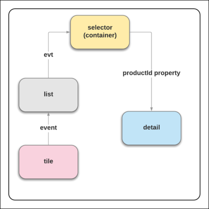
Pour ce faire, nous devons enchaîner les écouteurs et les gestionnaires d’événements en remontant la hiérarchie jusqu’au composant ebikes. Nous devons ensuite transmettre une propriété vers le bas, au composant détails.
Vous voyez ce qui suit dans nos fichiers.
- tile.html comporte l’écouteur d’événements
onclickqui appelle le gestionnairetileClick.
- tile.js comporte la méthode
tileClickqui crée unCustomEventavec le type d’événementtileclicket un objet contenant une valeurdetail(this.product.fields.Id.value).
- list.html comporte l’écouteur
ontileclickqui appelle le gestionnairehandleTileClick.
- list.js comporte la méthode
handleTileClickqui passe dans l’événement(evt) pour créer un autreCustomEvent(productselected) avec un objet contenant également une valeurdetailevt.detail. Et il distribue l’événement dans JavaScript :
- selector.html comporte l’écouteur d’événements
onproductselectedqui appelle le gestionnairehandleProductSelected.
- selector.js comporte la méthode
handleProductSelectedqui définitselectedProductIdsur la valeurevt.detailqui lui a été transmise. La variable « selectedProductId » est transmise du composant de sélecteur au composant de détail dans selector.html :product-id={selectedProductId}.
- detail.html comporte une directive conditionnelle (vous vous souvenez de celle de l’unité 2 ?) qui attend une valeur de produit :
<template lwc:if={product}> - detail.js regroupe les pièces. Il crée une variable privée
_productIdpour surveiller l’état de la valeurproductId. Il utilise ensuite un modèle obtention/définition pour obtenir la valeur et la définir sur une variableproductqui permet à detail.html de charger le contenu conditionnel.
Les méthodes d’obtention et de définition sont des constructions JavaScript courantes. Elles vous permettent d’ajouter une logique et des conditions aux attributions de propriété.
Chaque fois que vous cliquez sur une vignette, ce processus se répète.
Déploiement des fichiers dans votre organisation
Déployons ces nouveaux fichiers de projet bikeCard dans votre organisation pour voir comment le processus fonctionne. En suivant les mêmes étapes que dans l’unité précédente, déployez vos nouveaux fichiers, ouvrez l’organisation et créez une page dans le Générateur d’application Lightning avec cette application.
- Dans le projet VS Code bikeCard, faites un clic droit sur le dossier force-app/main/default et sélectionnez SFDX : déployer la source dans l’organisation.
- À partir de la palette de commandes dans VS Code, utilisez SFDX : ouvrir l’organisation par défaut pour ouvrir votre organisation.
- Créez une page composée d’une zone à l’aide du composant Sélecteur.
- Apposez-lui le libellé
Your Bike Selection.
- Faites glisser votre composant selector en haut de la présentation de page.
- Enregistrez-le et activez-le pour tous les utilisateurs.
- Ouvrez-le et regardez votre composant fonctionner dans l’interface utilisateur.
Vous avez une page entièrement interactive composée de plusieurs composants qui fonctionnent ensemble. Nous allons à présent faire des expériences sur le style et l’obtention de données en direct à partir d’une organisation.
Ressources
- Guide du développeur de composants Web Lightning : DOM fantôme
- Guide du développeur de composants Web Lightning : Communiquer au moyen d’événements
- Guide du développeur de composants Web Lightning : Créer des méthodes d’obtention et de définition