Learn When and How to Build a Bar Chart
Learning Objectives
After completing this unit, you’ll be able to:
- Identify how bar charts effectively compare categorical data values visually.
- Explain the steps to build a basic vertical bar chart.
- Identify best practices to use when creating bar charts.
Scenario
Jamal Booker is a Data Analyst at Mainstage Analytics, a company that specializes in data visualization and analysis, and is working with multiple clients including Coffee Chain and the retail giant, Superstore.

Coffee Chain, a popular supplier for cafes, wants to improve business performance and needs to analyze their sales data to compare product sales, market performance, and budget comparisons to make informed decisions. In this module, watch demos of charts built for Superstore and then follow along with Jamal to explore the Coffee Chain data set provided. You’ll learn to find answers to specific questions — and optionally dig up additional questions to explore on your own.
This module is a guided analysis of a specific data set and specific analytical questions, designed to help you learn by doing. There are questions and discussion of why and how things happen, not just the series of steps needed to get the answer. Some of the units have quiz questions about the analysis and some are graded challenges that check the visualizations you build.
In order to assess performance, the Coffee Chain sales team needs a visual representation of sales by product, so Jamal decides to help by creating a bar chart.
Why Use a Bar Chart?
Bar charts let you compare numerical values like integers and percentages across categories. Bar charts use length to encode values. Length is a preattentive attribute. Preattentive attributes are visual elements that our brains process almost instantly. This lets us quickly perceive patterns and relationships. People easily recognize differences in length. Sorting or ranking by length makes it easy to discern and compare the magnitude of each value.
Examples and Variations
The simplest bar charts use a single form of encoding, typically length or height.
Simple vertical and horizontal bar charts
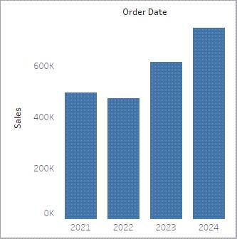
The following vertical bar chart sorts sales by category. The category with the most sales is the one whose bar is the highest or tallest.

In a horizontal bar chart, the axes are swapped so the longest bar shows the category with the most sales.

Bar charts can also show comparisons by specific discrete time periods, for example, sales by year. You can contrast this with using a line chart to show trends over time.
Color-Encoded Bar Charts
Adding a second type of encoding, such as color, to a bar chart lets you add another field to the chart for additional insights.
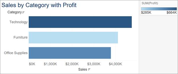
In the following bar chart, average profit was added to color. It's easy to see that, although Furniture has the second-highest sales, it has the lowest profit.
Segmented Bar Charts
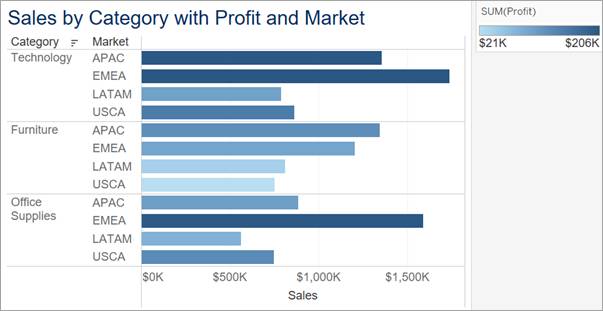
Adding another dimension or category can further segment the information into panes. The following bar chart separates out sales by market in addition to category. The use of total profit on color also lets you see the sales and profitability of each market within each category.
Stacked Bar Charts
Stacked bar charts can offer additional depth to your analysis and answer multiple questions at the same time. A stacked bar chart is useful when you want to compare the parts within each mark (bar). In a stacked bar chart, you use a dimension to divide each bar into its component parts. You typically then use color to highlight each of these parts.
Use stacked bar charts to compare the contributions of different groups to the total value, as well as compare how each group varies from bar to bar.
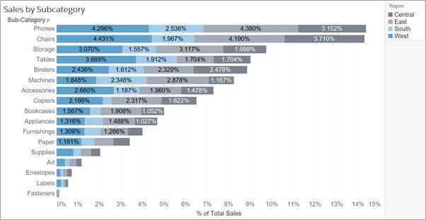
The following stacked bar chart uses percentages on the axis. Each bar’s length shows the percentage each sub-category contributes to the whole. Within each bar, color indicates each region's percentage contribution to that bar.
A variation of the stacked bar chart is the 100% stacked bar chart. In a 100% stacked bar chart, the total for each bar adds up to 100%. Furthermore, each section of the bar reflects the percentage that it contributes to the whole. Because each bar totals 100%, each bar is the same length, which makes it easier to see whether the percentages vary or remain constant across each section of the bar.
The following 100% stacked bar chart shows the percentage that each region contributes to the total sales within a sub-category.

Stacked bar charts do have a limitation, because groups that aren't aligned along the axis are harder to compare with precision. Adding details by using tooltips or labels can help make it easier to understand the differences in length of each group, regardless of axis alignment.
Demonstration of Building a Bar Chart in Tableau
Imagine another of Jamal’s customers, a retail company named Superstore, wants to find answers to the following questions about their company's retail data:
- How do sales compare among product categories?
- Which product categories are the most and least profitable?
Watch this short video that follows to see how to find these answers by building a bar chart in Tableau. (If you need to orient yourself to The Tableau Workspace, this Help article can be useful.)
As shown in the video, you create a simple bar chart to compare data across different categories by dragging a measure to either the Rows or Columns shelf and a category or dimension to the other shelf.
Best Practices
When using bar charts and stacked bar charts for comparing and ranking categories, consider these best practices.
Select each tab to learn about best practices to consider.
What's Next: Build and Analyze a Bar Chart
In this unit, you learned why bar charts are effective for comparing categorical data values visually and some best practices to consider when creating bar charts.
In the next unit, you build and analyze a bar chart and a stacked bar chart on Tableau Public while applying these best practices.