Learning Objectives
After completing this unit, you’ll be able to:
- Create and analyze a bar-in-bar chart.
- Apply best practices when creating a bar-in-bar chart.
Check: Connect Your Tableau Public Account
If you haven’t logged in or the playground has timed out, log in to your Tableau Public account in the Playground window.

Scenario
Now that you’ve learned about bar-in-bar charts, you're ready to build one while applying best practices.
Coffee Chain now understands the performance of each one of their products. But stakeholders also want to know how sales compare against the budget or targets that they set at the beginning of the year. Jamal decides to create a bar-in-bar chart. Follow along with the steps here. Remember, you can use Undo in the toolbar 
Question for Analysis: Compare Product Sales Against Budget Targets
Coffee Chain stakeholders want to know:
- Which products have already met their sales targets?
Follow the steps here to find out.
First: Build a Side-by-Side Bar Chart
Start with a basic bar chart that has Coffee Chain Sales on Columns and Product on Rows that Jamal has already made.
To compare product sales and budget targets side-by-side, use the Measure Values and Measure Names fields. In Tableau Desktop, these fields are automatically invoked when you bring in a second measure, but in Tableau Public, you'll drag these fields in yourself. Note that Measure Names and Measure Values are in italics in the Data pane because they are Tableau-generated fields.
- Drag Measure Names to Rows and place it to the right of Product.
This adds a label to the view for the name of the Coffee Chain Sales measure already in the view.
You want to use both Coffee Chain Sales and Budget Sales in the viz. You can do this by filtering Measure Names.
- From Rows, right-click Measure Names and select Filter.….

- In the Filter [Measure Names] dialog box, Select the All checkbox to clear everything, then select Budget Sales and Coffee Chain Sales, and then select OK.

- Drag Measure Values to Columns, placing it on top of Coffee Chain Sales to replace it.
The view should now be a side-by-side bar chart with Coffee Chain Sales and Budget Sales.
Can you easily answer Coffee Chain’s question: Which products have already met their sales targets?
There's a lot of information on the view, which makes it hard to quickly identify which of the 13 products have met and exceeded their targets, and which ones are still working toward meeting that overall goal. To highlight the target comparisons, turn the side-by-side chart into a bar-in-bar chart.
Turn the Side-by-Side Chart Into a Bar-in-Bar Chart
Stack and Resize the Bars
Now, stack the two measures and then resize the bars so you can see both of them.
- From Rows, drag Measure Names to Color on the Marks card.
Dragging Measure Names off Rows creates the stacked marks.
- On Color on the Marks card, press and hold the Ctrl key while dragging Measure Names to Size.
This adds a copy of Measure Names to Size.
Now the bars are different sizes, but the marks are starting at different values. You can see this by hovering over both colored bars for one of the products.
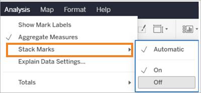
Set the Bars to Both Start at Zero
Unstack the bars to set the bars so they both start at the origin.
- On the Analysis menu, point to Stack Marks, and select Off to start both bars at zero (0).
Apply Best Practices (Optional)
To make this chart easier to analyze and follow best practices, edit the colors, sizes, and axis label. And finally, rename the sheet. Note that this part of the challenge won't be checked.
- If you want, edit the bar colors by selecting Color and then Edit Colors on the Marks card.
For example, you can set Budget Sales to Gray and Coffee Chain Sales to Blue.
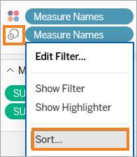
- If desired, edit the sizes of the bars by selecting the drop-down menu on Measure Names next to the Size icon and then Sort and then Descending.

These changes make it easier to see which products surpassed their budgeted sales. As you can see here, Amaretto needs just a bit more to meet its budgeted sales, and Caffe Latte has already exceeded its goal.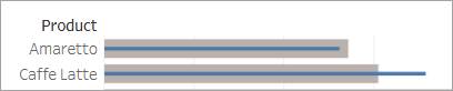
- To rename the horizontal axis, double-click the Value label and change the title as desired, for example,
Sales and Budgeted Sales.
- Rename the sheet with a meaningful name, for example,
Product Sales and Budgeted Sales.
Nice work. You created a bar-in-bar chart that compares sales measures directly to budgeted sales measures.
Answer Questions Using Your Bar-in-Bar Chart
Use your viz to answer this question:
- Which products have already exceeded their budgeted sales?
Jamal also notes that Colombian is Coffee Chain’s best-selling product but hasn't yet met its target. These are all interesting points to bring back to the stakeholders.
Publish Your Viz (Optional)
To save your workbook for more analysis later, publish it to Tableau Public.
- From the area above the toolbar or from the File menu, select Publish As.
- On the Publish Workbook dialog, enter a name for your viz, for example,
Coffee Chain Bar-in-Bar Chart.
- Select Publish.
Next Steps: Build and Analyze a Bullet Graph
To better understand their progress toward targets, Coffee Chain stakeholders also want to see how product sales are tracking against milestones throughout the year, with the ability to see the information for each market.
In the next unit, you build and analyze a bullet graph on Tableau Public to analyze their new request.