Learning Objectives
After completing this unit, you’ll be able to:
- Create and analyze a bullet graph.
- Apply best practices to enhance the readability and effectiveness of a bullet graph.
Check: Connect Your Tableau Public Account
If you haven’t logged in or the playground has timed out, log in to your Tableau Public account in the Playground window.

Scenario
Coffee Chain stakeholders regularly use dashboards to track product sales progress. At the beginning of each quarter, they set product sales targets. Then they monitor their progress toward those targets. Stakeholders expect to see about 50% of the target value in the middle of the quarter and so on. They want to compare the actual values to important milestones and also filter the information for each market.
Jamal decides to create a bullet graph to help identify product sales progress toward those types of milestones along the way. You're going to follow along with the steps here.
Questions for Analysis: Compare Product Sales Against Budget Milestones by Market
Coffee Chain stakeholders want to know:
- Which products are within 75% of meeting their sales targets?
- How much does the answer vary by market?
Follow along with the steps here to find out.
Start with a basic bar chart with Coffee Chain Sales on Columns and Product on Rows that Jamal has already made and has already added a filter for Market.
Create a Bullet Graph
Add a Reference Line for Budget Sales
First, add reference lines, which show as a vertical line for the target for each bar in the chart.
- Drag Budget Sales to Detail on the Marks card.
This is necessary so that the field can be used by Tableau when defining the reference line and distribution bands.
- Select the Analytics tab next to the Data pane tab to open the Analytics pane.
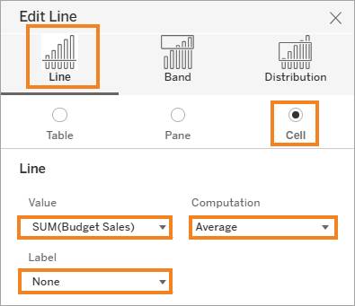
- From the Analytics pane, drag Reference Line into the view, drop it on Cell, select these options, and then select X to close the dialog box.
- Scope: Per Cell
- Value: Sum(Budget Sales) with an Average aggregation computation
- Label: None
- Scope: Per Cell
Add Distribution Bands to Show Progress
Then, add distribution bands, which show the milestones using percentages for each of the targets.
4. From the Analytics pane, drag Distribution Band into the view, drop it on Cell, select these options, and then select X to close the dialog box.
- Scope: Per Cell
- Value: Percentages: 0, 50, 75, 100 of SUM(Budget Sales) with an Average aggregation
- Label: None

Add Color to Show Products that Met/Didn’t Meet Targets
Use a calculated field to show which products have met their budgeted sales quota. Use the Met Quota? calculated field already provided or try to write your own calculation.
- Select the Data tab and then drag the Met Quota? calculated field to Color on the Marks card.
- Edit the colors, if desired.
In this example filtered for the Central market, products that have met their target are shown in green and those that haven't yet met the target are shown in gray. You might prefer to highlight products that haven't met their target with a brighter color, such as orange, and use gray for those that have.

Apply Best Practices (Optional)
To make this chart easier to read and follow best practices, resize the bars and remove the vertical gridlines, and then rename the sheet.
- On the Marks card, select Size, and move the slider toward the left to reduce the size of the sales bars to make it easier to see the distribution behind them.
- Remove column gridlines from the worksheet to improve readability. Note that this method differs from the method used in Tableau Desktop.
From the Format menu, select Worksheet.- In the Format pane, use the arrow to expand the Lines section.
- Under Grid Lines, use the arrow to expand the All section.
- Under Vertical, use the arrow to open the menu.
- Change the drop-down from On to Off.
- Select X to close the Format pane.
- In the Format pane, use the arrow to expand the Lines section.
- Rename the sheet something meaningful, for example,
Sales Actual vs. Budgeted by Market.
Good job. You’ve created a bullet graph that compares actual product sales to budgeted sales quotas, and that shows each product’s stages of progress toward its sales goal.
Answer Questions Using Your Bullet Graph
To see the milestones for each product, hover over one of the vertical reference lines for a product. To see information by market, use the Market filter in the view.
Use your viz to answer these questions:
- Are each of the products that haven't met their targets yet within 75% of meeting their budgeted sales goals?
- For Colombian coffee in the West market, actual sales are $30,352. What's the budgeted sales target for Colombian coffee in the western market?
Jamal also notes that Colombian coffee hasn't met its overall goal, but has met its target in some of the markets. Use the filter to verify his findings. These insights are great to share with stakeholders.
Publish Your Viz (Optional)
To save your workbook for more analysis later, publish it to Tableau Public.
- From the area above the toolbar or from the File menu, select Publish As.
- On the Publish Workbook dialog, enter a name for your viz, for example,
Coffee Chain Bullet Graph.
- Select Publish.
Next Steps: Put It All Together
Next, you review all the charts and identify use cases for each one.