Apply Systems Design Principles
Learning Objectives
After completing this unit, you’ll be able to:
- Take a systems design approach to using elements of a design system.
- Apply systems design principles to creating elements for a design system.
Using Existing Elements
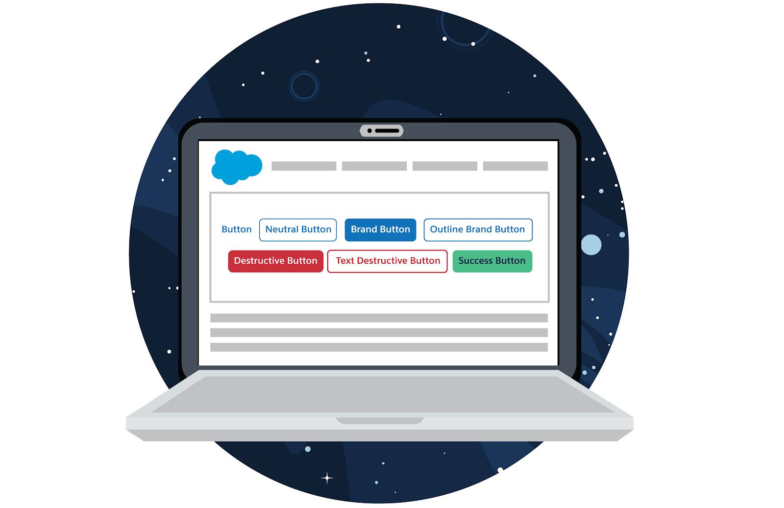
When you understand systems design, you can consciously design the best possible experience for your audience. Let’s think about a concrete example: buttons. You may be thinking that buttons are relatively simple and straightforward, but they highlight the interconnectedness of elements within larger systems.
With the Salesforce Lightning Design System, it’s easy to reuse familiar components, such as buttons. But before you jump into using an SLDS button, it’s essential to fully grasp the bigger picture so you can make informed decisions. You need to understand how buttons work as part of a complete system.
- What type of action does a button execute?
- What types of buttons are available for that action?
- How do buttons function in relation to other types of buttons users have seen in your app or on a different platform?
- Will someone visiting your app recognize the button and know what its purpose is?
- Does the button type visually reflect how common or important its action is in your app?

In the SLDS 1 and SLDS 2 documentation, the breadth of options, such as actions and states, for different types of buttons demonstrates how important buttons are to the rest of the design system. Since the first button was added to SLDS 1 in 2015, customers, partners, and Salesforce designers have provided valued input, contributing to its evolution to what you see today. Practice—with feedback—makes perfect.
In systems design, it’s essential to observe how elements are used and listen to user feedback. That’s how we evolve existing patterns and identify the need for new patterns. Put simply: Consider the big picture and its relationship to your work. Consider the hierarchy of your users’ needs.
Contributing New Elements to a System
Sometimes an element you envision doesn’t exist, and you need to create your own. Imagine that you’re back in the early days of SLDS, and there are no UI elements that enable a user to take an action. Eureka! You come up with a novel idea to create a new button element for SLDS. When designing buttons for a design system, the first goal is to understand the types of actions required across all areas of Salesforce.

The worst thing to do is focus on your needs only. If you design the button for one section of just one page in your application, you’re thinking too narrowly. Ignoring how people will use button actions outside the context of what you’re designing for is a recipe for suboptimal user experiences. Instead, remember that when a user clicks your new button, they will expect similar buttons to behave a similar way.
Systems design relies on elements that adapt to different use cases across an app or system. We want people to recognize the connection between the function, structure, and visual design of a button and the expected outcome of using a button. When an element looks like a button, users expect it to function like a button, not just in one part of your app but throughout the entire app. In UX circles, this is called an affordance.
Affordance
Affordances are parts of an element that people recognize and associate with the actions they can take. In applications, settings are often represented by a gear and email is represented by an envelope. Neither settings nor email actually require gears or envelopes but the characteristics of those icons imply the functionality and use. Similarly, a button looks like it should be pushed, clicked, or switched on and off.
“When affordances are taken advantage of, the user knows what to do just by looking: no picture, label, or instruction needed.”
—Don Norman, Grand Old Man of User Experience
When you design a button, look beyond the context you're designing it for. Consider other places the button might be used in your application and make sure your design accommodates those other uses. Sometimes you need multiple types of buttons. Maybe you want to bring attention to some actions that are recommended over others. Perhaps some actions are more relevant and impactful than others, so you want to draw attention to them. When you design a new button, account for the existing button hierarchy.
Considering a wide variety of use cases brings clarity to design. You'll begin to recognize the types, states, and variants your button needs. Test your design against each identified use case to validate your design decisions.
Over time, users learn these affordances and become more efficient using your application. These repeatable habits become mental shortcuts. We dig deeper into design patterns like this in the next unit.
Resources
- Article: What Are Affordances?
- Salesforce Developers Blog Post: Affordance and Natural Design
- Lightning Design System: Buttons