Modify Custom Components for Dark Mode with SLDS Linter
After completing this unit, you can:
- Explain how to use SLDS Linter to validate custom component compliance with SLDS 2 dark mode styling.
- Create a Salesforce DX project and edit custom component code.
- Activate a custom theme and enable dark mode in your org.
- Deploy dark-mode ready components to your org.
Now you know how dark mode transforms your Salesforce interface. Next, explore how you, as a developer, can make your custom components shine in dark mode. As you know, dark mode is built with the Salesforce Lightning Design System 2 (SLDS 2) styling hook architecture. This architecture is designed to integrate seamlessly with your custom developments while preserving your brand's unique identity. Get ready to make your custom components truly adaptable to light or dark modes.

Fix a Bug in Dark Mode
Remember that bug that you found in your dark mode preview? It’s time to squash that bug.
For the next steps and the remainder of this unit, you work with the Hello, World! app and its custom component code. Lucky for you, we already installed the app in your special Developer Edition org.
To start solving this problem by editing custom component code, here are the overall steps you take in this unit.
- Install some prerequisites.
- Work with SLDS Linter. It’s an awesome, free code analysis tool that analyzes your code and identifies SLDS 2 code discrepancies.
- Create a Salesforce DX (SFDX) project. SFDX is a set of tools designed to streamline the development and management of your Salesforce apps.
- Deploy your edited code back to your special Developer Edition org.
Let’s get started!
Salesforce DX and SLDS Linter Prerequisites
To get started with SFDX and SLDS Linter, complete these prerequisites:
- Install Visual Studio (VS) Code. If you want to learn more, complete the Quick Start: Visual Studio Code for Salesforce Development Trailhead module.
- With VS Code open, to install Salesforce Extension Pack, click Extension
 in the navigation menu.
- (Optional) Install the SARIF Viewer VS Code extension. With this extension you can view reports that contain the issues identified by SLDS Linter.
- Install Node.js. This is required to run SLDS Linter. The minimum supported version is v18.4.0. We recommend using the latest Active Long Term Support (LTS) version of Node.js.
You can learn more about SLDS Linter in the SLDS Linter Developer Guide and about SFDX in the Salesforce DX Developer Guide.
Create a Salesforce DX Project
Now that you set up your development environment, create a simple Lightning web component.
- In VS Code, open the Command Palette by pressing Ctrl+Shift+P (Windows) or Cmd+Shift+P (macOS).
- Type and select SFDX: Create Project.
- Press Enter to accept the standard option.
- Enter
HelloWorldLightningWebComponentas the project name.
- Press Enter.
- Select a root folder to store your project.
- Click Create Project.
Authorize Your Developer Edition Org and Open Your Project
With the VS Code Command Palette open, complete these steps to authorize your Developer Edition org.
- Type and select SFDX: Authorize an Org.
- Press Enter to accept the Project Default login URL option.
- Press Enter to accept the default alias. This opens the Salesforce login in a separate browser window.
- Log in using your Developer Edition org credentials.
- If prompted to allow access, click Allow.
- Return to VS Code.
- Click Terminal then select New Terminal.
- To pull down the already deployed helloWorld component to the
/force-app/main/default/lwcfolder, run this command:sf project retrieve start -m LightningComponentBundle:helloWorld
- To open the
helloWorldcomponent folder, run this command:cd force-app/main/default/lwc/helloWorld
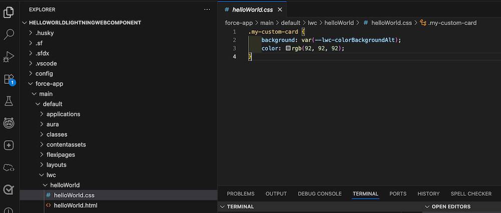
- In VS Code Explorer, navigate to and open the
helloWorld.cssandhelloWorld.htmlfiles.
Use SLDS Linter to Validate Your Component Code
Now that you have your project’s component folder open, take a look at your code. It contains multiple SLDS components. Double-check that those components are SLDS 2 and dark mode-ready.
HTML:
<template>
  <div class="my-custom-card slds-p-around--medium">
    <p>Hello, {greeting}!</p>
    <!-- Base Components ship with SLDS 2 support -->
    <lightning-input label="Name" value={greeting} onchange={changeHandler}></lightning-input>
  </div>
</template>
CSS:
.my-custom-card {
    background: var(--lwc-colorBackgroundAlt);
    color: rgb(92, 92, 92);
} |
|---|
SLDS Linter helps developers verify that code complies with SLDS 2 standards and best practices, including dark mode styling. This proactive issue identification is crucial for future dark mode features, to aim for 100% design consistency, and to meet WCAG color contrast guidelines. SLDS Linter helps you maintain a consistent, accessible, high-quality user experience for your dark mode-ready components.
Run SLDS Linter
To identify code issues with your components, run SLDS Linter on your project. In VS Code, in your project root directory, follow these steps.
- Open Terminal.
- To run SLDS Linter on your
helloWorldcomponent folder, run this command:
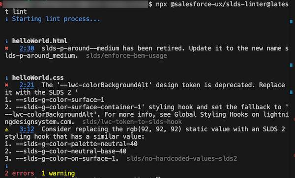
npx @salesforce-ux/slds-linter@latest lint
- If you’re asked to install packages, type
y.
Review the linting output that’s displayed in the console. Notice how it includes the row and column numbers. And notice how the helloWorld component shows two violations, one in the CSS file and one in the HTML file. No worries—you can fix that.
Uplift a Custom Component to SLDS 2
To fix the errors that you identified with SLDS Linter, you have two options.
- Apply automatic fixes suggested by SLDS Linter.
- Manually fix your code.
First, see what can be fixed automatically by using the --fix argument. This command fixes HTML and CSS files in your project folder. Next, fix a couple of bugs manually.
Complete these steps in your open Terminal:
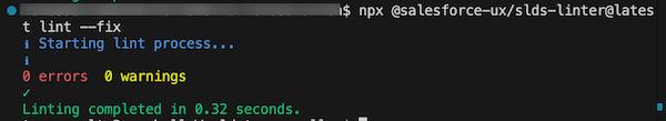
- Run
npx @salesforce-ux/slds-linter@latest lint --fix
- View the output.
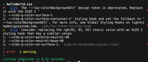
Fantastic, you just fixed the HTML file. Notice that the remaining issues have recommendations in the output.
- Review your CSS file code and determine how to update it. If you need help, review this code, then copy and paste this SLDS 2 and dark-mode-compliant code into your CSS file:
.my-custom-card {
    background: var(--slds-g-color-surface-container-1, var(--lwc-colorBackgroundAlt));
    color: var(--slds-g-color-on-surface-1);
}
So why is this updated code SLDS 2 and dark mode compliant?
- The global styling hook pulls the corresponding light or dark value for the background color instead of static value provided by the
--lwc-colorBackgroundAltstyling hook.
- The text color correctly contrasts with the background color.
- Save your changes.
- Rerun SLDS Linter to re-validate your code.
npx @salesforce-ux/slds-linter@latest lint
Wow! No violations. You uplifted the component to SLDS 2 standards, fantastic.
Deploy Your Edited Code to Your Org
Now that you validated your custom components using SLDS Linter, you're ready to deploy your edited code to your Salesforce org.
In VS Code, complete these steps.
- Right click on the
/force-app/main/default/lwcfolder.
- Select SFDX: Deploy this Source to Org.
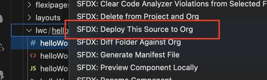
- Wait for the deployment to complete.
- In your web browser with your org and the Hello, World! app open, refresh the page to see your updates.
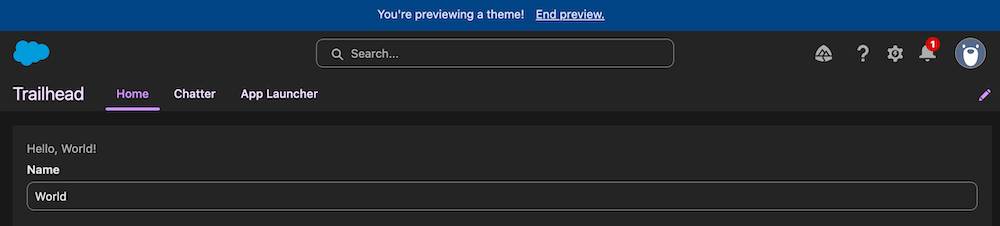
Well, check that out. Your Hello, World! App now displays correctly in dark mode: the background is dark, and the font is light. Well done!
Activate Your Custom Theme and Dark Mode
You previewed dark mode and fixed a bug. You’re happy with what you see. You’re ready to activate the dark mode option for all your users. After dark mode is activated, each user can decide whether to turn it on or off in their personal view.
Follow these steps in your special Developer Edition org in Themes and Branding to activate dark mode.
- If you don’t have your custom theme (My Theme) open yet, from the dropdown next to My Theme, select Edit.
- Click Activate.
Congrats! You activated your custom theme and you activated dark mode at the org level for your users.
Turn Dark Mode On
Now that dark mode is activated at the org level, see how your users can enable it—or turn it on—for themselves. Yes, from Trish in Accounting to Pedro in Sales to Salome in Engineering, anyone can turn dark mode on and off. It’s super simple.
You enabled dark mode earlier in this module as one of the steps to preview your new theme. Here are the steps for your users to turn on dark mode. To try them out in your special Developer Edition org, from the App Picker, select the Trailhead app.
- Click your avatar to view your profile.
- In Color Mode (Beta), click dark.
That's it! Dark mode is now turned on in your personal org view. To turn off dark mode, if your computer's system setting is set to Light mode, simply repeat these steps and select Light or System. Keep in mind that if you switch from an SLDS 2 theme to an SLDS 1 theme, dark mode is automatically deactivated.
Wrap It Up

You’ve come a long way! You:
- Explored how dark mode integrates with custom components in Salesforce.
- Worked through the recommended dark mode development flow.
- Used powerful SLDS 2 styling hooks.
- Validated your code with SLDS Linter.
- Activated and enabled dark mode in your org.
By using these ideas, your custom solutions look great and provide a simple and consistent experience for all users, no matter what color mode they choose. Keep experimenting, and enjoy the power of adaptable design!
Now, make sure you complete all the steps in this unit in your special Developer Edition org, and then click Check Challenge to Earn 500 Points.
Resources
- Salesforce Developer Documentation: SLDS Linter
- Salesforce Lightning Design System 2: Styling Hooks
- Salesforce Lightning Design System 2: Global Styling Hooks
- Salesforce Lightning Design System 2: Transition to SLDS 2
- Developer Site: Salesforce DX Developer Guide
- Developer Site: Install Visual Studio Code
- Trailhead: Quick Start: Visual Studio Code for Salesforce Development