Restructure Page Layouts
Learning Objectives
After completing this unit, you’ll be able to:
- Choose a page template that optimizes navigation for keyboard users.
- Customize record pages to prioritize essential information.
Challenge: Ditch the Mouse
Before you learn how to fix common accessibility mistakes in a Salesforce environment, here is an optional challenge for learners who typically use a mouse or trackpad to navigate the web. To better understand the experience of a keyboard-only user, it helps to walk a mile–or rather, tab a mile–in their shoes. With that in mind, challenge yourself to use only your keyboard to complete this unit. Going forward, you could challenge yourself to practice Mouseless Mondays.
How to Navigate with a Keyboard
Here are some quick tips on keyboard navigation. Check out this article on keyboard shortcuts specific to Salesforce navigation.
-
Tab: Moves focus to the next interactive element (such as a link, button, or form field).
-
Shift+Tab: Moves focus backward to the previous element.
-
Enter (or Return): Activates a link or button.
-
Spacebar: Checks or unchecks a checkbox, and can also activate buttons.
-
Arrow keys: Use these to scroll through text or navigate within certain components such as radio buttons or dropdown menus.
-
Escape: Close or dismiss page elements like popups, modals, or dropdown menus.
Ready? Hands off the mouse. Let’s go!
Sign Up for This free Developer Edition Org with Special Configurations
To complete this module, you need a special Developer Edition org that contains our sample data and configurations. Get this free Developer Edition and connect it to Trailhead now so you can complete the challenges in this module. Note that this Developer Edition is designed to work with the challenges in this badge, and may not work for other badges. Always check that you’re using the Trailhead Playground or special Developer Edition org recommended for each badge.
- Sign up for this free Developer Edition org with special configurations.
- Fill out the form:
- For Email, enter an active email address.
- For Username, enter a username that looks like an email address and is unique, but it doesn't need to be a valid email account (for example, yourname@example.com).
- For Email, enter an active email address.
- After you fill out the form, select Sign me up. A confirmation message appears.
- When you receive the activation email (this might take a few minutes), open it and select Verify Account.
- Complete your registration by setting your password and challenge question. Tip: Save your username, password, and login URL in a secure place—such as a password manager—for easy access later.
- You are logged in to your Developer Edition.
Now connect your new Developer Edition org to Trailhead.
- Make sure you're logged in to your Trailhead account.
- In the Challenge section at the bottom of this page, select the org name and then select Connect Org.
- On the login screen, enter the username and password for the Developer Edition you just set up.
- On the Allow Access? screen, select Allow.
- On the Want to connect this org for hands-on challenges? screen, select Yes! Save it. You are redirected back to the challenge page and ready to use your new Developer Edition to earn this badge.

Structural Choices and Accessibility
For this badge, you assume the role of a Salesforce admin tasked with fixing some accessibility mistakes identified in page layouts and screen flows. First, you focus on structural choices in a page layout and how those choices can impact accessibility and the overall user experience.
Consider where the main information on a page resides. Is it immediately available, or is it buried? For a keyboard or screen reader user, noise, such as excessive links, redundant components, or disorganized sections, can be a major blocker. The more there is at the beginning of a page, the longer it takes to navigate to the content that matters. Your goal is to streamline this path, ensuring that users can access critical information without excessive obstacles.
It’s worth noting that user preferences vary. As an admin, it’s best to work directly with your users to determine the most effective layout for their needs.
Navigating the Noise with the Blind Institute of Technology
You work in the special Developer Edition org you created earlier where we’ve built some examples of common accessibility mistakes. Before you learn how to fix these issues, Brando from the Blind Institute of Technology (BIT) will show us a badly designed contact page and explain how it presents a poor user experience for some users.
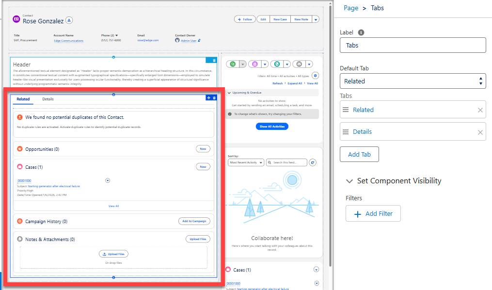
As Brando demonstrates, the current page layout presents a significant challenge for keyboard users. To reach the desired content (the Details tab in this case), a user must first tab through a cluttered main content area, including the left sidebar column and the Related tab. Even when using headings to skim the page highlights, screen reader users encounter a lot of auditory clutter before the Details section.
The elements in the left sidebar column and the Related tab both appear under the same heading as the Details tab but are positioned before it in the flow of the content. This navigation path includes many less-critical elements that force user interaction before they can reach the most important information on the record.
Update the Page Template
The template you choose for a page impacts keyboard navigation. Currently, the contact page uses the Header and Left Sidebar template, which places the sidebar content before the main content in the tab order. Because the main content is in the right column, users must tab through the entire sidebar to reach it. By flipping the template to move that sidebar content to the right, you can clear the path, making it much easier for keyboard users to get to the Details tab.
Hands-on challenge note: In order to pass the challenge for this unit, you must complete the steps outlined in the badge content.
- Select
 to open the App Launcher.
- Select Service, then select the Contacts tab.
- Open the Rose Gonzales contact record.
- Select
 , then Edit Page.
- On the Page menu in the Properties section (right panel), select the Change button next to Template.
- Select Header and Right Sidebar, then select Next.
- On the Map template regions page, leave the default selections and select Done.
- Select Save to save the updates to the contact page.
Add and Rearrange Tabs
How you arrange tabs on a record page also impacts navigation. In our example, the Related tab appears first, which requires extra clicks or tabs to reach the main Details tab. In this section, you change the default tab to Details to prioritize that information. You also add a new Marketing tab to house specialized data, keeping the main view uncluttered.
- If needed, reopen the Contact Record Page in the Lightning App Builder.
- Select the existing Tabs component in the main region.
- Change the Default Tab to Details.
- In the tabs list, reorder so that the Details tab is first.
- Select Add Tab.
- Select the newly added tab to change the label.
- For Tab Label, select Custom at the top of the list.
- For Custom Label, enter
Marketing.
- Select Done to save the new tab label.
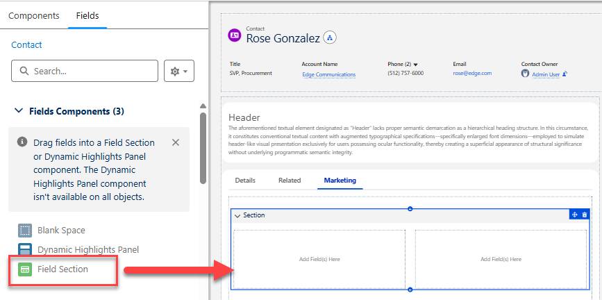
- In the center column, select the new Marketing tab.
- Then, from the left column select the Fields tab.
- Add the Field Section component underneath the Marketing tab.
- Leave default component settings as is.
- Select Save to save the updates to the contact page.
- If you get a warning about missing required fields, select Save to ignore–we’ll add fields to the new tab in a later unit.
Great work! You’ve significantly improved the accessibility of your contact pages with a few simple updates to the template and tab structure. Open a contact record and try navigating with your keyboard again to see the difference. Notice how much faster and smoother the path to the Details tab is? By removing structural barriers, you’ve made the experience more efficient for users.
Resources
- Salesforce Help: Keyboard Shortcuts
- Salesforce Help: Create and Configure Lightning Experience Record Pages
- Salesforce Help: Keyboard Navigation and Shortcuts in the Lightning App Builder
- Salesforce Help: Navigate Lightning Experience Pages with a Screen Reader
- Salesforce Help: Lightning Experience Tips for Screen Readers