Create Accessible Images and Graphic Elements
Learning Objectives
After completing this unit, you’ll be able to:
- Identify harmful or problematic elements to avoid in your images.
- Understand how to create descriptive and helpful alt-text for your images.
- Format tables correctly for screen readers.
Images are a vital part of online and digital content, but not all users can access them in the same ways. How can you use images and other visual elements like tables, charts, and graphs to reinforce and highlight your message, while making sure that all users are able to take away the same meaning from them? Additionally, what are the cultural considerations you need to be aware of when choosing photography and illustrations?
This unit gives you a better understanding of how to make your graphic elements inclusive and accessible to everyone, regardless of their abilities or the devices they use.
Format Graphic Elements Correctly
When using graphic elements like photos, illustrations, charts, and graphs, you’re no doubt seeking to add additional context and clarity to your written message. It’s important to make sure that additional context is available for all users, no matter their level of ability or what device they are using to access the images. The most basic way to do this is to format these elements correctly so that screen readers can make sense of them.
Consideration for Images
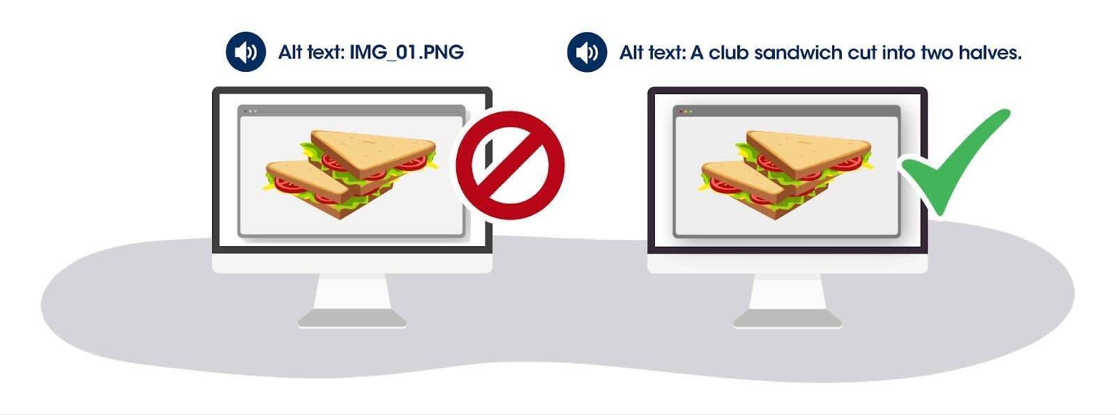
Use alt text. Alt text is a short description of an image that’s displayed if the image can’t be displayed.
- Alt text should be brief, usually no more than a few words.
- Alt text should also be written in sentence case—the first letter of the first word is capitalized, the rest are lowercase.
- Only use alt text if the image adds to the content in a meaningful way. If the image is purely decorative, use an empty alt attribute (alt="").
- Avoid using the same alt text for multiple images. Each alt text attribute should be unique and describe a specific image. Also, avoid using words like “image” or “photo.”
Use captions. Captions help people understand the content of your images and provide context for people who may be unable to see them, whether they have vision issues or the image fails to load for any reason.
Use descriptive, relevant file names. This helps search engines understand what the image is about and makes it easier for people with low vision to find your images.
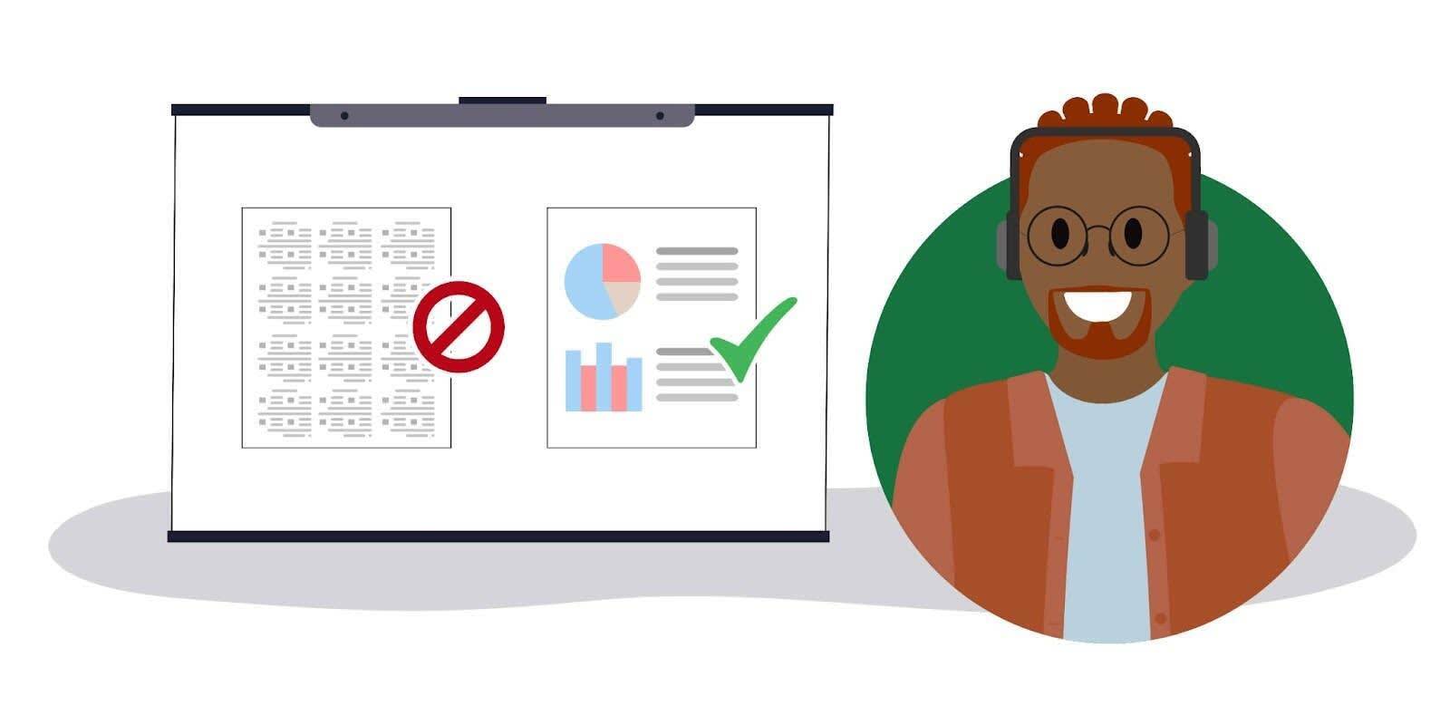
Consideration for Tables
Tables are another graphic element that must be formatted correctly to make sure everyone can access them. Here are some best practices for tables.
-
Use row and column headers. Use the <th> element to mark row and column headers. This helps screen reader users understand the structure of the table and the relationships between different cells in the table.
-
Provide a summary of the table. Use the <caption> element to provide a brief summary of the table’s content. This helps screen reader users understand the purpose of the table.
-
Use proper formatting for empty cells. Use the <td> element with an empty value (<td></td>) to mark empty cells in the table. Do not use multiple spaces or nonbreaking spaces ( ) to create empty cells.
-
Use proper text formatting. Use bold or italic text sparingly to convey meaning within the table. Do not use color to convey meaning, as this may not be accessible to some audiences.
When you’ve added these elements to your images and tables, you can check them by having a screen reader access them and then listening to what it can access and convey accurately to the end user. Reference the Resources section at the end of this unit for links to screen readers you can use.
Promote Inclusivity
Images are another way that you can promote inclusivity, helping all of your potential audience members feel represented by the photographs and illustrations you choose. Here are some techniques you can use to make your image choices more inclusive.
-
Work with a broad range of designers. When you work with graphic designers from a wide range of backgrounds and life experiences, they will naturally bring more different perspectives to their work.
-
Avoid stereotypes. Analyze your images to identify elements that reinforce harmful stereotypes or that depict people in a way that is degrading or demeaning. Ensure your images depict the subjects as individuals, rather than focusing on their disability as the most important aspect of their identity.
-
Expand your image sources. If using stock, subscribe to and search from a range of stock image sites. Take the time to find images from a variety of sources. Disability:IN has a section of its website devoted to Creative Commons stock photography with a disability focus.
-
Consider the context. Think about the context in which the image is being used and make sure it’s appropriate. For example, if you’re using an image of a person with a disability, make sure it’s not being used in a way that is exploitative or insensitive.
-
Keep it real. Avoid photoshopping images in ways that are deceptive or misleading.
Consider Neurodivergence
Your neurodivergent users may have special considerations in terms of images and graphics accompanying your text. Due to issues with concentration and comprehension, it’s best to keep your images simple and their meanings clear.
Here are a few tips to aid all users, including those who are neurodivergent.
-
Include good alt text. Describing your images correctly is especially important with this audience. Alt text can help neurodivergent users understand the content of your images if they have turned off images to lessen visual stimulation on the page.
-
Include captions with your images. Captions help neurodivergent users understand the content of your images and provide important context in case the meaning of the image is unclear.
-
Use simple designs. Neurodivergent users (and all users in a hurry!) benefit from a clear, simple design that is easy to understand and navigate.
-
Avoid flashing or flickering images. These can be distracting or disruptive for neurodivergent users and are not ideal for those with visual disabilities or seizure disorders related to flickering images. Access a Photosensitive Epilepsy Analysis Tool here.
-
Be sensitive to color usage. High-contrast colors and complicated color schemes can be overwhelming for some users. Aim to strike a balance between appropriate contrast for low-vision users and color palettes that are not too jarring for neurodivergent users.
-
Optimize your file sizes. Large image files can take a long time to load, which can be frustrating for neurodivergent users (and for those on slow internet connections, or just people in a rush!). Optimizing your images to an appropriate file size can improve the loading time of your website.
The best way to check if you’re doing this correctly is to have someone review your work. There are also many online tools you can use to make sure your online content—including images, tables, and graphs—is meeting current accessibility standards. Check the Resources section below for helpful links.
In the next unit, you learn best practices for creating accessible video content, and what tools are available to help you audit your videos.
Resources
- External Website: Apple’s VoiceOver Screen Reader
- External Website: Google’s TalkBack for Android Devices
- External Website: Microsoft Complete Guide to Narrator
- External Website: NVDA Free Screen Reader
- External Website: W3CEasy Checks—A First Review of Web Accessibility
- External Website: WebAIM Accessibility Checker
- External Website: Designing for Neurodivergent Audiences