Learn the Basics of Interface Builder
Learning Objectives
After completing this unit, you'll be able to:
- Use Interface Builder to build a user interface (UI).
- Preview UIs without compiling the app.
Xcode has a built-in tool called Interface Builder that you can use to create interfaces visually. In this unit, you'll learn how to navigate through Interface Builder, add elements onto the canvas, and interact with those elements in code.
Storyboards
Interface Builder opens when you select an XIB file (.xib) or a storyboard file (.storyboard) from the project navigator.
An XIB file contains the user interface for a single visual element, such as a full-screen view, a table view cell, or a custom UI control. XIBs were used more often before the introduction of storyboards. They're still a useful format in certain situations, but this lesson will focus on storyboards.
In contrast with an XIB, a storyboard file includes multiple pieces of the interface, defining the layout of one or more screens as well as defining the progression from one screen to another. As a developer, your ability to see multiple screens at the same time helps you understand the flow within your app.

Click Main.storyboard in the project navigator to open the file in Interface Builder. In the center of the screen, notice a single scene with a plain white view on an otherwise blank canvas. As you add more scenes to the storyboard, you can drag them anywhere on the canvas. To see more view controllers at the same time, use two fingers on a Multi-Touch trackpad to pinch and zoom the canvas out or to zoom in on a particular view. If you don't have a trackpad, you can use the zoom buttons near the bottom of the canvas to get the same result.
Build and run the project. The simulator displays the same white screen you saw in the storyboard. How did the app know to display this screen?
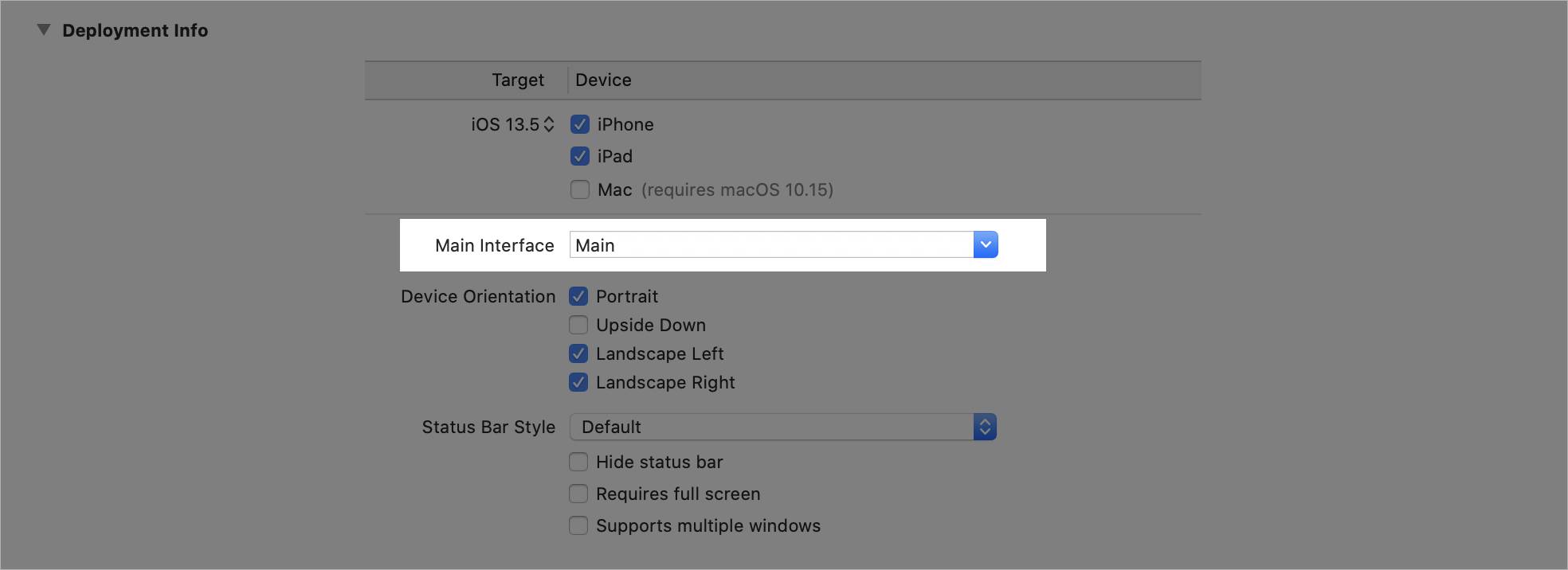
To investigate, select the top-most file (LearningXcode) in the project navigator, and find the Deployment Info section under the General header. The Main Interface field defines which storyboard file the app loads first upon launch.
Because you created the project using the Single View App template, this field is preconfigured to use Main.storyboard.
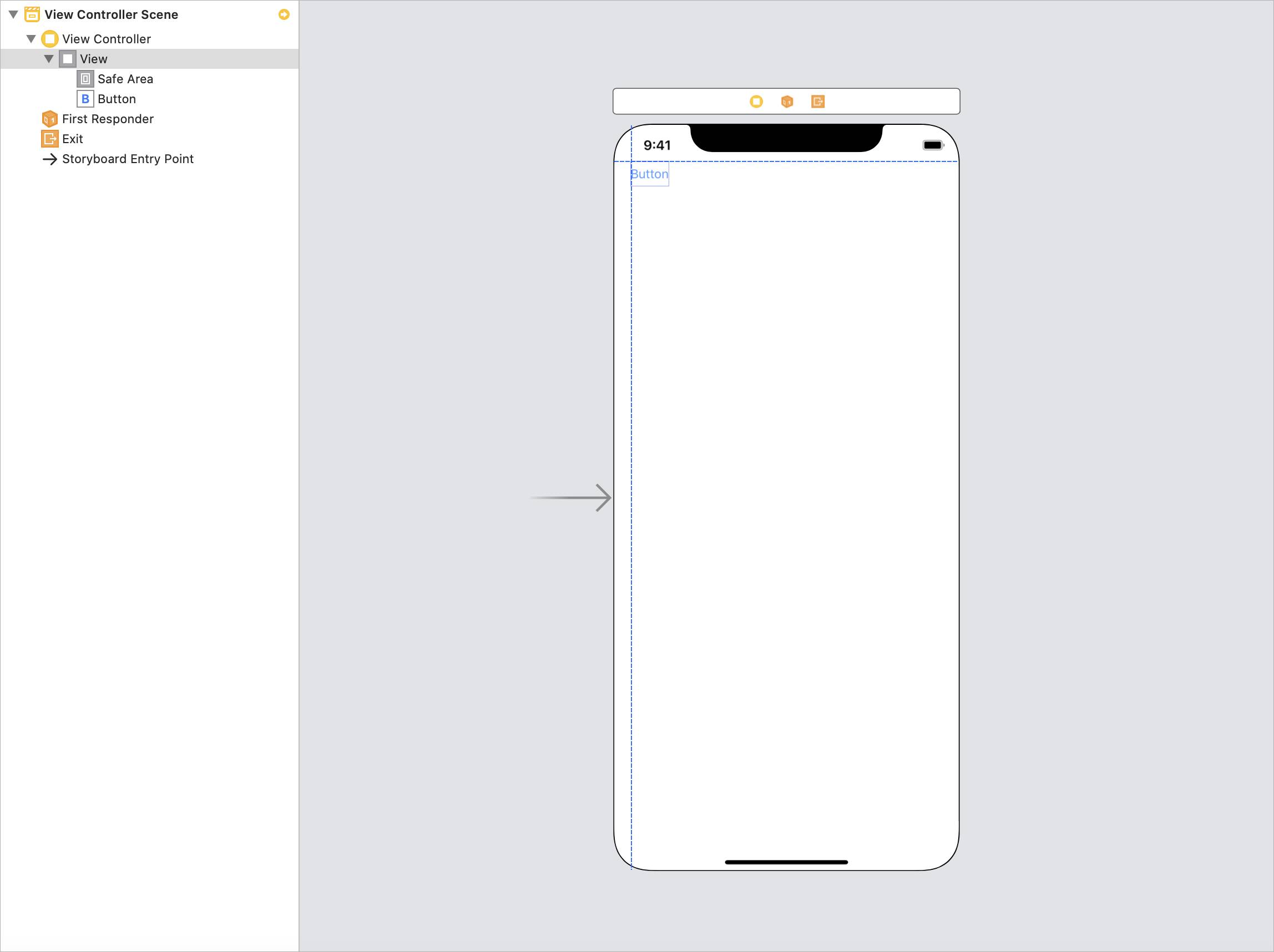
Click on the Main storyboard file in the project navigator. Notice the gray arrow to the left of the view controller.
The gray arrow indicates the initial view controller of a storyboard. The initial view controller is the first view controller that appears when the storyboard loads. A storyboard has only one initial view controller. You determine the initial view controller of a storyboard by selecting a view controller and selecting the Is Initial View Controller checkbox in the Attributes inspector.
Interface Builder Layout
To the left of the main canvas is the Document Outline view. To reveal the view, click the Show Document Outline button
 in the bottom-left corner of the canvas. The Document Outline displays a list of each view controller in the scene, along with a hierarchical list of the elements within each view controller. Click the gray triangles to the left of
each item to inspect the contents. As you might notice, clicking the view in the outline highlights the corresponding element on the canvas.
in the bottom-left corner of the canvas. The Document Outline displays a list of each view controller in the scene, along with a hierarchical list of the elements within each view controller. Click the gray triangles to the left of
each item to inspect the contents. As you might notice, clicking the view in the outline highlights the corresponding element on the canvas.

Click the Object library button
 in the toolbar above the main canvas. Use the Object library to add UI elements, such as buttons or views, to your canvas.
Drag the Button object out of the library and move it to the upper-left corner of the canvas. Try to align the button using the layout guides, which appear as blue dotted lines. The layout guides help you place content within appropriate margins and safe areas.
Release the Button to drop it into the scene. The Button object now appears in the Document Outline as well.
In the utilities area of Xcode, notice the inspectors. In addition to the File and Quick Help inspectors, which are always available, the top of the utilities area displays four context-sensitive inspectors when you're working in Interface Builder. To explore these different inspectors and how they can help you customize the objects in your view, select the button that you just added to the scene—either in the Document Outline or in the scene itself.
Use the Identity inspector
 to edit the properties that are related to an object's identity, such as its associated class. In this example, the button belongs to the
 UIButton class. If you defined a custom button class elsewhere, use the Identity inspector to change
the class of the button that you just added. You'll learn more about classes in a future lesson.
The Attributes inspector
 provides a list of adjustable visual properties for the selected item. In the case of a
 UIButton, you can change such attributes as the button's text, text color, background, and alignment. Try changing the appearance of your button.
Use the Size inspector
 to adjust the size and position of the selected element within the scene. Use the X and Y fields—where the top-left of the screen corresponds to (0,0)—to change the element's position. The X value increases as you move the element farther to the right,
and Y increases as you move down the screen. For
to adjust the size and position of the selected element within the scene. Use the X and Y fields—where the top-left of the screen corresponds to (0,0)—to change the element's position. The X value increases as you move the element farther to the right,
and Y increases as you move down the screen. For UIButton, the Size inspector includes additional fields for adjusting the padding around the button's title or image.
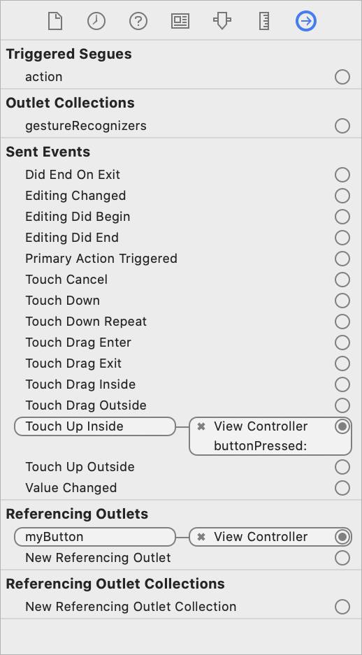
The Connections inspector
 lists all the functions and variable names related to the object. Currently, your button isn't connected to anything, so you won't see any connections. In the next section, you'll learn how to reference the button in code so that the button performs
functions when the user interacts with it.
lists all the functions and variable names related to the object. Currently, your button isn't connected to anything, so you won't see any connections. In the next section, you'll learn how to reference the button in code so that the button performs
functions when the user interacts with it.
Outlets and Actions
You often need to reference your visual elements in code so that these elements can be adjusted at runtime, or when the app is already running. This reference from Interface Builder to code is called an outlet. An action connects an event on a visual element with a function in code. Create an action when you want to respond to a user interaction, like a button press.
In the Document Outline, select the view controller, and then select the Identity inspector. The template that you chose when creating the project has set the Custom Class to ViewController. Click Adjust Editor Options  ,
then open the Assistant editor
,
then open the Assistant editor
 to see the definition of
 ViewController displayed adjacent to the storyboard (because this definition corresponds to the Custom Class field in the Identity inspector).
But the ViewController class still doesn't have access to the button that you added. To make the object accessible in code, create an outlet.
Creating an Outlet
Control-click (or right-click) the button in the storyboard, and start dragging to the Assistant editor pane, which contains the ViewController class definition. As you drag the pointer into the code, notice
a blue line.
When you release the mouse button, the Connection dialog appears with Outlet selected as the Connection type. In the Name field, enter a variable name for the button: myButton. Click the Connect button to finalize the creation of the outlet, generating a line of code that defines the outlet.
The outlet definition has multiple parts. They appear from left to right:
- Circle. The filled circle icon indicates that the outlet is connected. The circle is empty if the variable isn't connected to anything.
-
@IBOutlet. Unique to Interface Builder, this keyword specifies a relationship between the variable and a storyboard. Without the@IBOutletkeyword, the circle doesn't appear. -
weak. This keyword describes details about the relationship between theViewControllerandmyButton. You'll learn about it in a later unit. -
var myButton. This declaration creates a variable named myButton. -
: UIButton!. The type of the property is aUIButton, the button type within theUIKitframework. The exclamation point warns you that the program crashes if you try to access this property when the outlet isn't connected.
Now that you have access to the button in code, add the following line inside the viewDidLoad() function:
myButton.setTitleColor(.red, for: .normal)
This line changes the color of the button's title from blue to red. Build and run your app to see the visual change.
Notice that nothing happens when you try clicking the button. To add functionality, create an action that's connected to the button.
Creating an Action
Control-click (or right-click) the button in the storyboard again, and drag the pointer into the ViewController class definition.
When the Connection dialog appears, select Action from the Connection dropdown menu. In this example, your entry in the Name field doesn't define a variable. Instead, the Name field defines the action that is connected to the button tap
event. Name the action: buttonPressed. Click the Connect button to finalize the creation of the action.
Review the new line of code. It appears from left to right:
- Circle. The filled circle icon indicates that the action is connected. The circle is empty if the function isn't connected to anything in the storyboard.
-
@IBAction. Unique to Interface Builder, this keyword specifies a relationship between an action and an object in a storyboard. Without the@IBActionkeyword, the circle doesn't appear. -
func buttonPressed. This declaration creates a function called buttonPressed. -
(_ sender: Any). An action can be connected to a number of different objects: buttons, sliders, switches, and more. In this example,senderis the name of the object that triggers the action. Becausesendercould represent any of several user interface elements, this object is of theAnytype.
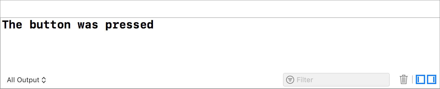
You now have a function to execute when the user taps the button. Add the following line inside the buttonPressed function:
print("The button was pressed")This code prints a message to the Xcode console when the function executes. Build and run your app, and then click the button to see the message print in the console at the bottom-right of the screen.
Back in the Document Outline, select the button again, and then select the Connections inspector in the utilities area. Now that you've connected an outlet and an action to the button, you'll see this outlet and action in the Connections inspector.
A Note About Interface Builder
Every attribute in Interface Builder represents a property that can also be configured programmatically, or in code. Interface Builder is simply a graphical user interface for configuring and setting properties on UIKit classes your app displays.
Add a label to your scene, and then look at the Attributes inspector for the label.
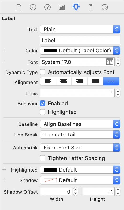
Now search for the symbols, or properties and functions, for UILabel in the Documentation Browser. Notice that each setting in Interface Builder has a companion property.
|
Interface Builder Attribute
|
Property Name
|
| Text
|
text
|
| Color
|
textColor
|
| Font
|
font
|
| Alignment
|
textAlignment
|
| Lines
|
numberOfLines
|
| Enabled
|
enabled
|
| Highlighted
|
isHighlighted
|
| Baseline
|
baselineAdjustment
|
| Line break
|
lineBreakMode
|
| Autoshrink
|
adjustsFontSizeToFitWidth
|
| Tighten letter spacing
|
allowsDefaultTightenintForTruncation
|
| Highlighted
|
highlightedTextColor
|
| Shadow
|
shadowColor
|
| Shadow offset
|
shadowOffset
|
Many objects that you can configure in Interface Builder have properties that can only be set programmatically. For example, UIScrollView has a contentSize property that does not have a matching option in the Attributes inspector.
When you need to adjust one of these settings, you can do so programmatically by setting up an IBOutlet and updating the properties using dot-notation:
scrollView.contentSize = CGSize(width: 100, height: 100)
In fact, everything that you can do in Interface Builder can also be done programmatically, including setting up all child views and adding them to the screen:
let label = UILabel(frame: CGRect(x: 16, y: 16, width: 200, height:
44))
view.addSubview(label) // Adds label as a child view to `view`
This type of setup is most commonly done in the viewDidLoad() method of a view controller, where you can access the view controller's view property before the view hierarchy appears on the screen.
While you have the option to do everything programmatically, Interface Builder can save you time when setting up complex views. As your projects become more complex, storyboards help you more easily maintain your interface setup. Additionally, Interface Builder has support for building complex views that support multiple device sizes, all in one place.
Exercise: Use Interface Builder
Overview
The objective of this exercise is to use Interface Builder and the assistant editor to create a basic view.
Part 1: Create an Xcode project
- Create a new Xcode Project named InterfaceBuilderBasics.
- Save InterfaceBuilderBasics in your project folder.
Part 2: Create a simple view with Interface Builder
- Open Interface Builder by clicking Main.storyboard in the project navigator.
- Use what you learned in the lesson to recreate the following image. You need to use a label and a button.

Part 3: Use the Assistant Editor to connect your view
- Open the assistant editor, and make sure the Assistant Editor displays the file named
ViewController.swift. Create an outlet from your label, and name the outlet:mainLabel. - Create an action from your button and name the action:
changeTitle. - Inside
changeTitle, enter:mainLabel.text = "This app rocks!". Run the app and tap the button. Notice what happens to the text.
Congratulations! You should now have a simple view with text that you can edit in code. Save your project to your project folder again.
Check the Solution if You Need It
Here is the completed Interface Builder project. You can compare it to how you built your storyboard and used the Assistant Editor.