Compare Measures Using a Scatter Plot
Learning Objectives
After completing this unit, you’ll be able to:
- Explain when to use scatter plots to visualize data.
- Customize the marks used in a view.
When Do You Use a Scatter Plot?
What if you want to compare two different measures, such as sales and profits? Well, you can use a scatter plot, which is meant for visualizing relationships between numerical variables.
Scatter plots help you:
- Easily spot trends and outliers in your data.
- Identify other patterns by groups. You can divide data points into groups based on how closely sets of points cluster together.
- Identify unexpected gaps in the data.
Know the Relationships Between Scatter Plot Variables
Relationships between variables are common with scatter plots. They can be described in several ways.
- Positive correlation
- Negative correlation
- No correlation

How Do You Create a Scatter Plot?
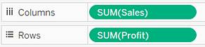
In Tableau, you create a scatter plot by placing at least one measure on the Columns shelf and at least one measure on the Rows shelf.
If these shelves contain both dimensions and measures, Tableau places the measures as the innermost fields, which means that measures are always to the right of any dimensions that you have also placed on these shelves. The word innermost in this case refers to the table structure.
Creates Simple Scatter Plot |
Creates Matrix of Scatter Plots |
|
|
A scatter plot can use several mark types. By default, Tableau uses the “shape” mark type. Depending on your data, you might want to use another mark type, such as a circle or a square. For more information about mark types, see Change the Type of Mark in the View.
Control the Appearance of Marks in the View
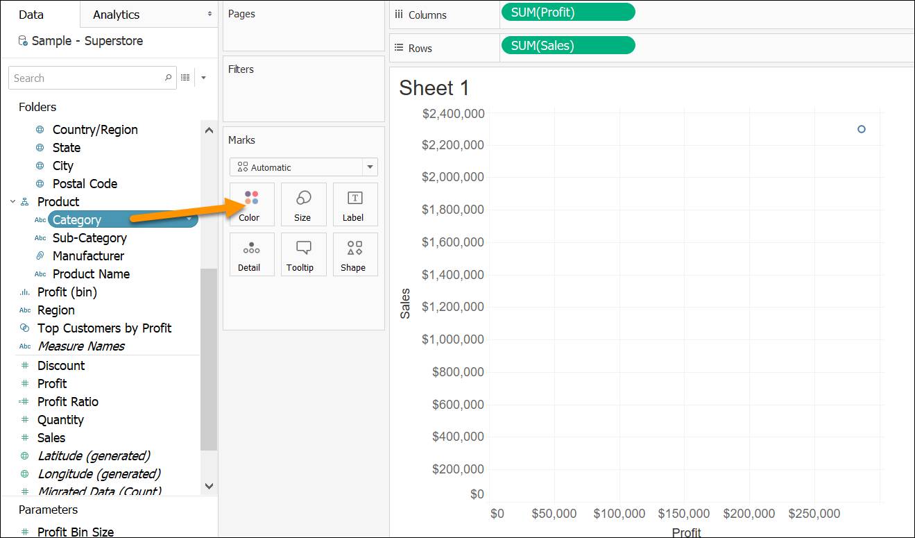
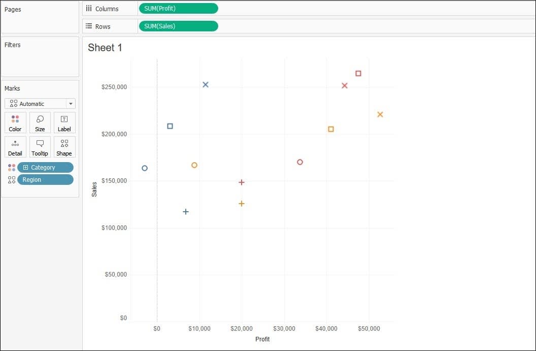
You use the Marks cards to control how they appear in your visualization. If you drag a field into Marks card, for example, drag the Category field into Color, this enables you to change the context and details of your chart.
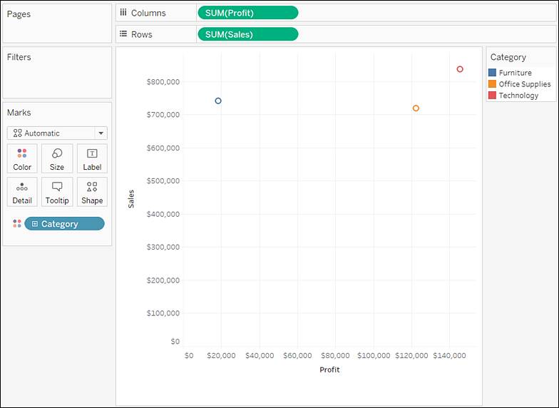
With the Marks cards, you can also control the size, shape, detail, text, and tooltips for each mark. In this example, you have marks that represent each category as they intersect sales and profits.
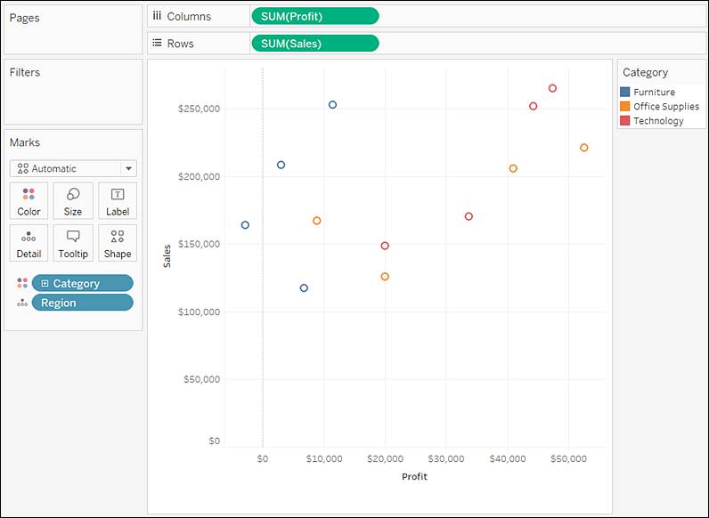
What would this look like if you compared values based on region, as well? Simply drag the Region dimension into the Detail Marks card. This gives you many more marks in the view.
Feel free to play around with marks until you get the visualization that will give your audience the clearest view of the data. You can also try dragging Region into the Shape Marks card, for example.
After you have the marks you need, you can click the marks icon next to the field to change its property. You can also click the buttons on the Marks card to change those settings.
Add Trend Lines
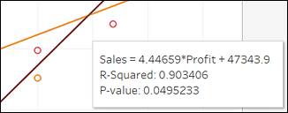
Adding trend lines to a scatter plot gives you deeper insight into the relation of your data. You do this via the Analytics tab on your sheet.
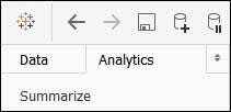
Simply drag the Trend Line model into your view.
A trend line can provide a statistical definition of the relationship between two numerical values. To add trend lines to a view, both axes must contain a field that can be interpreted as a number—by definition, that is always the case with a scatter plot.
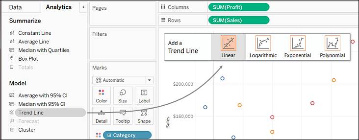
In this example, Tableau adds three linear trend lines—one for each color that is being used.
Hover the cursor over the trend lines to see statistical information about the model used to create the line.
With a line chart, bar chart, and scatter plot in your repertoire, you're closer to data rockstar-dom!
Put It All Together to Build a Scatter Plot
Now that you’ve learned how to build a few common chart types and views in Tableau, it’s time to practice for yourself.
If you’ve completed other Tableau modules in Trailhead, there’s a good chance you’re already familiar with the Trailhead Simulator.
For the best experience, view the Trailhead Simulator on a computer, not a mobile device. Trailhead Simulator is different from a Trailhead Playground. The simulator doesn’t store your progress or any data you enter. If you close your browser, you start from the beginning of the simulation again. You can always use the navigation controls at the bottom of the simulator to get back to where you left off.
![]()
| Navigation Controls |
Description |
| (1) Left Arrow |
Go backward in the simulator. |
| (2) Right Arrow |
Go forward in the simulator. |
| (3) Scrub Bar |
View your progress, plus you can use the progress arrow to quickly move to a different location within the simulator. |
| (4) Close Button |
Exit the simulator. Remember that if you close the simulator, you start from the beginning the next time you launch it. |
Also note that not everything is clickable in the simulator, just the steps that are laid out here.
When you click in the wrong spot, highlighting shows you where to click.
Now you’re ready to practice what you’ve learned and build some views in Tableau.
Build a Scatter Plot
In your analysis, you realize that the South region is showing low profits on product sales despite the sales number being high. You want to understand what might be causing this and share the data with your manager.
- Launch Trailhead Simulator.
- Click Build a Scatter Plot.
- Click Begin.
- Drag Sales to the Rows shelf.
- Now drag Profit to Columns. This creates a continuous axis for each measure on a scatter plot.
- To see more marks, click the Analysis menu and then deselect Aggregate Measures. You can clearly see an outlier at the top of the view.
- Click the outlier to see the details. Notice that despite high sales, profit is negative. You want to investigate this further.
- Let’s identify the region where the outlier is. Drag Region to Color on the Marks card.
- You can see that the outlier is in the South region. Click the outlier mark again. This still doesn’t tell you why the profit is so low. Could discounts be contributing to negative profitability?
- Drag Discount to Detail on the Marks card.
- Click on the outlier again to see the details. Notice that the discount here is 50%.
- Let’s compare the discount here to the discount on a profitable sale. Click anywhere to continue.
- We see a blue mark for the Central region on the extreme right in the view with high profitability. Click on it. Notice, the discount here is 0.
Clearly the deep discount is contributing to negative profitability in the South region, despite its high sales.
You've built a view that allows you to see correlation between measures. In the next unit, you will analyze data trends and patterns within regions.