Explore Sample Pages and Component Types
Learning Objectives
- Identify the page type and component type ID naming convention.
- Explain how page types relate to component types.
- Describe the purpose of mock attributes.
- Explain how resolved values relate to the B2C Commerce API.
- Describe how Page Designer elements are updated in cache.
Introduction
Vijay Lahiri, the Cloud Kicks developer, has installed, configured, and downloaded the files he needs to work with Page Designer. He’s uploaded code and data to the server and is ready to create a custom cartridge for Page Designer. Before he gets started, however, he wants to explore the sample Page Designer page and component types that come with SFRA.
He starts with the SFRA sample cartridges, which look like these. (The names can change per release as new features are added.)
- app_storefront_base: The page and component types' runtime files (templates, JSON, and scripts)
- bm_app_storefront_base: The page and components' design time files (for example, names, descriptions, icons, and custom attribute editors)
It's All in the Name
Vijay learns fast that it’s easy to access page types, component types, and UI controls in his code. The ID is the key!
The ID for a page type, component type, or UI control ID is a combination of the subdirectory (if any) where the meta definition file and script file are located and the file name without the extension. Use periods to separate subdirectory levels in the file name.
Vijay’s page type ID, for example, is homepage, with a meta definition file and script file located directly under cartridge/experience/pages. If the meta definition file and script file for homepage are located in a subdirectory storefront/campaigns under cartridge/experience/pages, the page type ID is storefront.campaigns.homepage.
Page Types
Page types define the overall structure of a Page Designer page. To keep things simple, Vijay starts with the sample page type that comes with SFRA: Storefront Homepage. This page has a simple layout and structure to which he can add as many components as he wants.
Component Types
Component types contain attributes that let merchandisers breathe life into a page. For example, the Carousel component type lets the merchandiser specify the number of slides that display in a carousel for each device type, such as phone, tablet, and desktop. Each slide contains a component type, where the merchandiser can specify attributes such as a graphic, text, and a link for the shopper to click. Cloud Kicks merchandisers, for example, can showcase multiple product types in a single component, dazzling the shopper with gorgeous apparel for multiple sports.
Here are some of the sample component types that Vijay can use.
- Main Banner
- Carousel
- Image and Text
- Header
- Shop Category
- Campaign banner
- Product Tile
- Product Carousel - Einstein
The components are typically in cartridges like these in the SFRA repository.
- ./cartridges/app_storefront_base/cartridge: css, js, json, and isml
- ./cartridges/bm_app_storefront_base/cartridge: css and properties
For now, Vijay works with these components.
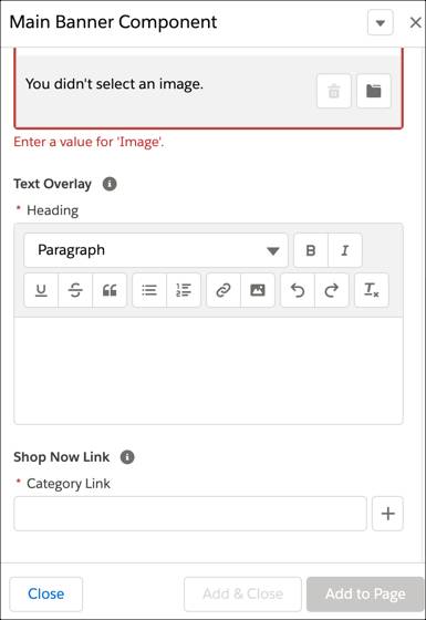
- Main Banner: Shows as a hero image with text overlay and a category picker to create the link. A hero image is a large web banner image that’s usually the first thing a shopper sees when they land on a site.
- Carousel: Shows product tiles or other components with configurable display attributes for phone, tablet, and desktop.
- Image and Text: Shows a graphic, overlay text, text beneath the graphic, and a link.
This is what the Main Banner component looks like in Page Designer.
Each page type and component type has a meta definition file and a script file. We get into more details about these files in a later unit.
Component Attributes
Component types are all about attributes. Each attribute in a component type’s meta definition file has a type assigned to it. The attribute’s type determines how the merchandiser sets its value in Page Designer. For example, an attribute of type file displays a file selection modal window that the merchandiser can use to browse the library files. An attribute of type enum displays a single select box where the merchandiser can select an allowed value. Attributes call UI controls that do things like display a data entry field or perform an action when a shopper clicks a button. If none of the standard types meet his needs, Vijay can create a custom attribute editor such as to select store locations on a map. Vijay explores how to do this in another unit.
Resolved Values
Page Designer defines the content attributes available from the context object (also known as the content dictionary) in a map, with the attribute IDs as the keys and the resolved values as values.
A resolved value is a value that was converted to a B2C Commerce API object. For example, for an attribute of type product, the value of the attribute (the product SKU) is converted to a dw.catalog.Product object instance. For some attributes, conversion isn't necessary. For example, strings can be stored as is. See the Infocenter for content attribute types and their corresponding B2C Commerce API objects.
Mock Attributes
Page Designer creates mock attributes along the way. When a merchandiser drags a component onto a Page Designer page in edit mode, a mock component placeholder displays until they configure the component attributes. Mock component placeholders are also used when they create a localized page based on another page or when a page doesn’t render because it’s missing attributes.
Page and Component Type Caching
Vijay pays close attention to how long B2C Commerce caches page types, component types, and custom UI controls in memory. It depends on whether his environment is a sandbox, development, staging, or production instance. To refresh the page types, component types, and UI controls on a production instance, or to refresh them immediately on other instances, he must perform a code version switch.
It’s a best practice that for new or existing Page Designer elements, after replicating them to a production instance, that you issue an event for a code version switch to refresh the elements immediately.
Next Steps
In this unit, Vijay learned how page types, component types, and attributes relate and about the ID naming convention. He also learned about mock attributes, resolved values, and how Page Designer elements are updated in cache. In the next unit, he explores the underlying code files that make Page Designer page and component types happen.