Create Reports and Dashboards
The Suggestion Box app you created includes a Reports tab and a Dashboards tab, where you can create, edit, and run reports and dashboards. These features make an app more useful by providing the business with valuable insights.
Create a Tabular Report
Start with a simple tabular report to show the number of suggestions received and the status of each one. A tabular report presents data in simple rows and columns, much like a spreadsheet. You can use it to show column summaries, like sum, average, maximum, and minimum.
- Click the App Launcher
 and select Suggestion Box.
- Select the Reports tab, click New Report.
- In the Search Report Types, enter
Suggestionsand choose Suggestions.
Note: If you don't see the Suggestions report type, go back to Setup and click Object Manager. Click the arrow next to Suggestion and then click Edit. Under Optional Features, check Allow Reports. Click Save. Then go back and create the report.
- Click Start Report.
Note: In the Report Builder, notice that the Suggestion Name field is already on the report. In the preview screen, you can see the sample Suggestion records you created in previous steps.
- Enter
Statusin the Add Columns search and select Status. Similarly, enterNumber of Days Openin the Columns search and select Number of Days Open.
Note: You can also drag the fields from the Fields pane into the Columns section.
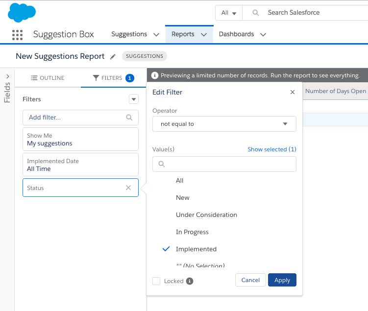
- To make sure that you’re viewing only suggestions that still need to be implemented, select Filters.
- In Add filter search, enter
Statusand select Status.
- In the Filter by Status, change operator to not equal to and change Value(s) to Implemented.
- Click Apply.
- Click Save, and name your report
Suggestions: Status of Open Suggestions.
- For Folder, click Select Folder and select Public Reports so that everyone can access it.
- Then click Select Folder again.
Note: If you don’t want this report to be accessible to everyone, create a folder and give different people different levels of access to it.
- Click Save and then Save & Run.

Create a Summary Report and a Report Chart
It’s often a good idea to give users a visual way to understand the data in your report. Tabular reports don’t include charts, so let’s copy the report and make a Summary report. Then, you can add a chart.
- From the Report Results view of the Suggestions: Status of Open Suggestions report.
- Click the dropdown by Edit and choose Save As.
- Type
Suggestions: By Statusas the report name.
- Select Public Reports folder.
- Click Save.
- Click the Edit button, then in the Groups search, enter
Statusand select Status.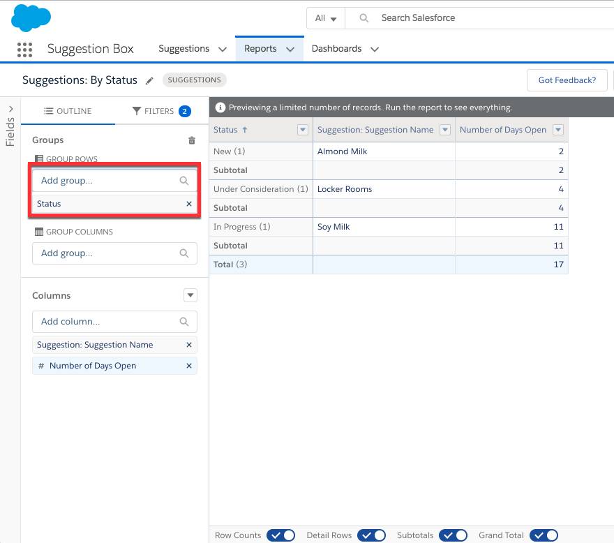
- Click Save & Run which leads to the Report Results view.
- Click the Add Chart button to add a chart to this report.
- Click the chart properties gear icon and choose Donut chart.
- In the Chart Title type
Suggestions Statusand in Value dropdown, choose Record Count.
- Click the dropdown by the Edit button and then click Save.
The donut chart displays above the report results and shows the total number of open suggestions by status.
Create a Dashboard
Dashboards in Salesforce are like a dashboard in your car, showing you important information at a glance. Dashboards can show data in charts, gauges, tables, and metrics. Dashboards are powered by reports.
- Go to the Dashboards tab and click New Dashboard.
- Type the Dashboard Name as
Suggestions Dashboardand create it on the default Private Dashboards folder.
- Click Create.
- Click the +Widget button and select Chart or Table.
- In the Report Search, look for
Suggestions: By Statusand select it. Click Select.
- Choose the donut chart and in the Value dropdown select Record Count.
- Edit the Title as
Suggestions By Status.
- Click Add.
- Click Done and then Save.

Summary
You did it! You built a simple suggestions management app, all without a single line of code. You started by creating the simple data model and the default user interface for managing suggestions. You then customized the user experience by using drag-and-drop editors. Next, you added business logic with the formula language and flow builder. Finally, you created some reports and dashboards to monitor and analyze your business data. You can continue your journey and dive deeper by following the links in the Resources sections of this project.
Resources