Create a Child Component and Interact with It
Our code base has grown in the previous steps. Let’s now take a minute to refactor our bear list component into several smaller components. We are going to move the code of bear tiles into a new component.
Create the Bear Tile Component
- In VS Code, right-click the
lwcfolder and click SFDX: Create Lightning Web Component. - Name the component
bearTile. - Open
bearList.htmland cut all the code between<!-- Start bear tile -->and<!-- End bear tile -->. - Paste the code within the
templatetags ofbearTile.html. Once you’re done,bearTile.htmlshould look like this.<template> <lightning-card title={bear.Name} class="bear-tile"> <div class="slds-var-p-horizontal_small"> <div class="slds-media"> <div class="slds-media__figure"> <img src={appResources.bearSilhouette} alt="Bear profile" class="bear-silhouette"/> </div> <div class="slds-media__body"> <p class="slds-var-m-bottom_xx-small">{bear.Sex__c}</p> <p class="slds-var-m-bottom_xx-small">{bear.Age__c} years old</p> <p class="slds-var-m-bottom_xx-small">{bear.Height__c} cm</p> <p class="slds-var-m-bottom_xx-small">{bear.Weight__c} Kg</p> </div> </div> </div> </lightning-card> </template> - Replace the contents of
bearTile.jswith:import { LightningElement, api } from 'lwc'; import ursusResources from '@salesforce/resourceUrl/ursus_park'; export default class BearTile extends LightningElement { @api bear; appResources = { bearSilhouette: `${ursusResources}/standing-bear-silhouette.png`, }; }We added abearproperty decorated with@api. This exposes thebearproperty to any parent component. - Delete
bearList.css. - Create a new
bearTile.cssfile in thebearTiledirectory and paste the following code into the file.:host { --sds-c-card-color-background: linear-gradient(180deg, rgba(255,255,255,1) 80%, #fae8d2 100%); } .bear-tile { display: block; border: 1px solid #d2955d; border-radius: .25rem; background-color: #fae8d2; } .bear-silhouette { height: 100px; } - Open
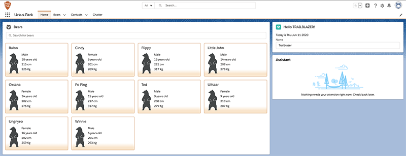
bearList.htmland replace the content between the<!-- Start bear tile -->and<!-- End bear tile -->comments with<c-bear-tile bear={bear}></c-bear-tile>. Once you are done,bearList.htmlshould look like this.<template> <lightning-card title="Bears" icon-name="utility:animal_and_nature"> <div class="slds-card__body slds-card__body_inner"> <!-- Start bear list --> <template if:true={bears.data}> <lightning-input type="search" onchange={handleSearchTermChange} variant="label-hidden" class="slds-var-m-bottom_small" label="Search" placeholder="Search for bears" value={searchTerm}> </lightning-input> <lightning-layout multiple-rows="true" pull-to-boundary="small"> <template for:each={bears.data} for:item="bear"> <lightning-layout-item key={bear.Id} size="3" class="slds-var-p-around_x-small"> <c-bear-tile bear={bear}></c-bear-tile> </lightning-layout-item> </template> </lightning-layout> <!-- No bears found --> <template if:false={hasResults}> <div class="slds-align_absolute-center slds-var-m-vertical_small"> This is beary disturbing, we did not find results... </div> </template> </template> <!-- End bear list --> <!-- Data failed to load --> <template if:true={bears.error}> <div class="slds-text-color_error"> An error occurred while loading the bear list </div> </template> </div> </lightning-card> </template>This references our bear tile component with thebearattribute that we defined in the previous steps. Notice that our component folder and files are namedbearTile, but the tag we added isc-bear-tile. The startingcrepresents the default namespace, appended with the name of the component in lowercase, with dashes separating what use to be capital letters. - Deploy the updated code to the org and test your new list component. It should look better with a subtle gradient.
Interact with the Bear List Component
Rangers are requesting the ability to quickly look at a bear record and edit it without having to navigate away from the homepage. Let's make bear tiles clickable and open an editable bear record form.
- Edit
bearTile.htmland add the following code after the<lightning-card title={bear.Name} class="bear-tile">tag.<div slot="actions"> <lightning-button-icon icon-name="utility:search" icon-class="bear-tile-button" variant="bare" alternative-text="Open record" onclick={handleOpenRecordClick}> </lightning-button-icon> </div>We added an edit button that fires thehandleOpenRecordClickfunction. The button is placed on the lightning card using theactionsslot. A slot is a placeholder for markup that a parent component passes into a component’s body. - Edit
bearTile.jsand add the following function before the last closing bracket.handleOpenRecordClick() { const selectEvent = new CustomEvent('bearview', { detail: this.bear.Id }); this.dispatchEvent(selectEvent); }Code highlights:- The
handleOpenRecordClickfunction is called when a user clicks on the open record button of a bear tile. - The function creates and fires a custom
bearviewevent that holds the bear record id.
- The
- Edit
bearList.htmland add anonbearview={handleBearView}attribute to thec-bear-tiletag. This allows us to capture thebearviewevent that is fired by the tile component. The event is handled in ahandleBearViewfunction.
<c-bear-tile bear={bear} onbearview={handleBearView}></c-bear-tile> - Replace the contents of
bearList.jswith:import { NavigationMixin } from 'lightning/navigation'; import { LightningElement, wire } from 'lwc'; /** BearController.searchBears(searchTerm) Apex method */ import searchBears from '@salesforce/apex/BearController.searchBears'; export default class BearList extends NavigationMixin(LightningElement) { searchTerm = ''; @wire(searchBears, {searchTerm: '$searchTerm'}) bears; handleSearchTermChange(event) { // Debouncing this method: do not update the reactive property as // long as this function is being called within a delay of 300 ms. // This is to avoid a very large number of Apex method calls. window.clearTimeout(this.delayTimeout); const searchTerm = event.target.value; // eslint-disable-next-line @lwc/lwc/no-async-operation this.delayTimeout = setTimeout(() => { this.searchTerm = searchTerm; }, 300); } get hasResults() { return (this.bears.data.length > 0); } handleBearView(event) { // Get bear record id from bearview event const bearId = event.detail; // Navigate to bear record page this[NavigationMixin.Navigate]({ type: 'standard__recordPage', attributes: { recordId: bearId, objectApiName: 'Bear__c', actionName: 'view', }, }); } }Code highlights:- We import a navigation mixin that bundles utility functions dealing with navigation. A mixin lets us add functionality to a class without extending it. This is useful when a class already extends a parent class (a class can only extend a single parent).
- Our class extends the navigation mixin applied to the
LightningElementbase class. - We handle the
bearviewevent in thehandleBearViewfunction. We extract the bear record id from the event detail and we use the navigation mixin to navigate to a bear record page.
- Deploy the updated code to the org and test that you can navigate to a bear record with the button icon on a tile.
That’s it for this step. We’ve refactored our component into two smaller components: the bear list and a bear tile. We’ve explored how to communicate from the parent list component to the child tile component with an @api decorator. We also saw how to communicate from a child to a parent with a custom event.
In the next step, we see how to interact with other components in a Lightning page.