Use Bindings to Compare Data
Interactions to the Rescue
The director wants a way to quickly compare each team members’ fundraising results against the average. That way, we can get an idea of where to focus resources. The way to do that: Draw a line representing team average in the chart that shows every member’s fundraising total. Then you can see right away who’s above the line and who’s below.
But how do you set the line to a calculated average? The answer: Interactions!
Hello, Interactions!
Remember algebraic equations, like y = 2x + 1? The output variable (y) varies based on the input variable (x). Well an interaction works the same way—an interaction has an input and output. Based on the interaction, you can use a query to determine an output, which can either be another query’s results or the setting for a widget property.
The value provided by the query is based on the interaction type. There are two types of interaction: selection and result.
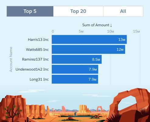
- Selection interactions returns the selections in the query to the output component. Selections are interaction-driven, where the result is evaluated each time the user makes a selection in the dashboard. For example, when a user selects the Top 5 toggle, a chart shows the top 5 accounts.
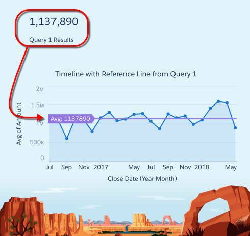
- Result interactions uses the result of the query to update the output component. For instance, think of a chart that displays an average reference line based on a calculation from another query.
Compare Account Owners Against the Average
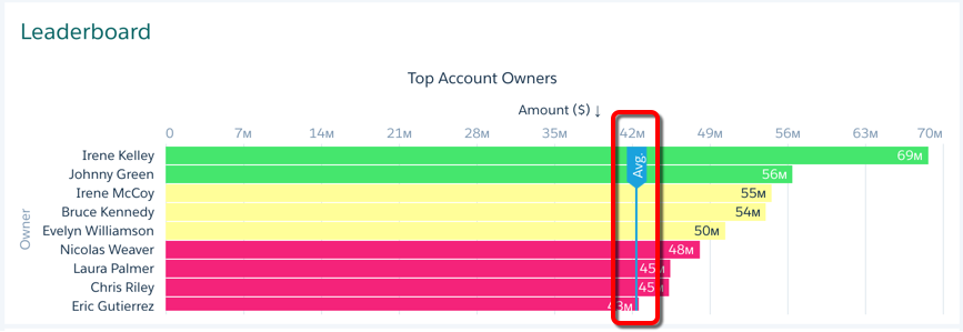
The Top Account Owners chart shows large differences in total opportunity amount per account owner. To determine how each account owner compares against the team’s average, let’s add a reference line that represents the average. It just so happens that the Account Owner Avg number widget, found on the left column of the dashboard, already calculates the average. So let’s share the results between widgets! 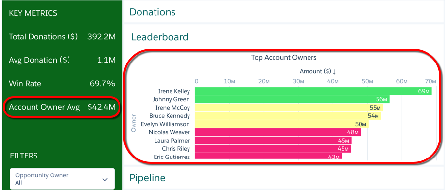
To show the average as a reference line on the chart, we have to bind the query results from the Account Owner Avg widget to the Top Account Owners chart. But before we can add the interaction, we need to know the expected JSON first. Interactions require you to modify the dashboard JSON.
Determine the Expected JSON Structure
Let’s start by creating a reference line with a fixed value. Later, we can replace the fixed value with a dynamic one—the interaction.
- Open the Leaderboard page.
- Select the Top Account Owners chart widget.
- Add a reference line based on a fixed value, 30 million. Set label to Avg.. In the X-Axis (Top) section of the widget properties, click + Reference Line, and add a reference line with the following settings:
Widget Property
Value
Value
30000000Label
Avg. -
 Save the dashboard.
The chart now shows the reference line at the designated value.
Replace the Fixed Value with the Result Interaction
To dynamically set the reference line based on the account owner’s average, use a result interaction to replace the hardcoded value with the calculated average in the Account Owner Avg widget.
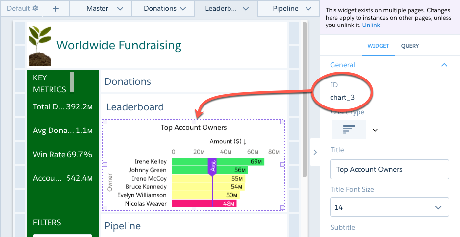
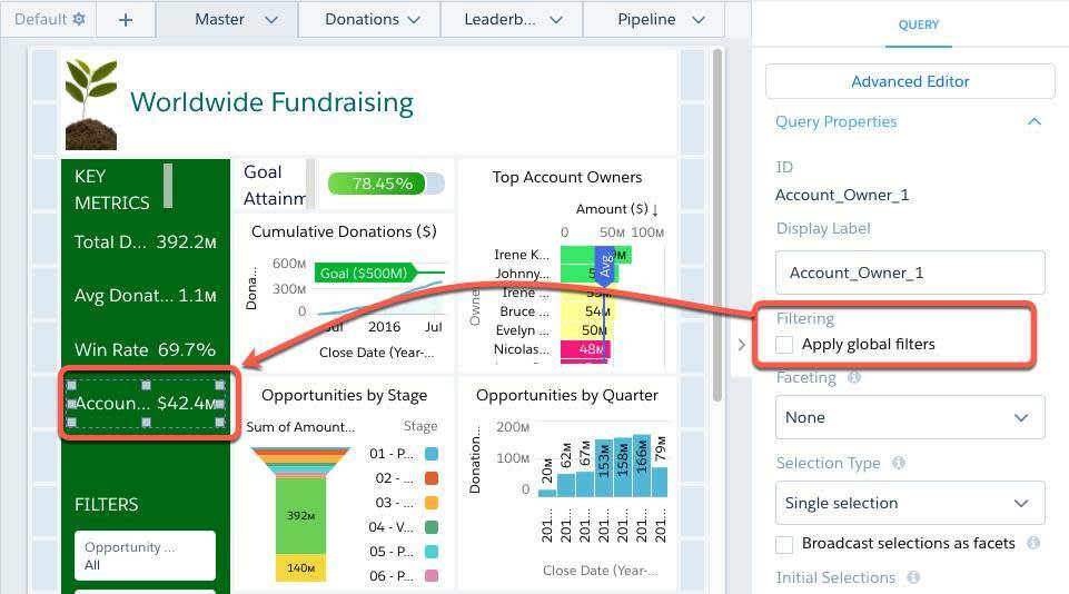
- Find the ID of the query, the one associated with the Account Owner Avg widget.
- Select the Account Owner Avg widget under KEY METRICS.
- Click the Query tab in the right pane.
- Take note of the ID at the top of the right pane. In this case, it’s Account_Owner_1. We need to reference this input by its ID in the interaction.
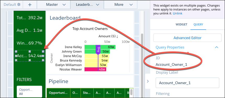
- Select the Top Account Owners widget and take note of the widget ID. We need the widget ID to locate the widget in the dashboard JSON. We’ll add the interaction to the reference line defined in this widget’s properties in the dashboard JSON. In this example, the widget ID is chart_3.
- To view the dashboard JSON, press Ctrl+e for Windows or Cmd+e for Mac.
- Search the JSON for 30000000. To open the search bar, press Ctrl+f for Windows or Cmd+f for Mac.
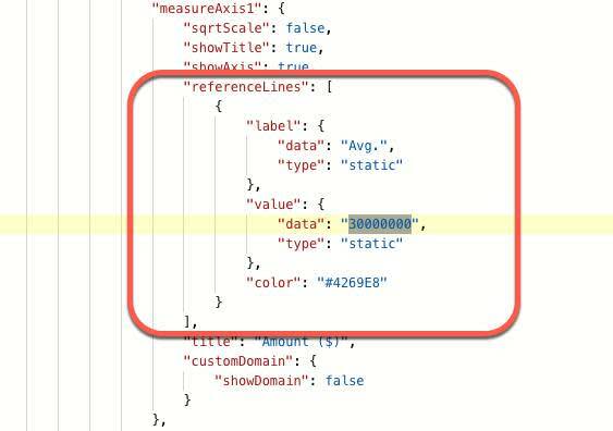 If scroll up, you’ll see that this value is set for the widget with ID chart_3—this is the Top Account Owners widget.
- Replace 30000000 with the following interaction.
"{{cell(Account_Owner_1.result, 0, \"C\").asString()}}"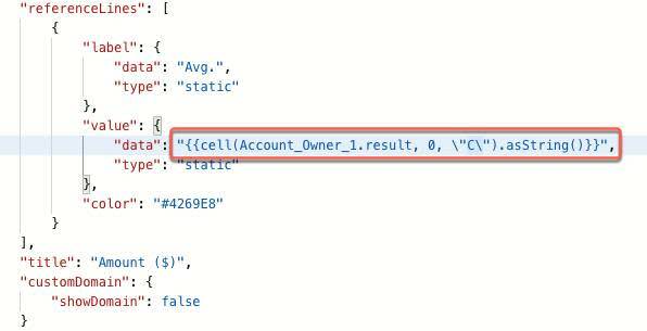
Let’s review this interaction for a moment, shall we? As you may already have figured out, this interaction returns the average total opportunity amount per account owner from the Account Owner Avg widget.
- result specifies that this is a result (as opposed to a selection).
- cell(Account_Owner_1.result, 0, \"C\") returns the result from the Account_Owner_1 query. Specifically, the cell data selection function returns a single cell of data, located at row 1 (row with index 0), column C from the query results. Note: To preview a cell’s value, view the query’s results in tabular form in the query editor. Looking at the results of the Account_Owner_1 query, you can see the value of the cell at row 0, column C—this value is the account owner’s average.
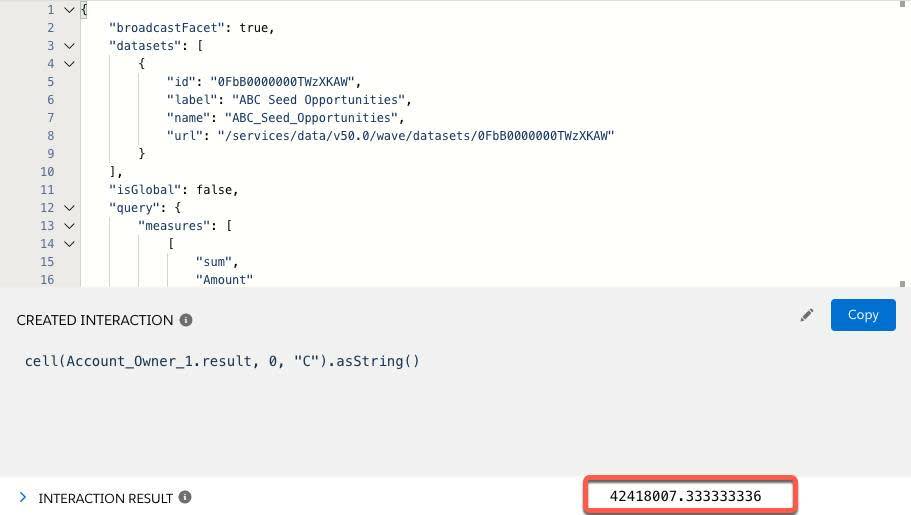
- Press Cmd+e or Ctrl+e to view the update in the dashboard. In the Leaderboard page, notice that the Avg reference line in the Top Account Owners widget moved from $30 million to around $42 million.
- To ensure the average doesn’t change when users make selections in global filters or widgets that cause faceting, select the Account Owner Avg widget, select the Query tab in the right pane, and verify that the Apply global filters query property is deselected.
- Save the dashboard, but this time, rename it to Worldwide Fundraising Final.
Wrap Up
At the next monthly All Hands, the program director shared the new version of the Worldwide Fundraising dashboard with ABC Seeds team. The director clicked through the dynamic pages that you added, showing off each page’s insights. While showing the Leaderboard, she congratulated the top account owners for generating a healthy donation pipeline—Irene and Johnny clearly standing out. As soon as the director opened the Donations page, the room immediately cheered. The $500 million goal is within reach. Time for ABC Seeds to determine which new schools to fund next!
When you can get these reactions within seconds of opening a dashboard, you know you’ve built an effective solution that’s easy to read. Congratulations to you, too! Stand up and take a bow (or that much needed stretch). We hope to see you back on the CRM Analytics trail soon!
Resources
- Video: Make Analytics Dashboards Interactive
- Help: Get Started with Dashboard Interactions
- Help: Interaction Functions
- Interactive App (with interaction examples): Analytics Learning Adventure App