Explore Insights on the Go
Learning Objectives
The Exploration Goal: Find the Big Deals That Are Still Open
You just jumped in a taxi to go to the airport for a business trip, and you don’t want to wait until you come back to the office to help your sales team close the big deals. You open Analytics on your iPhone, looking for insights. You want to search for promising industries that your reps should focus on to sell laptops. You have a question in mind: Which industry has the most open laptop deals?
The Mobile Exploration Interface
- Tap the My DTC Sales app to view its assets.
- Tap the Datasets tab.

- To start exploring opportunities, tap DTC Opportunity.
The initial exploration state is similar on mobile and desktop: A blue bar represents the count of rows without any grouping or filtering applied. - In the lower part of the screen, notice the tools and actions drawer.
 These are the tools you’ll need to explore data, and create and use lenses.
- Data—Add measures and groupings
- Filter—Focus the lens
- View—Change the visualization
- Actions—Save and share
- Tap Data to open the drawer with the build tools.
Notice that the drawer has three positions, closed, open to half screen, and full screen. Try sliding the drawer up and down to get comfortable with the different positions.
Now back to exploring your data. If you’re not already there, open the drawer to its half screen position. Here’s where you add the measures and groups you want for your chart. Notice that Count of Rows is already listed as the measure for Columns. In the next section, you’ll start shaping your query and building your lens. 
Group Opportunities by Industry
- If you’re not there already, tap Data to access the build tools.
- Tap the + sign next to Group By. You can scroll the list to search through your dimensions, or type in the search box.
- Select Industry.
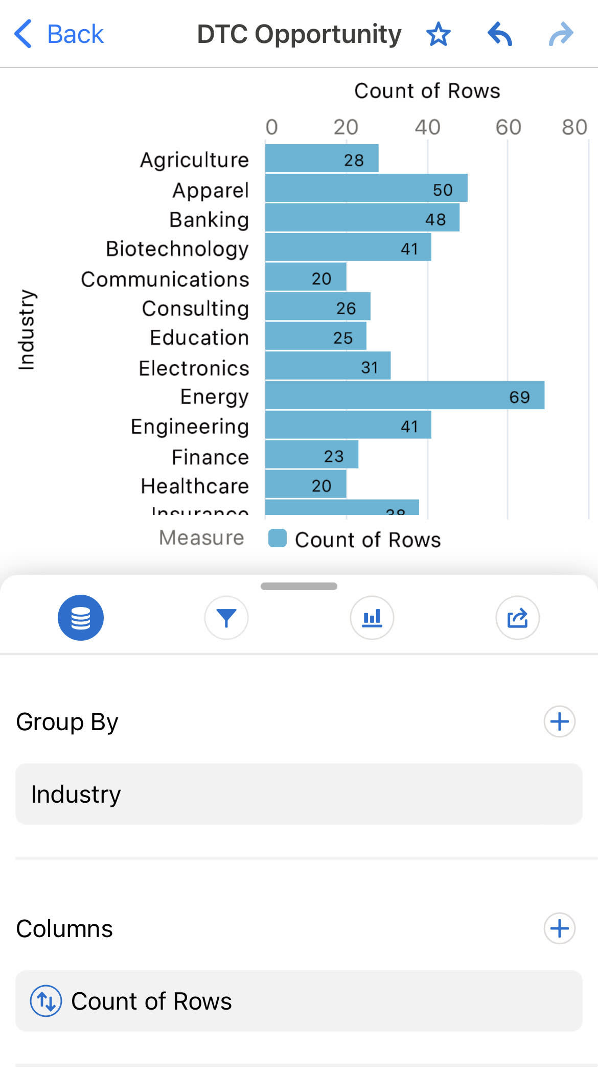
Now you can see your account industries, each with a bar in the chart. But the aggregation isn’t right. Rather than count of rows, you want the sum of the opportunity amounts.
Aggregation: Changing the Measure
- In the Data drawer, tap Count of Rows below Columns.
All available aggregation functions are listed. - Tap Sum.
You now have to choose the measure. - Select Amount.
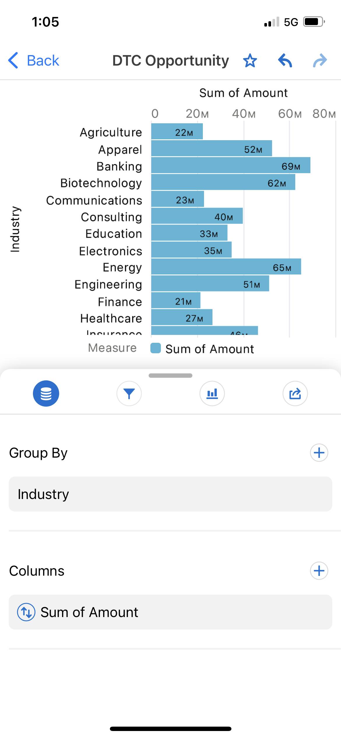 The values on the horizontal axis have changed radically. You’re getting closer to your goal, but you want to find the open deals. Time to learn about filters!
Filter by Dimension
- Tap the filter icon
 to see the filters list.
 - Tap the + sign next to Filter By.
- Select the Stage dimension.
- Tap 08-Closed Won and 09-Closed Lost.
- Tap Equals to change the filter of all the opportunities to be not equal to Closed Lost or Closed Won.

- Tap OK.

Filter by Date
- Tap the filter icon to see the filters list (if you’re not already there).
- Tap the + sign to add a date filter.
- Select Close Date
- Tap Absolute.
- Tap the From field.
- Select December 1, 2021 (we’ll say that’s today for this example).
- Tap Start Date again to close it.
- Tap the To field.
- Select March 1, 2022 (for our example, that’s three months from today).
- Tap OK.

Swipe left to delete a group or filter.
Use the undo and redo actions while exploring:

Drill In: Focus on the Stage Name for Banking Open Opportunities
- Tap the bar for Banking, the dimension value that you want to drill into.
 Making a selection on the chart changes the icons at the bottom of the screen. You can now do actions such as see the raw details, which list all the related opportunities, or drill into another aspect of the data.
 - Tap Drill In.
- Select Stage in the dimension list.

Great! Negotiation/Review is at the end of your sales pipeline. With some focus, you can close these deals before the end of the quarter. Next you’ll try to find out who owns those opportunities so you can share this critical information.
Choose the Right Visualization on Mobile
- Tap
 to change the visualization.
 - Tap Stacked Bar.
 Now let’s order the results to show the largest sum at the top.
 - Tap
 to access the measure, and then tap
  next to Sum of Amount to change the order to descending. Tapping twice changes the order to ascending. Tapping three times restores the default alphabetical ordering.
 Notice that the names for the measures and dimensions have changed. You can now identify where each is used in the chart. You can also hold and slide them to change their assignments. Go ahead and experiment, if you’d like. Just be sure to use the Undo arrow at the top to get back to where we are. Scroll the chart’s legend by sliding it left and right. Now you can see who owns that large band of Perception Analysis. It’s Laura Garza. Time to start a conversation with her on Chatter!
Share and Take Action
- Tap
 to take action on your exploration.
 - Tap Save As.
- Name it
M01 - Easy Closing Opportunities In Banking. - Change the location from My Private App to the My Exploration app.
It will be instantly accessible to all your coworkers who have access to the My Exploration app. - Tap Save As.

- Tap the Actions icon
 to take action on your exploration.
 - Tap Share Snapshot.
- Tap Save Image.
- Use the tools to annotate your image.

- Tap OK.
- Tap Done.
Voilà, your sales reps hear the tip! They can open your saved lens and make their own explorations to close deals. Your plane is about to take off. You can enjoy the trip knowing you’ll close the open deals this quarter.
Your Next Steps with Analytics
- Install the Analytics mobile app.
- Connect the Analytics mobile app to your Developer Edition org.
- Perform the four basic actions: aggregating, grouping, filtering, and visualizing.
- Filter by dimensions and by dates.
- Drill into your data to get detailed insights.
- Share your discoveries with your company to make your business move forward.
There’s still a lot to learn, so check the Salesforce Help if you want to learn more about Analytics on mobile.
Want to continue blazing your own trail? Check the official Analytics Library for more amazing documentation. We also have an active Analytics discussion group on the Trailblazer Community, where you can exchange ideas and best practices with other Analytics customers. We’re excited to see what you do with Analytics!