Analyze Your Service Data in Salesforce
Learning Objectives
Options for Tracking Service Metrics
Now that Maria knows which metrics Ursa Major Solar’s service team wants to track, she looks into how to fetch the data from Salesforce. After clicking around Salesforce documentation, Trailhead, and the Trailblazer Community, she discovers that Salesforce offers an entire suite of reporting and analytics tools that can help Ursa Major understand and act on their service data.
| Salesforce Feature | Description |
| Reports | Reports give you access to your Salesforce data. You can examine your Salesforce data in almost infinite combinations, display it in easy-to-understand formats, and share the resulting insights with others. |
| Dashboards | Dashboards help you visually understand changing business conditions so you can make decisions based on the real-time data you have gathered with reports. Use dashboards to help users identify trends, sort out quantities, and measure the impact of their activities. |
| AppExchange | AppExchange is an online marketplace where you can buy or find free Salesforce applications—you can choose from a variety of apps to help your team find a variety of metrics tools. |
| Tableau |
Tableau helps you to analyze, explore, and make decisions on your data with just a few clicks. Create engaging visualizations and embed them in your Lightning pages to use them in your workflows. Tableau has enterprise analytics platform solutions for deep data exploration. |
| Tableau CRM |
Salesforce Tableau CRM (formerly known as Einstein Analytics) is a cloud-based platform for connecting data from multiple sources, creating interactive views of that data, and sharing those views in apps. It's a better way to distribute insight to business users so they can understand and take action on changing information. |
| Einstein Discovery | Einstein Discovery exposes relevant facts and themes in your data without you building sophisticated software and statistical models. It generates unbiased answers, explanations, and recommendations. |
| Service Analytics App | Service Analytics is a ready-to-go analytics app that gives service managers and agents access to important key performance indicators (KPIs) from any device. It includes prebuilt queries, formulas, and ratios that draw from your Service Cloud data and assembles the information into easy-to-read visualizations. |
After reviewing all of these options, Maria decides to tinker around with creating a report and dashboard related to service—they’re the easiest tools to start with.
Build a Service Metrics Report
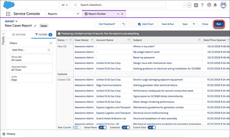
Maria is excited to answer some of Ursa Major Solar’s basic service questions by running a report. From what she’s read, Lightning Report Builder is a simple, out-of-the-box tool for analyzing data in Salesforce and answering business questions. Let’s see how Maria whips up a service report that can track the total number of opened and closed cases to assess the service team’s workload.
- From the Reports tab, click New Report.

- Choose Customer Support Reports, then Cases.

- Click Continue to see a preview of the report.
- In the preview, add the Status and Priority fields to the report’s columns.

- With Status and Priority on the report preview, remove the Open and Closed columns because they display the same data as the Status column.

- To see the elapsed time on cases in days, change the Units filter to Days. Age on an open case is the time from creation to the present, and age on a closed case is the time from creation to when it’s marked closed.

- To organize cases by status, click Group Rows by This Field on the Status column.

- Click Run.
- Name the report Ursa Major Solar Caseload, then add it to Public Folders. If no public folders exists, create one.
- Click Save.

That’s it! Maria has already gained insight into the total number of cases at Ursa Major Solar. She also grouped cases by Status to easily see all New or Closed cases. Now she knows a little bit more about how to run reports to track simple service metrics.
Build a Service Metrics Dashboard
After building a simple report in Lightning Report Builder, Maria decides to hook it up to a dashboard to share a visualization of its data with others. From what she’s learned, she must create a source report first and save it in a folder that others can access to see the dashboard. With those tasks accomplished in the steps above, she’s ready to create her first dashboard. Here’s how she does it.
- From the Dashboards tab, click New Dashboard.

- Name the dashboard, Ursa Major Solar Caseload.
- Create a new folder named Public Dashboards in which to save the dashboard.
- Click Create.

- Click +Component, and choose Ursa Major Solar Caseload.
- Select Vertical Bar Chart as the visual display for the dashboard, and click Add.

- Click Save, then Done.

Maria has created the first service metrics dashboard for the Ursa Major Solar team. By creating a visual representation of data from a source report, she’s ready to highlight more service metrics on eye-catching dashboards for easy retrieval.
Next Steps for Service Metrics
Maria understands that this is just the beginning of her metrics adventure. As an admin, building a report and dashboard with Salesforce’s out-of-the box tools is an easy start.
Her next step is to explore some of the other metrics tools mentioned in this unit to help answer more complex business questions. Some of the answers to those questions may require creating custom objects and custom fields to track the data that’s needed in Salesforce. To better understand her options, she jots down this list of trails and modules to check out later:
- Explore with CRM Analytics: view and explore data in Salesforce.
- Quick Start: CRM Analytics: build analytics apps and dashboards.
- CRM Analytics for Service App: view and explore service metrics from a mobile app.
With the collaboration between Maria, Ryan, and Sita, Ursa Major now has a good handle on the business metrics they need to run their contact center. Not only will they be able to make the right adjustments based on data, but they will also be able to give their agents important feedback on new processes or changes the company wants to make based on the metrics and overall business performance. This all leads to better agent and customer experiences.
Resources
- Salesforce Help: Build a Report in Lightning Experience
- Salesforce Help: Build a Lightning Experience Dashboard
- Trailhead: Build and Administer CRM Analytics
- Trailhead Superbadge: Service Cloud Specialist
- AppExchange Package: Preconfigured Service Cloud Dashboards