Design Your Emails
Learning Objectives
After completing this unit, you’ll be able to:
- Identify email design and accessibility guidelines.
- Compare the different levels of responsive design.
Email Design Principles
Now that you have built great content, it’s time to go back and review your emails for accessibility guidelines and email design principles. You don’t have to be a designer to recognize and apply good design to your emails. So with that in mind, in this unit, we are going to focus on four design principles: Accessibility, Clarity, Mobile Responsiveness, and Emotion.
Be Accessible
According to Merriam-Webster, accessibility is defined as “easily used, accessed, or adapted for use by people with disabilities.” Following accessibility guidelines ensures your emails can be viewed by all subscribers, regardless of their abilities or disabilities. And frankly, the guidelines also encourage great design. Bottom line: Accessibility isn’t an afterthought, it’s your guide to great content.
So, how do you create accessible content? There are many resources to ensure accessibility (including a few listed at the end of this unit), but here are some key tips to get you started.
- Use precise subject lines. Be clear, but catchy in your subject line.
- Organize in a logical reading order. Content should be easy to navigate and skimmable. Consistency of content, layouts, and visual styles is key.
- Use large and readable fonts. Display important parts of the content in bold and increase the font size (over 16pt) to make your content easier to read and digest.
- Adjust line spacing. Be generous with line spacing to make a paragraph easier on the eyes and easier to read.
- Use large and clickable buttons with clear labels. Buttons should be at least 44 pixels square for mobile, signal an action, and set the expectation of where the user will be taken when they click (think: read more, buy here, shop now). Fun Fact: An MIT study found that the average width of the index finger is around .6–.7 inches for most adults, which is equal to 45–57 pixels. And many users utilize their thumb (about 1 inch wide) for clicking a button on a mobile screen.
- Use live text and text-only options. Live text is HTML text or editable text that isn’t embedded in an image. Include live text when possible, for faster load times, responsiveness, and a better experience when images are turned off. Bonus: Live text looks better. Live text is never pixelated and remains crisp across all devices.
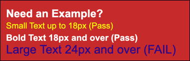
- Choose colors wisely. Use a color scheme (including backgrounds, buttons, links, and text) that has high color contrast to ensure readability across brightness levels. Here are contrast ratio guidelines for you to follow.
- Small text (less than 18 pixels) should be at least 4.5 to 1.
- Large text (greater than 24 pixels) should be 3.0 to 1.
- Test your colors at aremycolorsaccessible.com.
Check out the examples of small text, bold text, and large text that either meet the contrast guidelines (marked pass) or doesn’t (marked fail).
Ready to geek out? We’ve got some coding tips to make your content even easier for people using screen readers and assistive technologies.
| Tip | Description | Example |
|---|---|---|
|
Include ALT tags. Give the necessary information about an image, but make it as short and concise as possible. |
An ALT tag (also called ALT text or ALT description) is added to HTML to provide a text description of that image. Tags are also useful where images may be blocked or slow to load. | alt="Descriptive text about an image" |
|
Make sure layout tables have a role="presentation" attribute. Treat tables like a div based layout by adding role="presentation" to each <table>. |
Nested tables can create an unpleasant experience for people who use assistive technologies. | <table role="presentation" border="0" cellpadding="0" cellspacing="0"></table> |
|
Use semantic HTML tags. Code your paragraphs, lists, and headings with specific identifiers to help users navigate and consume content more easily. |
Semantic HTML is HTML that adds meaning or context to the code, which in turn, helps assistive technologies. | <header></header> |
Be Clear
The design principle of clarity refers to how readable and digestible your content is for the viewer. Clarity is an important element in accessibility guidelines and reiterates the need to have a logical flow, good line spacing, and readable fonts. It also refers to how clear your brand comes through in your email design. How do you do that? Be transparent with the value of your messages and keep sentences short. White space is a good thing. Also as we mentioned in the previous unit, content placement is key. Use a consistent email format that places your most important content first. Make your emails simple but significant.
While known for his literary career, Antoine de Saint-Exupéry had wise words that all designers and non-designers should follow, “A designer knows he has achieved perfection not when there is nothing left to add, but when there is nothing left to take away.”
Be Mobile Responsive
According to the Adestra Consumer Adoption and Usage Study, 71% of consumers delete emails that don’t look good on mobile. Don’t risk deletions—optimize your emails for mobile! There are three options to consider for mobile optimization. Select the one that works for your brand by evaluating how your customers are interacting with your messages and how much time and experience your email production team has to create and code emails. Let’s check out your options.
|
|
Description | When to Use | What to Know |
|---|---|---|---|
| Mobile Aware | A single layout, designed to scale down and still look good on mobile. | Quick turnaround, low effort |
|
| Responsive Aware | Responsive headers and footers. | Repeatable elements, upfront effort. | Header and footer modules include media queries allowing simple change and adaptation
|
| Responsive | Modular content adapts to device screen size. | Optimal experience, ongoing effort. |
|
Add Emotion
According to the Interaction Design Foundation, emotional design strives to elicit appropriate emotions, in order to create a positive experience for the user. What does emotion have to do with emails then? Simple: If subscribers care, they won’t delete. Emails can evoke an emotional response through storytelling and the overall aesthetics of your campaigns. Let’s review some considerations for the visual elements of your email.
Branding
Stay true to your brand. Use clear brand standards that match your website, so that if a user clicks a CTA, their email experience will be seamless with their web or mobile app experience. Consistency, clarity.
Images and Graphics
Engage with customers by using high-resolution graphics and purposeful imagery that connect them to your brand. Here are a few specific tips.
- Double the size of your images, including your logo, to account for high-resolution retina screens. When the image is then scaled down in the email, it looks sharper.
- View the email without those images. If images don’t load or are turned off, does your content still work?
Animated GIFs
Animated GIFs are a great way to capture attention, showcase several images, or to show how something works. However, they can cause accessibility issues for visually impaired subscribers. Review your animations with these considerations.
- Ensure your animated GIFs have smooth transitions.
- Content flashing rates between 2 Hz and 55 Hz can harm users with photosensitive epilepsy.
Explore animation and video, but be sure to test and review loading time and file size. If it adds value, keep it. If not, skip it.
Finally consider reviewing the module, Inclusive Marketing Practices, to make sure that your content strikes the right tone and has equal representation. In the next unit, we review the most important step before hitting send: testing.
Resources
- Trailhead: Inclusive Marketing Practices
- Salesforce Blog: How Salesforce Built its First Email Design System
- Salesforce: Email Design Best Practices
- External Site: Ultimate Guide to Accessible Emails (Download Optional)
- External Site: Check Email Accessibility
- External Site: Web Content Accessibility Guidelines
- External Site: Are My Colours Accessible?
- External Site: Finger Friendly Design
- External Site: How Does Your Email Sound?