Deploy Lightning Web Component Files
Learning Objectives
After completing this unit, you'll be able to:
- Configure Lightning web component files for display in an org.
- Deploy your files to an org.
- Verify component behavior in an org environment.
Set Up Lightning Web Component Files for Use in an Org
You're going to create the bike component discussed in the Create Lightning Component unit and push it to your org.

The files you need to push this component to an org:
- bikeCard.html
- bikeCard.js
- bikeCard.js-meta.xml
Here's the steps.
- Continue in the bikeCard project.
- Under force-app/main/default, right-click the lwc folder and select SFDX: Create Lightning Web Component.
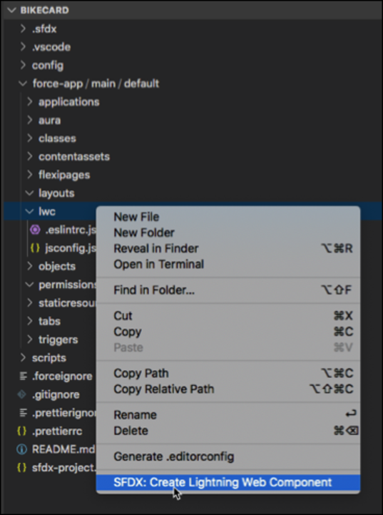
- Enter
bikeCardfor the name of the new component.
- Press Enter and then press Enter again to accept the default
force-app/main/default/lwc.
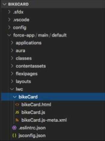
- You see the following in VS Code under \force-app\main\default\lwc\bikeCard:
Lightning web components follow web standards. The HTML standard recommends that multi-word custom element names contain a hyphen. However, the Salesforce platform doesn't allow hyphens in the component folder or file names. So we use camelCase naming conventions here.
- Copy and replace the contents for the bikeCard.html, bikeCard.js, and bikeCard.js-meta.xml files.
bikeCard.htmlbikeCard.js<template> <div> <div>Name: {name}</div> <div>Description: {description}</div> <lightning-badge label={material}></lightning-badge> <lightning-badge label={category}></lightning-badge> <div>Price: {price}</div> <div><img src={pictureUrl} alt={name}/></div> </div> </template>bikeCard.js-meta.xmlimport { LightningElement } from 'lwc'; export default class BikeCard extends LightningElement { name = 'Electra X4'; description = 'A sweet bike built for comfort.'; category = 'Mountain'; material = 'Steel'; price = '$2,700'; pictureUrl = 'https://s3-us-west-2.amazonaws.com/dev-or-devrl-s3-bucket/sample-apps/ebikes/electrax4.jpg'; }<?xml version="1.0" encoding="UTF-8"?> <LightningComponentBundle xmlns="http://soap.sforce.com/2006/04/metadata"> <!-- The apiVersion may need to be increased for the current release --> <apiVersion>63.0</apiVersion> <isExposed>true</isExposed> <masterLabel>Bike Card</masterLabel> <targets> <target>lightning__AppPage</target> <target>lightning__RecordPage</target> <target>lightning__HomePage</target> </targets> </LightningComponentBundle>
- Save your files.
The Component Configuration File
The file we haven't covered yet is the component configuration file with the extension .js-meta.xml. This file provides metadata for Salesforce, including the design configuration for components intended for use in Lightning App Builder.
We haven't covered configuration files yet, because we've been playing in LWC.studio. Now that you're going to start using the content within an org, you must include a configuration file.
Notice that the ebikes repo components all have this configuration file. Here's an example from the ebikes repo:
<?xml version="1.0" encoding="UTF-8" ?>
<LightningComponentBundle xmlns="http://soap.sforce.com/2006/04/metadata">
  <apiVersion>63.0</apiVersion>
  <isExposed>true</isExposed>
  <masterLabel>Product Card</masterLabel>
  <targets>
    <target>lightning__AppPage</target>
    <target>lightning__RecordPage</target>
    <target>lightning__HomePage</target>
    <target>lightningCommunity__Page</target>
  </targets>
  <targetConfigs>
    <targetConfig targets="lightning__RecordPage">
      <objects>
        <object>Product__c</object>
      </objects>
    </targetConfig>
  </targetConfigs>
</LightningComponentBundle>
Required:
-
apiVersionbinds the component to a Salesforce API version.
-
isExposed(trueorfalse) IfisExposedisfalse, the component isn't exposed to Lightning App Builder or Experience Builder.
- To allow the component to be used in Lightning App Builder or Experience Builder, set
isExposedtotrueand define at least one<target>, which is a type of Lightning page.
Optional:
-
targetsspecify which types of Lightning pages the component can be added to in the Lightning App Builder.
-
targetConfigslet you specify behavior specific to each type of Lightning page, including things like which objects support the component.
See the documentation for the full list of supported syntax.
Displaying a Component in an Org
You have two options for displaying a Lightning web component in the UI.
- Set the component to support various flexipage types (home, record home, and so on) then add it to a flexipage using the Lightning App Builder. This is the simplest approach and the one you follow in this unit.
- You can also create a tab which points to an Aura component containing your Lightning web component. You can see the required pieces in the repo.
Deploy Your Files
Now, you need to deploy the component files to your org.
- Authenticate with your org using SFDX: Authorize an Org from the Command Palette in VS Code. When prompted, accept the Project Default and press Enter to accept the default alias. If prompted to allow access, click Allow.
- Right-click on the force-app/main/default folder and select SFDX: Deploy This Source to Org.
Allow Ebike Images to Display
The images we are using are hosted on an Amazon AWS site. In order to allow the images to display in our app we need to add the URL to the Trusted URLs list.
- To open your org, use SFDX: Open Default Org from the Command Palette in VS Code.
- In Setup, enter
trusted urlsin the Quick Find box and then select Trusted URLs.
- Click New Trusted URL.
- For API Name enter
ebikes.
- For URL enter
https://s3-us-west-2.amazonaws.com.
- For Description enter
Allow ebike images to display.
- Leave Active selected.
- Make sure img-src (images) is selected.
- Click Save.
Create a New Page for Your Component
Since we set up our component configuration file to enable the use of the component in Lightning App Builder, use the UI to create an app and add your component to it.
- To open your org, use SFDX: Open Default Org from the Command Palette in VS Code.
- In Setup, enter
Lightning App Builderin the Quick Find box and then select Lightning App Builder.
- Click New.
- Select App Page and click Next.
- Give it the label
Bike Cardand click Next.
- Select One Region and click Done.
- In Lightning App Builder, scroll down the Components list until you see your Bike Card component.
Now you can drag it onto the page. Save the page, Activate it, and the Bike Card component shows up on the assigned page.
- Drag your Bike Card component to the top of the page layout until the bike appears.
- Click Save.
- Click Activate.
- Keep Activate for all users selected. And, optionally, change the name or icon for your app.
- Click Save. You're asked to add your page to navigation menus, but you don't need to. You can still get to your page in this environment.
- Click Skip and Save.
- Click
 to exit the Lightning App Builder.
- From the App Launcher (
 ), find and select Bike Card.
- Open it and see your component working in the UI.
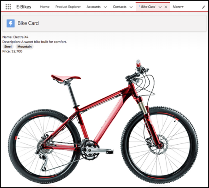
There you go, a shiny new bike. You've pushed a component to an org, seen it on the page, and can verify it in the UI.
In the next unit, you build an interactive component with event handling and deploy it to your org for testing.