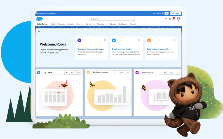
Check Out Reports, Dashboards, Feeds, and More
Learning Objectives
After completing this unit, you'll be able to:
- Run a report and add a filter.
- View a dashboard.
- Create a list view and add a chart.
Make a List (View) and Check It Twice
When you click pages from the navigation menu, you land on an object’s home page. On that object home page, you have options for the lists of records to view. These lists are called list views.
Each list view returns a set of records based on the filters defined. This list view shows all accounts that you have permission to view.
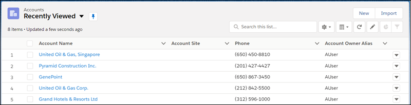
Some list views are standard, meaning they’re created by Salesforce and are available to all users. Your admin can also create custom list views for your use. And depending on your permissions, you can create a custom list view or edit an existing list view.
Let’s practice adding a list view chart.
Create a List View
Create a view to see an infinitely scrollable list of records that meet your filter criteria.

Actions you can take for list views are available in the List View Controls menu, accessed by clicking  .
.
- From List View Controls, select New. A dialog box appears.
- Enter a name for your list.
- Choose who can see this list view: just you, or all users, including Partner and Customer Portal users.
- Click Save. The Filters panel appears.
- Click Filter by Owner, then select All objects (for example All Accounts) or My objects.
- Click Done.
- Add and set filters to view only the records that meet your criteria. You have different options depending on the field you want to filter and the operator you choose.
- Click Add Filter.
- Select the field you want to filter, the operator, and the value. For example, choose equals, starts with, or excludes.
- Click Done.
- To set another filter, click Add Filter.
- To remove a filter, click
 near the filter name.
- To add logic that further refines which records appear in your list view, click Filter Logic. Use the number assigned to each filter to reference filters in your logic statement. Make sure you include every filter in your logic statement.
Operand |
Definition |
|---|---|
AND |
Finds records that match both values. 1 AND 2 |
OR |
Finds records that match either value. 1 OR 2 |
NOT |
Finds records that exclude values.For example, Filter 1 is Industry equals Biotechnology. You set filter logic as NOT 1. Your report returns records that don’t have Biotechnology as the Industry value. |
- Let’s say you want to find all opportunities created on or after a certain date that are either in late stages of negotiation, have a high probability of closing, or both. Choose any Created Date, and then apply these filters: 1. Created Date greater or equal to any date you choose 2. Stage contains Proposal/Price Quote, Negotiation/Review 3. Probability equals 50. Then add the logic statement: 1 AND 2 AND 3.

- Click Save. The view appears in the list view dropdown list, so you can access it later.
- Optionally, choose and order the columns in your list view.
- From the List View Controls menu, select Select Fields to Display.
- To add columns, select one or more fields from Available Fields and use the arrow to move them to Visible Fields.
- To remove columns, select one or more fields from Visible Fields and use the arrow to move them to Available Fields.
- Order columns by selecting one or more fields from Visible Fields and using the arrows to move them up or down.
- Click Save.
Add a Chart to a List View
Create a chart to visualize list view data. There are three types of charts: vertical bar, horizontal bar, and donut. For any list view chart, you can change the data display to another type, if desired. When you create a list view chart for an object, such as Opportunities or Leads, the chart is associated with the object. The chart is available for any list view that you have permission to see for that object, except the Recently Viewed list.
- On an object home page, select a list view with data you want to visualize.
- Click
 .
.
- In the Charts panel that appears, click
 .
.
- Select New Chart. A dialog box appears.
- Enter a chart name.
- Select a chart type: vertical bar, horizontal bar, or donut.
- Select the aggregate type, aggregate field, and grouping field. The aggregate type specifies how the field data is calculated: by sum, count, or average. The aggregate field specifies the type of data to calculate. The grouping field labels the chart segments.
- To view your chart, click Save.
See and Slice the Data You Need
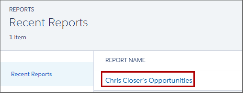
Reports in Salesforce allow you to see a set of records displayed in a table, summary, or matrix format, similar to what you’d see in a spreadsheet.

To get to reports, click Reports from the navigation menu.
Select a report to run it.
And you can easily add a report chart by clicking the  icon. Change the formatting of the chart by clicking the gear icon and selecting display options.

Adding filters and a chart to your report can help you visualize your records and reveal key insights. In this example, you can see that we had a great August, and September looks even better, but we need some new leads for October.

Killer Visualizations with Dashboards
Dashboards are visual representations of your reports. Multiple reports can be represented on a single dashboard, using multiple dashboard components.

Dashboards allow instant access to summarized data, and can be a powerful tool for running sales meetings and communicating to your executives on what’s closed and what’s in the pipeline.
Your Next Stop on the Tour
You’ve now learned how to get started with Salesforce, from where to log in to how to use Lightning Experience to power your sales process. So what’s next?
During the tour, you saw some of the ways Salesforce can be customized with your company’s sales stages, helpful coaching tips, and reports and dashboards. Your Salesforce org is going to be customized in similar ways. Take what you’ve learned here and take a tour of your own in your Salesforce org, and see the ways your admin has customized the experience for you.
Don’t forget, you can click the question mark at any time to (1) get contextual help, (2) access help, training, and knowledge articles, and (3) give feedback.

Once again, welcome to Salesforce!