Build Customized Dashboards
Learning Objectives
After completing this unit, you’ll be able to:
- List some topics to discuss before you build a custom dashboard.
- Build your own lens.
- Describe how to build a customized dashboard.
The standard dashboards you get with the B2B Marketing Analytics app can be a great help. Now let’s look at how you can build a dashboard customized for your company.
Before You Start
Review your company priorities before moving forward with Dashboard creation. Ask for input from your team. Here are some topics to consider.
- Your individual and team goals and metrics
- How frequently you need to track those goals and metrics (daily, weekly, monthly)
- The visual presentation of the data (chart, table, numeric sum)
For example, let’s say you identify the goal of increasing conversion rates, with the main metric being email click-through rates. You could decide you want to see how your emails have performed over the last year, visually represented in a graph over time.
Think of your dashboard as an overview of all of the metrics that are relevant to you and your team. Breaking them down in this way can help you create an outline for the final product.
Build a Lens
Before you build a dashboard, you need to build a lens. And of course, before you build the lens, make sure your data is clean.
Let's go back to our example of tracking click-through rates over time. Here’s how to build that lens.
- Navigate to the Analytics Studio.
- Click into the B2BMA app.
- Click into the Pardot Emails dataset.

- For Horizontal Axis, select Average, then scroll down and select Total CTR.
- For Vertical Axis, select Sent on Date, then Month.
- Click the plus sign to add another grouping.
- Select Sent on Date, then Year 7 (or whichever year you want data from). If you do not add the year grouping, your lens shows the average monthly CTR from all years for which data exists.

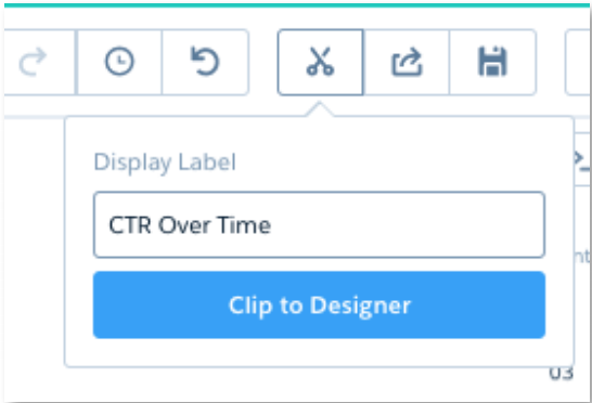
- Click
 and select the style of visual presentation you’d like to use for your data. In this case, let’s select Column.

- Click
 and enter the Display Label
 CTR Over Time. - Click Clip to Designer.
Now you’ve built your lens.
Build Your Dashboard
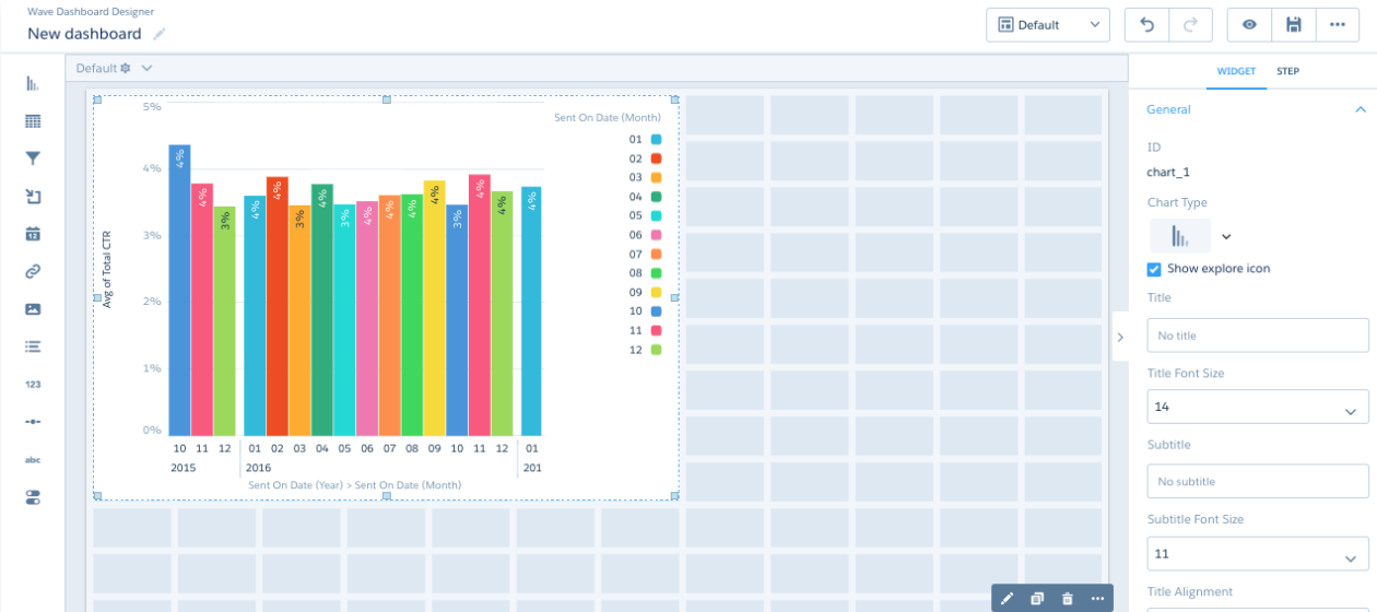
Now that you’ve organized your data and built at least one lens, let’s look at the Dashboard Designer. This is where you pull all of your lenses together to create one unified view—that is, a dashboard.
There is no one correct way to represent your data. Decide with your team what is most useful to anyone using the dashboard. Let’s place the lens that we’ve created onto the canvas and see how we can further customize it.
Drag the CTR Over Time lens into the top-left corner of the Dashboard Designer canvas.
As soon as you do, a blue outline appears around the lens, indicating that it is OK to put it where you’ve placed it. If you had other widgets in the way, the outline around the lens would be red. In that case, you’d have to place the lens elsewhere on the canvas.
Now that you have put the lens onto the canvas, it becomes one of the dashboard’s widgets, or a visual representation of your data. You can add more lenses to your dashboard as necessary. Whenever you’re ready, click the Preview (the eye) icon to interact with the lenses and make sure they are working as expected. When you are ready to save, click the Save (floppy disk) icon and name your dashboard. You can always find your saved dashboard under the Dashboards tab on the main B2BMA page.
Other Ways to Build Dashboards
You also can build dashboards using any of five templates in the B2B Analytics app.
- Comparison: With this template, you can compare metrics side-by-side across a single dimension such as a region, date, or specific marketing campaign.
- Details: With this template, you can visualize your data with charts and include record-level details in a table.
- Summary: This template organizes information into horizontal sections with filters across the top.
- Three-column: This template gives you a dashboard in three columns, with filters across the top.
- Tile dashboard: This is a dashboard that pulls together links to other dashboards (for example, if you had a dashboard built out for all your sales reps, but wanted to compile all that data for a sales manager, you could use this dashboard, using tiles to represent each sales rep's individual dashboard).
To create a dashboard with one of the templates:
- In the B2B Marketing Analytics workspace, click Create.
- You have the option to create either a dashboard or a dataset. Select Dashboard.
- Select the dashboard you want.
- Drag your desired lenses onto the canvas.
- Next, style the widgets as necessary (color, font size, and so forth), preview, and then save.
That’s it! Now you’re ready to begin diving deeper into your data with dashboards you’ve customized for your company.