Build Views in Tableau Cloud
Learning Objectives
After completing this unit, you'll be able to:
- Describe the web authoring workspace area.
- Create a new workbook on the web.
- Build common chart types on the web.
If you completed the Tableau Cloud Basics module, you learned about roles and workflows in Tableau Cloud and how to connect to a data source and prepare data for analysis. In this module you learn how to create a visual analysis of your data. Tableau calls this a view (it’s also referred to as a visualization or “viz”).
To create a view with Tableau Cloud, you use the workspace area. If you’ve used Tableau Desktop before, the Tableau Cloud workspace area is very similar. To get to the workspace in Tableau Cloud, you open a new workbook.
Explore the Workspace Area
Let’s take a look around the workspace.
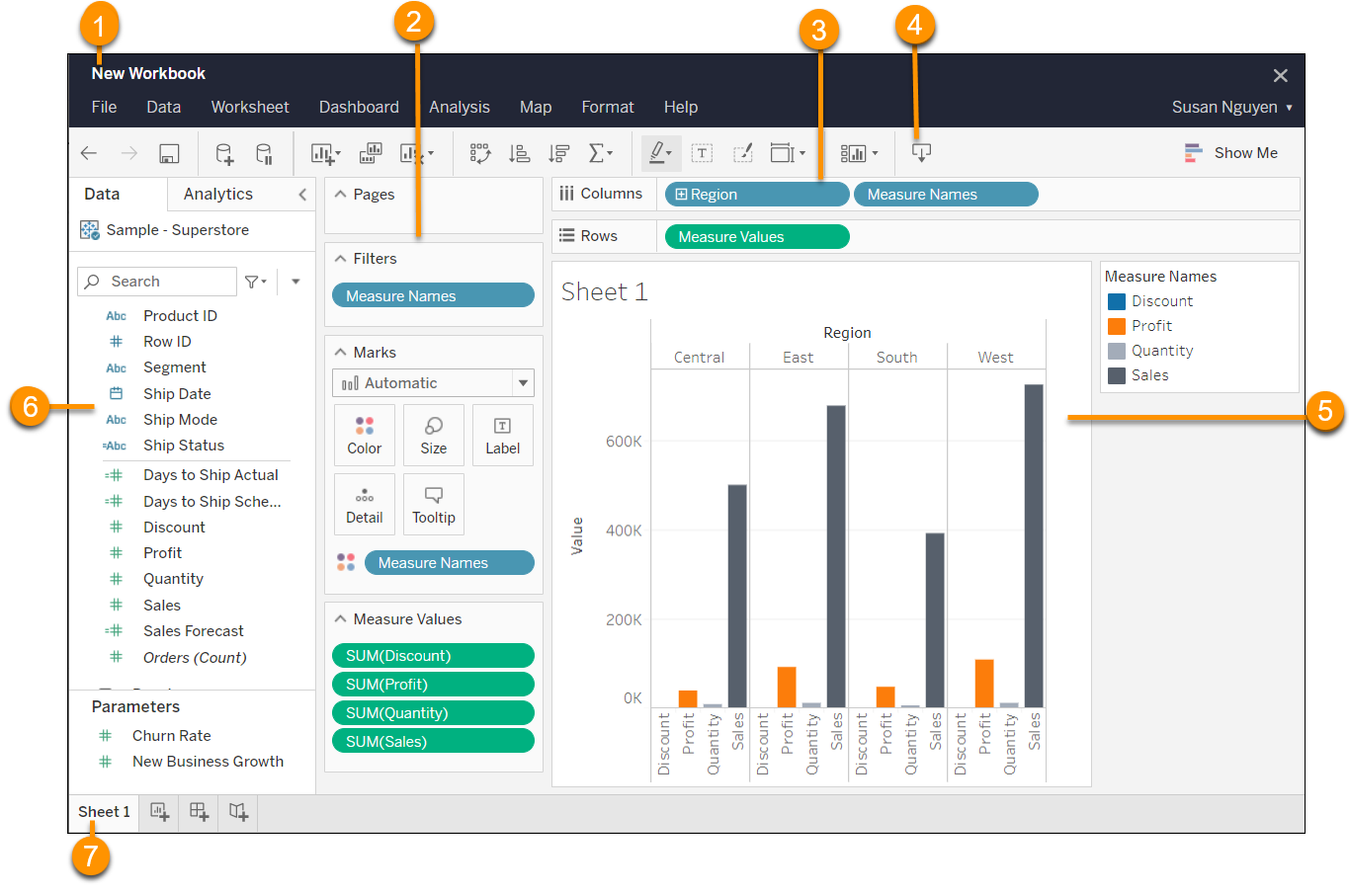
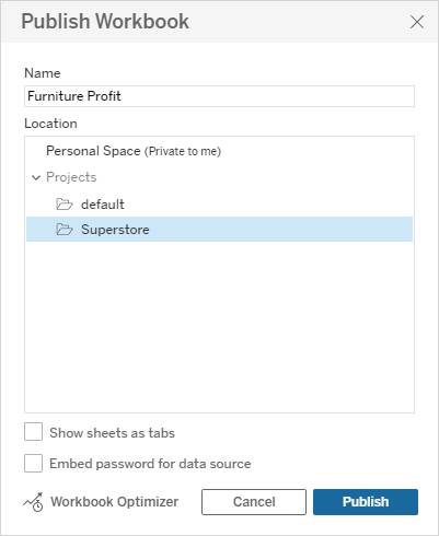
- Workbook name: Before you publish a workbook, the "New Workbook" name displays by default. When you are ready to publish the workbook, you have the opportunity to name the workbook in the Publish Workbook dialog box.
-
Pages shelf, Filters shelf, Marks card: Drag fields to the Pages shelf, the Filters shelf, and the Marks card in the workspace to:
- Use pages to see how a specific field affects the rest of the data in a view.
- Build the structure of your visualization.
- Increase the level of detail and control the number of marks in the view by including or excluding data.
- Add context to the visualization by encoding marks with color, size, shape, text, and detail.
- Columns and Rows shelves: Drag fields to the Columns and Rows shelves in the workspace to add data to your view and build the structure of your visualization.
- Toolbar: Use the toolbar to access commands and analysis and navigation tools.
- View or canvas: This is the area where you create your data visualizations.
- Sidebar (Data and Analytics panes): In a worksheet, the sidebar contains the Data pane and the Analytics pane. Use the arrows to expand and collapse this area in the workspace. Toggle between the Data pane and the Analytics pane by clicking the tabs at the top.
- Sheet tabs: Use tabs to add and navigate to views in a workbook. A view can be a worksheet, dashboard, or story.
Start Building a View
Every view that you build in Tableau should answer a question. For example, you might want to know how much profit Office Supplies generated in the West region, or who your top 10 Copiers customers are in California.
To create a view, you start by connecting to data.
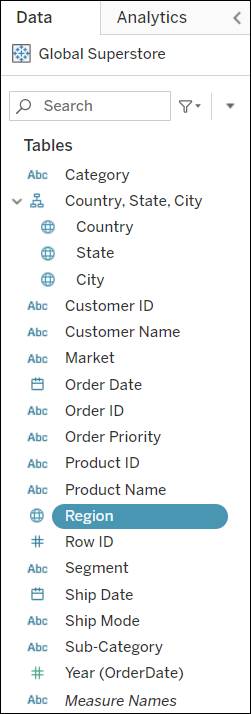
When you’ve connected your data source, Tableau shows the columns from your data source as a variety of different fields in the Data pane, organized by table.
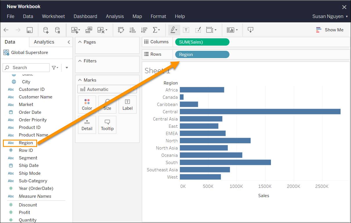
When you build a view, you can add any of the fields from the Data pane. You can do this in different ways. Let’s look at a few examples.
- Drag fields from the Data pane and drop them onto the cards and shelves that are part of every Tableau worksheet. Alternatively, double-click a field in the Data pane to add it to the view.
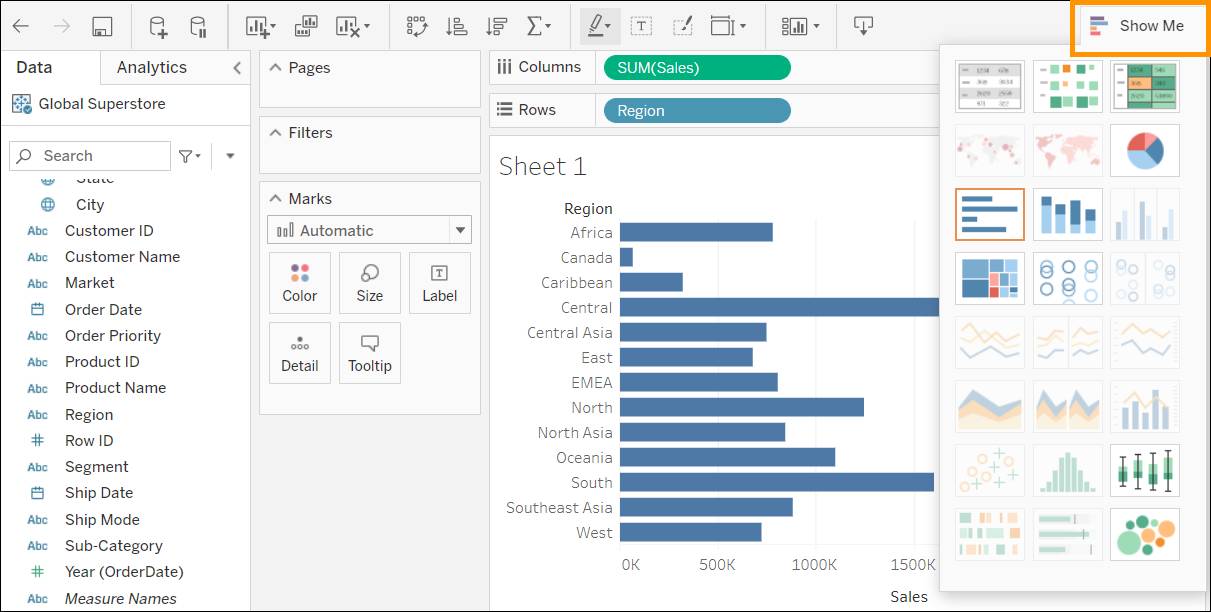
- Select one or more fields in the Data pane and then choose a chart type from Show Me, which identifies the chart types that are appropriate for the fields you selected.
Publish a Workbook
Once you’ve created the views you want, you can publish the workbook from the File menu or the toolbar. The Publish options available to you vary depending on your permissions, which are set by your Tableau site admin. You need to have the Creator or Explorer (can publish) role and appropriate project-level permissions to publish workbooks. Note that the Publish option is only available if you’re the owner of the workbook. If you’re not the workbook owner, you can use Publish As to publish the workbook with a different name.
In Tableau Cloud, while you work, the edits that you make to a new or existing workbook are auto saved to a private draft version of your workbook. When you’re ready to share your changes with others, use Publish to replace the last published revision with your draft.
When you're finished, select Close from the File menu to exit the workspace.
Get to Know the Trailhead Simulator
In this module, we show you the steps to build some basic charts—a bar chart and a highlight table—in Tableau Cloud. Before you get started, familiarize yourself with the Trailhead Simulator for Tableau Cloud. (If you’ve completed other Tableau modules in Trailhead, there’s a good chance you’re already familiar with the Trailhead Simulator.) You use the simulator instead of a Trailhead Playground to follow along and try out the steps.
For the best experience, view the Trailhead Simulator on a computer, not a mobile device. The Trailhead Simulator is different from a Trailhead Playground. The simulator doesn’t store your progress or the data you enter. If you close your browser, the simulation starts from the beginning each time you launch it. You can use the navigation controls at the bottom of the simulator to find where you left off.

|
Navigation Controls |
Description |
|---|---|
|
(1) Left Arrow |
Go backward in the simulator. |
|
(2) Right Arrow |
Go forward in the simulator. |
|
(3) Scrub Bar |
View your progress, plus you can use the progress arrow to quickly move to a different location within the simulator. |
|
(4) Close Button |
Exit the simulator. Remember that if you close the simulator, you start from the beginning the next time you launch it. |
When you click in the wrong spot, highlighting shows you where to click.
Build a Bar Chart
Let’s get started. In the Cloud Basics module you set up some company data for analysis. Now imagine your manager wants you to analyze the company data and create a view that displays a list of technology products and how much profit each has generated. A bar chart is ideal for this.
- Launch the Trailhead Simulator.
- Click Build a Bar Chart.
- Click Begin.
- You are connected to Global Superstore and a blank workbook is open. From the Data pane, under Product, drag Category and then Sub-Category to the Columns shelf.
- Next, drag Profit to the Rows shelf. Tableau now has enough to convert the data into a visualization (view), in this case, a vertical bar chart.
- To display only the items under Furniture, click the Furniture header and select Keep Only.
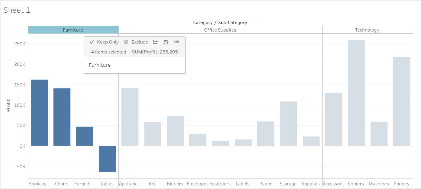
- To display each bar as a separate color according to profitability, drag Profit to the Color card.

- Right-click the Sheet tab, click Rename, type
Bar chart, press enter (Windows) or return (Mac), and then click OK. You’ve created a bar chart to show the profits for each product within the Furniture category. - Click Next Exercise to create a highlight table in Tableau Cloud.
Build a Highlight Table
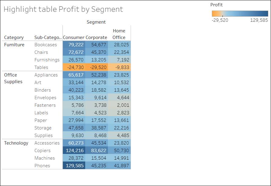
You’ve created a view to show profits for the Furniture category. Next, imagine you want to create a table that lists product profits by category and highlights the range of sales sizes. You can do this by creating a highlight table.
- Ensure you’re in the Build a Highlight Table simulation. If you’re not there yet, launch the Trailhead Simulator and click Build a Highlight Table.
- Click Begin.
- Create a new sheet by clicking the
 icon.
icon. - From the Data pane, drag Segment to the Columns shelf.
- Next drag Category and Sub-Category to the Rows shelf.
- Finally, drag Profit to the Text card. Your view now displays profit data in a table.
- Add color to your table by dragging Profit to the Color card.
- Change the marks type to square by clicking the Marks dropdown and selecting Square. Your view now clearly displays items that are not profitable.
- Give the view a name by right-clicking the sheet tab, clicking Rename, and typing
Highlight table. - Press enter (Windows) or return (Mac), then click OK.
- Click Home to restart the activity or Exit to close the simulation.
This is just a start. As you get more familiar with web authoring, you’ll be able to create several other types of views using Tableau Cloud.
Resources
- Tableau Help: Workbooks and Sheets
- Tableau Help: Shelves and Cards Reference
- Tableau Help: The Tableau Workspace
- Tableau Help: Use Show Me to Start a View