Build a Custom Block
Learning Objectives
After completing this unit, you’ll be able to:
- Install the SDK.
- Name the methods in the SDK.
- Explain what you need to prepare before packaging your custom block.
- Install and register your custom block package.
Install SDK from GitHub
As we explored in the first unit, the Content Builder Block SDK provides domain validation and wraps simple method calls around the cross-document messaging that the editor uses to communicate with your block. The SDK is available for installation directly from a GitHub repository.
Navigate to https://github.com/salesforce-marketingcloud/blocksdk to import the SDK into your code, which you can do as an HTML script tag or as a node module.
Tag
<html>
<head></head>
<body>
<script src="path/to/blocksdk.js"></script>
<script>
var sdk = new window.sfdc.BlockSDK();
// do something with the sdk
</script>
</body>
</html>
Module
var SDK = require('blocksdk');
var sdk = new SDK();
// do something with the sdk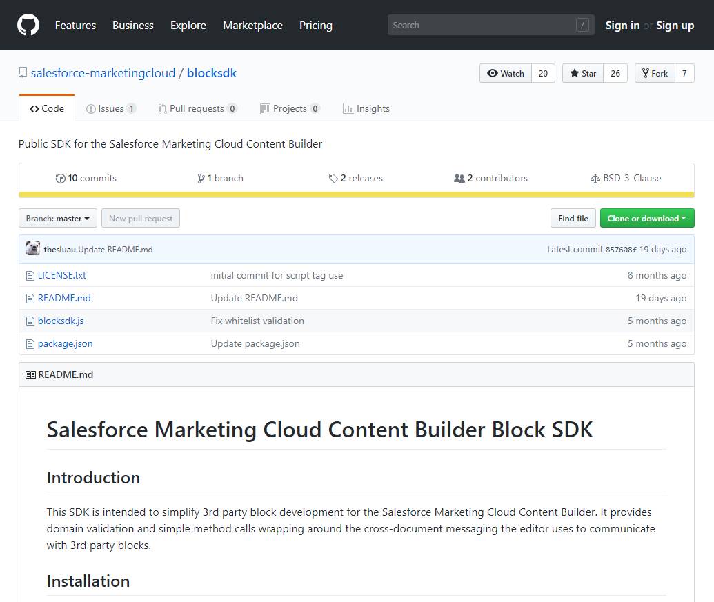
The SDK Methods
Now that you have the Content Builder Block SDK, let’s take a closer look at what it includes. The SDK provides a set of methods:
- getContent
- setContent
- setSuperContent
- getData
- setData
- getUserData
- setBlockEditorWidth
- triggerAuth
getContent(callback(:content))
This method gets your block’s current content and passes it into the callback function. This is the content that is sent in the final message.
Parameter Name |
Type |
Description |
Required |
|---|---|---|---|
callback(:content) |
function |
Receives the current content stored in the block (string) |
No |
setContent(content, callback(:newContent))
This method sets the block’s content. Updated content is passed into a callback function. The content passed into the callback doesn’t necessarily match the content passed as the first parameter. Processing is built in to remove potentially malicious content and to correct HTML. Ensure that the callback’s content is used as the source of truth for current content, rather than using the content passed.
Parameter Name |
Type |
Description |
Required |
|---|---|---|---|
content |
string |
The requested content that sets the block |
Yes |
callback(:newContent) |
function |
Receives the content stored in the block (string) |
No |
setSuperContent(superContent, callback(:newSuperContent))
This method sets the block’s visible preview content. Super Content is used for preview purposes only. It allows the block to show the user a representation of the block in the preview, in case the content being set contains AMPscript, Guide Template Language (GTL), or other non-HTML content that is used for personalizing messages and doesn’t display cleanly in the preview. Similar to setContent, the content passed to the callback doesn’t always match the superContent passed in because of how the block is processed. Use SuperContent to set a preview, not for consumption by the custom block.
Parameter Name |
Type |
Description |
Required |
|---|---|---|---|
superContent |
string |
The requested preview content that sets the block |
Yes |
callback(:newSuperContent) |
function |
Receives the content stored in the block (string) |
No |
getData(callback(:dataObject))
This method gets the custom block's metadata and passes it into a callback function. Use the metadata as the custom block's way to retain state. Create the getData method as a JSON serializable object.
Parameter Name |
Type |
Description |
Required |
|---|---|---|---|
callback(:data) |
function |
Receives the current metadata stored in the block (object) |
No |
setData(dataObject, callback(:dataObject))
This method sets the block’s metadata. The updated data object is passed into a callback function. This method overwrites the entire metadata. Any partial data object can cause data loss. Extend your current metadata to include a full data object before passing to setData.
Parameter Name |
Type |
Description |
Required |
|---|---|---|---|
dataObject |
object |
The requested metadata that sets the block |
Yes |
callback(:data) |
function |
Receives the new metadata stored in the block (object) |
No |
getUserData(callback(:dataObject))
Use this method to get context for the currently authenticated user. The updated data object is passed into a callback function. The object argument of the callback contains a stack and locale property.
Parameter Name |
Type |
Description |
Required |
|---|---|---|---|
callback(:data) |
function |
Receives data about the currently authenticated user (object) |
No |
setBlockEditorWidth(width, callback())
This method sets the width of the current block. The width must be greater than 425px and less than 850px. Percentage widths aren’t supported. The width doesn’t persist, so for example, if you want the block’s width to be 500px, the width must be set every time the block is opened.
Parameter Name |
Type |
Description |
Required |
|---|---|---|---|
width |
number or string |
Block width can be specified as a number, or a string like 500px |
Yes |
callback() |
function |
Called after the block expands to the specified width |
No |
triggerAuth(appID)
This method opens a hidden iframe to the SSO page for the appID provided. Then the block's server side login URL (the login URL for the appID) is passed to a JSON Web Token (JWT) so it can request a token.
Parameter Name |
Type |
Description |
Required |
|---|---|---|---|
appID |
string |
The installed package ID or appExchange appID in alphanumerical xxxxxxxx-xxxx-xxxx-xxxx-xxxxxxxxxxxx string format |
Yes |
Here’s an example of how you can use the methods.
var sdk = new window.sfdc.BlockSDK();
sdk.getContent(function (content) {
content += '.';
sdk.setContent(content, function (setContent) {
// block content is now its original content + '.'
});
});
Custom Tabs
As if all those methods aren’t enough, you can also use an array to insert custom tabs into your custom blocks. The Content tab is always there, but you won’t see the default Settings and HTML Editor tabs. Instead, use an array to specify the tab and order of the tabs to include. For example, the following example adds a custom tab (with a name, key, and URL location value) to the available tabs.
[{
name: 'My Custom Tab',
key: 'customtab',
url: 'https://localhost:3000/customtab'
}, 'stylingblock', 'htmlblock']
This example includes the Content tab and a custom tab with English and French localized names.
[{
name: {
'en-US': 'English Name',
'fr': 'French Name'
},
key: 'localized-tab',
url: 'https://localhost:3000/customtab'
}]
The Content Builder SDK instructions include many more examples and information on implementing custom tabs in your content blocks.
Start Building
You installed the SDK and your plan is ready to go. Now it’s time to assemble all the pieces to create your custom block.
Lightning Design System
If you want your custom block to fit the Salesforce look and feel, install the Lightning Design System in your code editor. This includes your CSS framework, icons, font, and design tokens. Learn more in the Lightning Design System module.
Block Widget
Next, you need to build your block widget. Remember, this is your HTML page for editing content that interacts with content blocks in the Content Builder editor.
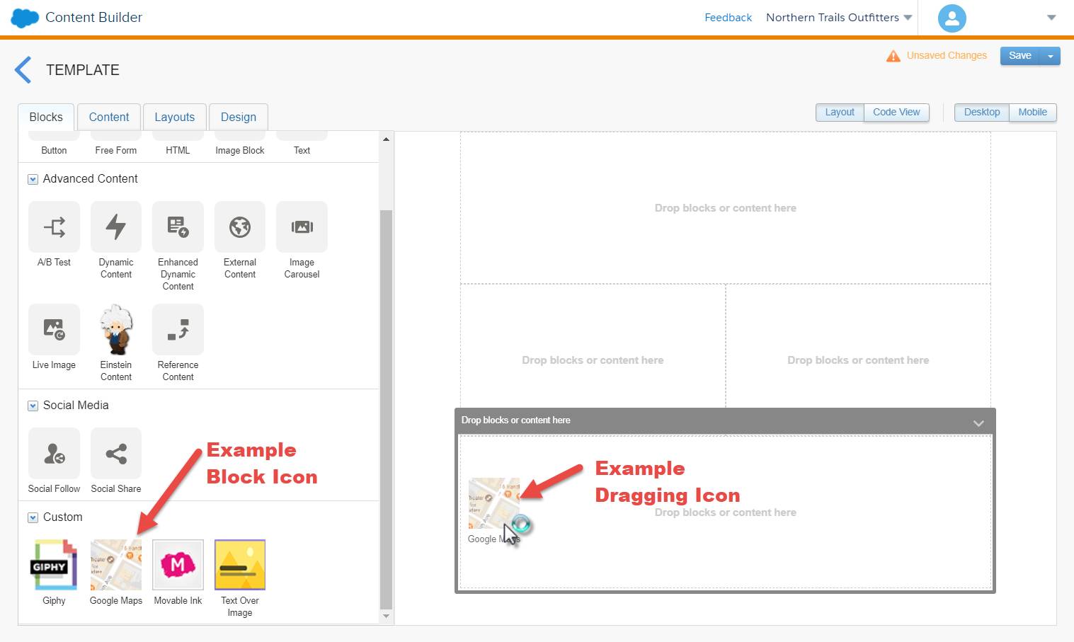
Block Icon and Dragging Icon
For some content block types, Marketing Cloud Engagement users drag the block onto the canvas. You need icons that demonstrate those actions. Create an icon for the block and an icon for dragging the block.
App and Hosting Provider
Create an application that serves up the custom block HTML page. Arrange for a hosting provider to host the app.
Install Package and Register Block Widget URL
Last, you need to package your custom block files to install in Marketing Cloud Engagement. When you know the hosted endpoint for your custom content block UI, register that endpoint in the installed package. For example, if the URL for your block widget is https://www.example.com/myblock/, then the Content Builder editor assumes these URLs exist.

Follow these steps to install your custom block package in Marketing Cloud Engagement.
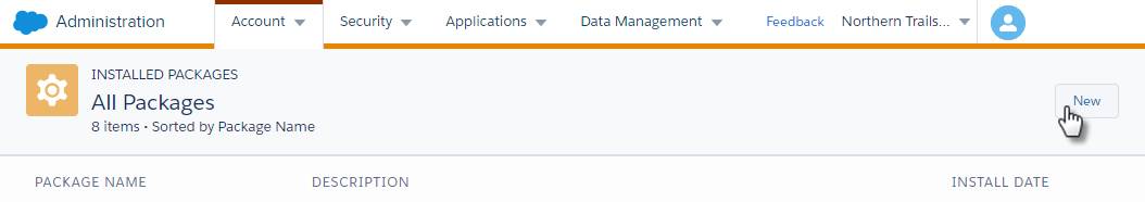
- Navigate to Installed Packages in Marketing Cloud Engagement Administration.
- Click New.
- Enter a name and description for the package.
- Save the package.
- Under Components, click Add Component.
- Select Custom Content Block.
- Type a name and description for the content block. This name doesn't display in Content Builder.
- Enter the Endpoint URL, which is the base URL for your block widget. Content Builder loads all assets relative to this endpoint.
- To complete registration, save the component.
That’s it! Your custom block package is installed. You can uninstall or delete the package if needed. The package or app is then uninstalled or deleted from all accounts in the enterprise.
Now that you understand how to install the SDK, build your custom block, install the package, and register your block widget URL, next we look at tools for testing and deploying your custom block.
Resources
- Salesforce Developers: Custom Block Widget Example
- Salesforce Developers: Extend Content Builder
- Salesforce Developers: Marketing Cloud Engagement Package Development—Install Packages
- External Link: Install the Content Builder Editor SDK (GitHub Repo)
- Trailhead: Lightning Design System
- Salesforce Developers: Register Endpoint for Custom Content Block Component