Review Key Metrics with the Main Dashboard
Learning Objectives
After completing this unit, you’ll be able to:
- Describe the purpose of the Main dashboard metrics.
- Summarize how the Main dashboard metrics provide clues to storefront performance.
- Apply the Main dashboard metrics to a use case solution.
Just Look at the Data
The Agentforce Commerce for B2C Reports & Dashboards tool provides Brandon Wilson, Cloud Kicks merchandiser, with a single source to access, monitor, and analyze critical site data.
When he logs in to Reports & Dashboards, the Main dashboard is the first dashboard he sees. The Main dashboard, located under the Home tab, is a performance summary of many data points throughout his sites. It’s like a report card for his sites. Similar to how a report card tells you about your past academic achievements, the Main dashboard shows Brandon key performance metrics for his sites over a period of time that he specifies.

The Main dashboard shows performance data for revenue, site visits, orders, top-selling products, and the most popular promotions. These key performance indicators (KPIs) provide a general summary of site performance. The Main dashboard can show Brandon where his sites are exceeding performance goals, and where deeper analysis and some fine-tuning are needed to improve performance and increase revenue.
Explore the Main Dashboard
Brandon takes a closer look at the Main dashboard. The dashboard has two sets of charts and analytics.
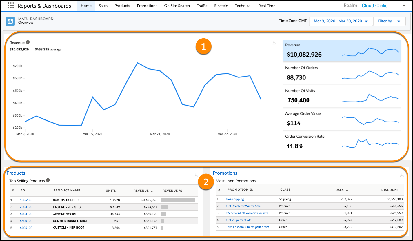
This table describes what Brandon sees.
View |
Description |
|---|---|
Charts (1) |
The charts represent their data as line graphs, plotted as daily values over time. You can use these analytics to identify correlations between revenue, orders, and site visits.
|
Tables (2) |
The tables break down the details of the top performers for products and promotions. The reports give you an indication of promotion success and product sales.
|
Collectively, the Main dashboard analytics show Brandon a broad view of his realm operations. And just like grades on a report card, the data sets on the Main dashboard help him assess general site performance and identify aspects of his site implementation that might require further analysis.
Review the Metrics Summary and Dive Deeper
Brandon really likes the Main dashboard and its summary of key storefront data. It lets him easily review key site analytics, assess storefront performance, and if necessary, determine which of the other dashboards to access for further detailed analysis.
Last week Brandon and his team kicked off a new storefront promotion called Run with Faster Socks. It offers customers who purchase a pair of Custom Soft Stride running shoes, 50% off 10 pairs of Personalized Swift Runner socks. Now in its second week, Brandon wants to check metrics on the promotion.
Here’s how to do it.
- In Business Manager, click App Launcher, and then select Merchant Tools | Analytics | Reports & Dashboards.
- On the Main dashboard, set the date range to 2 weeks. Brandon is looking for trends that tell him how customers are responding to the promotion.
Brandon can see from the data on the Main dashboard that the promotion is running successfully.
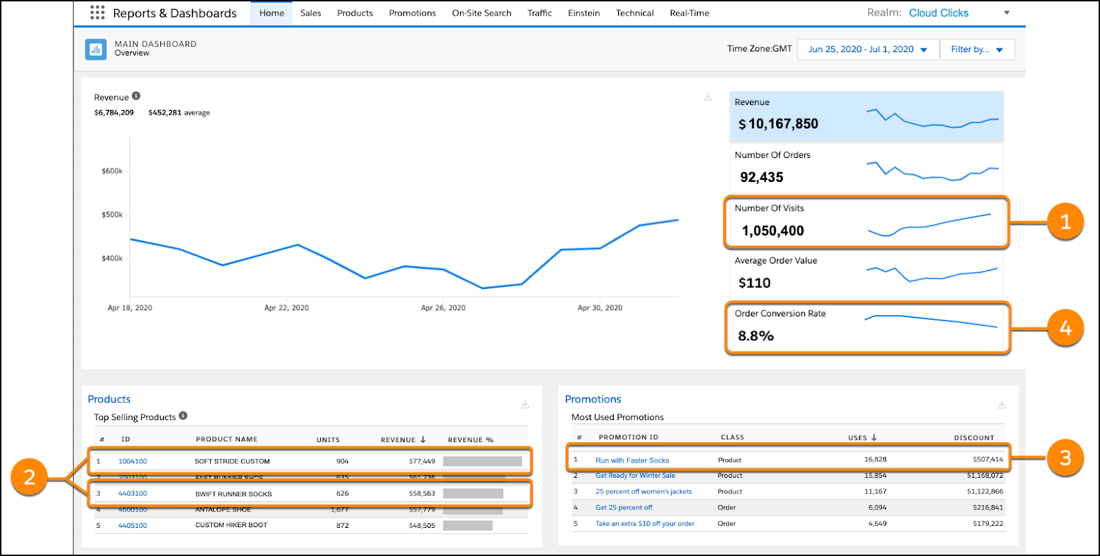
1) Site visits are up by 300,000. That’s a 28% increase over the past 2 weeks.
2) Custom Soft Stride shoes and Personalized Swift Running sock sales are close to their units-sold sales targets.
3) The Run with Faster Socks promotion is listed as a Most Used Promotion.
But as he digs a bit deeper into the dashboard analytics, he’s concerned with the decrease in order conversion rate.
4) Order conversions are down 3% over the past 2 weeks. He knows that more site visits usually means a slight drop in the conversion rate, but 3% is a bit higher than expected.
He wants to find the cause of the drop in order conversion rate. He filters the dashboard results for each site in the Cloud Clicks realm. By narrowing the dashboard view by site, he can identify site anomalies that impact the order conversion rate. Brandon finds that on the Cloud Clicks French language sites, the sales of the promotional items are flat, and use of the promotion is well below expectations. He wonders if there could be a problem with how the promotion is configured on the French language site.
Brandon’s next step is to check the Sales, Product, and Promotions dashboards for detailed site metrics to confirm his suspicion that the promotion isn’t working on the French language site. With a little more investigation, he finds that an error in the translation of the promotion text is the likely reason the promotion is not being used on that site.
Let’s Wrap It Up
In this unit, you learned that the Main dashboard is the control center where you can monitor and analyze metrics that gauge the performance of your realm. You also learned that the Main dashboard can show you where to dig deeper and analyze realm metrics in the detailed report metrics available in the other dashboards.
References