Create a Custom Attribute Editor
Learning Objectives
- Explain why you would create a custom attribute editor.
- Explain how the HTML iframe works with a custom attribute editor.
- Explain the difference between a breakout custom attribute editor and a trigger custom attribute editor.
- Explain why you would use a breakout custom attribute editor.
Introduction
Vijay Lahiri, the Cloud Kicks developer, created several Page Designer component types with attributes that a merchandiser like Brandon Wilson can set when he creates his storefront pages.
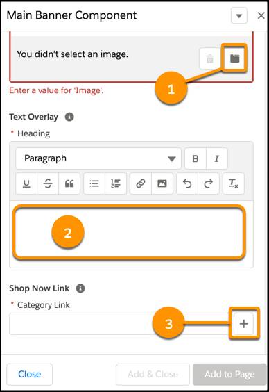
For example, Vijay created a headline banner component type with an Image attribute. When Brandon creates a page using this component type, he uses the Image attribute (1) to select the image to display. This component also has text box (2) for a text overlay, and a link (3) to the category list to configure a category page as the navigation destination.
The type value that Vijay assigns to the attribute in the component’s meta definition file determines the UI control that the underlying code uses. For example, he uses a file picker for selecting the image for the Image attribute.
Page Designer comes with several preconfigured type options, such as the file type attribute that Brandon uses to select an image file, and the boolean type attribute for a checkbox. But these type options don’t exactly fit what the marketing director wants. So what does Vijay do?
Fortunately, he can create custom attribute editors. Here are some of his ideas.
- Select store locations on a map.
- Choose a background color.
- Place a Favorite icon on a product tile.
- Select the Shop Now button to use.
He can create multiple custom attribute editor for each component type, and is only limited by browser real estate. There’s more on that later.
Host Component
Just as with a page or component type, a custom attribute editor uses a meta definition file, script, JavaScript, and CSS. Each custom attribute editor is wrapped in a host component that contains an HTML iframe element. The iframe encapsulates the editor’s code and styling and represents a self-contained sandbox environment in which the editor runs so that different custom attribute editors on the same page don't interfere with each other. The host and the custom attribute editor in the iframe communicate by passing events back and forth on a special messaging channel.
Page Designer adds management code to the iframe that includes a subscribemethod and an emit method that send predefined events with serializable payloads back and forth between the host and the editor.
Vijay took a look at the Mozilla site to learn more about channel messaging.
Create a Custom Attribute Editor
Vijay wants to add a background color custom attribute editor that provides a selection of branded colors to the Main Banner component type.
Here are the steps he takes.
- In the Main Banner component type meta definition file, set the type of the attribute for which you want to use a custom attribute editor to custom.
- Include an editor_definition element for the attribute. This element includes the custom attribute editor ID and any configuration information that you want to pass to the custom attribute editor.
- Save the file with a unique name. This file references the JavaScript and CSS resources that the custom attribute editor requires.
- Make the custom attribute editor meta definition file reference the JavaScript and CSS resources that it requires. Save the file in your cartridge directory or a subdirectory under this directory: <your_bm_ cartridge>/cartridge/experience/editors
- Create a script file with the same name as the corresponding meta definition file but with a .js extension.
- Save the client-side JavaScript files and CSS resources required to run the custom attribute editor in the static/default directory of the custom cartridge at a location that corresponds to the location of the meta definition file and script file for the editor.
Meta Definition File Example
Let’s take a look at Vijay’s Main Banner component type. Its meta definition file, mainBanner.json, has three standard attributes.
- image of type image
- heading of type markup
- categoryLink of type category
He can add options for each attribute. The options are listed in the configuration element in the editor_definition and passed to the custom attribute editor.
Here’s the mainBanner.json file.
{
  "name": "Main Banner",
  "description": "Image, text overlay that links user to a category using the markup editor",
  "group": "commerce_assets",
  "attribute_definition_groups": [
    {
     "id": "bannerImage",
     "name": "Banner Image",
     "description": "The visual display of the banner image in the background.",
     "attribute_definitions": [
       {
        "id": "image",
        "name": "Image",
        "type": "image",
        "required": true
       }
      ]
    },
    {
     "id": "textOverlay",
     "name": "Text Overlay",
     "description": "The overlay text on top of the banner image.",
     "attribute_definitions": [
       {
        "id": "heading",
        "name": "Heading",
        "type": "markup",
        "required": true
      }
     ]
    },
    {
     "id": "shopNowLink",
     "name": "Shop Now Link",
     "description": "The Shop Now link on the banner image",
     "attribute_definitions": [
       {
        "id": "categoryLink",
        "name": "Category Link",
        "type": "category",
        "required": true
       }
     ]
    }
  ],
  "region_definitions": []
}
Brandon can use Vijay's custom attribute editor and easily customize the main banner for seasons, promotions, and sales events.
Take It to the Next Level
Storefront page real estate can be tricky when you have lots of options. Vijay learned that when he started adding attributes to his components. He wants Brandon to be able to select which background color to use in a banner, but the right pane doesn’t have enough space to list all the colors that Brandon wants to use. There’s only so much room!
For now, Brandon’s OK with the limitation, but Vijay wants him to be completely happy. So he explores other options.
That’s where breakout and trigger custom attribute editors come in handy. He can create a trigger custom editor that appears with the other component attributes in the right pane and includes a Select button. When Brandon clicks Select, the breakout editor (for the custom attribute) opens in a modal window that shows the available color choices.
Here’s how Vijay creates a trigger custom attribute editor.
- Define the attribute as type custom in the component meta definition file.
- Create a meta definition JSON file and a script file for the trigger editor.
- In the script file, instantiate the breakout editor using the PageMgr.getCustomEditor method. This method takes the ID of the breakout editor and an optional configuration object.
- Add the breakout editor as a dependency.
Like with a custom editor, a breakout custom attribute editor requires its own meta definition and script files.
Callback on Event Emitters
Vijay digs into the details to better understand how breakout and trigger custom attribute editors work.
To open the modal window for the breakout editor, he uses a callback on event emission approach, which manages the asynchronous breakout editor process. (This is the Salesforce recommended approach.) If you have multiple breakout editors, this approach makes it easier to keep track of open breakout editors because a callback is related to only one breakout process.
If you are unfamiliar with Node.js event emitters, take a look at the nodejs site.
He can emit an sfcc:valid event from the breakout editor to indicate if the value that Brandon selected in the breakout editor is valid. If it is, Page Designer enables the Apply button in the breakout modal window footer. If the value’s invalid, Page Designer disables the Apply button and displays an error message.
The trigger editor and the breakout editor require client-side script files. You can incorporate any of the custom attribute editor events in the script files.
- The trigger editor file opens and closes the breakout editor and emits the sfcc:value event to Page Designer.
- The breakout editor file includes the code to implement the editor, and emits sfcc:valid and sfcc:value events to the trigger editor.
Vijay plans to explore this feature in more detail later, and is happy to have the option.
Let's Sum It Up
In this unit, you learned how to extend Page Designer components with custom attribute editors. You also went a step further and learned how to create breakout and trigger custom attribute editors for modal windows with more choices.
In this module, you learned how to create Page Designer page and component types to give merchandisers the best tools for creating amazing storefront experiences for his company’s amazing shoppers.
Now test your skills with this quiz and earn an amazing badge!