Enhance Screen Flow Structure and Usability
Learning Objectives
After completing this unit, you’ll be able to:
- Identify structural elements that impact the accessibility of Screen Flows.
- Configure screen flows to optimize navigation and usability.
Applying Accessible Design Everywhere
The principles of accessible design aren’t limited to page layouts. The concepts you learned in the previous units, such as using proper heading hierarchy and organizing information logically, apply to other configurations you build on the Salesforce Platform. Whether you’re designing a Lightning page, a dashboard, or an Experience Cloud site, the goal remains the same: create a structure that’s clear and navigable for all users. In this unit, you review a screen flow that suffers from some of the same issues you saw earlier: missing headings and disorganized content. Time to dive in and apply your new skills in a different context.
Navigating the Noise with the Blind Institute of Technology
Our friends at BIT emphasize how important it is to provide users with a clear and easy way to report accessibility issues. This ensures that you capture direct, real-world feedback from the people who use your systems and are best positioned to identify barriers in their specific workflows. Additionally, the continuous feedback loop helps you identify issues that automated checks and testing can miss.
Your next challenge is inspired by BIT’s guidance on how to report accessibility issues. The org for this badge includes a screen flow embedded on the Service Home page. The flow collects information and automatically creates an accessibility case.
The Case of the Invisible Screen Flow
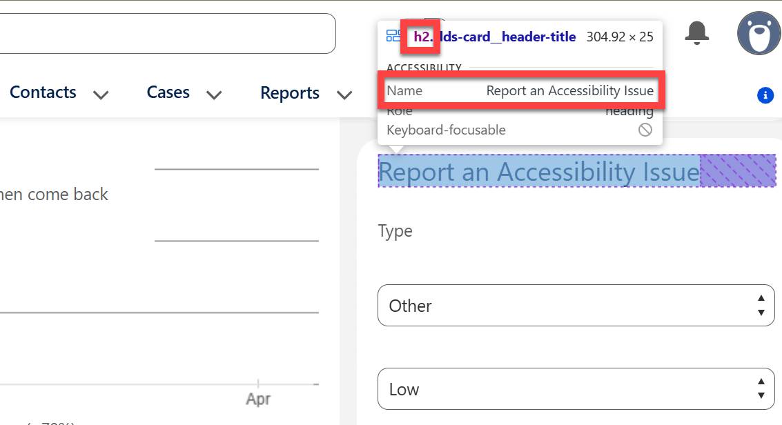
As you’ve seen in previous units, headings are an important aspect of screen reader navigation. But if a screen-reader user navigates the Service Home page by headings, the embedded screen flow is essentially invisible. Because the flow itself lacks any headings, the screen reader skips it unless the user tabs through all components and fields on the page. If you check the accessibility tree for the Service Home page, you can see that the heading navigation trail ends at Assistant, the component directly before the screen flow, leaving the flow in a digital blind spot.
Check it out for yourself.
- Select
 to open the App Launcher.
- Select Service and open the Service App Home page.
- Inspect the embedded screen flow at the bottom of the right side bar.
Remember, you can enter Ctrl+Shift+C on Windows (or Cmd+Shift+C on Mac) in a Chrome browser to inspect the page elements.
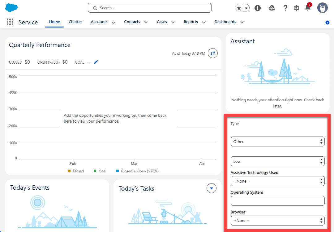
While you’re on the Service Home page, it’s worth noting that the embedded screen flow is not just an accessibility issue; it’s a usability issue for everyone. Without a clear heading or description, users are left guessing. What is this flow for? What does it do? In its current state, the flow’s purpose is a mystery, creating a confusing experience for any user who encounters it.

Add a Heading to the Screen Flow Component
First, add a heading to the screen flow so keyboard users can find it and all users have a better understanding of the flow’s purpose.
Hands-on challenge note: In order to pass the challenge for this unit, you must complete the steps outlined in the badge content.
- Select
 , then Setup.
- In Quick Find, enter and select
Flows.
- Select Report an Accessibility Issue to open the flow editor.
- Select the Report an Accessibility Issue screen component.
- From the Screen Properties panel on the right, select Configure Header to expand the section.
- Check the box next to Show Header.
- Select Done.
- Select Save As New Version, then Save.
- Select Activate.
Note that Show Header is checked by default when you create a new screen element and it’s generally a best practice to keep the header. However, there are some circumstances where it may be necessary and appropriate to remove the header.
Check Your Work
Head back to the Service Home page to see how this changes the experience (you might need to refresh the page). Not only is the heading now visible on the page, if you inspect it in the accessibility tree, you can see that it has the <h2> heading applied. This means it’s also visible in the page structure and available via heading navigation.
Field Structure in the Screen Flow
Now that you’ve made sure the embedded screen flow is more easily discovered with assistive technology, it’s time to take a closer look at the content within the screen flow. You might have noticed some issues. Again, a poor accessibility experience often equates to a poor experience for all users. There are missing and misplaced labels and the screen also lacks introductory language and structure to organize the information logically. Let’s fix these barriers to create a smoother experience for all users.
Inspect the Field Labels
The Report an Accessibility Issue screen has six input fields, of which only four have a label that appears above the input field. The second and last fields on the form are missing labels. Instead, the designer chose to set a default value directly in the input field. This is the end user’s only indication of what’s expected of them when interacting with these fields.
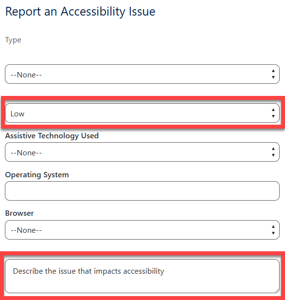
If you’re familiar with a typical Salesforce case record and you’re a good digital detective, you might be able to figure out that the second field is asking for case Priority and that the last field maps to the Description field on the case object. But it’s not reasonable to expect your typical user to decipher such a cryptic form.
Finally, look a little closer at the Type field at the top of the screen. Notice that the label seems to appear further away from the input field than the other field labels. That’s because it’s not a field label at all. It’s actually display text inserted above the input field. Visually, this looks very much like a label. A sighted user can easily determine that the display text is related to the input field directly below it, but programmatically, these two components are unrelated, which means the label wouldn’t be clear to a screen reader user.
Fix the Field Labels
Let’s get those labels fixed.
- Select
 , then Setup.
- In Quick Find, enter and select
Flows.
- Select Report an Accessibility Issue to open the flow editor.
- Select the Report an Accessibility Issue screen component.
- Select the caseType picklist field below the display text component.
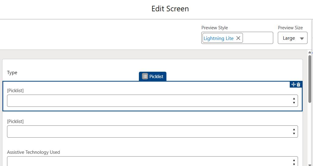
- Update the Label to
Accessibility Issue Type.
- Next, select the casePriority picklist field below Accessibility Issue Type.
- Update the Label to
Priority.
- Finally, select the [Long Text Area] (API Name = Description) field at the bottom of the screen.
- Update the Label to
Issue Description.
- Select Done.
If you’d like to check your work again, save the flow as a new version and activate it. Then refresh the Service Home page to see your updates and inspect them in the accessibility tree.
Enhance Flow Clarity and Structure
It’s time to make this flow easier to navigate and understand. First, you add introductory text to clearly state the flow's purpose. Then, you organize related fields into a section to improve the structure and flow of information. Finally, you add help text to the Issue Description field. Note that the Issue Description field currently has a Default Value that reads a lot like help text. However, it might not be clear to the user that they should delete the placeholder text before describing the issue. The placeholder text could accidentally get logged in many cases.
- Back in the screen flow, select the Report an Accessibility Issue screen component.
- Select the Type display text component at the top of the screen.
- Change the API Name to
FlowDescription.
- In the text editor, replace the text with
Found an accessibility barrier? Use this form to report it. Your feedback helps us create a more inclusive experience for everyone. - From the left Components panel, select Section (shown in the Display options) and add it under the Priority field on the screen.
- In the right panel (with the new section selected), check the box for Include Header.
- Set the Label to:
Technical Environment Details - Move the following fields to the new section:
-
Assistive Technology Used
-
Operating System
-
Browser
-
Assistive Technology Used
- Next, select the Issue Description component.
- Delete the text in the Default Value field.
- Select Provide Help and expand the section.
- Populate the Help Text field with:
Describe the issue that impacts accessibility including steps to reproduce and work arounds/solutions (if known). - Select Done.
- Select Save As New Version, then Activate.
Great Job!
You successfully transformed a confusing screen flow into a user-friendly tool. By adding a clear heading and introductory text, you provided essential context so users know exactly what to expect right from the start. You also organized the screen by grouping related fields into sections, which creates a logical structure that reduces the cognitive load. Finally, by fixing field labels and adding help text, you ensured that everyone, including those navigating with assistive technology, can understand the form’s requirements and provide the correct information with confidence. These updates significantly improve usability and independence for all users.
In the next unit, you tackle inaccessible language and visual indicators.