Use Sales Analytics to Get an Overview of Your Business
Learning Objectives
After completing this unit, you’ll be able to:
- Use Sales Analytics dashboards to find answers to sales questions.
- Drill down in dashboards to explore your data.
- Take action in Salesforce directly from Sales Analytics.
Gain Key Insights and Take Action with Sales Analytics
As the Salesforce admin for DTC Electronics, you’ve been working with Laura Garza, the World Wide Sales Manager, to get Sales Analytics set up. It’s working the way you want, so now it’s time to help her get ready for her meeting with the CEO tomorrow. You need to show her how to navigate the dashboards to find the metrics she asked you to provide. Let's take our dashboards for a test drive with Laura.
You’ll use the dashboards you just created to get answers to these questions:
- How is the quarter going? What are the top-line results so far?
- How is Laura doing against her target?
- Who are Laura’s top performers, and how are they doing against their targets?
- What are the biggest opportunities her team can push on to make this a great quarter?
And you know that your CEO has an inquiring mind, so you and Laura should anticipate other questions the CEO might have and answer them before he even has to ask. You’ll also explore some of the other cool things that the app lets you do. Along the way, you’ll see just how easy it is to use Sales Analytics to gather key insights and take action on them. If Laura can quickly show the CEO how well her team’s doing, the CEO will take everyone to the celebratory team lunch he promised.
Start with an Overview to See How the Quarter’s Going
Let’s jump in.
- In Analytics Studio, click Run App to the far right of your app, Analytics for Sales Managers to go to the home dashboard. You’re greeted with a great view of the company’s top-line metrics over the past year. It includes links below them to the rest of the dashboards. Take a few minutes to look them over so you know what’s in the app. Every dashboard contains a convenient way to get back here: A home button in the upper left corner
 . Which dashboard answers Laura’s first question, that is how the quarter’s going so far? Company Overview, which you just looked at, sounds right since it shows the pipeline and other KPIs.
- Find the Company Overview link and click it to open the dashboard.
- Change the View As menu from All to Sales_WW, that is her role in the company. All the charts adjust to show Laura the data that she wants to see. She wants to get this view whenever she comes back to the dashboard without having to touch the View As filter again.
 Note: Your dashboard details may be different than the screen shots shown here, since data can vary depending on how long ago you created your DE org. If it's been a while, you can run the Data Refresh tool in the Trailhead Data Manager now. To do that, select the Trailhead Data Manager in the app picker. Then click Refresh DTC Data.
- Open the dashboard editor. In the group of icons at the upper right, click the pencil icon.

- Click the icon with three dots to the right of group of icons, and select Pick Initial Values.
- Open the View As filter and change it to Sales_WW, Laura’s role. Click Done.
- Click the disk icon
 at the top, then click Save. Every time Laura opens the Company Overview dashboard, she’ll see just the data for her team. Nice!
Right away, you see that Sales Analytics answers the CEO’s questions about how the quarter’s going. It starts with the Overview dashboard.

The Company Overview dashboard gives Laura a top-level view with key performance indicators (KPIs). It shows quota attainment, closed won deals, and pipe generation for a given period. Laura can see in general how her team is doing this quarter.
She can also easily navigate from the overview to other dashboards that show more detail. The Trending dashboard shows the pipeline, and Stage Analysis shows how opportunities move through the sales process. She can return to the Home dashboard anytime by clicking the Home button  .
.
She also gets an immediate snapshot of how she’s doing against her target—and the answer to one of her specific questions. Sales Analytics puts the most important metric for Laura front and center in the main chart: the quarterly forecast. The percentage is how the forecast (what’s won plus what’s expected to close this quarter) compares to what Laura was planning for the quota.
And it looks good, but Laura’s not as excited as she’d like to be. She’d like to show the boss that her team’s bursting through its quota. Sales Analytics gives her a few cool ways to help her do that. By the time Laura burrows into the details, she’ll feel a lot more confident about her team’s results, and her meeting with the CEO. Let’s have a look.
Make the Quarter, Part 1: A Better Case
Her first step lies right inside the Company Overview dashboard. Find the Forecast Category filter at the top of the dashboard. You can see it’s set to All. 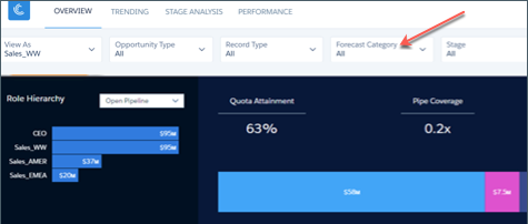
You and Laura can select specific statuses and see what that does to the forecast. Open the filter and select Best Case and Commit and click Apply.
Wow! The forecast just went up dramatically. While quota attainment stays the same because it reflects the status of the team today, the forecast looks a whole lot better. Laura could increase it even more by selecting Omitted and Pipeline. But it’s a best-case scenario. Laura would like to add some certainty to this optimistic forecast. The Overview dashboard gives her another idea.
Look at the Opportunity Owner chart below the forecast. You can see a list of all the members of Laura’s team. Maybe she could work with a couple of those folks to accelerate their deals!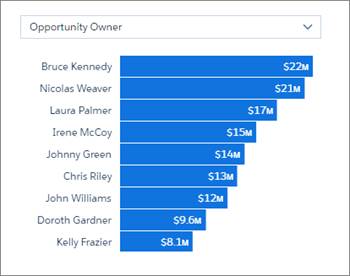
Make the Quarter, Part 2: Forecast and Actions
Laura sees that Harold Campbell and Catherine Brown both have low numbers. (Remember, the examples here may not be exactly what you see in your org. You can perform the same steps with the two reps with highest remaining quota in your org.) She can work directly with them to help the best case scenario become real. How does she do that? One answer is a click away—in the Forecast dashboard. There she can find details about how her team’s doing against their quota.
- Return to the Sales Analytics Home page by clicking the Home button
 .
.
- In the list of links below the KPIs, click Forecast to open the dashboard.
- To be sure Laura’s looking at only her team, select Sales_WW from the View As filter.
- Open the Opportunity Owner filter, look for Harold Campbell, and select him. Then click Apply.
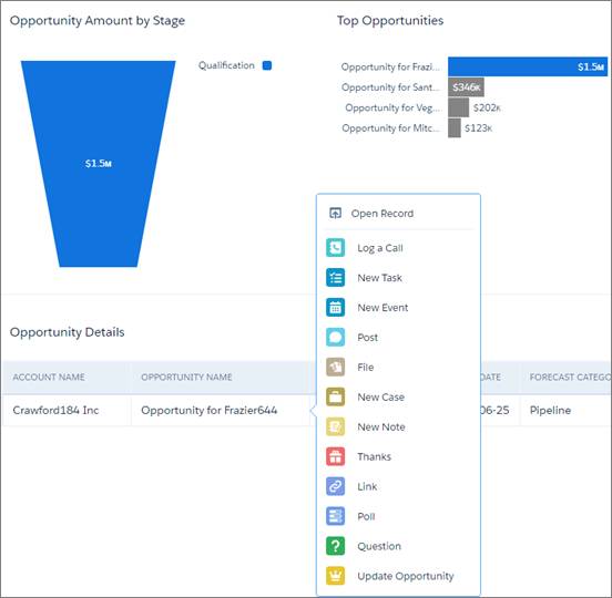
The main chart makes it clear how far Harold has to go—and what a positive difference it could make if he gets there. Scrolling down through the dashboard, Laura can see his top opportunities. Harold’s largest opportunity all by itself could make a significant difference, so she’s going to see if she can get this deal going. The power of Salesforce actions helps her do that.
- Click the bar for Harold’s largest opportunity. You’ll see that the widgets along the bottom of the dashboard redraw themselves, thanks to a bit of CRM Analytics magic called faceting.
- If you don’t see the Opportunity Details chart yet, scroll down the dashboard. It includes only one opportunity—Harold’s largest
- In that chart, under Opportunity Name, hover over the name of the opportunity. You’ll see a disclosure triangle. Click the triangle to the right of the Opportunity Name cell to open the drop-down Actions menu. From this menu, Laura has access to Salesforce actions as well as the Salesforce record. It’s all integrated so she can get insights and take action faster than ever!
- Laura wants to take action with a Chatter post. To see how this works, select Post in the menu. (Because of variations of data in your org, you may not see the same opportunity as the one we show here.)
- Enter: “Message from Laura: ‘Let’s get this deal moving. What can I do to help?’” (Laura will explain to the team later that she made the post from your account while she was training on Sales Analytics.)
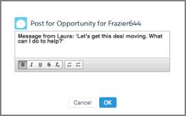
- Click OK. Even though you’re in Sales Analytics, your account owners see the post in Chatter as if you posted from within Salesforce.
Make the Future Happen Now: Trending and Sales Stage
You’ve helped Laura make things happen by lighting a fire under an opportunity. She’d like to do more of that! Laura’s wondering how she can pull business from the future into this quarter. Not a question she was thinking about before she started using Sales Analytics, but an important one for her success. Let’s look at a couple of ways Sales Analytics can help.
The first is staring her in the face on the Forecast dashboard. Look for the Time Period filter near the top of the dashboard. It should be set to This Quarter. Open the menu, and you’ll see that it lets you look at future quota progress numbers.
Select Next Quarter, and thanks to faceting all the charts on the dashboard redraw themselves with future opportunities. Laura can look at top opportunities for the coming quarter, select them, and light a fire under whoever owns them. Simple, right?
Sales Analytics gives her another way to pull future business into the quarter through the Trending dashboard, which shows pipeline changes. Laura’s sure the CEO will want to see the pipeline anyway, to make sure she and her team have plenty of opportunities, both now and in the future. And maybe, lurking in the pipeline, is some future business the team can close now. Let’s have a look.
In the Forecast dashboard, click the Trending tab to go to the dashboard. Select Sales_WW from the View As filter to see just Laura’s team’s contribution to the pipe for the quarter.

Not bad: her team has added a lot to the pipe (the Pipeline Change amount), and they’re above target (the percentage number next to that). Scroll down and see details about the opportunities that are part of the pipe. The default shows current deals. Laura’s looking for deals to move into the quarter, so what can she do?
Like other dashboards, this one’s faceted. As you select segments in the waterfall chart on the right, the Opportunity Details chart changes accordingly. Laura notices that one of the segments is Moved Out—opportunities that have been moved into a future quarter. Maybe the solution lies there.
- Select Moved Out.
- The Opportunity Details chart at the bottom changes to show only those opportunities.
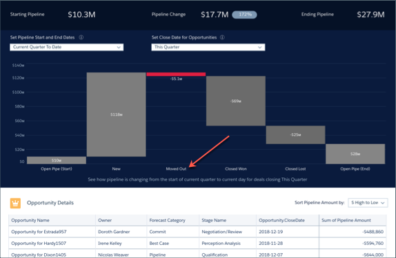
- Scroll down to the Opportunity Details chart and find the opportunity with the highest dollar value that’s far along in the process. You can identify where the opportunity stands from its status in the Stage Name column. For example, a status of Negotiation/Review or Proposal/Price Quote indicates that an opportunity might close quickly and that Laura might be able move it back in to the quarter.
- Open the Actions menu by hovering over the high-dollar value opportunity name. Laura wants to see all the detail possible, so select Open Record to look at all the opportunity activity.
Laura can review all the information about the opportunity, including its future close date, stage, type, status, related activities, and so on. She’s satisfied this is a good deal to try to pull back in to the quarter, so she posts a note to the account owner right from the record.
- On the record page, be sure the page’s feed is open by clicking Show Feed.
- Enter “Message from Laura: ‘It would really be great to pull this deal back into the quarter. What can we do?’” (Again, she’ll explain later that she made the post from your account.)
But you’re not done with this dashboard yet. Laura notices that the dashboard has a couple of date filters. She asks, “What if we look at the future pipeline? Maybe we could move some of those deals into the quarter.” So....
- Reset the dashboard to its original state by clicking the Reset button
 .
.
- Make sure you’re looking at Laura’s team by selecting Sales_WW from the View As filter.
- Find the Set Close Date for Opportunities filter and change it from This Quarter to Next Quarter.

Cool! Now Laura can see the pipeline for next quarter. Scrolling down, she sees details for opportunities she can try to bring into the current pipe using Actions for promising opportunities. Great—now she’s super excited!
But there’s more: Laura notices a dashboard called Sales Stage Analysis. She says, “If I had to guess, I’d say that one shows the stages of opportunities in the sales process. Maybe we can find more business to accelerate there.” You tell her there’s no reason to guess, you can open it up and see what’s there.
- Go to the app’s Home dashboard by clicking the Home button. Find and open Stage Analysis. Sure enough: You see opportunities in various stages of the process, from Prospecting through Value Proposition and on to Negotiation/Review. At the bottom, you see widgets with neglected, stalled, and pushed opportunities.
- Select the Open Opportunities bar for Negotiation/Review, the opportunities furthest along in the process, to see just those potential deals.
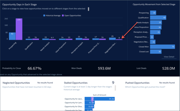
- Under Stalled Opportunities, click the bar for the largest deal and you’ll see the details below.
You’ve just unearthed another potential opportunity for Laura to accelerate business. She can push on a large stalled deal that’s far along in the sales process. Laura could take action right from the dashboard, just like she did before, and get the responsible team member to unblock the deal!
Several management actions done, all driving your business forward as you prepare for the meeting tomorrow. It looks like Laura knows how the quarter is going and what the top-line results so far are. And just from this initial exploration, through a few dashboards, Laura has an idea about where to focus to boost her confidence about making quota.
Laura’s happy, and you hope the CEO will be, too!
Upsell and Cross–Sell With Team Whitespace
Glancing through the other dashboards, Laura notices the Team Whitespace dashboard. She wonders if, true to the name, the dashboard reveals white space where DTC might find business it didn’t know it had. The answer: Yes! We included the dashboard just for that purpose, giving her one more way to help accelerate revenue.
The dashboard shows accounts owned by her team, what products each has purchased, and how much they’ve purchased. Maybe a recent large deal included only one or two products. Laura’s team could go back in and sell more of those products and other products, too. It’s certainly worth a try!
- Go back to your app, and open Team Whitespace.
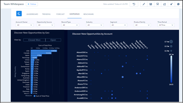
- Under Discover New Opportunities by Geo, select Closed Won, so you just see customers who’ve purchased already.
- Look at the scatter plot chart on the right, called Discover New Opportunities by Account. Click any of the circles in the chart and the chart focuses on that account. You can look below and see the details, such as account name, products involved, amount, and status. Click the circle again, and you again see all the potential opportunities. Look through the rest of the chart by dragging through the scroll bar on the far right.
- Laura knows the CEO will want to know about larger customers. Drag down through the chart to find a large deal that involved only a product or two—that is, an account that has bubbles under only one or two product names. For example, have a look at Barber878 and Benson346 in this example:
 The accounts purchased lots of one or two products, but no others. Maybe they’re so happy with their purchase they want more. Let’s see if we can make that happen!
- Click the bubble for the deal you found in your example org, and see the detail below it. You’d like to have a better idea of what’s going on with the account, so as you’ve just done, you can open the Actions menu, and have a look at the record. Once you’re satisfied you have the details, you can post a message to the account owner asking them to go back to the account to drum up more business. Since you’ve already used the Actions menu and posted a couple of messages, we won’t take you through that again. But you get the idea.
Sales Analytics gives Laura lots of ways to help her make the best case scenario for the quarter. Even though the top-level forecast wasn’t as exciting as Laura had hoped for, she now feels a lot happier about a great result this quarter. And she’s confident she can put the CEO at ease, too, by taking her through Sales Analytics. Cool!
Take a Quick Step Back: Are You Finding the Answers?
You can keep digging—so many places to look, and it’s so easy and fun to discover new insights. But let’s take a step back from the dashboards and numbers for a minute and see where we are. Remember your purpose: to make sure Laura has an overview of her business. Toward that end, you set out to answer a few specific questions and figure out some new ones along the way. So how’s that going?
Originally, you set out to answer these questions:
- How is the quarter going? What are the top-line results so far?
- How is Laura doing against her target?
- Who are her top performers and how are they doing against their targets?
- What are the biggest opportunities her team can push on to make this a great quarter?Looks like you’ve answered numbers one and two, and made a lot of progress on number four. It’s fine that you haven’t gone in order; by exploring organically, you’ve actually encountered additional insights and answered more questions:
- Will Laura make her quarter?
- Are there any promising deals that could close this quarter?
- Can she pull some business from next quarter into this one?
The answer to number five is “looking good!” because the answers to six and seven are both “yes!” That leaves just one more question, namely the one about the top performers. Let’s look into that now.
Look for the Top Performers
Again, it’s like Sales Analytics can read your mind. (Well, it’s not really that hard to imagine that sales managers would want to know how their teams are doing.) As she can with other KPIs, Laura can start with the home dashboard and dive deeper right from there.
- Go back to the home dashboard by clicking
 .
.
- The Leaderboard dashboard provides some insight into how the team’s doing, but there’s an even better one to learn about top performers. Open the Team Benchmark dashboard. To get just Laura’s team, select Sales_WW from the View As filter.
Okay, this is looking good. You can see how members of the team are doing—the leaders according to Closed Won.
- Laura wants to see how the salespeople have been doing this year, so you set the Time Period filter to Current Fiscal Year. She’s looking at a comparison of the absolute value of their revenue and quota attainment percentage.
- And, if she wants, Sales Analytics also lets her see more detail. The filters above the charts let her choose other values. Open the one on the left that currently shows the Closed Won value and change it to AvgSaleCycle (days).
Laura can now see which members of her team are slowest and fastest at closing deals.
- What if she wants specifics about a team member? Click the bar for one of her team members, and faceting takes care of the rest, changing the values in the Performance vs. Team Avg widget on the right to show how that team member stacks up against the rest.
There you have it: your team members with the highest win rates for the year. Laura’s last question asked and answered. Laura now knows who to turn to for accelerating business, and who to single out for attention from the CEO.
This chart also provides quota attainment percentage, showing how her people are doing against their targets. That’s the last question to answer—at least the last question before lunch!
Wrap Up
Amazing! Laura is ready for the meeting. You’ve also answered additional questions she didn’t even know she had when you started and she took management actions—all the while learning how to find the most meaningful visualization of the relevant data. And it was fun!
One thing you’ve both definitely learned: Sales Analytics helps you get analysis and answers fast by providing an intuitive path through its prebuilt dashboards. Because it’s so interactive, you’re able to answer many questions in the space of just a few minutes. Best of all, the answers are all in the form of beautiful charts—visualizations of data that are worth a thousand words.
There’s still more to explore. We’ve focused on a sales manager’s path through Sales Analytics, but the app provides ready-made paths for sales reps as well as the sales ops team. For now, Laura is confidently ready for tomorrow’s meeting with the CEO. If the CEO has questions, Laura can drill in and answer them on the spot. If he has suggestions, she can create new tasks and Chatter posts directly from dashboards. You’re pretty sure he’ll be impressed. And you won’t be late for lunch!
Resources
- Salesforce Help: Key Elements of a Dashboard
- Salesforce Help: Learn About Sales Analytics App Prebuilt Dashboards and Datasets
- Salesforce Help: Get to Know Sales Analytics App Data Terminology