Promote Feature Adoption and Discovery
Learning Objectives
After completing this unit, you’ll be able to:
- Decide when to use prompts and walkthroughs.
- Describe the three types of prompts: floating, targeted, and docked.
Identifying When to Use Prompts and Walkthroughs
In the previous unit, we saw that two types of in-app guidance—prompts and walkthroughs—are useful for onboarding, feature adoption and discovery, and deeper learning scenarios. Let’s dive a little deeper on the feature adoption and discovery scenario. The term “features” is a big bucket that covers a width and breadth of complexity, accessibility, and longevity.
Suitable Use Cases
Prompts and walkthroughs work best when you have something short and helpful to say, or when you want to quickly call attention to something new, interesting, or important. Prompts and walkthroughs help users quickly absorb and acknowledge information and then continue with their flow of work. These use cases are good candidates for prompts and walkthroughs.
- Features that are easy to learn and use immediately
- Features that are available without setup or personalization
- Features that are requested enhancements to existing functionality
- Reminders or simple instructions to onboard to features that have low adoption
- Tips for being productive in the app
Unsuitable Use Cases
Prompts and walkthroughs are less effective when you have lots of information to share, prerequisites to explain, or context to establish. These use cases aren’t suitable for prompts and walkthroughs.
- Features that are complex, with hard-to-remember workflows
- Features that have a steep learning curve
- Features that can be heavily personalized by users
Consider Your Audience
In addition to the subject matter, consider the target audience for your prompt or walkthrough. Just like features, your users aren’t monolithic. They have a variety of experience levels, educational backgrounds, assumptions, and jobs to do. However, you can still develop prompts and walkthroughs that effectively support many types of users at once by remembering that most users:
- Know the basics, and don’t want their workflow interrupted without good reason
- Want actionable, relevant information about updates to features they use often and new features that could increase productivity
- Don’t want to be sold to, unless an offering is clearly tailored to their needs
With these considerations in mind, you can more carefully select an appropriate scenario where prompts and walkthroughs provide value to users of all types.
We have our purpose and audience in mind, so let’s next talk about the difference between prompts and walkthroughs.
Prompt vs Walkthrough
A prompt is a single, small window that directs users’ attention to a feature, update, or call to action. The user notices the prompt, reads the information or takes action, and moves on with their day.
A walkthrough is a series of connected prompts that provides a step-by-step, guided experience across a single page or multiple pages for in-context learning. Walkthroughs ask more of the user’s time, attention, and action. However, the walkthrough’s unique hands-on experience encourages users to take the time to complete all steps.
Use a single prompt for a short message to help users quickly discover one feature. Use a walkthrough when you want to guide users through multiple steps that help them adopt the feature or to help users discover multiple related features.
A walkthrough is also a great resource for these activities:
- Onboarding new hires to their workspace
- Providing a navigational or feature overview
- Guiding users through a multi-step procedure
Types of Prompts
If a prompt is the right type of in-app guidance for your scenario, your next decision is to choose which type of prompt you want to build. Prompts come in three flavors: floating, targeted, and docked. Choose the appropriate prompt type depending on your use case.
|
Use Case
|
Floating Prompt
|
Targeted Prompt
|
Docked Prompt
|
|---|---|---|---|
Your goal is to drive readers to a resource, such as a training PDF or website. |
|
|
|
Your goal is to have readers acknowledge information without specifically completing an action. |
|
|
|
Your message is short (approximately one or two sentences). |
|
|
|
Your message has multiple sentences, or you want to include color, links, and lists in your text. |
|
||
You want to show information that the user can consult as they work. |
|
||
You want to embed a video into the docked prompt. |
|
Floating Prompt
A floating prompt is a nonintrusive way to nudge users toward a feature or opportunity. There’s no extra fluff here. Just a short and sweet message, an optional image, and a call to action in the form of a button that opens a URL of your choice. You can spruce up your message using the rich text editor or leave it plain and simple. Floating prompts are also ideal for most steps of a walkthrough. You can place a floating prompt in one of nine positions on a page.
- Top left
- Top center
- Top right
- Middle left
- Middle center
- Middle right
- Bottom left
- Bottom center
- Bottom right
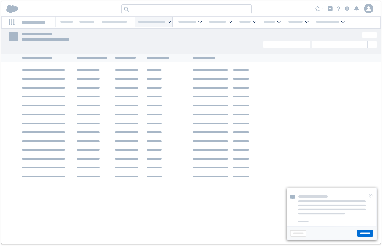
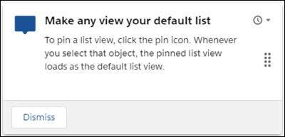
For example, say that you want to let users know that they can be more productive by pinning their favorite list view. A floating prompt can summarize how to accomplish this task and what users gain from it.
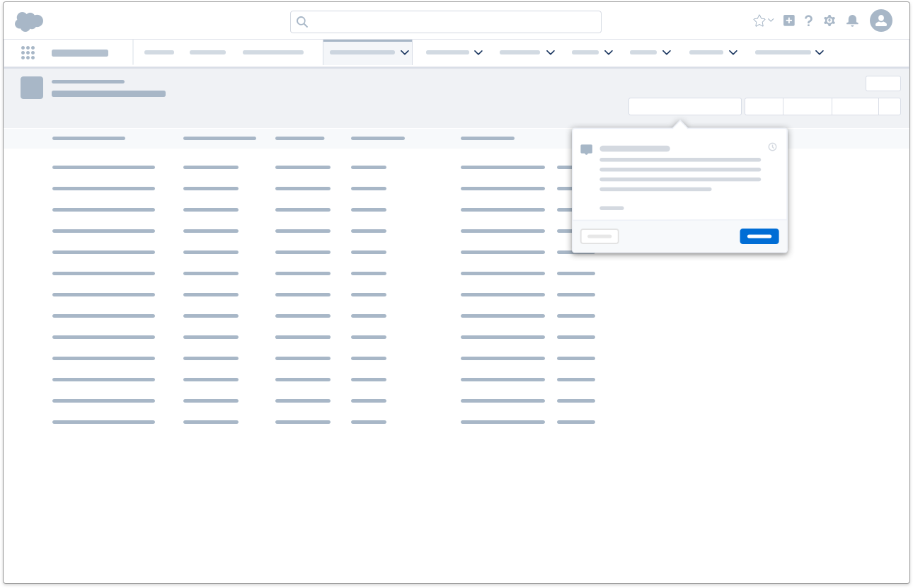
Targeted Prompt
Targeted prompts have all of the same benefits as a floating prompt without being confined to nine placement positions. Connect a targeted prompt to a specific page element to show your users exactly what you’re referring to.
Docked Prompt
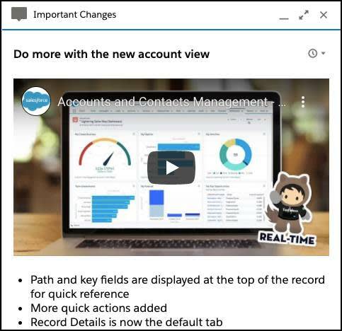
Docked prompts are helpful when users need to refer to content while exploring a feature on their own. Unlike the floating and targeted prompts, the docked prompt stays in place as the user navigates through the app. Use a docked prompt for content that you want to remain on screen, such as step-by-step instructions or an image or short video that users can follow in their flow of work. A docked prompt supports more rich text options than a floating or targeted prompt. Consider using a docked prompt to show next steps or takeaways in the last step of a walkthrough.
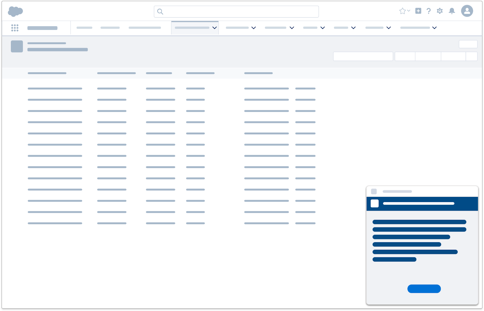
For example, maybe you want to introduce users to the new layout for the account record detail page. You add a header that indicates the change is important. You give it an engaging title, embed a helpful video, and highlight the main updates, including that Path and key fields are displayed at the top of the record for quick reference. A docked prompt can include all of this information.
More Examples of Prompts
For more examples of prompts that you can see in Lightning Experience, consider installing the In-App Guidance: Boost Sales User Productivity in Lightning Experience or In-App Guidance: Boost Service User Productivity in Lightning Experience managed package from Salesforce. These managed packages are helpful starting points for building your own prompts. To install this package, your org must already have the Sales or Service Console app installed.
In the next unit, you get hands-on with the In-App Guidance Builder to create prompts in Lightning Experience.
Resources
- Salesforce Help: In-App Guidance
- Video: Create Prompts in Lightning Experience
- Video: Create Walkthroughs in Lightning Experience


