Get Started with User Engagement
Learning Objectives
After completing this unit, you’ll be able to:
- Describe user engagement as a key part of a user’s experience.
- List the key user engagement scenarios.
- Explain the Salesforce components that you can use to engage users.
The Art of User Engagement Scenarios
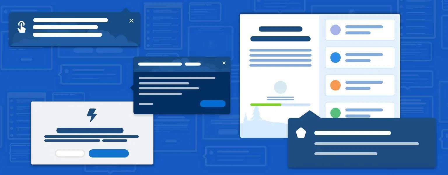
User engagement is the process of onboarding, empowering, assisting, and educating users through in-app guidance. You’ve probably encountered in-app guidance in Salesforce without even knowing it. Providing in-app guidance components, such as infobubbles and tooltips, is one way that Salesforce helps users work more effectively. And now, you can bring your unique knowledge of your org and your users to customize those components. But before you get going, you should understand why and when to add in-app guidance.
There are four key scenarios for user engagement. To explain them, we’re going to use an example that takes us outside the office and into an art museum. Picture yourself there. After getting your ticket and checking your backpack, the first things you want to know are what exhibits are on display and where to start. You pick up the gallery guide and map. You discover all the current exhibits, review how the general collection is laid out, and even identify the pieces of art you want to see most. Well, when users are in onboarding mode, they’re doing similar things. User engagement during this phase shows users where to begin and highlights what’s new or changed.

You’ve been walking around the museum for a while. You’re seeing great art along the way. But now you notice that some of the placards have a note: Take the free audio tour to learn more about the collection! You didn’t know that there was a free tour available, but are now intrigued (especially about the free part). In the user engagement world, this is known as feature discovery and adoption. A short message drives users to a feature that’s helpful. The note about the audio tour is particularly effective because it relates to what you, the user, are doing right now: learning about the art right in front of you.
After lunch, you sign up for the audio tour. But as you’re working your way around the museum, you get stuck behind a large group of students on a tour. You can’t quite see the details of the art described in the audio tour, and you want to replay a segment of the tour. Luckily for you, the audio tour equipment has a helpful card attached that tells you how to do just that. The card serves the same purpose as troubleshooting help in a Salesforce app. It’s a good idea to provide help for common tasks and problems so users can get on with their work without too much disruption.
After listening to the audio tour, you want to learn even more about one of the photography exhibits. So you decide to join the next guided tour for the exhibit. The guide is pretty knowledgeable about the artist’s life, her influences, and how her art fits into the larger photography movement. This is the idea behind deeper learning guidance. This is guidance that takes the user on a learning journey to a better understanding of the concepts they need to be more productive and innovative at work.
To summarize, there are four basic scenarios in user engagement.
|
Scenario
|
Description
|
Examples
|
|---|---|---|
Onboarding |
Show users where to begin and what’s new or changed. Get them to the “aha moment” quickly. |
|
Feature discovery and adoption |
Help beginners become experts. Help experienced users learn new things. Raise awareness of new features and releases. |
|
Troubleshooting help |
Provide just-in-time prompts that help users learn by doing. Offer reliable resources and access to support. |
|
Deeper learning |
Give users the skills and information they need to get as much value as possible out of your product or application. |
User wants a deeper understanding of a new feature |
These scenarios are important to remember. Each component works better in some scenarios than others. So, let’s meet the lineup of user engagement components available in Salesforce.
Components and Patterns
Now that we’ve gone over the why of user engagement, let’s go over the what. Salesforce offers a whole host of options for delivering your message, whatever the user engagement scenario.

One of the great things about Salesforce is that there are features to use with clicks (declarative development) and code (programmatic development).
|
Component
|
Description
|
Programmatic or Declarative?
|
|---|---|---|
Welcome Mat |
Provide getting started resources the first time that users log in to Lightning Experience. |
Programmatic |
Guidance Center |
The Trailhead icon in the header opens a menu of contextual help topics, Trailhead modules, and more items. |
Declarative |
Prompts |
Use a floating, targeted, or docked prompt to let users know about new features, news, important announcements, or helpful guidance for the page they're working on. |
Declarative |
Popovers |
Use a feature popover to point to a lower-level component on the page to provide tips and best practices. |
Programmatic |
Empty State |
Replace a blank section with instructions on next steps. |
Programmatic |
Field-level Help |
Detail the purpose and function of a standard or custom field. |
Declarative |
Setup Assistant |
Centralized list of tasks designed to help users onboard organizations, clouds, or features. |
Programmatic |
Walkthrough |
Hands-on interactive tour, guiding users through a series of onboarding steps. |
Declarative |
Let’s bring together what you’ve learned: the scenarios and the components. The next table indicates which components are best suited to each scenario.
|
Component
|
Onboarding
|
Adoption and Discovery
|
Troubleshooting
|
Deeper Learning
|
|---|---|---|---|---|
Welcome mat |
|
|
||
Guidance Center |
|
|
|
|
Prompts |
|
|
|
|
Popovers |
|
|
|
|
Empty State |
|
|
|
|
Field-level Help |
|
|
||
Walkthrough |
|
|
|
Within a scenario, how do you decide which component to use for a particular message? There are space and format considerations for each component. For example, you don’t want to include a long set of instructions in field-level help. But there’s another factor to consider when choosing the best user engagement mechanism: the pull method or the push method. Let’s push ahead and get to it.
Push Method vs. Pull Method
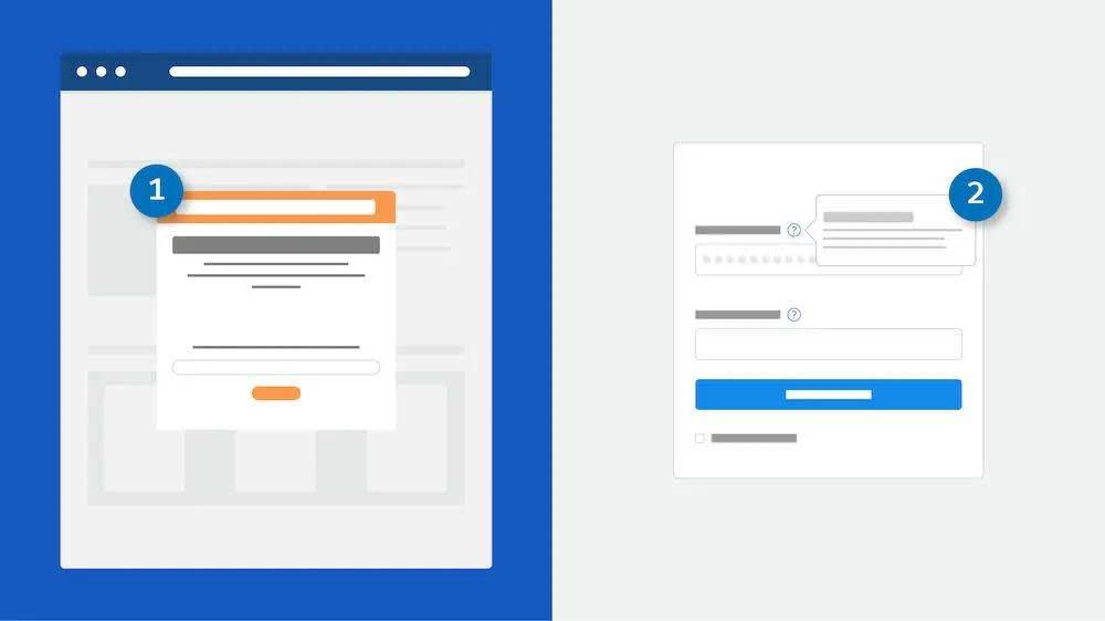
Use the push method when users may not notice or seek out help, but would benefit from assistance. Present content to the user even though they don’t seek it out. For example, show a welcome mat (1) upon first login or display a prompt when a user lands on the Account homepage. Prompts, popovers, and walkthroughs are examples of the push method.
Some push components “hide” in plain sight. Empty state messages (also known as zero states or first use states) and field-level help messages are considered push mechanisms because they're presented in the user interface even though the user didn’t specifically seek help.
Use the pull method when the user is motivated to seek help. For example, the infobubble (2)opens a tooltip when you hover over an icon.

Develop a user engagement strategy that encompasses both push and pull methods to support users.
Even More User Engagement Options
There are some additional features, options, and components that you might not even have considered as user engagement.
- Utility Bar Notes—Give your users quick access to common productivity tools in a fixed footer. Utilities open in docked panels.
- Rich Text Component—Add text and simple HTML markup to your Lightning pages.
- Guidance for Success on Path—At each step on the path, help users succeed with step-specific guidance, such as tips, links, and information about company policies.
- Custom Notification from a Flow—Send customized notifications when important events occur. For example, alert an account owner when a new support case is logged.
- Einstein Analytics In-Dashboard Videos—Drive adoption and engagement with educational videos. Provide customized instruction that helps users get the most out of each dashboard and its charts.
At this point, you must be pretty excited about the world of user engagement at Salesforce. Next, you learn about prompts and walkthroughs for feature adoption and discovery.
Resources
- Lightning Design System: User Engagement Overview
- Salesforce Help: Custom Help Content
- Salesforce Help: Standard Lightning Page Components
- Salesforce Help: Flow Core Action: Send Custom Notification
- Salesforce Help: Customize Onboarding with In-Dashboard Instructional Content


