Design a User Engagement Journey
Learning Objectives
After completing this unit, you’ll be able to:
- Describe the aha moment.
- Use MAP to write effective user engagement content.
- Storyboard your user engagement journey.
Aha!
You may know it as the Eureka! moment or the lightbulb moment, but in the user engagement space, the ultimate goal for any piece of guidance is to deliver an aha moment. This is the moment when a user first recognizes value in your product or solution.

You want users to immediately, completely, and clearly understand the value of the new information, to them and their job. Aha moments make the information stick in a user’s mind so they start using it right away. That’s a pretty high bar, but remember what we said earlier about users.
- They want actionable, relevant information.
- They don’t want their workflow interrupted without good reason.
- They don’t want to be sold to.
So to get to that aha moment, let’s give them actionable and relevant content that’s worth the time to read: information that maximizes users’ experience and efficiency; information that makes their job easier; information that brightens lightbulbs above heads.
Aha moments usually happen first during onboarding, but can and should recur as the user grows and becomes increasingly proficient. But it doesn’t happen without a little planning, so let’s get started.
Crafting a User Engagement Journey
Think of a user engagement journey in four phases:
-
Onboarding: Say hello and make users feel welcome.
-
Feature adoption and discovery: Get users excited about the latest and greatest features.
-
Help and troubleshooting: Support users with minimally disruptive, relevant content.
-
Deeper learning: Help users learn more about complex concepts or tasks.
Hmmm, those look familiar, right? They’re the user engagement scenarios, described as phases in the user engagement journey. Because Salesforce and your company are constantly innovating, the phases aren’t linear. Instead of thinking of a timeline, consider each phase a series of events that a user encounters again and again as they go along in their work.
Now that you’re pretty familiar with the scenarios and phases, you begin to understand what your users need in each phase. Ask yourself:
- What’s the most helpful information I can offer at this stage? Focus on the top use cases and those aha moments.
- What changes have an impact on users? Highlight those changes so users stay up to date.
- Do different users require different information? Consider familiarity with the product and industry, motivation level, and product complexity. Then tailor the help to the user's role or goals.
Before long, you’ll have a document (or set of documents) listing all the topics you want to cover. For example, in an onboarding strategy for new sales users, you might want to cover these topics.
- Tips and tricks for finding recent items, including search and favorites
- Instructions for changing apps through the App Launcher
- Instructions for personalizing the navigation bar and list views
- Quickstart guides for productivity features (such as notes, tasks, and calendar) and reporting, including dashboards
Now that you know what you want to cover, you create the individual elements. Let’s start by mapping it out.
MAP It Out
Identify the message, audience, and purpose of your content.
- The message is what you’re telling your users.
- The audience is who you’re addressing.
- The purpose is why you’ve chosen to communicate the message.
Consider these examples.
|
Message (What)
|
Audience (Who)
|
Purpose (Why)
|
|---|---|---|
Learn how to pin, switch, and customize list views with just a few clicks. |
All users |
Teach basic skills for list views. |
Keep deals moving forward with Path and Kanban. |
All sales users |
Encourage use of Path and Kanban. |
Bookmark your most-used records with Favorites. |
All users |
Encourage use of Favorites. |
When you’re defining your audience, you may want to see if you can get even more specific than a person’s role at the company. Is your target audience beginners, advanced users, or somewhere in between? Existing users need flows for new features. Inactive users need flows that refamiliarize them with the product.
The purpose is your reasoning for taking the time to create content. What will your guidance achieve? Although you may have a shared purpose with your audience, you may not state the purpose in your message. When writing your purpose, specify the phase, such as onboarding, feature adoption, troubleshooting, or deeper learning. This helps you define the purpose, and pick the right way to deliver the message. When you’ve chosen the best user engagement component to use, you can tailor your message to fit the format.
The next step is to write out what you want your target user to learn, understand, or achieve. Craft your message to focus on this objective. Make an impact right away by highlighting the value to the reader in the header or title. For prompts and walkthroughs, write content that’s easy to remember later without referring to the in-app guidance.
Consider these FACE principles for effective content.
- Friendly, upbeat, and engaging
- Accurate, to build trust with the reader
- Concise
- Educational, teaching how to be more efficient and productive
Usually, you end a message with a call to action. Sometimes, the call to action is an acknowledgment. For example, when you announce that changes are coming to the app soon, there’s no real action to take other than clicking Got It or OK, by which the user says, “I’ve read this.”
More commonly, your in-app guidance asks the user to do something.
- Open a wiki or PDF file.
- Try a new feature or enhancement.
- Complete a few steps to set up something.
- Watch a video to learn more.
Be thoughtful when choosing the action. Most people don’t want to interrupt their workflow, so pick a resource that gives them the information they need at the moment. Users may even want to refer to the information later. So, if possible, let them know about a secondary source for the information in case they don’t have time at the moment.
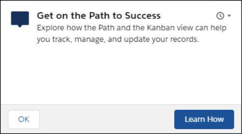
Here’s an example of a prompt for Path and Kanban awareness.

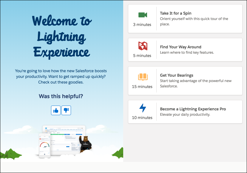
Here’s an example of a welcome mat for first-time Lightning Experience users.

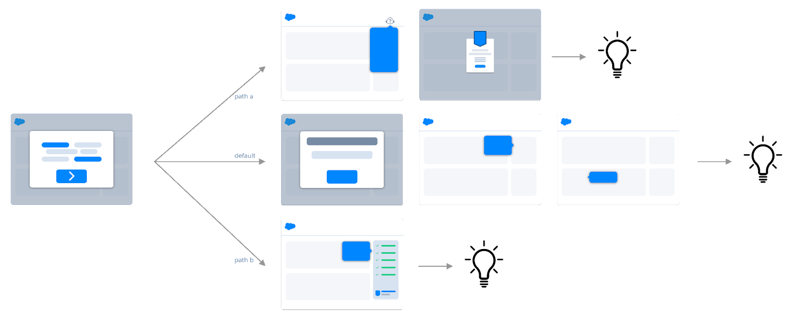
Storyboarding is a low-tech, quick way to visualize your user engagement story so you can make sure that all the pieces fit together. You don’t need to be an illustrator to sketch the situations and elements of your learning journey. If you can draw a square and an arrow, you’re ready to be a user engagement storyboarder. If pen and paper aren’t your style, Salesforce has a downloadable sketch kit of common symbols you can use. Check out the Lightning Design System link in the Resources section.
Start by drawing a basic wireframe of each component. For example, creating a wireframe for all the steps in a walkthrough can simplify the task of creating the walkthrough with In-App Guidance Builder. Identify and connect steps based on how the user encounters them. Focus on a series of moments spread over time, rather than isolated features here and there.

Now you know a little more about user engagement in general, and Salesforce user engagement components in particular. You’re ready to kickstart (or reevaluate) your user engagement strategies and take advantage of all that Salesforce has to offer you and your users.
Resources