Protect and Grow Your Business
Learning Objectives
After completing this unit, you’ll be able to:
- Identify agreements that need immediate attention.
- Uncover potential areas of growth for your business.
- Check the accuracy of forecasts.
Shift Your Attention to Agreements
In this unit, we’ll focus on metrics that show the pipeline for further growth, potential areas where Elliott could sell and cross-sell products, and ways to increase forecast accuracy.
On the Key Account Manager home page dashboard, Elliott clicks the Sales Agreements Insights card. This dashboard has two tabs, Sales Agreement Performance and Sales Agreement Pipeline.
The Sales Agreements Performance tab gives you key metrics on the number of active agreements, planned revenue, outstanding revenue, revenue realization percentage, and compliance percentage.
Elliott sorts the list of agreements by the number of days remaining and notices that the Tech Labs SA_Monthly6_2020-06-23 sales agreement has only 28 days remaining, with an outstanding revenue of over $1.5 million. The overall compliance of accounts at Rayler Parts is around 77%, which can be improved next year.

Further down, there are two more charts. On a scatter-chart, Elliott can see how each active sales agreement is placed with regards to compliance percentage and the number of active days. The number of active agreements with an actual vs planned difference of $1.8 million is fairly high, which is concerning. Elliott can also see the products that contribute the most and least to this actual vs planned difference. As with most CRM Analytics dashboards, Elliott can view the data based on quantity or revenue.

The charts also show the actual vs planned difference across all the months, for both quantity and revenue. From August to November, the difference is over 2.3 million dollars, peaking in August. For a top-level executive, these are critical patterns that would have gone unnoticed without CRM Analytics dashboards!

Next, Elliott turns his attention to sales agreements that are due for renewals.
Create a Pipeline for Your Business
The Sales Agreement Pipeline tab provides Elliott with data on sales agreements which have upcoming renewals, and the planned revenue broken down into accounts and products. This data can be further sorted by current year, month, and quarter. Elliott notes that around $22 million of revenue is planned from upcoming renewals, with Acme Partners and Compactor 9500 leading the way for accounts and products respectively.

Elliott can also see the amount of revenue Rayler Parts has lost from canceled sales agreements and the amount of revenue they received from expired sales agreements this year. Again, Elliott can choose to see this data for the current month or quarter. He’s relieved to find that there have been no canceled sales agreements. This is a good sign for the business.

Sell More, Build More
Using CRM Analytics, Elliott can look at inactive accounts and discover cross-selling opportunities.
Elliott opens the Whitespace Analysis dashboard. It shows him a list of accounts that have no active sales agreements, and the number of sales agreements in draft, expired, and canceled statuses. For accounts that have few active sales agreements and no draft agreements, it would be a good idea for key account managers to drum up some new business.

The tab also shows accounts where certain products aren’t sold yet. Elliott can find out which accounts don’t sell certain products and check if there’s scope to offer those products. Elliott chooses to see whitespaces for accounts that do not have any draft or active sales agreements. He notes that product Ripper 34 hasn’t been a popular choice for Meridian Partners even though other accounts in the same industry segment have bought it in bulk.

The last thing Elliott wants to check is the accuracy of account forecasts. He opens the last dashboard, Forecast Analysis, from the home page.
Accurate Account Forecasts
Account forecasts are generated based on a forecast formula and each account’s market and growth percentage. The Forecast Analysis dashboard gives business analysts a chance to see how accurate the system-generated forecasts are. The dashboard also shows the accuracy of the adjusted forecast. Rayler Parts has an adjustment period in the first week of every month. During this period, account managers can choose to either accept the system-generated forecast numbers or make their own updates based on executive decisions, market trends, and other logistics.
The Accuracy dashboard sorts accounts and products from highest to lowest accuracy. The accuracy is calculated based on the Mean Absolute Percentage Error (MAPE) method. Elliott can see that there’s just 1% difference between the MAPE for system-based and adjusted forecast, which means that their adjustments have been accurate.

For both system-generated and adjusted forecasts, Elliott can see the MAPE accuracy trend across months and the actual vs forecast difference.

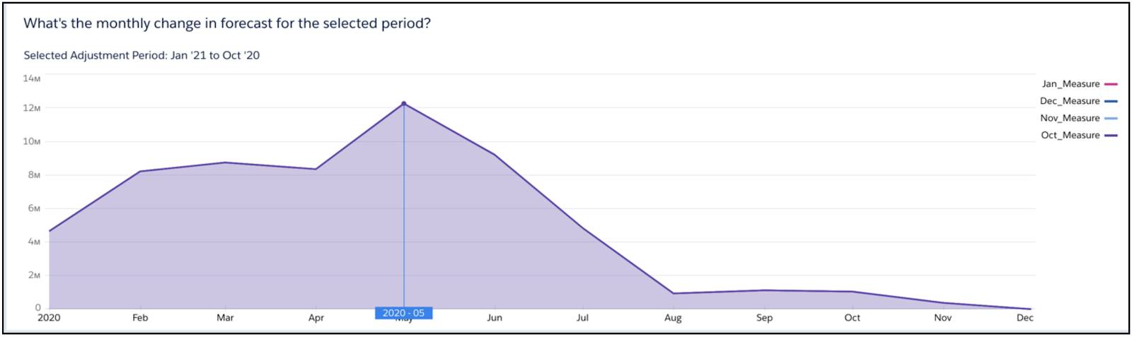
Elliott has reached the History tab on the Forecast Analysis dashboard. He selects the Forecast period as Previous Fiscal Year and can see the net change percentage in forecast for all accounts and products. He can also see the monthly change in forecast for a selected adjustment period.

Flaunt Your Dashboards
Key account managers at Rayler Parts are reaping the benefits of CRM Analytics. Elliott and his team can act faster because data is no longer hidden in a sea of spreadsheets. With interactive dashboards, account managers are easily detecting anomalies, patterns, and actionable pointers for their meetings and business strategy. With CRM Analytics, they can proactively engage their customers and partners.